
1. はじめに
Compose は UI ツールキットであるため、アプリのデザインを簡単に実装できます。UI の外観を記述すると、Compose が UI を画面に描画します。この Codelab では、Compose UI の記述方法について説明します。このチュートリアルは、基本の Codelab で学習したコンセプトを理解していることを前提としています。そのため、まずそちらの Codelab を修了しておく必要があります。基本の Codelab では、Surfaces、Rows、Columns を使用してシンプルなレイアウトを実装する方法を学習しました。また、padding、fillMaxWidth、size などの修飾子を使用して、これらのレイアウトを拡張しました。
この Codelab では、より現実的で複雑なレイアウトを実装し、初期状態で使用を開始できるさまざまなコンポーザブルと修飾子について学びます。この Codelab を修了すると、基本的なアプリのデザインを、機能するコードに変換できるようになります。
この Codelab では、実際の動作をアプリに追加することはありません。状態と操作については、Compose の状態に関する Codelab をご覧ください。
この Codelab の学習を進める際のサポートとして、次の Code-Along 動画をご覧ください。
学習内容
この Codelab では、以下について学びます。
- 修飾子がコンポーザブルを拡張する仕組み。
- Column や LazyRow などの標準レイアウト コンポーネントが子コンポーザブルを配置する仕組み。
- 位置揃えと配置により、親コンポーザブル内で子の位置が変化する様子。
- Scaffold やボトム ナビゲーションなどのマテリアル コンポーザブルを、包括的なレイアウトの作成に役立たせる方法。
- スロット API を使用して柔軟なコンポーザブルを作成する方法。
- さまざまな画面構成向けのレイアウトを作成する方法。
必要なもの
- 最新の Android Studio
- ラムダを含む Kotlin 構文の使用経験。
- Compose に関する基本的な経験。まだ Jetpack Compose の基本 Codelab を修了していない場合は、この Codelab を開始する前に修了してください。
- コンポーザブルと修飾子の概要に関する基本知識。
作成するアプリの概要
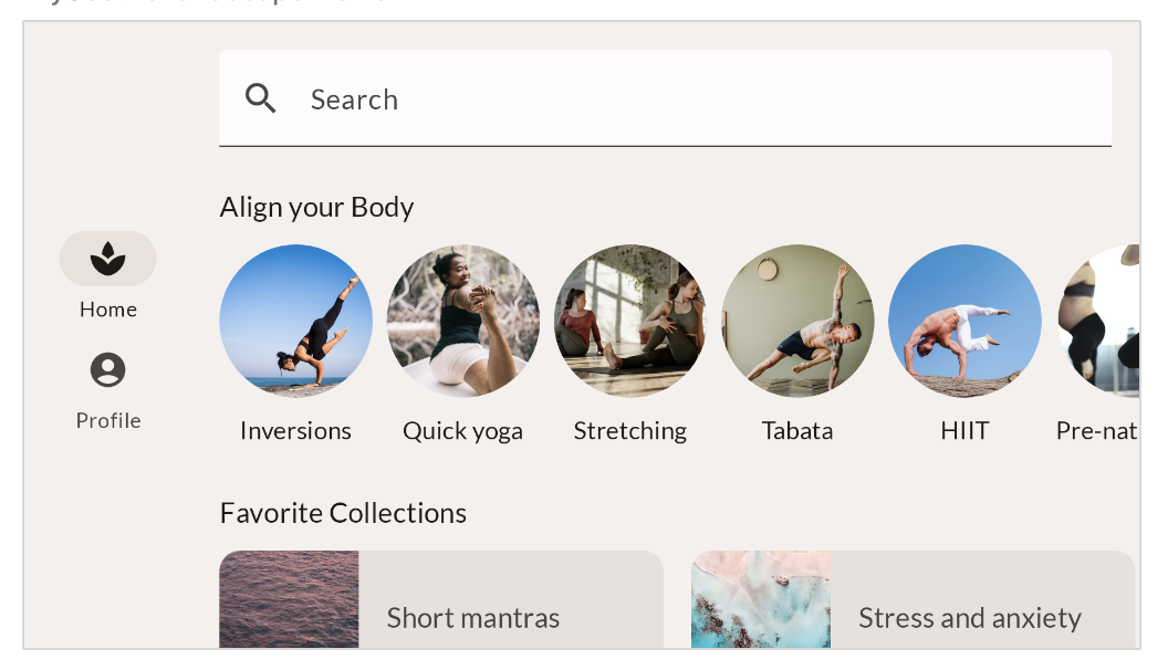
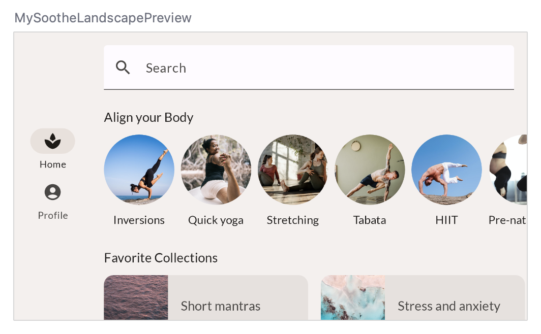
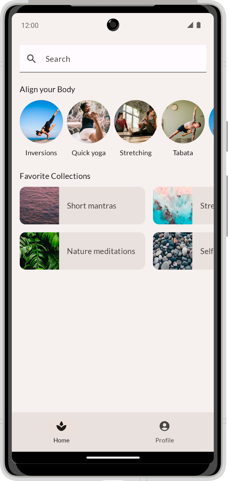
この Codelab では、デザイナーが提供するモックに基づいた現実的なアプリデザインを実装します。MySoothe は心と体の健康を改善するためのさまざまな方法をリストアップした健康管理アプリです。このアプリには、ユーザーがお気に入りに選択したものを表示するセクションと、実際に体を動かすエクササイズのセクションがあります。アプリの外観は次のようになります。


2. セットアップ方法
このステップでは、テーマ設定といくつかの基本的なセットアップを含むコードをダウンロードします。
コードを取得する
この Codelab のコードは、codelab-android-compose GitHub リポジトリにあります。クローンを作成するには、次のコマンドを実行します。
$ git clone https://github.com/android/codelab-android-compose
または、次の 2 つの zip ファイルをダウンロードします。
コードをチェックアウトする
ダウンロードしたコードには、利用可能な Compose Codelab すべてのコードが含まれています。この Codelab を行うには、Android Studio 内で BasicLayoutsCodelab プロジェクトを開きます。
main ブランチのコードから始め、ご自身のペースで順を追って Codelab を進めることをおすすめします。
3. プランを立ててから開始する
まず、アプリの縦向きのデザインを実装します。詳しく見てみましょう。

あるデザインの実装を求められたら、最初にその構造を明確に理解することから始めます。直ちにコーディングを開始するのではなく、デザインそのものを分析してください。この UI を再利用可能な複数の部分に分割するには、どうすればよいでしょうか。
このデザインについてもその点を考えてみましょう。抽象的な最上位レベルでは、このデザインを次の 2 つの部分に分けることができます。
- 画面のコンテンツ。
- ボトム ナビゲーション。

さらに分けてみると、画面コンテンツは次の 3 つのパートで構成されています。
- 検索バー。
- 「ALIGN YOUR BODY」というセクション。
- 「FAVORITE COLLECTIONS」というセクション。

各セクション内には、再利用されている下位レベルのコンポーネントも確認できます。
- 水平方向にスクロール可能な行に表示される「Align Your Body」要素。

- 水平方向にスクロール可能なグリッドに表示される「Favorite Collection」カード。

デザインを分析したところで、定義した UI の部分ごとにコンポーザブルの実装を開始します。最下位レベルのコンポーザブルから開始し、それらをより複雑なコンポーザブルにまとめていきましょう。この Codelab を終了すると、新しいアプリは、ここで示したデザインのような外観になります。
4. 検索バー - 修飾子
コンポーザブルに変換する最初の要素は、検索バーです。デザインをもう一度見てみましょう。
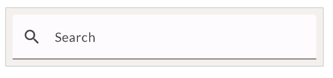 スクリーンショットを見ただけでは、このデザインをピクセル単位で正確に実装することは困難です。一般的には、デザインに関してより詳しい情報がデザイナーから伝えられます。また、デザインツールへのアクセス権や、いわゆるレッドライン デザインが共有される場合もあります。今回は、デザイナーからレッドライン デザインを受け取り、そのデザインを使用してサイズの設定値を読み取ります。デザインは 8 dp グリッドがオーバーレイされて表示されるため、要素間および要素の周りのスペースのサイズを簡単に確認できます。また、若干の余白が追加されているため、正確なサイズを確認できるようになっています。

検索バーの高さの密度非依存ピクセルは 56 であることが確認できます。また、幅は親の幅いっぱいにします。
検索バーを実装するには、テキスト フィールドと呼ばれるマテリアル コンポーネントを使用します。Compose マテリアル ライブラリには、このマテリアル コンポーネントの実装である TextField というコンポーザブルが含まれています。
基本的な TextField の実装から開始します。コードベースで MainActivity.kt を開き、SearchBar コンポーザブルを検索します。
SearchBar というコンポーザブル内に、基本的な TextField の実装を記述します。
import androidx.compose.material3.TextField

@Composable
fun SearchBar(
   modifier: Modifier = Modifier
) {
   TextField(
       value = "",
       onValueChange = {},
       modifier = modifier
   )
}
注意点:
- テキスト フィールドの値をハードコードしましたが、
onValueChangeコールバックは何も行いません。この Codelab ではレイアウトにフォーカスしているため、状態に関するものはすべて無視します。
- コンポーズ可能な関数
SearchBarは、modifierパラメータを受け取り、TextFieldに渡します。これは、Compose のガイドラインに即したベスト プラクティスです。これにより、メソッドの呼び出し元はコンポーザブルの外観を変更でき、柔軟性と再利用性が向上します。この Codelab では、すべてのコンポーザブルに対して常にこのベスト プラクティスを適用します。
このコンポーザブルのプレビューを見てみましょう。Android Studio のプレビュー機能を使用して、個別のコンポーザブルをすばやく反復処理できます。MainActivity.kt には、この Codelab で作成するすべてのコンポーザブルのプレビューが含まれています。今回は、SearchBarPreview メソッドで SearchBar コンポーザブルをレンダリングします。部分的な背景とパディングが表示され、コンテキストがよりわかりやすくなります。先ほど実装を追加した結果は、次のようになります。

いくつか足りないものがあります。まず、修飾子を使用してコンポーザブルのサイズを修正しましょう。
コンポーザブルを記述する場合は、修飾子を使用して、次のことを行います。
- コンポーザブルのサイズ、レイアウト、動作、外観を変更する
- ユーザー補助ラベルなどの情報を追加する
- ユーザー入力を処理する
- 要素をクリック可能、スクロール可能、ドラッグ可能、ズーム可能にするなど、高レベルの操作を追加する
呼び出す各コンポーザブルには modifier パラメータがあり、コンポーザブルの外観や動作に適応するように設定できます。この修飾子を設定すると、複数の修飾子メソッドを連結できるため、より複雑な調整が可能です。
今回の検索バーでは、高さを 56 dp 以上、幅を親の幅いっぱいにします。この場合の適切な修飾子については、修飾子のリストのサイズ セクションをご覧ください。高さには、heightIn 修飾子を使用できます。これにより、コンポーザブルが特定の最小の高さを持つようになります。ただし、ユーザーがシステムのフォントサイズを大きくした場合などに、高さの値が大きくなる場合があります。幅には、fillMaxWidth 修飾子を使用できます。この修飾子により、検索バーは親の水平方向のスペースをすべて占有します。
以下のコードと一致するように修飾子を更新します。
import androidx.compose.foundation.layout.fillMaxWidth
import androidx.compose.foundation.layout.heightIn
import androidx.compose.material3.TextField

@Composable
fun SearchBar(
   modifier: Modifier = Modifier
) {
   TextField(
       value = "",
       onValueChange = {},
       modifier = modifier
           .fillMaxWidth()
           .heightIn(min = 56.dp)
   )
}
この場合、一方の修飾子が幅に影響し、もう一方の修飾子が高さに影響するため、これらの修飾子の順序は重要ではありません。
また、TextField の一部のパラメータも設定する必要があります。コンポーザブルがデザインどおりになるようにパラメータ値を設定してみましょう。参照用に再度デザインを示します。

実装を更新する手順は次のとおりです。
- 検索アイコンを追加します。
TextFieldには、別のコンポーザブルを受け取るパラメータleadingIconが含まれています。この中で、Icon(この例ではSearchアイコン)を設定できます。Compose の正しいIconインポートを使用してください。 TextFieldDefaults.colorsを使用すると、特定の色をオーバーライドできます。テキスト フィールドのfocusedContainerColorとunfocusedContainerColorを MaterialTheme のsurfaceの色に設定します。- プレースホルダ テキスト「Search」を追加します(これは文字列リソース
R.string.placeholder_searchとして存在します)。
完了すると、コンポーザブルは次のようになります。
import androidx.compose.foundation.layout.fillMaxWidth
import androidx.compose.foundation.layout.heightIn
import androidx.compose.ui.res.stringResource
import androidx.compose.material3.Icon
import androidx.compose.material3.MaterialTheme
import androidx.compose.material3.Text
import androidx.compose.material3.TextField
import androidx.compose.material3.TextFieldDefaults
import androidx.compose.material.icons.Icons
import androidx.compose.material.icons.filled.Search


@Composable
fun SearchBar(
   modifier: Modifier = Modifier
) {
   TextField(
       value = "",
       onValueChange = {},
       leadingIcon = {
           Icon(
               imageVector = Icons.Default.Search,
               contentDescription = null
           )
       },
       colors = TextFieldDefaults.colors(
           unfocusedContainerColor = MaterialTheme.colorScheme.surface,
           focusedContainerColor = MaterialTheme.colorScheme.surface
       ),
       placeholder = {
           Text(stringResource(R.string.placeholder_search))
       },
       modifier = modifier
           .fillMaxWidth()
           .heightIn(min = 56.dp)
   )
}
次の点に注目してください。
- 検索アイコンを示す
leadingIconを追加しました。テキスト フィールドのプレースホルダがすでにテキスト フィールドの意味を表しているため、このアイコンにはコンテンツの説明は必要ありません。通常、コンテンツの説明はユーザー補助を目的としており、画像やアイコンをテキストでアプリのユーザーに伝えるためのものです。
- テキスト フィールドの背景色を調整するには、
colorsプロパティを設定します。コンポーザブルには、色ごとに個別のパラメータではなく、1 つの複合的なパラメータを使用します。ここでは、TextFieldDefaultsデータクラスのコピーを渡し、異なる色のみを更新します。この例ではunfocusedContainerColorとfocusedContainerColorの色のみです。
このステップでは、コンポーザブルのパラメータと修飾子を使用してコンポーザブルの外観を変更する方法を学習しました。これは、Compose ライブラリおよびマテリアル ライブラリで提供されるコンポーザブルと、ユーザー自身で作成するコンポーザブルの両方に適用されます。パラメータを指定し、記述しているコンポーザブルをカスタマイズすることを常に念頭に置いてください。また、modifier プロパティを追加して、コンポーザブルの外観を外部から調整可能にすることも検討してください。
5. Align your body - 位置揃え
次に実装するコンポーザブルは、「Align your body」要素です。レッドライン デザインと並べてそのデザインを見てみましょう。


レッドライン デザインにも、ベースライン指向のスペースが追加されました。次のことがわかります。
- 画像の高さは 88 dp にする。
- テキストのベースラインと画像の間隔は 24 dp にする。
- ベースラインと要素の底部の間隔は 8 dp にする。
- テキストは bodyMedium のタイポグラフィ スタイルにする。
このコンポーザブルを実装するには、Image と Text のコンポーザブルが必要です。これらのコンポーザブルは、Column に含まれるようにする必要があるため、上下に並べて配置します。
コードで AlignYourBodyElement コンポーザブルを見つけ、この基本的な実装を使用してそのコンテンツを更新します。
import androidx.compose.foundation.Image
import androidx.compose.foundation.layout.Column
import androidx.compose.ui.res.painterResource

@Composable
fun AlignYourBodyElement(
   modifier: Modifier = Modifier
) {
   Column(
       modifier = modifier
   ) {
       Image(
           painter = painterResource(R.drawable.ab1_inversions),
           contentDescription = null
       )
       Text(text = stringResource(R.string.ab1_inversions))
   }
}
次の点に注目してください。
- この画像は純粋に装飾的なものであるため、画像の
contentDescriptionは null に設定します。画像の下のテキストで十分にその意味を説明しているため、画像にも説明を付加する必要はありません。 - ここではハードコードされた画像とテキストを使用しています。次のステップでは、
AlignYourBodyElementコンポーザブルで指定されるパラメータを使用して動的要素となるようにこれらの画像とテキストを移動します。
このコンポーザブルのプレビューを見てみましょう。

いくつかの改良を加える必要があります。特に顕著なのは、画像のサイズが大きすぎることと、円形でないことです。size 修飾子および clip 修飾子と contentScale パラメータを使用して、Image コンポーザブルを調整できます。
size 修飾子は、前のステップで確認した fillMaxWidth 修飾子および heightIn 修飾子と同様に、特定のサイズに合うようにコンポーザブルを調整します。clip 修飾子の動作は異なり、コンポーザブルの外観を調整します。任意の Shape に設定すると、コンポーザブルのコンテンツがその形状にクリップされます。
import androidx.compose.foundation.layout.size
import androidx.compose.foundation.shape.CircleShape
import androidx.compose.ui.draw.clip
@Composable
fun AlignYourBodyElement(
   modifier: Modifier = Modifier
) {
   Column(
       modifier = modifier
   ) {
       Image(
           painter = painterResource(R.drawable.ab1_inversions),
           contentDescription = null,
           modifier = Modifier
               .size(88.dp)
               .clip(CircleShape)
       )
       Text(text = stringResource(R.string.ab1_inversions))
   }
}
現時点で、プレビュー中のデザインは次のようになります。

画像を適切なサイズに変更する必要もあります。これを行うには、Image の contentScale パラメータを使用します。いくつかのオプションがあります。最も一般的なものを以下に示します。

この例では Crop タイプが適切です。修飾子とパラメータを適用すると、コードは次のようになります。
import androidx.compose.foundation.layout.size
import androidx.compose.foundation.shape.CircleShape
import androidx.compose.ui.draw.clip
import androidx.compose.ui.layout.ContentScale
@Composable
fun AlignYourBodyElement(
   modifier: Modifier = Modifier
) {
   Column(
       modifier = modifier
   ) {
       Image(
           painter = painterResource(R.drawable.ab1_inversions),
           contentDescription = null,
           contentScale = ContentScale.Crop,
           modifier = Modifier
               .size(88.dp)
               .clip(CircleShape)
       )
       Text( text = stringResource(R.string.ab1_inversions) )
   }
}
デザインは次のようになります。

次のステップとして、Column の位置揃えを設定して、テキストを水平方向に揃えます。
一般に、コンポーザブルを親コンテナ内で位置揃えするには、親コンテナの位置揃えを設定します。つまり、子自体に親内部での配置について指示する代わりに、子の配置方法を親に指示します。
Column は、子を水平方向に配置する方法を決定します。オプションは次のとおりです。
- Start
- CenterHorizontally
- End
Row は、垂直方向の配置を設定します。オプションは Column の場合と類似しています。
- Top
- CenterVertically
- Bottom
Box は、水平方向と垂直方向の両方の配置を結合します。オプションは次のとおりです。
- TopStart
- TopCenter
- TopEnd
- CenterStart
- Center
- CenterEnd
- BottomStart
- BottomCenter
- BottomEnd
コンテナのすべての子も、これと同じ配置パターンに従います。1 つの子の位置をオーバーライドするには、対象の子に align 修飾子を追加します。
このデザインでは、テキストは水平方向に中央揃えで配置する必要があります。これを行うには、Column の horizontalAlignment を水平方向に中央揃えするように設定します。
import androidx.compose.ui.Alignment
@Composable
fun AlignYourBodyElement(
   modifier: Modifier = Modifier
) {
   Column(
       horizontalAlignment = Alignment.CenterHorizontally,
       modifier = modifier
   ) {
       Image(
           //..
       )
       Text(
           //..
       )
   }
}
これらのパートを実装したら、あとはいくつかの小さな変更のみで、コンポーザブルを目標のデザインと同一にできます。それらはご自分で実装してみてください。行き詰まった場合には最終的なコードが参考になります。以下の手順を検討してください。
- 画像とテキストを動的にします。それらを引数として、コンポーズ可能な関数に渡します。必ず、対応するプレビューを更新して、ハードコードしたデータを渡すようにしてください。
- bodyMedium のタイポグラフィ スタイルを使用するようにテキストを更新します。
- 図に沿ってテキスト要素のベースラインのスペースを更新します。

これらのステップの実装が完了すると、コードは以下のようになります。
import androidx.compose.foundation.layout.paddingFromBaseline
import androidx.compose.ui.Alignment
import androidx.compose.ui.layout.ContentScale

@Composable
fun AlignYourBodyElement(
   @DrawableRes drawable: Int,
   @StringRes text: Int,
   modifier: Modifier = Modifier
) {
   Column(
       modifier = modifier,
       horizontalAlignment = Alignment.CenterHorizontally
   ) {
       Image(
           painter = painterResource(drawable),
           contentDescription = null,
           contentScale = ContentScale.Crop,
           modifier = Modifier
               .size(88.dp)
               .clip(CircleShape)
       )
       Text(
           text = stringResource(text),
           modifier = Modifier.paddingFromBaseline(top = 24.dp, bottom = 8.dp),
           style = MaterialTheme.typography.bodyMedium
       )
   }
}


@Preview(showBackground = true, backgroundColor = 0xFFF5F0EE)
@Composable
fun AlignYourBodyElementPreview() {
   MySootheTheme {
       AlignYourBodyElement(
           text = R.string.ab1_inversions,
           drawable = R.drawable.ab1_inversions,
           modifier = Modifier.padding(8.dp)
       )
   }
}
Design タブの AlignYourBodyElement をご確認ください。

6. Favorite collection カード - マテリアル サーフェス
次に実装するコンポーザブルも、「Align your body」要素の場合と同様の方法で実装します。レッドライン入りのデザインを以下に示します。


ここでは、コンポーザブルのフルサイズが指定されています。テキストが titleMedium であることが確認できます。
このコンテナの背景色は、画面全体の背景とは異なる surfaceVariant を使用しています。また、角が丸められています。Favorite collection カードには、マテリアルの Surface コンポーザブルを使用して指定します。
Surface のパラメータと修飾子を設定することで、ニーズに適応させることができます。この場合は、サーフェスの角を丸くする必要があります。これには shape パラメータを使用できます。前のステップの画像では形状をそのまま Shape に設定しましたが、ここではマテリアル テーマから取得した値を使用します。
コードは次のようになります。
import androidx.compose.foundation.layout.Row
import androidx.compose.material3.Surface

@Composable
fun FavoriteCollectionCard(
   modifier: Modifier = Modifier
) {
   Surface(
       shape = MaterialTheme.shapes.medium,
       modifier = modifier
   ) {
       Row {
           Image(
               painter = painterResource(R.drawable.fc2_nature_meditations),
               contentDescription = null
           )
           Text(text = stringResource(R.string.fc2_nature_meditations))
       }
   }
}
実装のプレビューを見てみましょう。

次に、前のステップで学習したことを適用します。
Rowの幅を設定し、その子を垂直方向に位置揃えします。- 図に基づいて画像のサイズを設定し、コンテナ内で切り抜きます。

解答コードを確認する前に、これらの変更をご自分で実装してみてください。
コードは次のようになります。
import androidx.compose.foundation.layout.width

@Composable
fun FavoriteCollectionCard(
   modifier: Modifier = Modifier
) {
   Surface(
       shape = MaterialTheme.shapes.medium,
       modifier = modifier
   ) {
       Row(
           verticalAlignment = Alignment.CenterVertically,
           modifier = Modifier.width(255.dp)
       ) {
           Image(
               painter = painterResource(R.drawable.fc2_nature_meditations),
               contentDescription = null,
               contentScale = ContentScale.Crop,
               modifier = Modifier.size(80.dp)
           )
           Text(
               text = stringResource(R.string.fc2_nature_meditations)
           )
       }
   }
}
プレビューは次のようになります。

このコンポーザブルを完成させるには、次の手順で実装します。
- 画像とテキストを動的にします。それらを引数として、コンポーズ可能な関数に渡します。
- 色を surfaceVariant に更新します。
- titleMedium のタイポグラフィ スタイルを使用するようにテキストを更新します。
- 画像とテキストの間隔を更新します。
最終的な結果は次のようになります。
@Composable
fun FavoriteCollectionCard(
   @DrawableRes drawable: Int,
   @StringRes text: Int,
   modifier: Modifier = Modifier
) {
   Surface(
       shape = MaterialTheme.shapes.medium,
       color = MaterialTheme.colorScheme.surfaceVariant,
       modifier = modifier
   ) {
       Row(
           verticalAlignment = Alignment.CenterVertically,
           modifier = Modifier.width(255.dp)
       ) {
           Image(
               painter = painterResource(drawable),
               contentDescription = null,
               contentScale = ContentScale.Crop,
               modifier = Modifier.size(80.dp)
           )
           Text(
               text = stringResource(text),
               style = MaterialTheme.typography.titleMedium,
               modifier = Modifier.padding(horizontal = 16.dp)
           )
       }
   }
}


//..


@Preview(showBackground = true, backgroundColor = 0xFFF5F0EE)
@Composable
fun FavoriteCollectionCardPreview() {
   MySootheTheme {
       FavoriteCollectionCard(
           text = R.string.fc2_nature_meditations,
           drawable = R.drawable.fc2_nature_meditations,
           modifier = Modifier.padding(8.dp)
       )
   }
}
FavoriteCollectionCardPreview のプレビューをご覧ください。

7. Align your body の行 - 配置
画面に表示する基本的なコンポーザブルを作成したところで、続いて画面のさまざまなセクションの作成に取り掛かりましょう。
スクロール可能な「Align your body」行から始めましょう。

以下は、このコンポーネントのレッドライン デザインです。

グリッドの 1 マスは 8 dp を表すので、このデザインでは、行の最初のアイテムの前と最後のアイテムの後ろに 16 dp のスペースがあることがわかります。各アイテムの間隔は 8 dp です。
Compose では、LazyRow コンポーザブルを使用して、このようなスクロール可能な行を実装できます。Lazy リスト(LazyRow や LazyColumn など)について詳しくは、リストに関するドキュメントをご覧ください。この Codelab では、LazyRow がすべての要素を同時にではなく、画面に表示されている要素のみをレンダリングすることで、アプリのパフォーマンスを維持することをご理解いただければ十分です。
この LazyRow の基本的な実装から開始します。
import androidx.compose.foundation.lazy.LazyRow
import androidx.compose.foundation.lazy.items

@Composable
fun AlignYourBodyRow(
   modifier: Modifier = Modifier
) {
   LazyRow(
       modifier = modifier
   ) {
       items(alignYourBodyData) { item ->
           AlignYourBodyElement(item.drawable, item.text)
       }
   }
}
ご覧のとおり、LazyRow の子はコンポーザブルではありません。代わりに、コンポーザブルをリストアイテムとして出力する item や items などのメソッドを指定する Lazy リスト DSL を使用します。指定された alignYourBodyData のアイテムごとに、先ほど実装した AlignYourBodyElement コンポーザブルを出力します。
次のように表示されます。

レッドライン デザインに見られたスペースがまだありません。それらのスペースを実装するには、配置について理解する必要があります。
前のステップでは、位置揃えについて説明しました。これを使用すると、コンテナの子を交差軸上に配置できます。Column の場合、交差軸は横軸、Row の場合、交差軸は縦軸です。
ただし、子コンポーザブルをコンテナのメイン軸(Row の場合は横、Column の場合は縦)に配置する方法を決定することもできます。
Row の場合は、次の配置を選択できます。

Column の場合:

こうした配置に加えて、Arrangement.spacedBy() メソッドを使用して、各子コンポーザブル間に固定スペースを追加することもできます。
この例では、LazyRow 内の各アイテム間に 8 dp のスペースを配置するため、spacedBy メソッドを使用する必要があります。
import androidx.compose.foundation.layout.Arrangement

@Composable
fun AlignYourBodyRow(
   modifier: Modifier = Modifier
) {
   LazyRow(
       horizontalArrangement = Arrangement.spacedBy(8.dp),
       modifier = modifier
   ) {
       items(alignYourBodyData) { item ->
           AlignYourBodyElement(item.drawable, item.text)
       }
   }
}
デザインは次のようになります。

LazyRow の両側にもパディングを追加する必要があります。この場合は、単純なパディング修飾子を追加しても効果はありません。LazyRow にパディングを追加してみて、インタラクティブ プレビューを使用して動作を確認します。

ご覧のとおり、スクロールすると、表示された最初と最後のアイテムが画面の両側で切れて見えます。
同じパディングを維持しながら、親リストの境界内でクリッピングされることなくコンテンツをスクロールできるように、すべてのリストには contentPadding というパラメータが LazyRow に提供され、16.dp に設定されます。
import androidx.compose.foundation.layout.PaddingValues

@Composable
fun AlignYourBodyRow(
   modifier: Modifier = Modifier
) {
   LazyRow(
       horizontalArrangement = Arrangement.spacedBy(8.dp),
       contentPadding = PaddingValues(horizontal = 16.dp),
       modifier = modifier
   ) {
       items(alignYourBodyData) { item ->
           AlignYourBodyElement(item.drawable, item.text)
       }
   }
}
8. Favorite collections のグリッド - 遅延グリッド
次に実装するのは、画面の [FAVORITE COLLECTIONS] セクションです。このコンポーザブルには、単一行ではなくグリッドが必要です。

前のセクションと同様に、LazyRow を作成してこのセクションを実装し、2 つの FavoriteCollectionCard インスタンスで各アイテムが Column を保持するようにすることもできますが、このステップでは LazyHorizontalGrid を使用しましょう。アイテムからグリッド要素へより効果的にマッピングできます。
2 つの固定行を持つグリッドの簡単な実装から開始します。
import androidx.compose.foundation.lazy.grid.GridCells
import androidx.compose.foundation.lazy.grid.LazyHorizontalGrid
import androidx.compose.foundation.lazy.grid.items

@Composable
fun FavoriteCollectionsGrid(
   modifier: Modifier = Modifier
) {
   LazyHorizontalGrid(
       rows = GridCells.Fixed(2),
       modifier = modifier
   ) {
       items(favoriteCollectionsData) { item ->
           FavoriteCollectionCard(item.drawable, item.text)
       }
   }
}
ご覧のように、単純に前のステップの LazyRow を LazyHorizontalGrid に置き換えました。ただし、現時点では正確な結果が得られません。

グリッドは親と同じスペースを占有するため、Favorite collection カードが縦方向に過剰に引き伸ばされます。
コンポーザブルを調整して、次の状態にします。
- グリッドの水平方向の contentPadding は 16 dp である。
- 横方向と縦方向の配置は、16 dp の間隔で行われる。
- グリッドの高さは 168 dp である。
- FavoriteCollectionCard の修飾子は高さ 80 dp を指定する。
最終的なコードは次のようなります。
@Composable
fun FavoriteCollectionsGrid(
   modifier: Modifier = Modifier
) {
   LazyHorizontalGrid(
       rows = GridCells.Fixed(2),
       contentPadding = PaddingValues(horizontal = 16.dp),
       horizontalArrangement = Arrangement.spacedBy(16.dp),
       verticalArrangement = Arrangement.spacedBy(16.dp),
       modifier = modifier.height(168.dp)
   ) {
       items(favoriteCollectionsData) { item ->
           FavoriteCollectionCard(item.drawable, item.text, Modifier.height(80.dp))
       }
   }
}
プレビューは次のようになります。

9. ホーム セクション - スロット API
MySoothe のホーム画面には、同じパターンに基づく複数のセクションがあります。各セクションにはタイトルがあり、セクションによってコンテンツが異なります。実装するデザインは次のとおりです。

ご覧のとおり、各セクションにはタイトルとスロットがあります。タイトルには、いくらかのスペースとスタイルの情報が関連付けられています。スロットには、セクションに応じてさまざまなコンテンツを動的に挿入できるようになっています。
この柔軟なセクション コンテナを実装するには、いわゆるスロット API を使用します。この機能を実装するにあたり、ドキュメント ページでスロットベースのレイアウトのセクションをご覧になり、スロットベースのレイアウトの概要と、スロット API を使用してレイアウトを作成する方法をご確認ください。
タイトルとスロットのコンテンツを受け取るように HomeSection コンポーザブルを調整します。また、この HomeSection を「Align your body」のタイトルとコンテンツで呼び出すように、関連するプレビューも調整します。
@Composable
fun HomeSection(
   @StringRes title: Int,
   modifier: Modifier = Modifier,
   content: @Composable () -> Unit
) {
   Column(modifier) {
       Text(stringResource(title))
       content()
   }
}

@Preview(showBackground = true, backgroundColor = 0xFFF5F0EE)
@Composable
fun HomeSectionPreview() {
   MySootheTheme {
       HomeSection(R.string.align_your_body) {
           AlignYourBodyRow()
       }
   }
}
コンポーザブルのスロットには、content パラメータを使用できます。このように、HomeSection コンポーザブルを使用する場合は、後置ラムダを使用してコンテンツ スロットを埋めることができます。コンテンツを挿入できるスロットがコンポーザブルに複数ある場合は、より大きなコンポーザブル コンテナ内でも用途がわかりやすい名前を付けます。たとえば、マテリアルの TopAppBar は、title、navigationIcon、actions のスロットを提供します。
この実装でセクションがどのようになるかを見てみましょう。

テキスト コンポーザブルをデザインどおりにするには、もう少し情報が必要です。

次のように更新します。
- titleMedium タイポグラフィを使用する。
- テキストのベースラインと上部の間の間隔は 40 dp である。
- ベースラインと要素の底部の間隔は 16 dp である。
- 水平方向のパディングは 16 dp である。
最終的なソリューションは次のようになります。
@Composable
fun HomeSection(
   @StringRes title: Int,
   modifier: Modifier = Modifier,
   content: @Composable () -> Unit
) {
   Column(modifier) {
       Text(
           text = stringResource(title),
           style = MaterialTheme.typography.titleMedium,
           modifier = Modifier
               .paddingFromBaseline(top = 40.dp, bottom = 16.dp)
               .padding(horizontal = 16.dp)
       )
       content()
   }
}
10. ホーム画面 - スクロール
個別の構成要素をすべて作成したところで、次はそれらを組み合わせ、画面全体に実装していきましょう。
実装しようとしているデザインは次のとおりです。

検索バーと、2 つのセクションをシンプルに縦に並べて配置します。全体がデザインどおりに収まるように、スペースを追加する必要があります。これまで使用していなかったコンポーザブルとして、Spacer があります。これにより、Column 内にスペースを配置できます。代わりに Column のパディングを設定すると、先ほどの Favorite Collections グリッドで確認されたのと同じように、端のアイテムにクリッピングが生じてしまいます。
@Composable
fun HomeScreen(modifier: Modifier = Modifier) {
   Column(modifier) {
       Spacer(Modifier.height(16.dp))
       SearchBar(Modifier.padding(horizontal = 16.dp))
       HomeSection(title = R.string.align_your_body) {
           AlignYourBodyRow()
       }
       HomeSection(title = R.string.favorite_collections) {
           FavoriteCollectionsGrid()
       }
       Spacer(Modifier.height(16.dp))
   }
}
このデザインはほとんどのデバイスサイズにフィットしますが、横表示にした場合など、デバイスの高さが十分でないときは、垂直方向のスクロールが必要になります。そのためには、スクロール動作を追加する必要があります。
前述のように、LazyRow や LazyHorizontalGrid などの Lazy レイアウトは自動的にスクロール動作を追加します。ただし、常に Lazy レイアウトが必要になるわけではありません。一般に、リスト内に多数の要素がある場合や、大規模なデータセットを読み込む場合は、Lazy レイアウトを使用します。そのため、すべてのアイテムを一度に出力すると、パフォーマンス コストが増大し、アプリの速度が低下します。リストの要素の数が限られている場合は、代わりにシンプルな Column または Row を使用して、手動でスクロール動作を追加できます。そのためには、verticalScroll 修飾子または horizontalScroll 修飾子を使用します。これには、スクロール状態を外部から変更するために使用される、スクロールの現在の状態を含む ScrollState が必要です。この例ではスクロール状態を変更するわけではないため、rememberScrollState を使用して永続的な ScrollState インスタンスを作成します。
最終的な結果は次のようになります。
import androidx.compose.foundation.layout.Spacer
import androidx.compose.foundation.rememberScrollState
import androidx.compose.foundation.verticalScroll

@Composable
fun HomeScreen(modifier: Modifier = Modifier) {
   Column(
       modifier
           .verticalScroll(rememberScrollState())
   ) {
       Spacer(Modifier.height(16.dp))
       SearchBar(Modifier.padding(horizontal = 16.dp))
       HomeSection(title = R.string.align_your_body) {
           AlignYourBodyRow()
       }
       HomeSection(title = R.string.favorite_collections) {
           FavoriteCollectionsGrid()
       }
       Spacer(Modifier.height(16.dp))
   }
}
コンポーザブルのスクロール動作を検証するには、プレビューの高さを制限し、インタラクティブ プレビューで実行します。
@Preview(showBackground = true, backgroundColor = 0xFFF5F0EE, heightDp = 180)
@Composable
fun ScreenContentPreview() {
   MySootheTheme { HomeScreen() }
}
11. ボトム ナビゲーション - マテリアル
画面コンテンツの実装が完了し、ウィンドウの装飾を追加する準備が整いました。MySoothe には、ユーザーが画面を切り替えるためのナビゲーション バーがあります。
まず、ナビゲーション バー コンポーザブルを実装して、アプリに追加します。
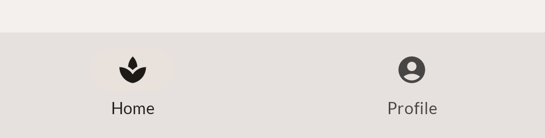
デザインを見てみましょう。

幸いなことに、このコンポーザブルをゼロからすべて実装する必要はありません。Compose マテリアル ライブラリの一部である NavigationBar コンポーザブルを使用できます。NavigationBar コンポーザブル内に 1 つ以上の NavigationBarItem 要素を追加すると、マテリアル ライブラリによって自動的にスタイルが設定されます。
このボトム ナビゲーションの基本的な実装から開始します。
import androidx.compose.material3.NavigationBar
import androidx.compose.material3.NavigationBarItem
import androidx.compose.material.icons.filled.AccountCircle
import androidx.compose.material.icons.filled.Spa

@Composable
private fun SootheBottomNavigation(modifier: Modifier = Modifier) {
   NavigationBar(
       modifier = modifier
   ) {
       NavigationBarItem(
           icon = {
               Icon(
                   imageVector = Icons.Default.Spa,
                   contentDescription = null
               )
           },
           label = {
               Text(
                   text = stringResource(R.string.bottom_navigation_home)
               )
           },
           selected = true,
           onClick = {}
       )
       NavigationBarItem(
           icon = {
               Icon(
                   imageVector = Icons.Default.AccountCircle,
                   contentDescription = null
               )
           },
           label = {
               Text(
                   text = stringResource(R.string.bottom_navigation_profile)
               )
           },
           selected = false,
           onClick = {}
       )
   }
}
基本的な実装は次のようになります。コンテンツの色とナビゲーション バーの色の間にコントラストはそれほどありません。

いくつかのスタイル調整を行う必要があります。まず、ボトム ナビゲーションの背景色を変更するには、containerColor パラメータを設定し、このパラメータに、マテリアル テーマの surfaceVariant 色を使用します。最終的なソリューションは次のようになります。
@Composable
private fun SootheBottomNavigation(modifier: Modifier = Modifier) {
   NavigationBar(
       containerColor = MaterialTheme.colorScheme.surfaceVariant,
       modifier = modifier
   ) {
       NavigationBarItem(
           icon = {
               Icon(
                   imageVector = Icons.Default.Spa,
                   contentDescription = null
               )
           },
           label = {
               Text(stringResource(R.string.bottom_navigation_home))
           },
           selected = true,
           onClick = {}
       )
       NavigationBarItem(
           icon = {
               Icon(
                   imageVector = Icons.Default.AccountCircle,
                   contentDescription = null
               )
           },
           label = {
               Text(stringResource(R.string.bottom_navigation_profile))
           },
           selected = false,
           onClick = {}
       )
   }
}
ナビゲーション バーは次のようになります。コントラストが強くなっていることに注目してください。
12. MySoothe アプリ - Scaffold
このステップでは、ボトム ナビゲーションを含む画面全体の実装を作成します。マテリアルの Scaffold コンポーザブルを使用します。Scaffold を使用すると、マテリアル デザインを実装するアプリ向けに構成可能なトップレベルのコンポーザブルを利用できます。これには、マテリアル コンセプトに対応したさまざまなスロットがあります(その一つは下部のバーです)。この下部のバーに、前のステップで作成したボトム ナビゲーション コンポーザブルを配置できます。
MySootheAppPortrait() コンポーザブルを実装します。これはアプリのトップレベルのコンポーザブルであるため、次のようにする必要があります。
MySootheThemeマテリアル テーマを適用します。Scaffoldを追加します。- 下部のバーを
SootheBottomNavigationコンポーザブルとして設定します。 - コンテンツを
HomeScreenコンポーザブルとして設定します。
最終的な結果は次のようになります。
import androidx.compose.material3.Scaffold

@Composable
fun MySootheAppPortrait() {
   MySootheTheme {
       Scaffold(
           bottomBar = { SootheBottomNavigation() }
       ) { padding ->
           HomeScreen(Modifier.padding(padding))
       }
   }
}
これで実装が完了しました。作成したバージョンがピクセル単位で正確に実装されているかどうかを確認するには、この画像をご自分のプレビュー実装と比較してください。

13. ナビゲーション レール - 素材
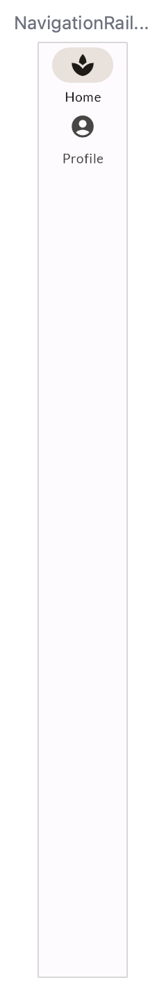
アプリのレイアウトを作成する際は、スマートフォンでの横表示を含め、複数の構成でどのように表示されるかも考慮する必要があります。横表示のアプリのデザインを以下に示します。ボトム ナビゲーションが、画面コンテンツの左側にあるレールに置き換えられている点に注目してください。
NavigationRail コンポーザブルを使用して、これを実装します。このコンポーザブルは Compose マテリアル ライブラリの一部で、実装は、ボトム ナビゲーション バーの作成に使用した NavigationBar に似ています。NavigationRail コンポーザブル内に、ホームとプロファイルの NavigationRailItem 要素を追加します。

まず、ナビゲーション レールの基本的な実装から説明します。
import androidx.compose.material3.NavigationRail
import androidx.compose.material3.NavigationRailItem

@Composable
private fun SootheNavigationRail(modifier: Modifier = Modifier) {
   NavigationRail(
   ) {
       Column(
       ) {
           NavigationRailItem(
               icon = {
                   Icon(
                       imageVector = Icons.Default.Spa,
                       contentDescription = null
                   )
               },
               label = {
                   Text(stringResource(R.string.bottom_navigation_home))
               },
               selected = true,
               onClick = {}
           )

           NavigationRailItem(
               icon = {
                   Icon(
                       imageVector = Icons.Default.AccountCircle,
                       contentDescription = null
                   )
               },
               label = {
                   Text(stringResource(R.string.bottom_navigation_profile))
               },
               selected = false,
               onClick = {}
           )
       }
   }
}
いくつかのスタイル調整を行う必要があります。
- レールの始点と終点に 8 dp のパディングを追加します。
- ナビゲーション レールの背景色を更新するには、このために用意されているマテリアル テーマの背景色を使用して、
containerColorパラメータを設定します。背景色を設定することで、テーマのonBackgroundの色に合うようにアイコンとテキストの色が自動的に適応します。 - 縦方向の列全体に配色されている必要があります。
- 列の垂直方向の配置を中央揃えに設定します。
- 列の水平方向の配置を中央揃えに設定します。
- 2 つのアイコンの間に 8 dp のパディングを追加します。
最終的なソリューションは次のようになります。
import androidx.compose.foundation.layout.fillMaxHeight

@Composable
private fun SootheNavigationRail(modifier: Modifier = Modifier) {
   NavigationRail(
       modifier = modifier.padding(start = 8.dp, end = 8.dp),
       containerColor = MaterialTheme.colorScheme.background,
   ) {
       Column(
           modifier = modifier.fillMaxHeight(),
           verticalArrangement = Arrangement.Center,
           horizontalAlignment = Alignment.CenterHorizontally
       ) {
           NavigationRailItem(
               icon = {
                   Icon(
                       imageVector = Icons.Default.Spa,
                       contentDescription = null
                   )
               },
               label = {
                   Text(stringResource(R.string.bottom_navigation_home))
               },
               selected = true,
               onClick = {}
           )
           Spacer(modifier = Modifier.height(8.dp))
           NavigationRailItem(
               icon = {
                   Icon(
                       imageVector = Icons.Default.AccountCircle,
                       contentDescription = null
                   )
               },
               label = {
                   Text(stringResource(R.string.bottom_navigation_profile))
               },
               selected = false,
               onClick = {}
           )
       }
   }
}

次は、ナビゲーション レールを横向きレイアウトに追加しましょう。

アプリの縦向きバージョンでは Scaffold を使用しましたが、横向きの場合は Row を使用して、ナビゲーション レールと画面コンテンツを隣り合わせに配置します。
@Composable
fun MySootheAppLandscape() {
   MySootheTheme {
       Row {
           SootheNavigationRail()
           HomeScreen()
       }
   }
}
また、縦向きバージョンで Scaffold を使用していたときに、コンテンツの色を背景に設定しました。ナビゲーション レールの色を設定するには、Row を Surface でラップして、背景色に設定します。
@Composable
fun MySootheAppLandscape() {
   MySootheTheme {
       Surface(color = MaterialTheme.colorScheme.background) {
           Row {
               SootheNavigationRail()
               HomeScreen()
           }
       }
   }
}
14. MySoothe アプリ - ウィンドウ サイズ
横表示のプレビュー内容は良好な状態です。しかし、アプリをデバイスまたはエミュレータで実行し、横に向けると、横向きバージョンは表示されません。これは、どの構成をどのタイミングで表示するか、アプリに指示する必要があるためです。これを行うために、calculateWindowSizeClass() 関数を使用して、スマートフォンがどの構成に設定されているかを確認します。

ウィンドウ サイズクラスの幅には、Compact(コンパクト)、Medium(中程度)、Expanded(拡大)の 3 種類があります。アプリがポートレート モードの場合はコンパクトな幅、横表示の場合は拡大幅になります。この Codelab では、中程度の幅での作業は行いません。
MySootheApp コンポーザブルで、デバイスの WindowSizeClass を受け取るように更新します。コンパクトの場合は、アプリの縦向きバージョンを渡します。横向きの場合は、アプリの横向きバージョンを渡します。
import androidx.compose.material3.windowsizeclass.WindowSizeClass
import androidx.compose.material3.windowsizeclass.WindowWidthSizeClass
@Composable
fun MySootheApp(windowSize: WindowSizeClass) {
   when (windowSize.widthSizeClass) {
       WindowWidthSizeClass.Compact -> {
           MySootheAppPortrait()
       }
       WindowWidthSizeClass.Expanded -> {
           MySootheAppLandscape()
       }
   }
}
setContent() で、windowSizeClass という名前の val を作成して calculateWindowSize() に設定し、MySootheApp() に渡します。
calculateWindowSize() はまだ試験運用版であるため、ExperimentalMaterial3WindowSizeClassApi クラスにオプトインする必要があります。
import androidx.compose.material3.windowsizeclass.ExperimentalMaterial3WindowSizeClassApi
import androidx.compose.material3.windowsizeclass.calculateWindowSizeClass

class MainActivity : ComponentActivity() {
   @OptIn(ExperimentalMaterial3WindowSizeClassApi::class)
   override fun onCreate(savedInstanceState: Bundle?) {
       super.onCreate(savedInstanceState)
       setContent {
           val windowSizeClass = calculateWindowSizeClass(this)
           MySootheApp(windowSizeClass)
       }
   }
}
次に、エミュレータまたはデバイスでアプリを実行し、回転時に表示がどのように変化するか確認します。
15. 完了
これで、この Codelab は終了です。Compose のレイアウトについて詳しく学習しました。実際のデザインの実装を通じて、修飾子、位置揃え、配置、Lazy レイアウト、スロット API、スクロール、マテリアル コンポーネント、レイアウト固有のデザインについて学びました。
Compose パスウェイにある他の Codelab を確認してください。コードサンプルもご確認ください。
ドキュメント
これらのトピックに関する詳細とガイダンスについては、以下のドキュメントをご覧ください。