
第 1 課:可組合函式
Jetpack Compose 是以可組合函式為基礎建構而成。您可以運用這些函式
以程式輔助的方式描述應用程式 UI 的外觀,並提供資料依附元件。
而非專注於 UI 的建構程序 (初始化元素、
然後將這個編號附加到父項等如要建立可組合函式,只需將
函式名稱的 @Composable 註解。

新增文字元素
首先,請下載最新版本的 Android Studio,建立應用程式方法是選取「New Project」,然後在 在「Phone and Tablet」類別中選取「Empty Activity」。 將應用程式命名為 ComposeTutorial,然後按一下「Finish」。預設 這個範本已包含部分 Compose 元素,但在本教學課程中,您將逐步進行建構 。
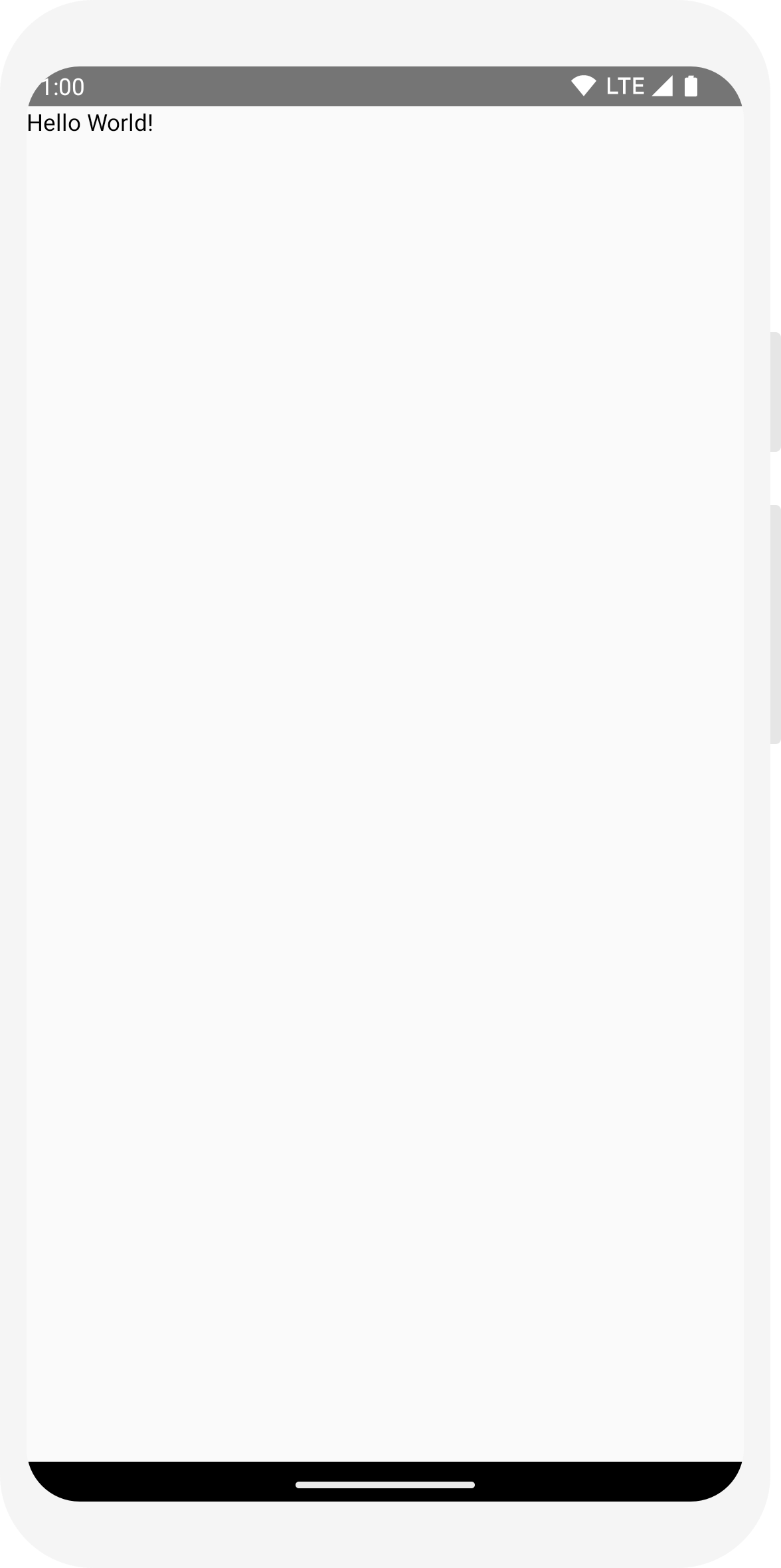
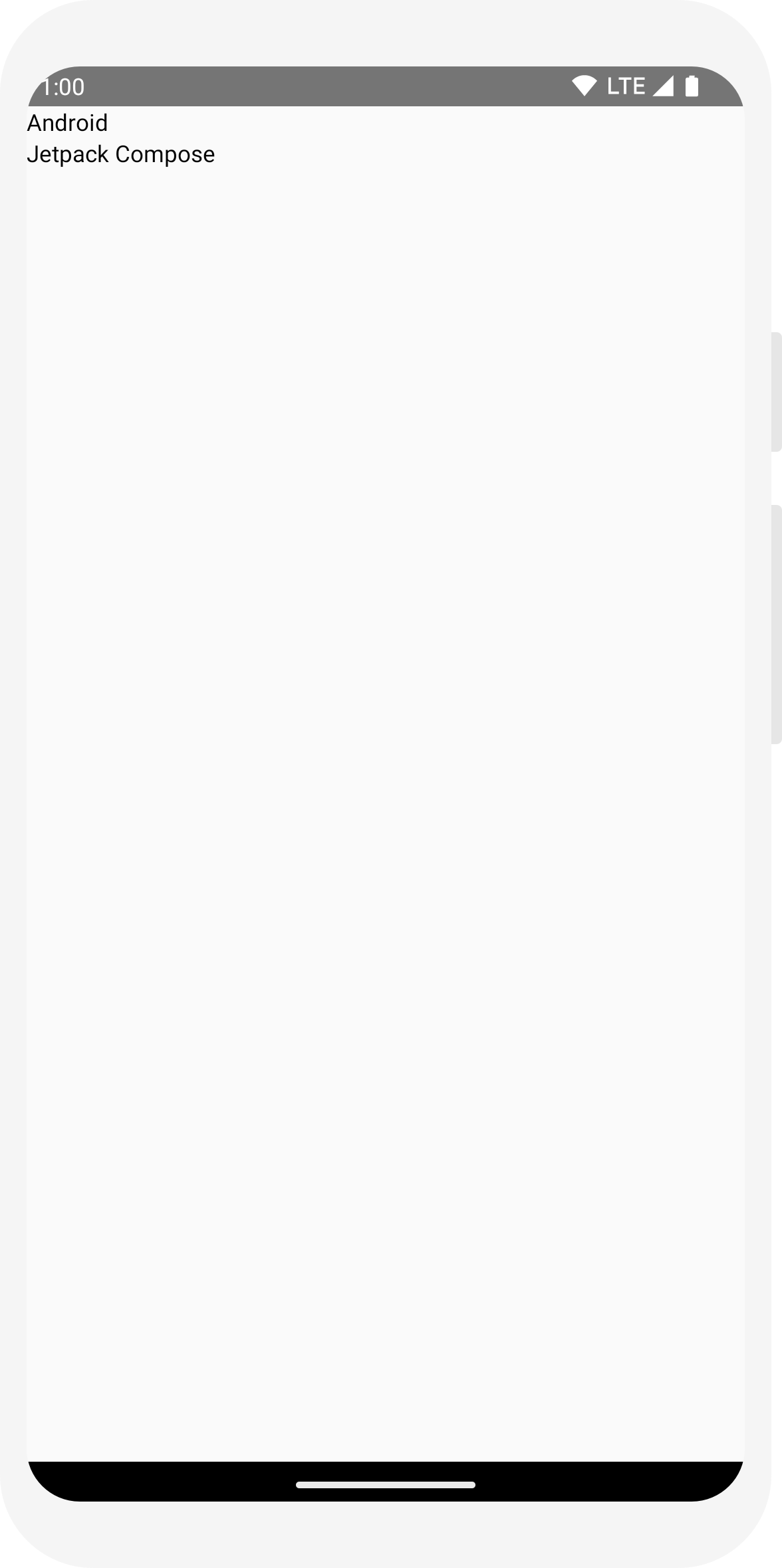
首先,顯示「Hello World!」方法是在
onCreate 方法。在這種情況下
封鎖及呼叫
Text 可組合函式。
setContent 區塊會定義活動的版面配置,其中
會呼叫可組合函式。可組合函式只能從其他可組合函式呼叫
函式。
Jetpack Compose 會使用 Kotlin 編譯器外掛程式,將這些可組合函式轉換為
調整應用程式的 UI 元素例如 Text 可組合函式
由 Compose UI 程式庫定義的函式會在螢幕上顯示文字標籤。
import android.os.Bundle
import androidx.activity.ComponentActivity
import androidx.activity.compose.setContent
import androidx.compose.material3.Text

class MainActivity : ComponentActivity() {
    override fun onCreate(savedInstanceState: Bundle?) {
        super.onCreate(savedInstanceState)
        setContent {
            Text("Hello world!")
        }
    }
}
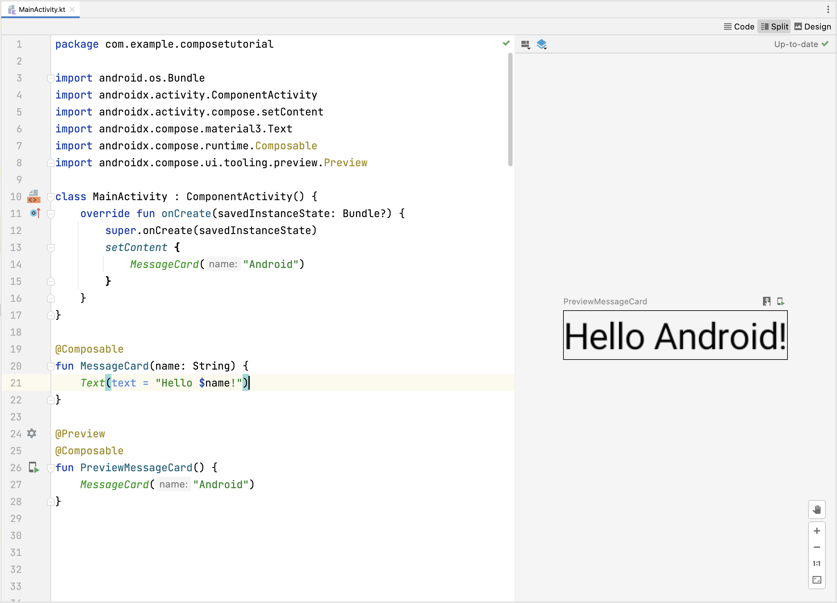
定義可組合函式
如要讓函式組成,請新增 @Composable 註解。
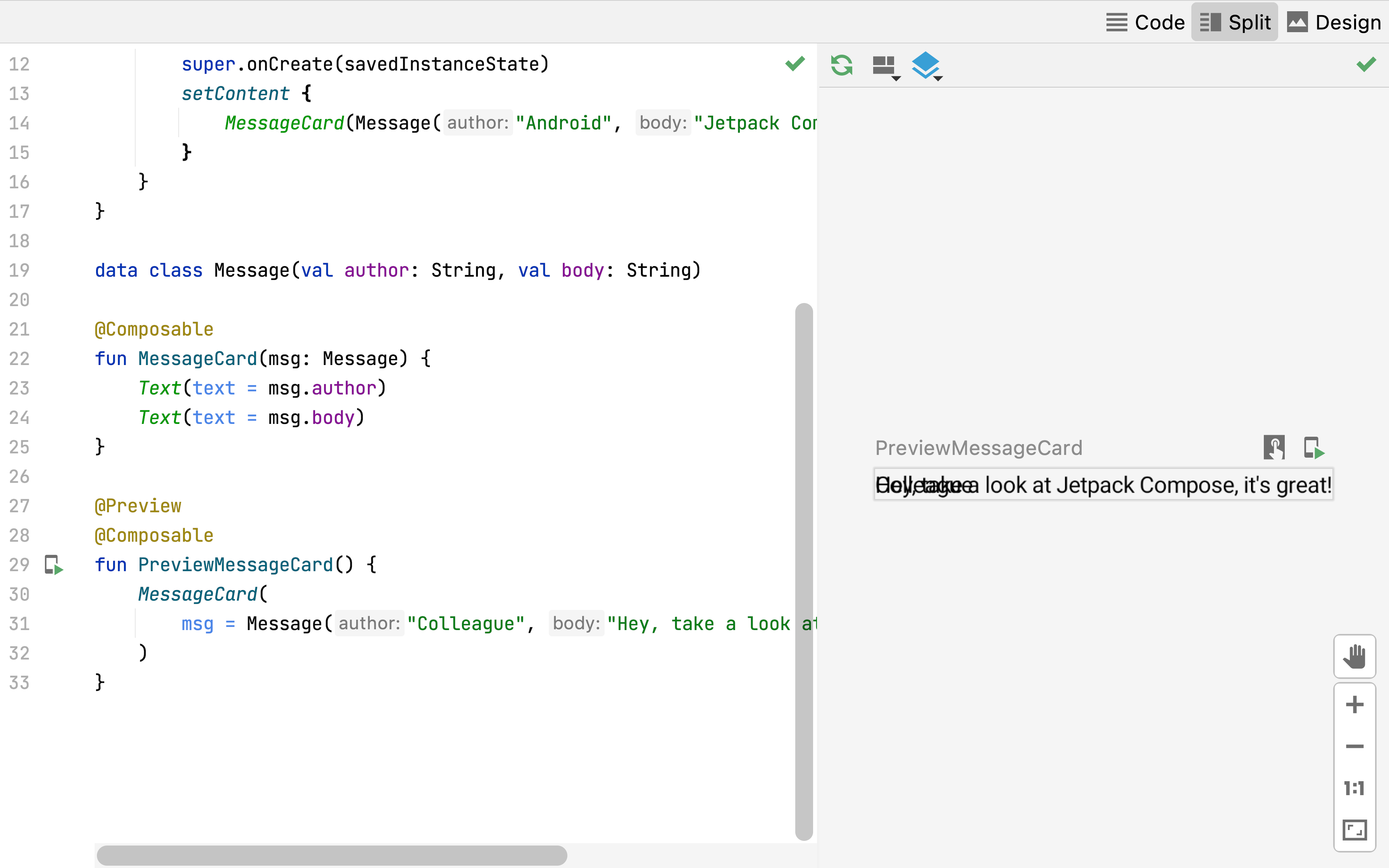
如要試用這項功能,請定義 MessageCard 函式,
會傳遞一個名稱,並用來設定文字元素。
// ...
import androidx.compose.runtime.Composable

class MainActivity : ComponentActivity() {
    override fun onCreate(savedInstanceState: Bundle?) {
        super.onCreate(savedInstanceState)
        setContent {
            MessageCard("Android")
        }
    }
}

@Composable
fun MessageCard(name: String) {
    Text(text = "Hello $name!")
}

在 Android Studio 中預覽函式
@Preview 註解可讓您在 Android 中預覽可組合函式
不必建構應用程式並安裝到 Android 裝置或模擬器中,就能使用 Studio。
註解必須用於不接受參數的可組合函式。為此
因此您無法預覽 MessageCard 函式
請改為將第二個函式命名為
PreviewMessageCard,會呼叫
MessageCard 取代為適當的參數。將
@Preview 個註解早於
@Composable。
// ...
import androidx.compose.ui.tooling.preview.Preview

@Composable
fun MessageCard(name: String) {
    Text(text = "Hello $name!")
}

@Preview
@Composable
fun PreviewMessageCard() {
    MessageCard("Android")
}
重新建構您的專案。應用程式本身不會變更,因為新的
沒有在任何位置呼叫 PreviewMessageCard 函式
但 Android Studio 會新增預覽視窗,點選「分割」圖示
(設計/程式碼) 檢視畫面。這個視窗會顯示可組合函式建立的 UI 元素預覽畫面
標有 @Preview 註解的函式。更新
只要按一下預覽視窗頂端的重新整理按鈕,即可隨時預覽。
import android.os.Bundle
import androidx.activity.ComponentActivity
import androidx.activity.compose.setContent
import androidx.compose.material3.Text

class MainActivity : ComponentActivity() {
    override fun onCreate(savedInstanceState: Bundle?) {
        super.onCreate(savedInstanceState)
        setContent {
            Text("Hello world!")
        }
    }
}
// ...
import androidx.compose.runtime.Composable

class MainActivity : ComponentActivity() {
    override fun onCreate(savedInstanceState: Bundle?) {
        super.onCreate(savedInstanceState)
        setContent {
            MessageCard("Android")
        }
    }
}

@Composable
fun MessageCard(name: String) {
    Text(text = "Hello $name!")
}
// ...
import androidx.compose.ui.tooling.preview.Preview

@Composable
fun MessageCard(name: String) {
    Text(text = "Hello $name!")
}

@Preview
@Composable
fun PreviewMessageCard() {
    MessageCard("Android")
}

新增多段文字
到目前為止,您已建構第一個可組合函式並進行預覽!探索更多 Jetpack Compose 您會建構一個簡單的訊息畫面,內含一系列 都可以使用一些動畫展開
首先,顯示訊息作者的姓名和
訊息內容您必須先變更可組合函式參數,才能接受
Message 物件,而不是
String,然後新增其他
程式碼中的 Text 可組合函式
MessageCard 可組合函式。請務必更新預覽畫面
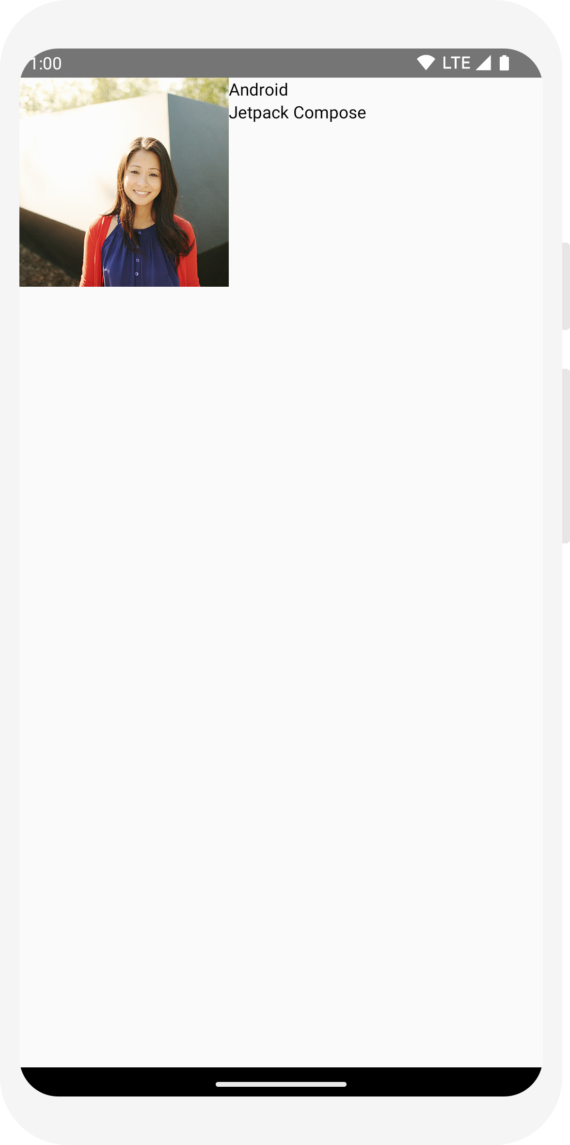
// ...

class MainActivity : ComponentActivity() {
    override fun onCreate(savedInstanceState: Bundle?) {
        super.onCreate(savedInstanceState)
        setContent {
            MessageCard(Message("Android", "Jetpack Compose"))
        }
    }
}

data class Message(val author: String, val body: String)

@Composable
fun MessageCard(msg: Message) {
    Text(text = msg.author)
    Text(text = msg.body)
}

@Preview
@Composable
fun PreviewMessageCard() {
    MessageCard(
        msg = Message("Lexi", "Hey, take a look at Jetpack Compose, it's great!")
    )
}
此程式碼會在內容檢視畫面中建立兩個文字元素。然而,由於您未提供 任何有關如何排列方式的資訊,文字元素會彼此疊加, 讓文字無法閱讀
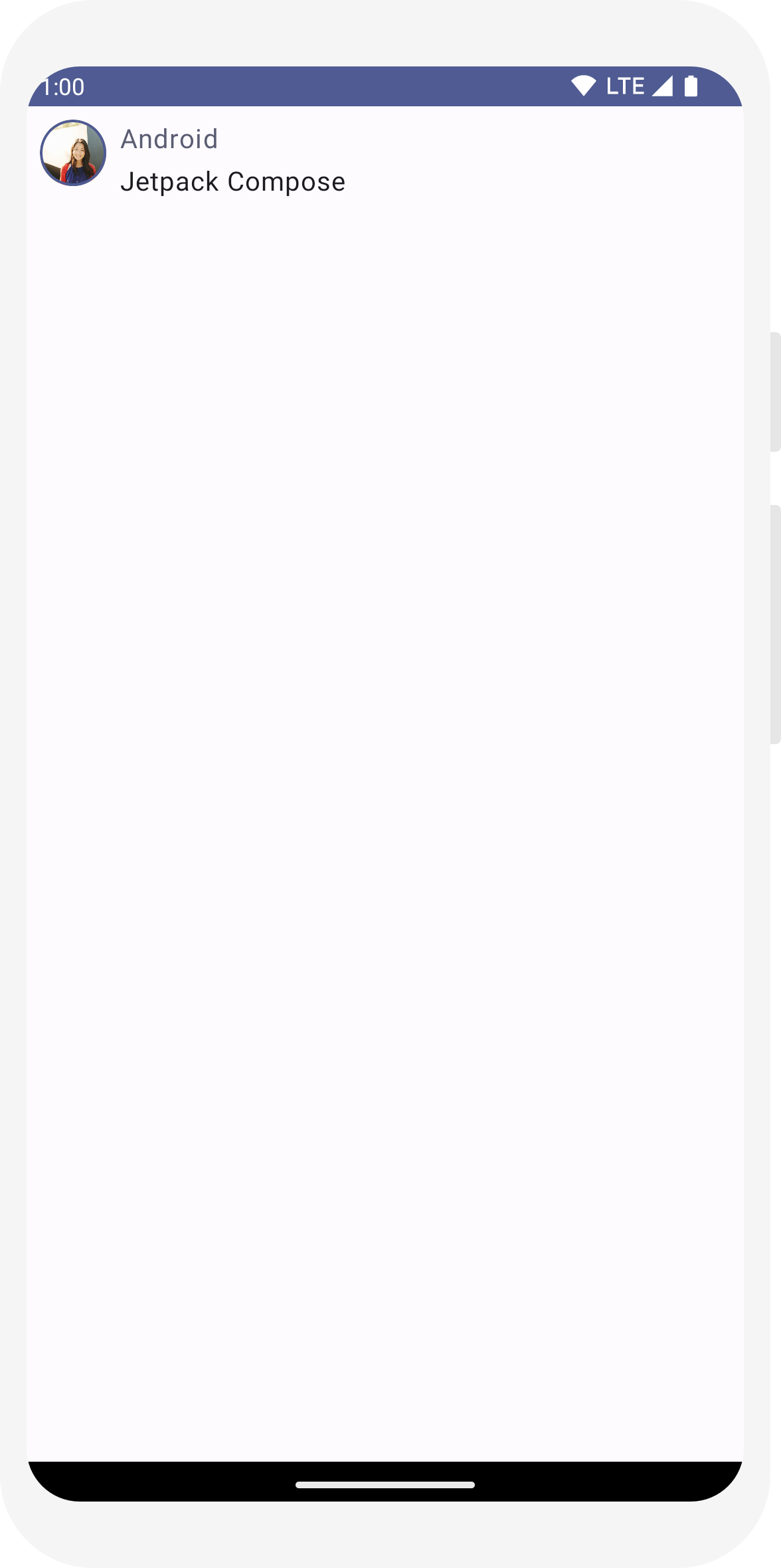
// ... import androidx.compose.foundation.Image import androidx.compose.foundation.layout.Row import androidx.compose.ui.res.painterResource @Composable fun MessageCard(msg: Message) { Row { Image( painter = painterResource(R.drawable.profile_picture), contentDescription = "Contact profile picture", ) Column { Text(text = msg.author) Text(text = msg.body) } } }
設定版面配置
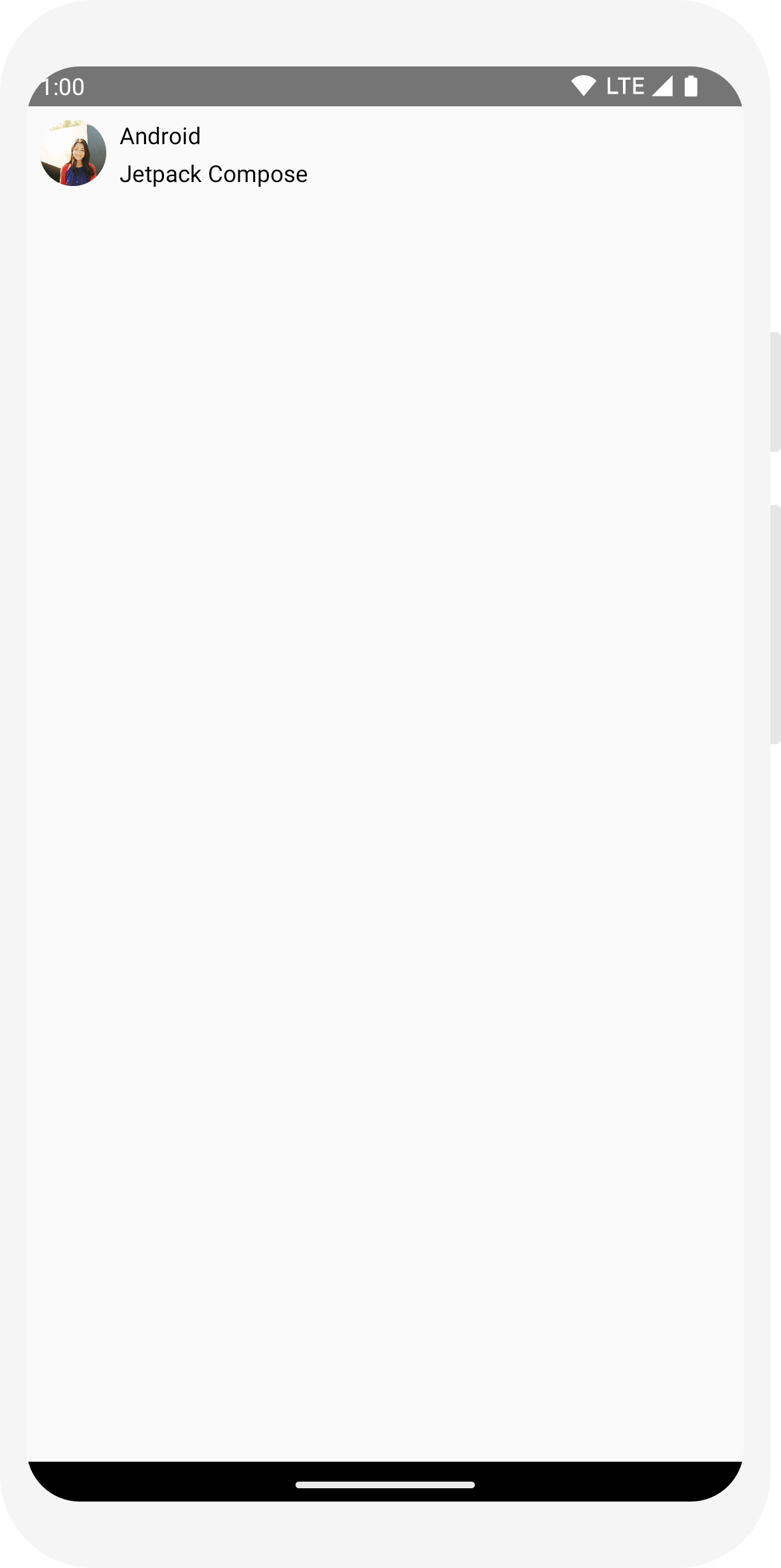
訊息版面配置的結構正確,但其元素之間的間距不適當,且圖片 太大!為了修飾或設定可組合函式,Compose 會使用修飾符。他們 可讓您變更可組合項的大小、版面配置、外觀或新增高階互動 例如將元素設為可點擊您可以為這些修飾符建立鏈結,產生功能更豐富的可組合項。您會用到 來改善版面配置
// ... import androidx.compose.foundation.layout.Spacer import androidx.compose.foundation.layout.height import androidx.compose.foundation.layout.padding import androidx.compose.foundation.layout.size import androidx.compose.foundation.layout.width import androidx.compose.foundation.shape.CircleShape import androidx.compose.ui.Modifier import androidx.compose.ui.draw.clip import androidx.compose.ui.unit.dp @Composable fun MessageCard(msg: Message) { // Add padding around our message Row(modifier = Modifier.padding(all = 8.dp)) { Image( painter = painterResource(R.drawable.profile_picture), contentDescription = "Contact profile picture", modifier = Modifier // Set image size to 40 dp .size(40.dp) // Clip image to be shaped as a circle .clip(CircleShape) ) // Add a horizontal space between the image and the column Spacer(modifier = Modifier.width(8.dp)) Column { Text(text = msg.author) // Add a vertical space between the author and message texts Spacer(modifier = Modifier.height(4.dp)) Text(text = msg.body) } } }
// ... class MainActivity : ComponentActivity() { override fun onCreate(savedInstanceState: Bundle?) { super.onCreate(savedInstanceState) setContent { MessageCard(Message("Android", "Jetpack Compose")) } } } data class Message(val author: String, val body: String) @Composable fun MessageCard(msg: Message) { Text(text = msg.author) Text(text = msg.body) } @Preview @Composable fun PreviewMessageCard() { MessageCard( msg = Message("Lexi", "Hey, take a look at Jetpack Compose, it's great!") ) }
// ...
import androidx.compose.foundation.layout.Column

@Composable
fun MessageCard(msg: Message) {
    Column {
        Text(text = msg.author)
        Text(text = msg.body)
    }
}
// ...
import androidx.compose.foundation.Image
import androidx.compose.foundation.layout.Row
import androidx.compose.ui.res.painterResource

@Composable
fun MessageCard(msg: Message) {
    Row {
        Image(
            painter = painterResource(R.drawable.profile_picture),
            contentDescription = "Contact profile picture",
        )

       Column {
            Text(text = msg.author)
            Text(text = msg.body)
        }

    }

}
// ...
import androidx.compose.foundation.layout.Spacer
import androidx.compose.foundation.layout.height
import androidx.compose.foundation.layout.padding
import androidx.compose.foundation.layout.size
import androidx.compose.foundation.layout.width
import androidx.compose.foundation.shape.CircleShape
import androidx.compose.ui.Modifier
import androidx.compose.ui.draw.clip
import androidx.compose.ui.unit.dp

@Composable
fun MessageCard(msg: Message) {
    // Add padding around our message
    Row(modifier = Modifier.padding(all = 8.dp)) {
        Image(
            painter = painterResource(R.drawable.profile_picture),
            contentDescription = "Contact profile picture",
            modifier = Modifier
                // Set image size to 40 dp
                .size(40.dp)
                // Clip image to be shaped as a circle
                .clip(CircleShape)
        )

        // Add a horizontal space between the image and the column
        Spacer(modifier = Modifier.width(8.dp))

        Column {
            Text(text = msg.author)
            // Add a vertical space between the author and message texts
            Spacer(modifier = Modifier.height(4.dp))
            Text(text = msg.body)
        }
    }
}
第 3 課:Material Design
Compose 的設計宗旨是支援質感設計的原則。許多 UI 元素 立即可用的質感設計。在本課程中,您將學習如何使用 Material Design 設定應用程式樣式

使用 Material Design
訊息設計現在支援版面配置,但使用體驗尚有待改進。
Jetpack Compose 可讓您實作 Material Design 3 及其 UI 元素,
方塊。你將改善「MessageCard」的外觀
利用 Material Design 樣式建立可組合函式。
首先,使用 MessageCard 函式包裝
在專案 ComposeTutorialTheme 中建立的質感主題。
以及 Surface
請同時在 @Preview 和
setContent 函式。這樣做可讓您的可組合項
沿用應用程式主題所定義的樣式,確保應用程式中的樣式一致。
Material Design 以三大核心為基礎建構而成:Color、
Typography和Shape。
您必須逐一新增。
注意:空白 Compose 活動範本會為您的專案產生預設主題,
可讓您自訂
MaterialTheme。
如果您將專案命名為
ComposeTutorial,您可以在以下路徑找到自訂主題:
Theme.kt 檔案位於
ui.theme 子套件。
// ...

class MainActivity : ComponentActivity() {
    override fun onCreate(savedInstanceState: Bundle?) {
        super.onCreate(savedInstanceState)
        setContent {
            ComposeTutorialTheme {
                Surface(modifier = Modifier.fillMaxSize()) {
                    MessageCard(Message("Android", "Jetpack Compose"))
                }
            }
        }
    }
}

@Preview
@Composable
fun PreviewMessageCard() {
    ComposeTutorialTheme {
        Surface {
            MessageCard(
                msg = Message("Lexi", "Take a look at Jetpack Compose, it's great!")
            )
        }
    }
}

顏色
使用 MaterialTheme.colorScheme 即可設定來自
經過包裝的主題。您可以在需要顏色的任何位置使用主題中的這些值。這個範例會使用動態主題設定顏色 (由裝置偏好設定定義)。
您可以在 MaterialTheme.kt 檔案中將 dynamicColor 設為 false,以變更這項設定。
設定標題樣式,並為圖片加上邊框。
// ...
import androidx.compose.foundation.border
import androidx.compose.material3.MaterialTheme

@Composable
fun MessageCard(msg: Message) {
   Row(modifier = Modifier.padding(all = 8.dp)) {
       Image(
           painter = painterResource(R.drawable.profile_picture),
           contentDescription = null,
           modifier = Modifier
               .size(40.dp)
               .clip(CircleShape)
               .border(1.5.dp, MaterialTheme.colorScheme.primary, CircleShape)
       )

       Spacer(modifier = Modifier.width(8.dp))

       Column {
           Text(
               text = msg.author,
               color = MaterialTheme.colorScheme.secondary
           )

           Spacer(modifier = Modifier.height(4.dp))
           Text(text = msg.body)
       }
   }
}
字體排版
MaterialTheme 提供 Material 字體排版樣式,
只要將這些可組合項新增至 Text 可組合函式即可。
// ...

@Composable
fun MessageCard(msg: Message) {
   Row(modifier = Modifier.padding(all = 8.dp)) {
       Image(
           painter = painterResource(R.drawable.profile_picture),
           contentDescription = null,
           modifier = Modifier
               .size(40.dp)
               .clip(CircleShape)
               .border(1.5.dp, MaterialTheme.colorScheme.primary, CircleShape)
       )
       Spacer(modifier = Modifier.width(8.dp))

       Column {
           Text(
               text = msg.author,
               color = MaterialTheme.colorScheme.secondary,
               style = MaterialTheme.typography.titleSmall
           )

           Spacer(modifier = Modifier.height(4.dp))

           Text(
               text = msg.body,
               style = MaterialTheme.typography.bodyMedium
           )
       }
   }
}

形狀
透過 Shape,您就可以新增最終點。首先,使用
郵件內文周圍
Surface 可組合函式。如此一來就可以自訂
訊息內文的形狀和高度此外,系統也會在訊息中新增邊框間距,以改善版面配置。
// ...
import androidx.compose.material3.Surface

@Composable
fun MessageCard(msg: Message) {
   Row(modifier = Modifier.padding(all = 8.dp)) {
       Image(
           painter = painterResource(R.drawable.profile_picture),
           contentDescription = null,
           modifier = Modifier
               .size(40.dp)
               .clip(CircleShape)
               .border(1.5.dp, MaterialTheme.colorScheme.primary, CircleShape)
       )
       Spacer(modifier = Modifier.width(8.dp))

       Column {
           Text(
               text = msg.author,
               color = MaterialTheme.colorScheme.secondary,
               style = MaterialTheme.typography.titleSmall
           )

           Spacer(modifier = Modifier.height(4.dp))

           Surface(shape = MaterialTheme.shapes.medium, shadowElevation = 1.dp) {
               Text(
                   text = msg.body,
                   modifier = Modifier.padding(all = 4.dp),
                   style = MaterialTheme.typography.bodyMedium
               )
           }
       }
   }
}

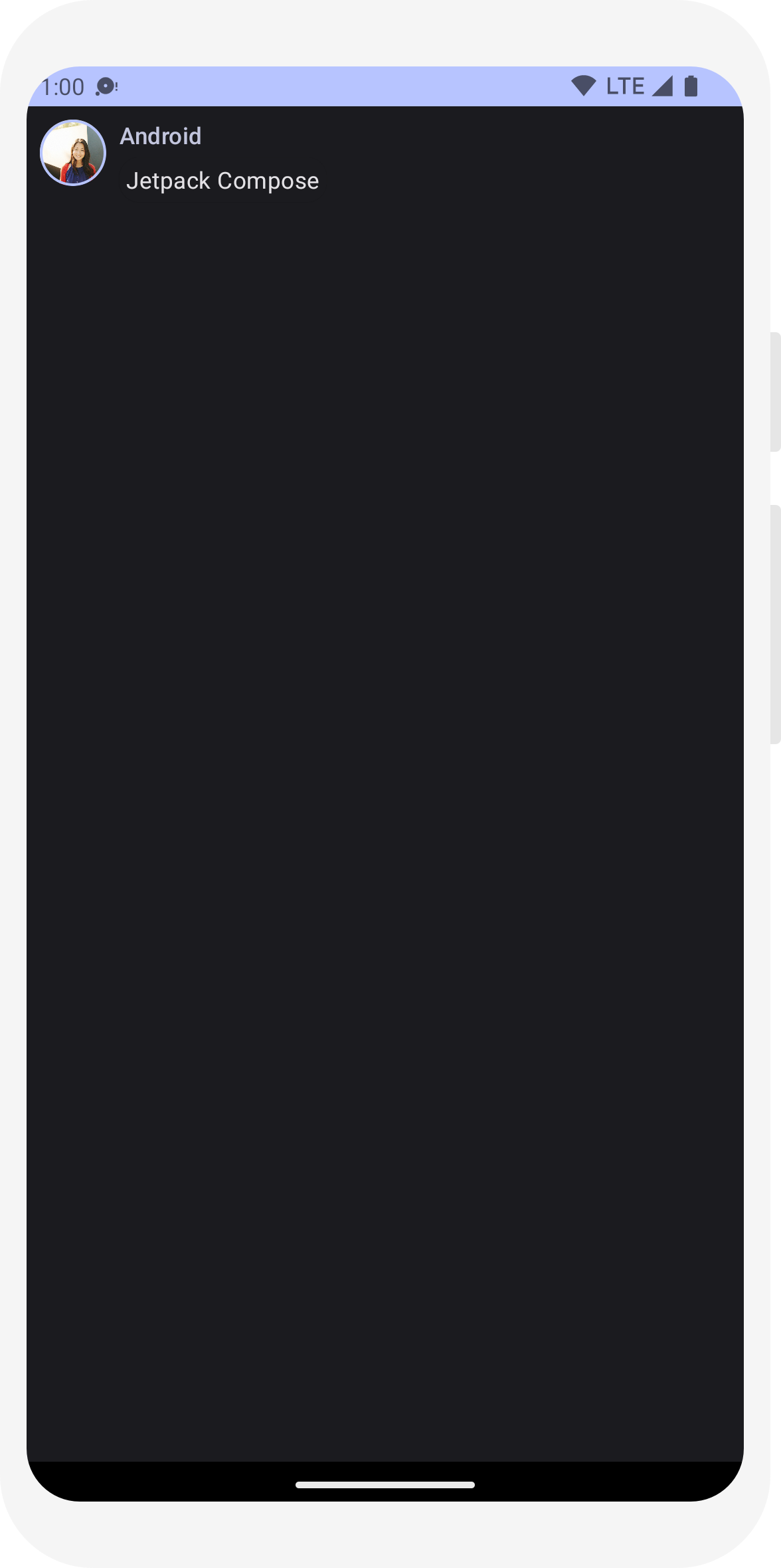
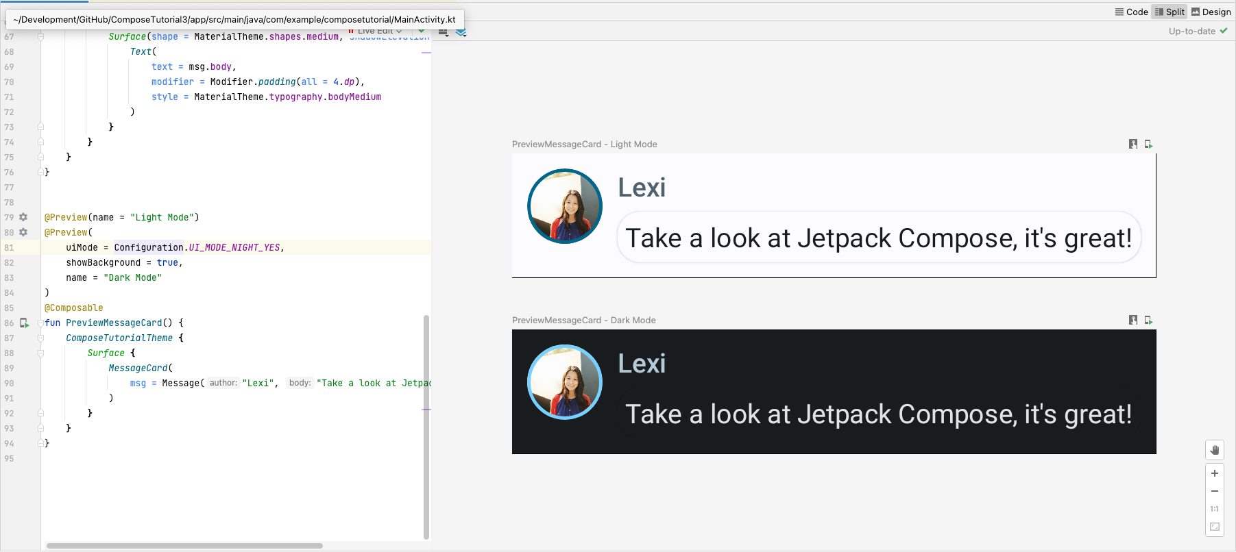
啟用深色主題
深色主題 (或夜間模式),可避免夜間螢幕顯示亮度過強,或單純用來儲存 裝置電池支援 Material Design 讓 Jetpack Compose 能夠處理深色 主題。系統會自動使用質感設計的顏色、文字和背景 適應深色背景
您可以在檔案中建立多個預覽做為個別函式,或新增多個 相同函式的註解。
新增預覽註解並啟用夜間模式。
// ...
import android.content.res.Configuration

@Preview(name = "Light Mode")
@Preview(
    uiMode = Configuration.UI_MODE_NIGHT_YES,
    showBackground = true,
    name = "Dark Mode"
)
@Composable
fun PreviewMessageCard() {
   ComposeTutorialTheme {
    Surface {
      MessageCard(
        msg = Message("Lexi", "Hey, take a look at Jetpack Compose, it's great!")
      )
    }
   }
}
IDE 產生的淺色和深色主題的顏色選項定義在 IDE 生成
Theme.kt 檔案。
目前為止,您已建立了一個訊息 UI 元素,可以顯示一張圖片和兩則文字不同的文字 樣式,在淺色和深色主題中都很美觀!
// ...
import android.content.res.Configuration

@Preview(name = "Light Mode")
@Preview(
    uiMode = Configuration.UI_MODE_NIGHT_YES,
    showBackground = true,
    name = "Dark Mode"
)
@Composable
fun PreviewMessageCard() {
   ComposeTutorialTheme {
    Surface {
      MessageCard(
        msg = Message("Lexi", "Hey, take a look at Jetpack Compose, it's great!")
      )
    }
   }
}
// ...

class MainActivity : ComponentActivity() {
    override fun onCreate(savedInstanceState: Bundle?) {
        super.onCreate(savedInstanceState)
        setContent {
            ComposeTutorialTheme {
                Surface(modifier = Modifier.fillMaxSize()) {
                    MessageCard(Message("Android", "Jetpack Compose"))
                }
            }
        }
    }
}

@Preview
@Composable
fun PreviewMessageCard() {
    ComposeTutorialTheme {
        Surface {
            MessageCard(
                msg = Message("Lexi", "Take a look at Jetpack Compose, it's great!")
            )
        }
    }
}
// ...
import androidx.compose.foundation.border
import androidx.compose.material3.MaterialTheme

@Composable
fun MessageCard(msg: Message) {
   Row(modifier = Modifier.padding(all = 8.dp)) {
       Image(
           painter = painterResource(R.drawable.profile_picture),
           contentDescription = null,
           modifier = Modifier
               .size(40.dp)
               .clip(CircleShape)
               .border(1.5.dp, MaterialTheme.colorScheme.primary, CircleShape)
       )

       Spacer(modifier = Modifier.width(8.dp))

       Column {
           Text(
               text = msg.author,
               color = MaterialTheme.colorScheme.secondary
           )

           Spacer(modifier = Modifier.height(4.dp))
           Text(text = msg.body)
       }
   }
}
// ...

@Composable
fun MessageCard(msg: Message) {
   Row(modifier = Modifier.padding(all = 8.dp)) {
       Image(
           painter = painterResource(R.drawable.profile_picture),
           contentDescription = null,
           modifier = Modifier
               .size(40.dp)
               .clip(CircleShape)
               .border(1.5.dp, MaterialTheme.colorScheme.primary, CircleShape)
       )
       Spacer(modifier = Modifier.width(8.dp))

       Column {
           Text(
               text = msg.author,
               color = MaterialTheme.colorScheme.secondary,
               style = MaterialTheme.typography.titleSmall
           )

           Spacer(modifier = Modifier.height(4.dp))

           Text(
               text = msg.body,
               style = MaterialTheme.typography.bodyMedium
           )
       }
   }
}
// ...
import androidx.compose.material3.Surface

@Composable
fun MessageCard(msg: Message) {
   Row(modifier = Modifier.padding(all = 8.dp)) {
       Image(
           painter = painterResource(R.drawable.profile_picture),
           contentDescription = null,
           modifier = Modifier
               .size(40.dp)
               .clip(CircleShape)
               .border(1.5.dp, MaterialTheme.colorScheme.primary, CircleShape)
       )
       Spacer(modifier = Modifier.width(8.dp))

       Column {
           Text(
               text = msg.author,
               color = MaterialTheme.colorScheme.secondary,
               style = MaterialTheme.typography.titleSmall
           )

           Spacer(modifier = Modifier.height(4.dp))

           Surface(shape = MaterialTheme.shapes.medium, shadowElevation = 1.dp) {
               Text(
                   text = msg.body,
                   modifier = Modifier.padding(all = 4.dp),
                   style = MaterialTheme.typography.bodyMedium
               )
           }
       }
   }
}
// ...
import android.content.res.Configuration

@Preview(name = "Light Mode")
@Preview(
    uiMode = Configuration.UI_MODE_NIGHT_YES,
    showBackground = true,
    name = "Dark Mode"
)
@Composable
fun PreviewMessageCard() {
   ComposeTutorialTheme {
    Surface {
      MessageCard(
        msg = Message("Lexi", "Hey, take a look at Jetpack Compose, it's great!")
      )
    }
   }
}

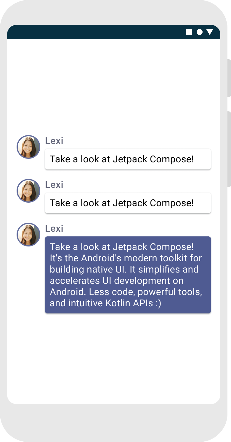
建立訊息清單
只顯示一則訊息會感覺有點孤單,因此我們可以變更對話內容,讓
1 則訊息您必須建立 Conversation 函式
顯示多則訊息針對這個用途,請使用 Compose 的
LazyColumn和
LazyRow。這些可組合函式只會轉譯元素
顯示在畫面上,因此對於較長清單來說是非常有效率。
在這個程式碼片段中,您可以看到 LazyColumn 具有
items 位兒童。這需要
List 做為參數及其 lambda
收到我們命名為 message 的參數 (可以是
可以隨意命名) 也就是 Message 的例項。
簡單來說,系統會針對所提供項目中的每個項目呼叫這個 lambda
List。複製
資料集範例
以便快速展開對話
// ...
import androidx.compose.foundation.lazy.LazyColumn
import androidx.compose.foundation.lazy.items

@Composable
fun Conversation(messages: List<Message>) {
    LazyColumn {
        items(messages) { message ->
            MessageCard(message)
        }
    }
}

@Preview
@Composable
fun PreviewConversation() {
    ComposeTutorialTheme {
        Conversation(SampleData.conversationSample)
    }
}
展開訊息時以動畫呈現訊息
對話變得更有趣。現在是時候製作動畫了!您將新增
能夠展開訊息以顯示更多內容,同時以動畫呈現內容大小和
背景顏色。如要儲存此本機 UI 狀態,您必須追蹤訊息是否
是否已展開。如要追蹤狀態變更,請使用函式
「remember」和
mutableStateOf。
可組合函式可以使用
remember,並追蹤傳遞至
mutableStateOf。可組合函式 (及其子項)
並在更新該值後,自動重新繪製這個狀態。這種訓練方式稱為
recomposition。
使用 Compose 的狀態 API,例如 remember 以及
mutableStateOf,任何狀態變更都會自動更新 UI。
注意:您必須新增以下匯入項目,才能正確使用 Kotlin 的
委派屬性語法 (by 關鍵字)。Alt+Enter 或 Option + Enter 鍵,即可新增這些項目
不必確保憑證管理是否適當
因為 Google Cloud 會為您管理安全性
      import androidx.compose.runtime.getValue
      import androidx.compose.runtime.setValue
// ...
import androidx.compose.foundation.clickable
import androidx.compose.runtime.getValue
import androidx.compose.runtime.mutableStateOf
import androidx.compose.runtime.remember
import androidx.compose.runtime.setValue

class MainActivity : ComponentActivity() {
   override fun onCreate(savedInstanceState: Bundle?) {
       super.onCreate(savedInstanceState)
       setContent {
           ComposeTutorialTheme {
               Conversation(SampleData.conversationSample)
           }
       }
   }
}

@Composable
fun MessageCard(msg: Message) {
    Row(modifier = Modifier.padding(all = 8.dp)) {
        Image(
            painter = painterResource(R.drawable.profile_picture),
            contentDescription = null,
            modifier = Modifier
                .size(40.dp)
                .clip(CircleShape)
                .border(1.5.dp, MaterialTheme.colorScheme.primary, CircleShape)
        )
        Spacer(modifier = Modifier.width(8.dp))

        // We keep track if the message is expanded or not in this
        // variable
        var isExpanded by remember { mutableStateOf(false) }

        // We toggle the isExpanded variable when we click on this Column
        Column(modifier = Modifier.clickable { isExpanded = !isExpanded }) {
            Text(
                text = msg.author,
                color = MaterialTheme.colorScheme.secondary,
                style = MaterialTheme.typography.titleSmall
            )

            Spacer(modifier = Modifier.height(4.dp))

            Surface(
                shape = MaterialTheme.shapes.medium,
                shadowElevation = 1.dp,
            ) {
                Text(
                    text = msg.body,
                    modifier = Modifier.padding(all = 4.dp),
                    // If the message is expanded, we display all its content
                    // otherwise we only display the first line
                    maxLines = if (isExpanded) Int.MAX_VALUE else 1,
                    style = MaterialTheme.typography.bodyMedium
                )
            }
        }
    }
}
您現在可以根據下列項目變更郵件內容的背景:
isExpanded。您會使用
clickable 修飾符來處理
可組合函式。請不要只是切換網站的背景顏色
Surface,您將要加上背景顏色的動畫效果
逐漸修改該函式的值
MaterialTheme.colorScheme.surface 至
MaterialTheme.colorScheme.primary,反之亦然。方法如下
您將使用 animateColorAsState 函式。最後
會使用 animateContentSize 修飾符建立動畫
訊息容器大小一致:
// ...
import androidx.compose.animation.animateColorAsState
import androidx.compose.animation.animateContentSize

@Composable
fun MessageCard(msg: Message) {
    Row(modifier = Modifier.padding(all = 8.dp)) {
        Image(
            painter = painterResource(R.drawable.profile_picture),
            contentDescription = null,
            modifier = Modifier
                .size(40.dp)
                .clip(CircleShape)
                .border(1.5.dp, MaterialTheme.colorScheme.secondary, CircleShape)
        )
        Spacer(modifier = Modifier.width(8.dp))

        // We keep track if the message is expanded or not in this
        // variable
        var isExpanded by remember { mutableStateOf(false) }
        // surfaceColor will be updated gradually from one color to the other
        val surfaceColor by animateColorAsState(
            if (isExpanded) MaterialTheme.colorScheme.primary else MaterialTheme.colorScheme.surface,
        )

        // We toggle the isExpanded variable when we click on this Column
        Column(modifier = Modifier.clickable { isExpanded = !isExpanded }) {
            Text(
                text = msg.author,
                color = MaterialTheme.colorScheme.secondary,
                style = MaterialTheme.typography.titleSmall
            )

            Spacer(modifier = Modifier.height(4.dp))

            Surface(
                shape = MaterialTheme.shapes.medium,
                shadowElevation = 1.dp,
                // surfaceColor color will be changing gradually from primary to surface
                color = surfaceColor,
                // animateContentSize will change the Surface size gradually
                modifier = Modifier.animateContentSize().padding(1.dp)
            ) {
                Text(
                    text = msg.body,
                    modifier = Modifier.padding(all = 4.dp),
                    // If the message is expanded, we display all its content
                    // otherwise we only display the first line
                    maxLines = if (isExpanded) Int.MAX_VALUE else 1,
                    style = MaterialTheme.typography.bodyMedium
                )
            }
        }
    }
}
// ...
import androidx.compose.foundation.lazy.LazyColumn
import androidx.compose.foundation.lazy.items

@Composable
fun Conversation(messages: List<Message>) {
    LazyColumn {
        items(messages) { message ->
            MessageCard(message)
        }
    }
}

@Preview
@Composable
fun PreviewConversation() {
    ComposeTutorialTheme {
        Conversation(SampleData.conversationSample)
    }
}
// ...
import androidx.compose.foundation.clickable
import androidx.compose.runtime.getValue
import androidx.compose.runtime.mutableStateOf
import androidx.compose.runtime.remember
import androidx.compose.runtime.setValue

class MainActivity : ComponentActivity() {
   override fun onCreate(savedInstanceState: Bundle?) {
       super.onCreate(savedInstanceState)
       setContent {
           ComposeTutorialTheme {
               Conversation(SampleData.conversationSample)
           }
       }
   }
}

@Composable
fun MessageCard(msg: Message) {
    Row(modifier = Modifier.padding(all = 8.dp)) {
        Image(
            painter = painterResource(R.drawable.profile_picture),
            contentDescription = null,
            modifier = Modifier
                .size(40.dp)
                .clip(CircleShape)
                .border(1.5.dp, MaterialTheme.colorScheme.primary, CircleShape)
        )
        Spacer(modifier = Modifier.width(8.dp))

        // We keep track if the message is expanded or not in this
        // variable
        var isExpanded by remember { mutableStateOf(false) }

        // We toggle the isExpanded variable when we click on this Column
        Column(modifier = Modifier.clickable { isExpanded = !isExpanded }) {
            Text(
                text = msg.author,
                color = MaterialTheme.colorScheme.secondary,
                style = MaterialTheme.typography.titleSmall
            )

            Spacer(modifier = Modifier.height(4.dp))

            Surface(
                shape = MaterialTheme.shapes.medium,
                shadowElevation = 1.dp,
            ) {
                Text(
                    text = msg.body,
                    modifier = Modifier.padding(all = 4.dp),
                    // If the message is expanded, we display all its content
                    // otherwise we only display the first line
                    maxLines = if (isExpanded) Int.MAX_VALUE else 1,
                    style = MaterialTheme.typography.bodyMedium
                )
            }
        }
    }
}
// ...
import androidx.compose.animation.animateColorAsState
import androidx.compose.animation.animateContentSize

@Composable
fun MessageCard(msg: Message) {
    Row(modifier = Modifier.padding(all = 8.dp)) {
        Image(
            painter = painterResource(R.drawable.profile_picture),
            contentDescription = null,
            modifier = Modifier
                .size(40.dp)
                .clip(CircleShape)
                .border(1.5.dp, MaterialTheme.colorScheme.secondary, CircleShape)
        )
        Spacer(modifier = Modifier.width(8.dp))

        // We keep track if the message is expanded or not in this
        // variable
        var isExpanded by remember { mutableStateOf(false) }
        // surfaceColor will be updated gradually from one color to the other
        val surfaceColor by animateColorAsState(
            if (isExpanded) MaterialTheme.colorScheme.primary else MaterialTheme.colorScheme.surface,
        )

        // We toggle the isExpanded variable when we click on this Column
        Column(modifier = Modifier.clickable { isExpanded = !isExpanded }) {
            Text(
                text = msg.author,
                color = MaterialTheme.colorScheme.secondary,
                style = MaterialTheme.typography.titleSmall
            )

            Spacer(modifier = Modifier.height(4.dp))

            Surface(
                shape = MaterialTheme.shapes.medium,
                shadowElevation = 1.dp,
                // surfaceColor color will be changing gradually from primary to surface
                color = surfaceColor,
                // animateContentSize will change the Surface size gradually
                modifier = Modifier.animateContentSize().padding(1.dp)
            ) {
                Text(
                    text = msg.body,
                    modifier = Modifier.padding(all = 4.dp),
                    // If the message is expanded, we display all its content
                    // otherwise we only display the first line
                    maxLines = if (isExpanded) Int.MAX_VALUE else 1,
                    style = MaterialTheme.typography.bodyMedium
                )
            }
        }
    }
}
後續步驟
恭喜,您已完成 Compose 教學課程!您只用了不到 100 行程式碼就建構了簡易即時通訊螢幕,非常有效率!畫面上展示的動畫訊息清單可供展開,包含圖片和文字,採用質感設計原則和深色主題,並具備預覽功能。
您目前已瞭解的內容如下:
- 定義可組合函式
- 在組合中新增不同元素
- 使用版面配置元件建構 UI 元件
- 使用修飾詞擴充可組合項
- 建立高效率清單
- 持續追蹤並修改狀態
- 在可組合項上新增使用者互動
- 在展開時為訊息加入動畫效果
如要深入瞭解這些步驟,請參閱下列資源。