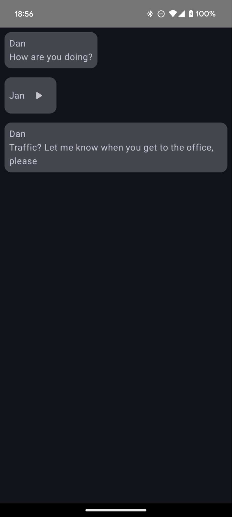
You can use a list with multiple item types to display mixed content types such as text, images, and interactive elements.
Version compatibility
This implementation requires that your project minSDK be set to API level 21 or higher.
Dependencies
Add multiple item types
You can specify the content type for each item of the layout when you compose a list or a grid with multiple types of items:
@Composable
fun ListWithMultipleItems(messages: List<Any>) {
LazyColumn {
items(
messages.size,
contentType = { it }
) {
for (message in messages)
when (message) {
is MediaStore.Audio -> AudioMessage(message)
is Text -> TextMessage(message)
}
}
}
}
@Composable
fun AudioMessage(message: MediaStore.Audio) {
TODO("Not yet implemented.")
}
@Composable
fun TextMessage(message: Text) {
TODO("Not yet implemented.")
}
data class SampleMessage(val text: String, val content: Any)
Key points about the code
- Specifies the content type for each item by setting
contentTypeinitems(). - Maps each content type to a corresponding composable. For example,
Audiois acontentTypethat is defined elsewhere and is mapped to anAudioMessagecomposable. - Compose reuses the rendered composables for each item of a given content type.
Results

Collections that contain this guide
This guide is part of these curated Quick Guide collections that cover broader Android development goals:

Display a list or grid
Lists and grids allow your app to display collections in a
visually pleasing form that's easy for users to consume.

Display interactive components
Learn how composable functions can enable you to easily
create beautiful UI components based on the Material Design design
system.

Compose basics (video collection)
This series of videos introduces various Compose APIs,
quickly showing you what’s available and how to use them.
Have questions or feedback
Go to our frequently asked questions page and learn about quick guides or reach out and let us know your thoughts.


