
The Picker helps users select and set specific data.
Picker
Pickers should be used to let users choose amongst a finite number of items.
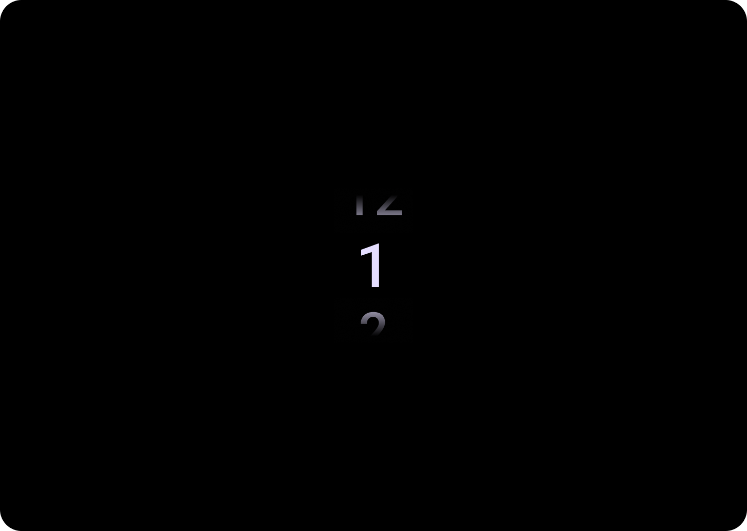
By default items will be looped infinitely in both directions. Consider disabling this behaviour if order in the list is important, or to allow users to reach the first and last element with a quick swipe.
Anatomy
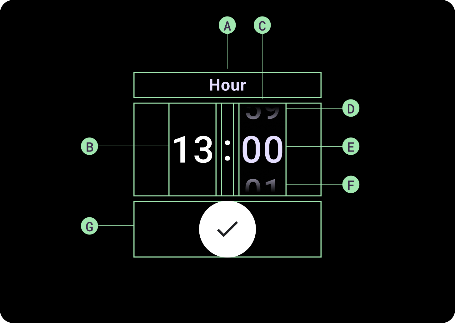
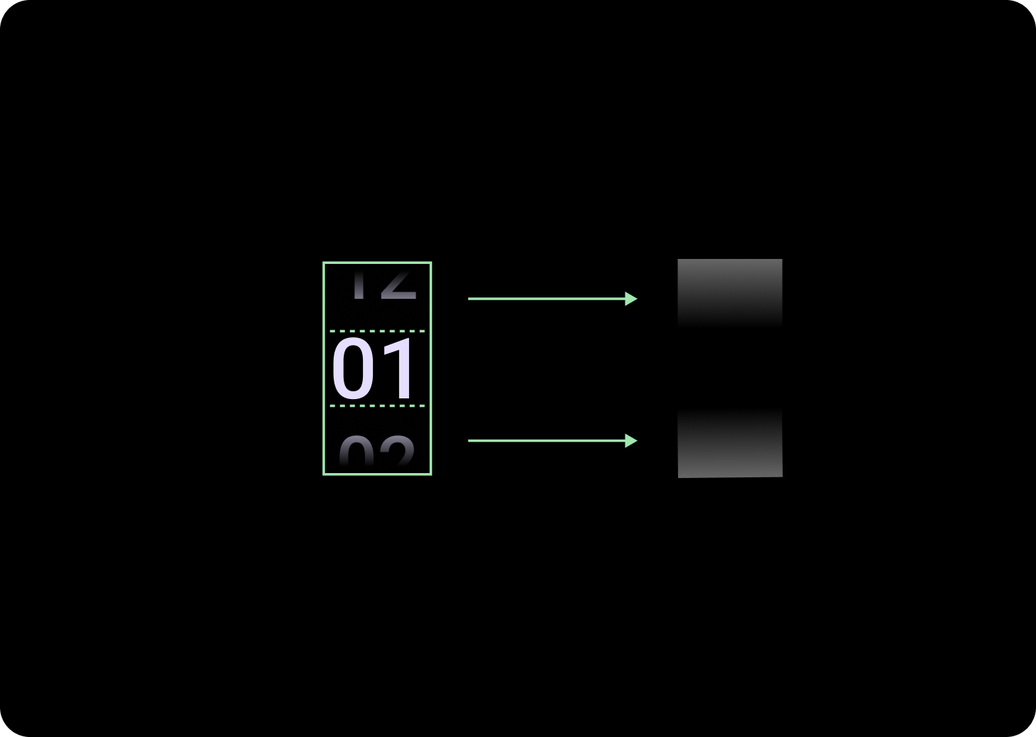
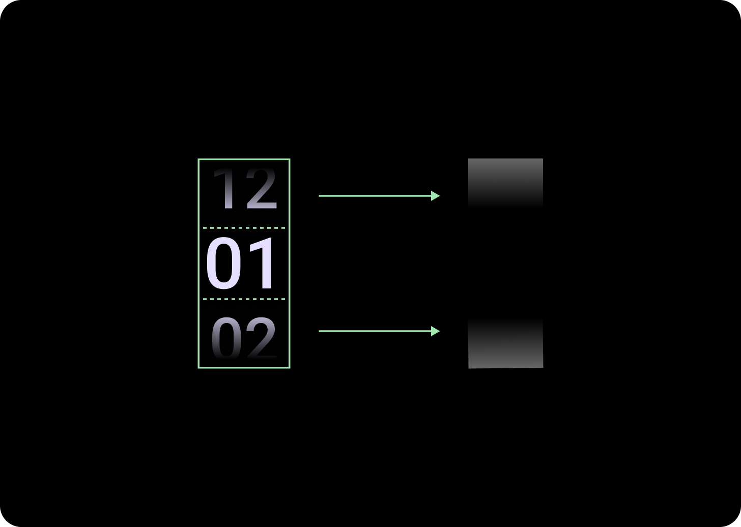
Anatomy
A. Inactive Column
B. Colon Breaker
C. Picker Column
D. Top Content
E. Middle Content
F. Bottom Content
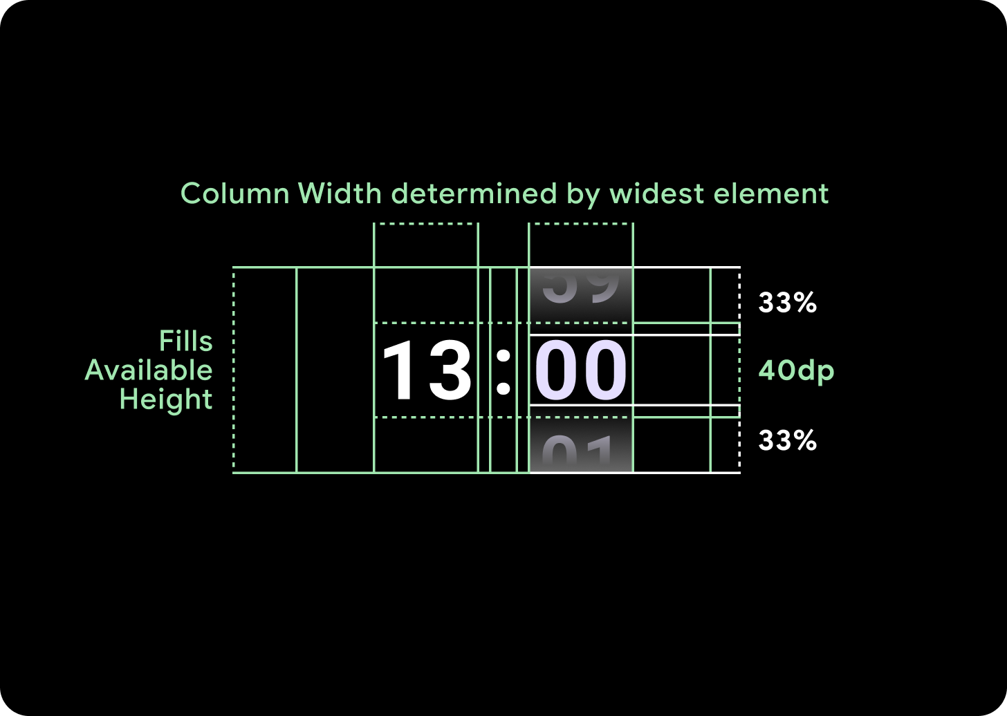
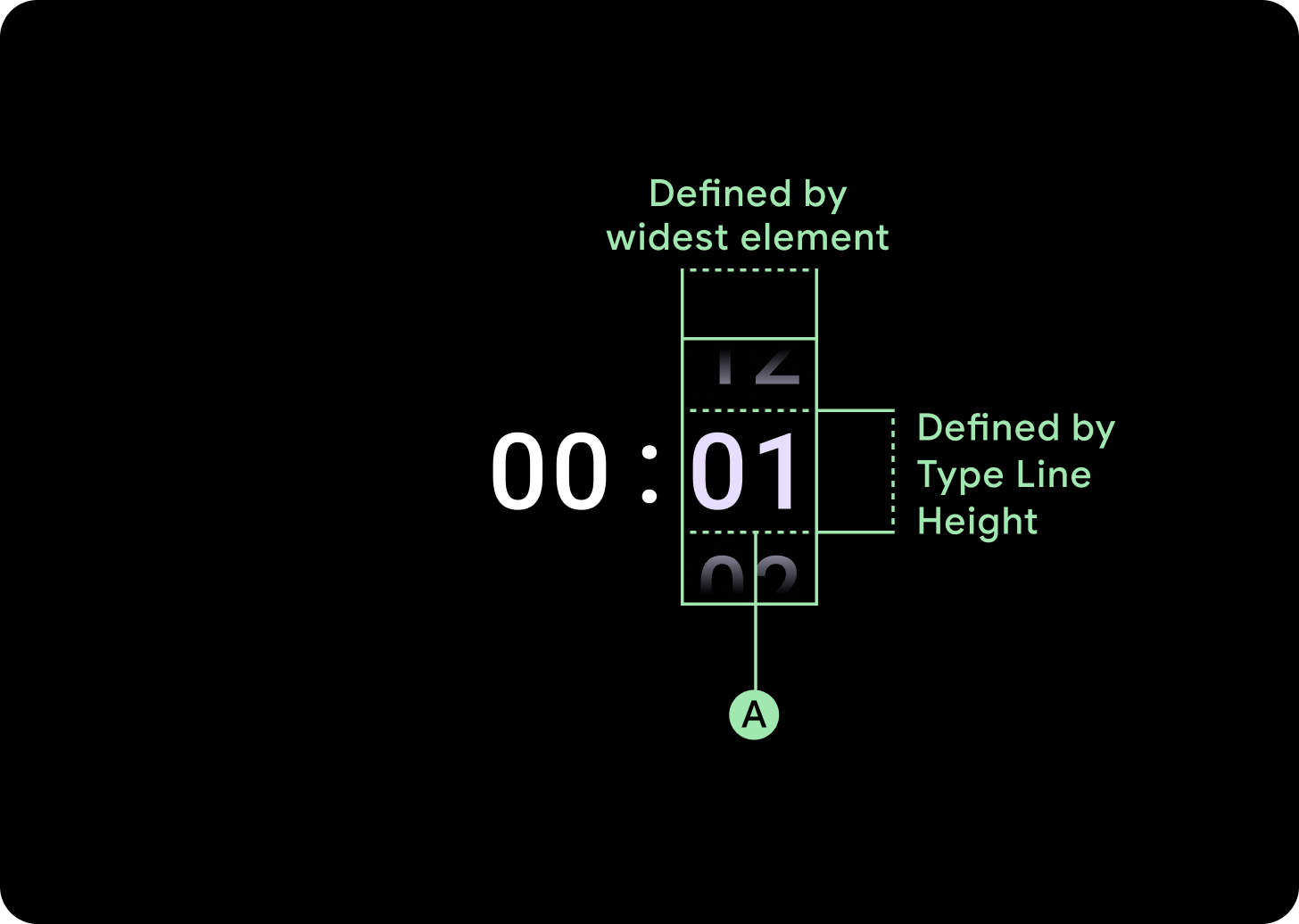
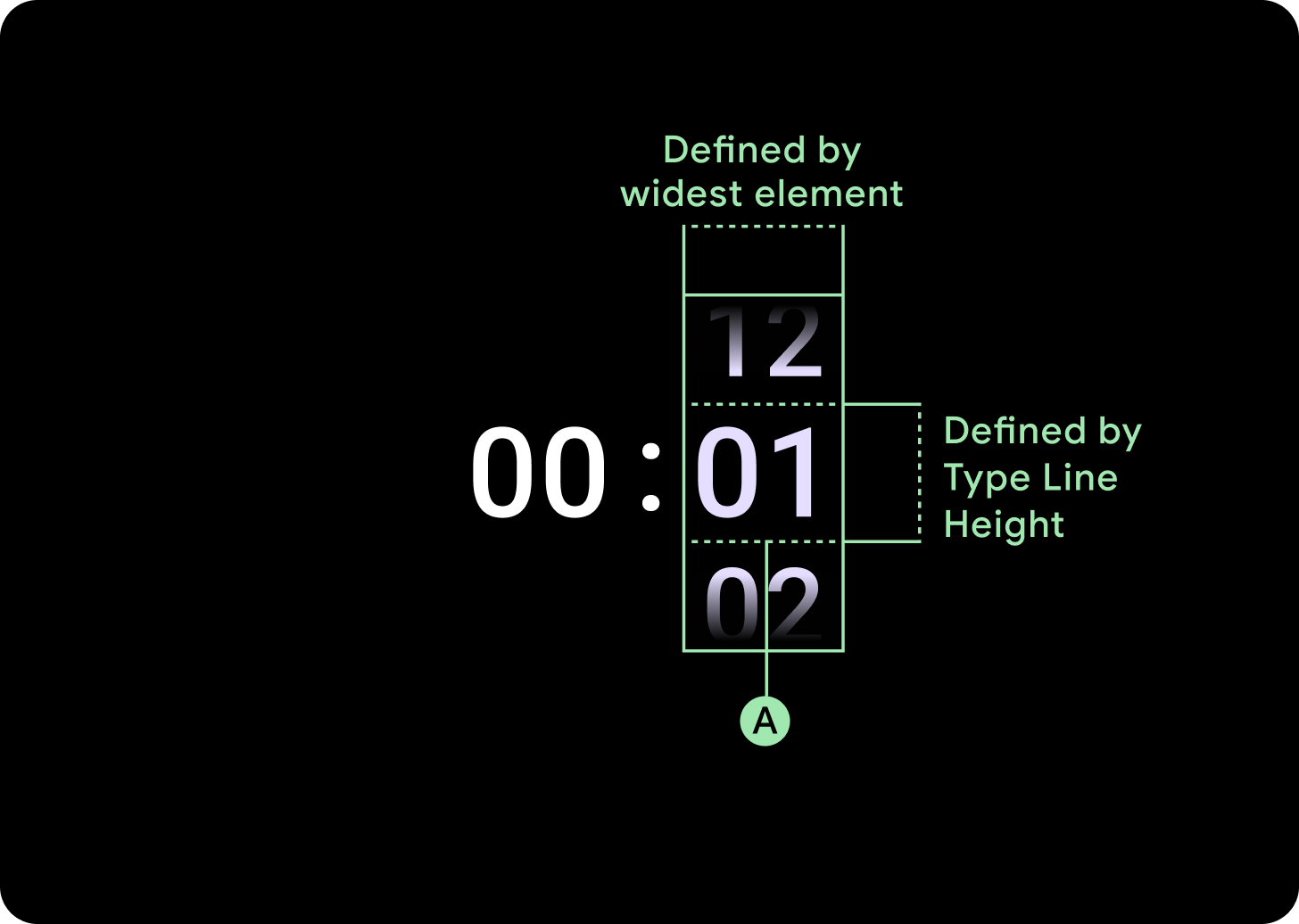
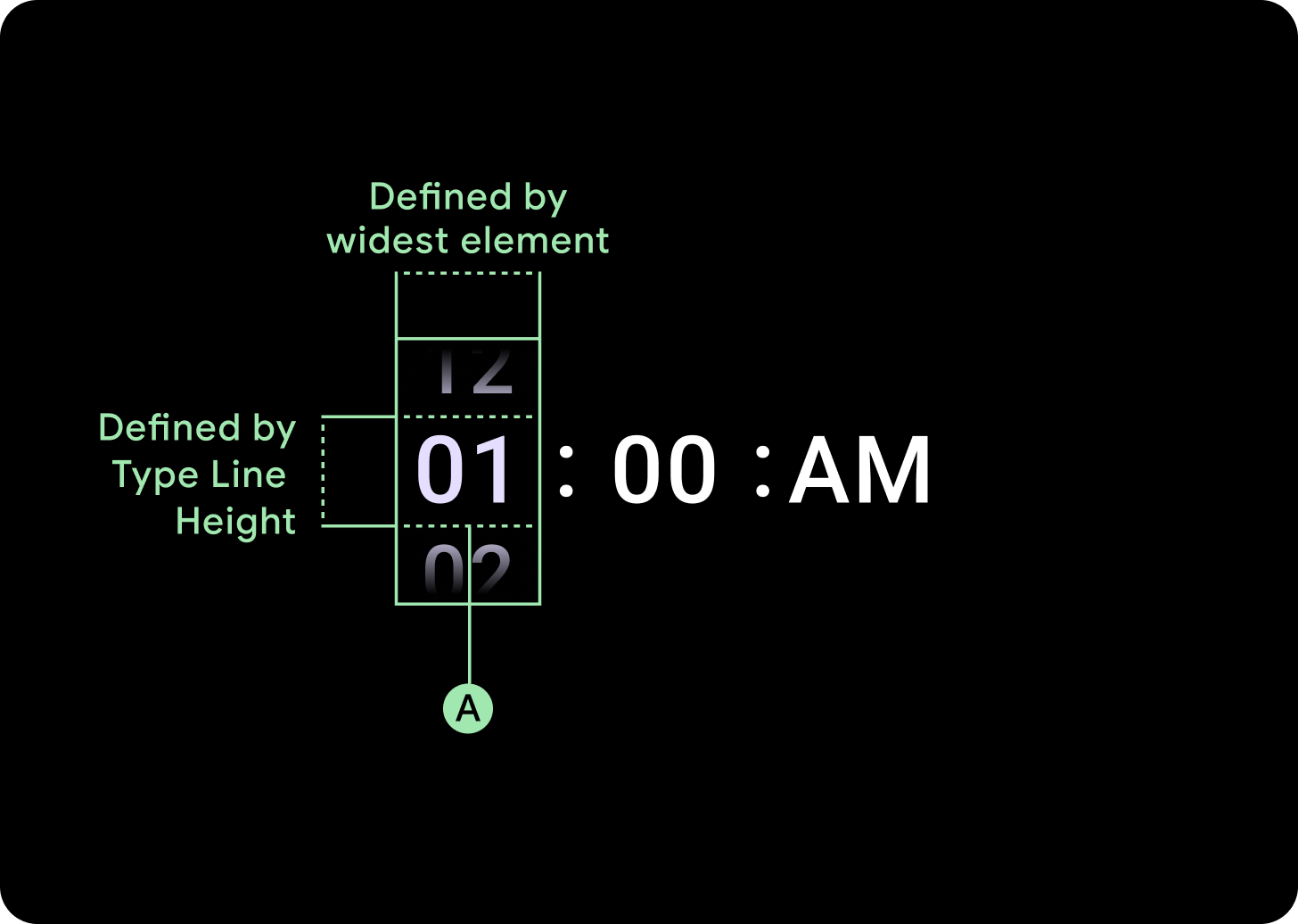
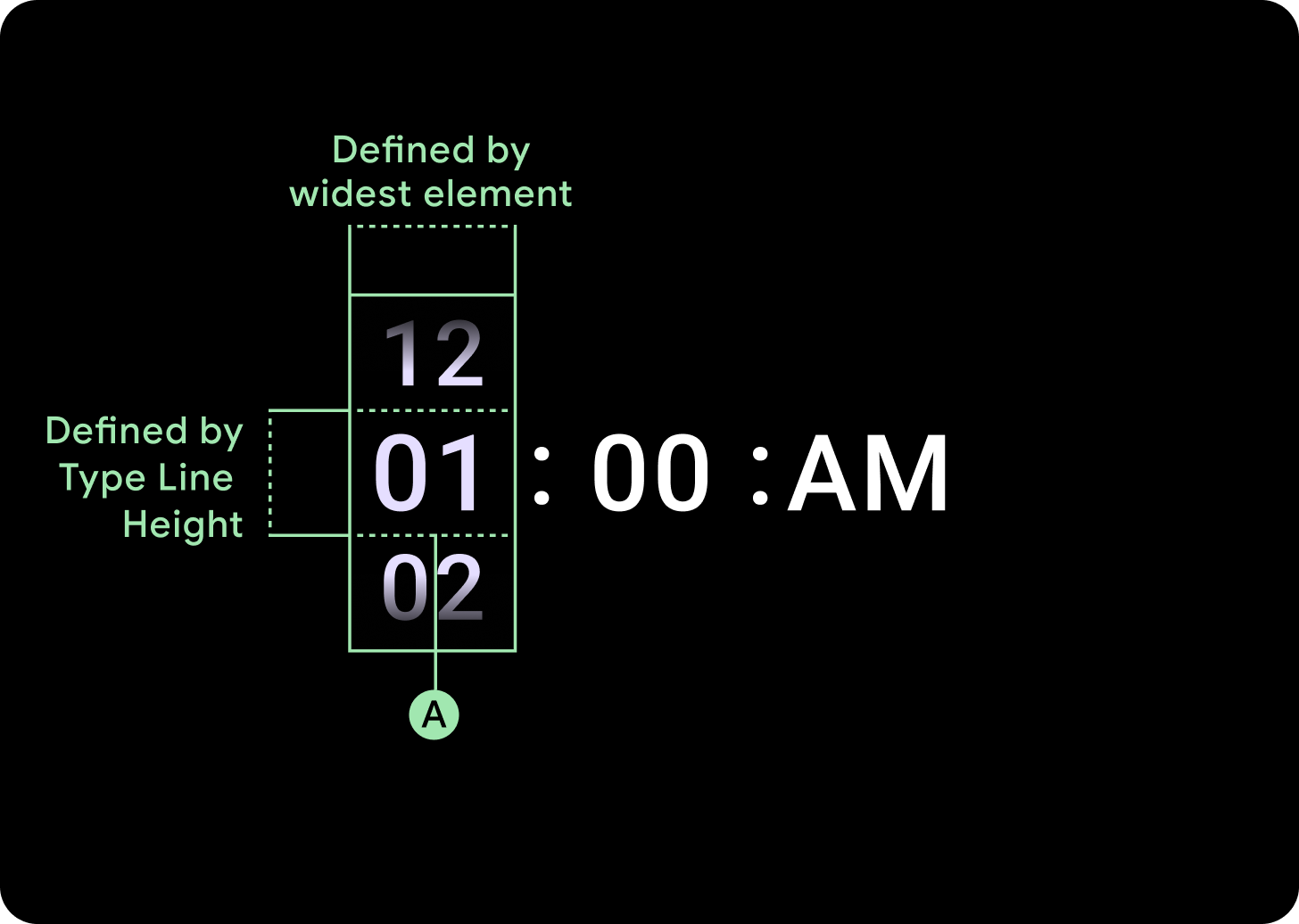
Widths and heights
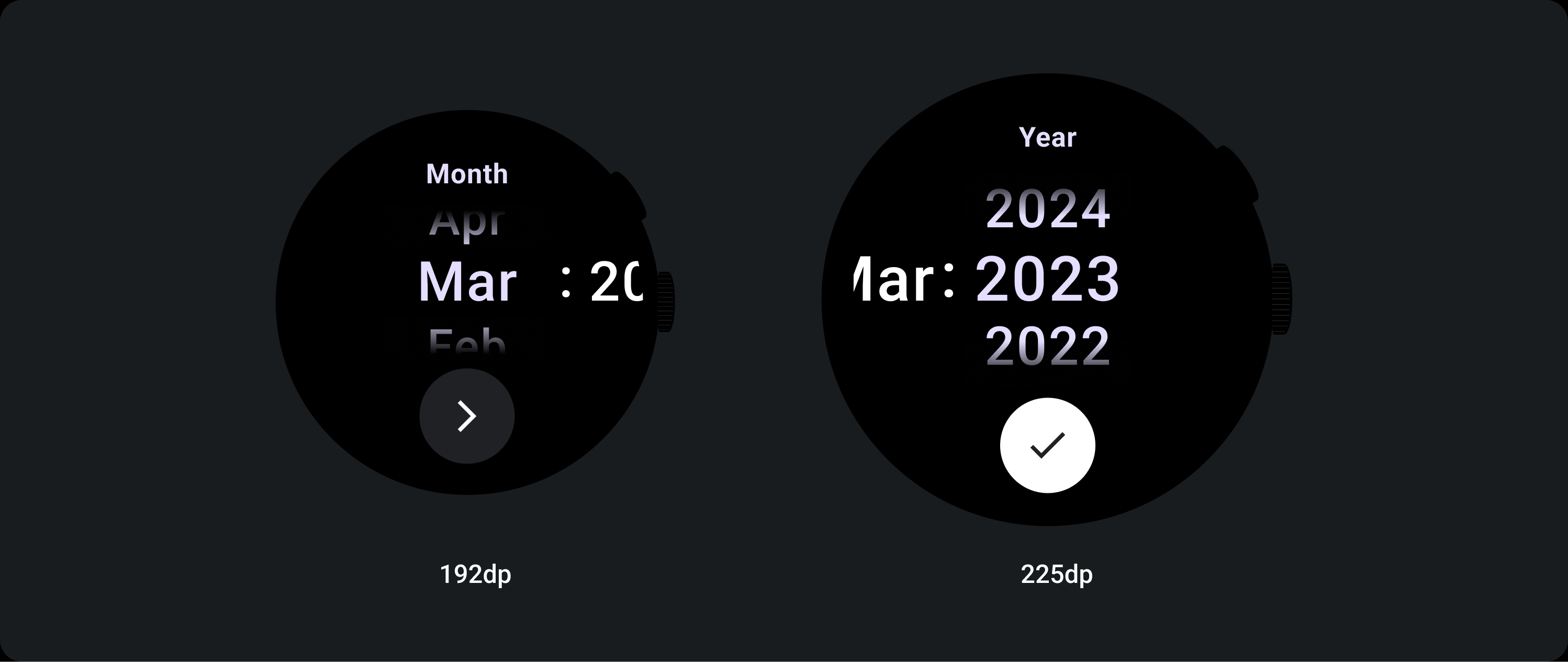
The Picker Group fills the available height and width. There are four layout options for the picker columns. Each layout is centred and fills the available height. Column widths are defined by the width needed to accommodate the number of digits needed in the font, Date-picker is the exception, horizontally it fills the screen and bleeds off the edge.
For example numbers will work out width of '00' is and then set the width. For text fields, for the month field for example, will be worked out as the width of 'MMM' (which is the widest letter in the latin alphabet). The width and height (which is the line height of that type style used) will therefore be affected by the font used.
Picker items vary in size across the breakpoint.
Usage
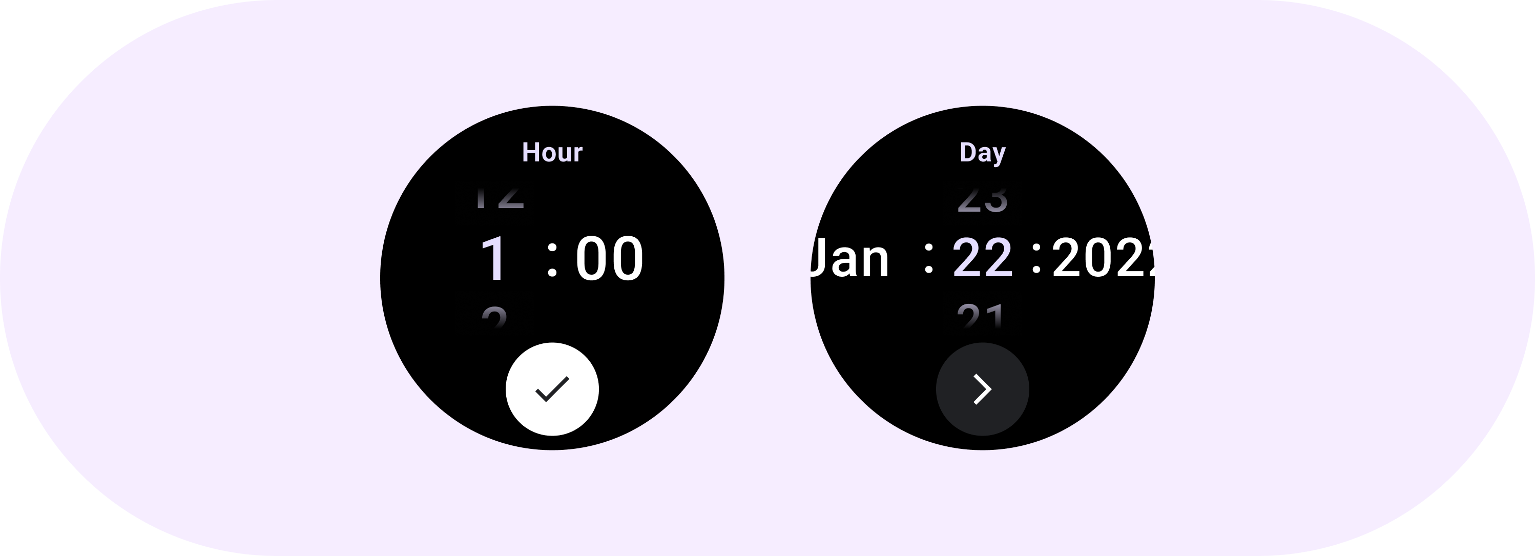
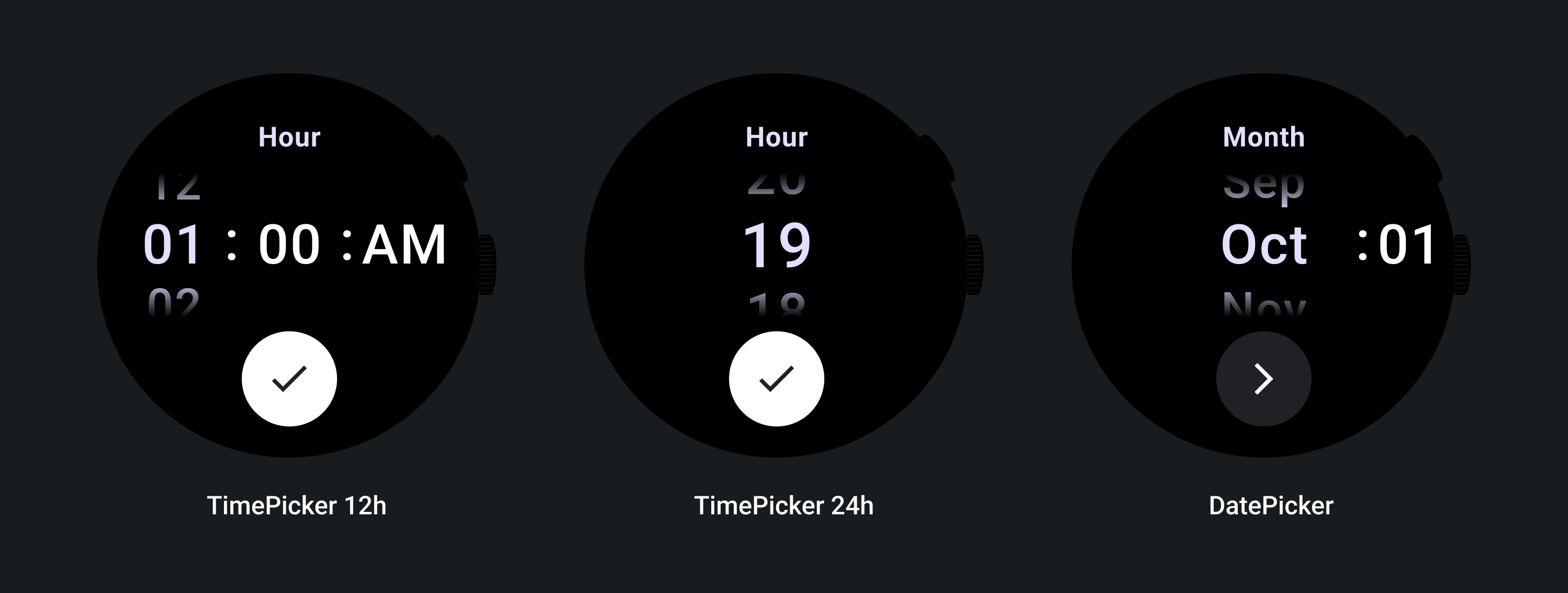
See the following examples of Date and Time Pickers
For a prebuilt date and time picker implementation, check out the Horologist Library on Github.
If you want to create a similar experience, where users choose a multi-part value across multiple pickers, use the built-in PickerGroup component. This object uses a focus coordinator object to assign focus to the correct Picker element.
Adaptive layouts
TimePicker 24H
TimePicker 12H
Date Picker
Responsive behavior
Text size increase
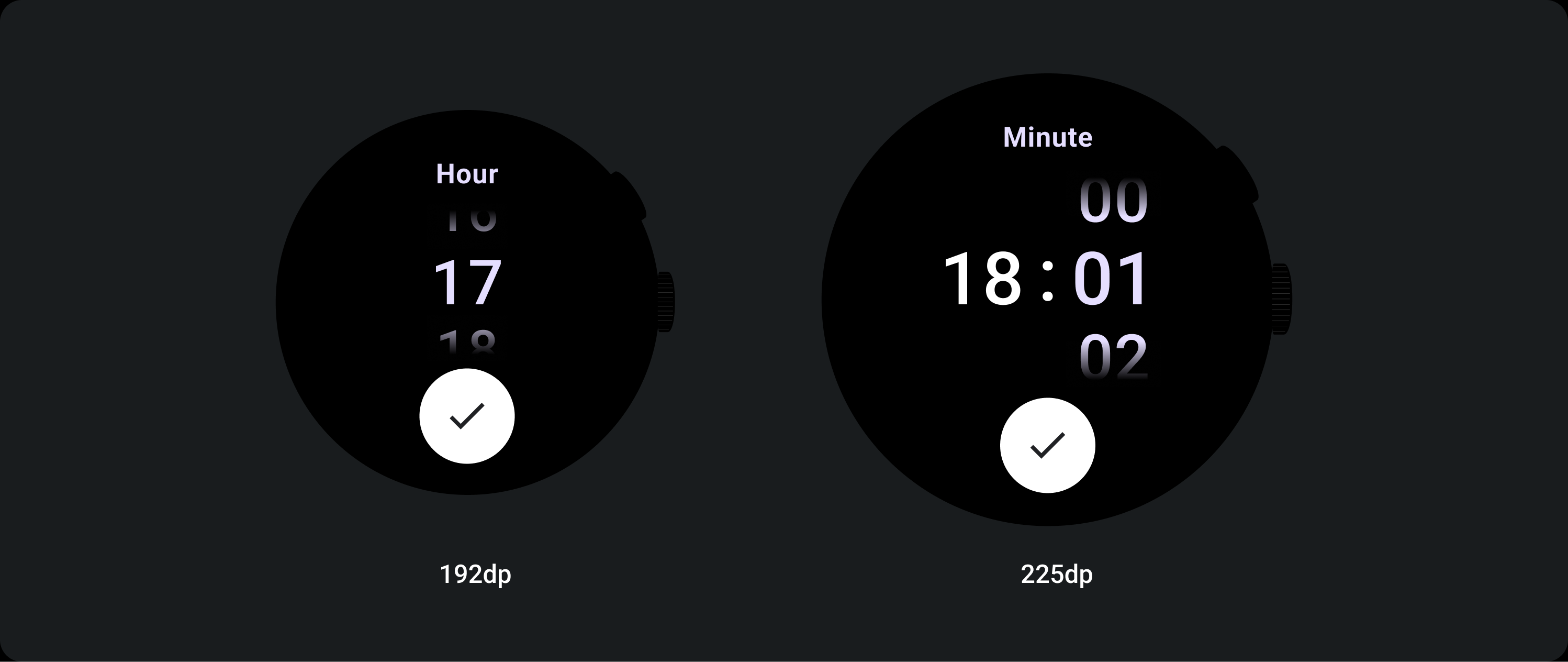
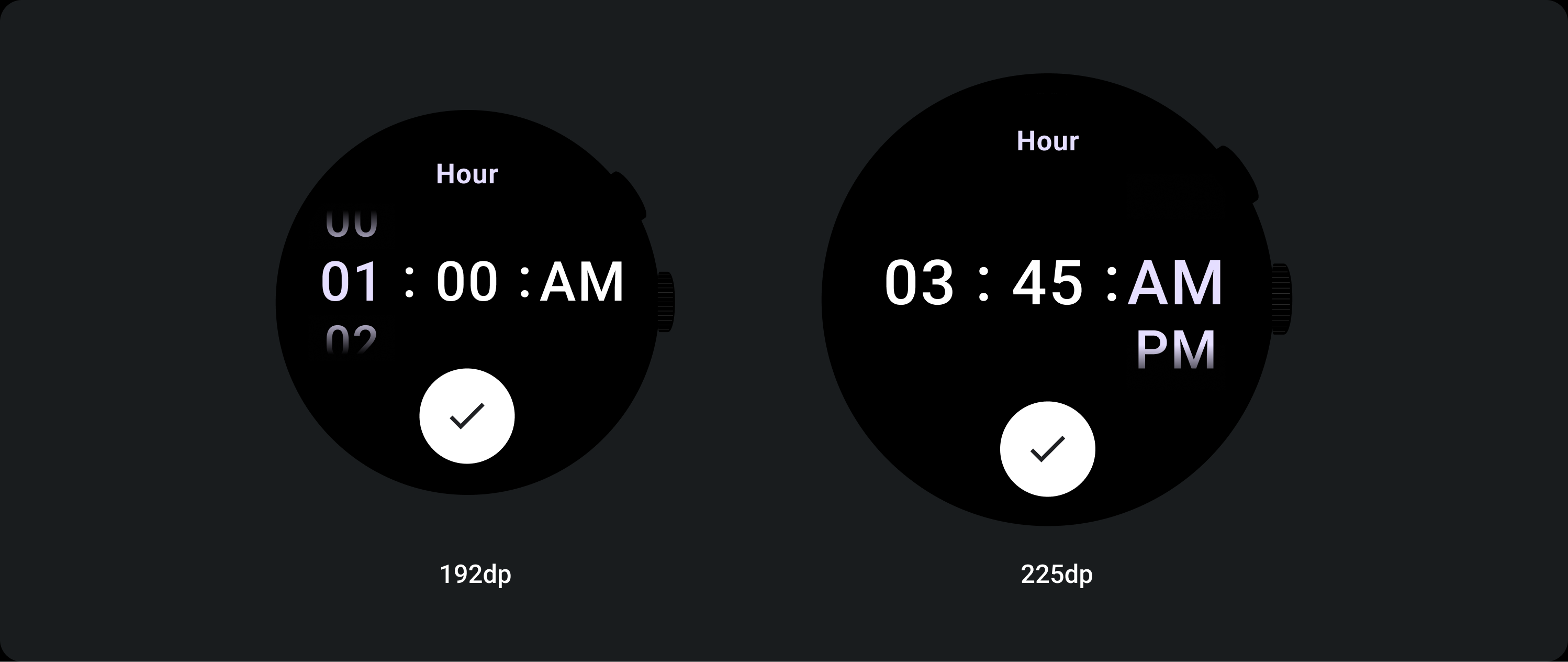
Past the 225+ Breakpoint, the Picker element’s font size changes. Top and Bottom copy within the lazy scrolling column adjusts (A), as does the Middle copy. Below are some examples of this:
Two column layout
Below the 225 dp breakpoint
Font: Display 2
Above 225 dp breakpoint
Font: Display 1
Three column layout
Below the 225 dp breakpoint
Font: Display 3
Above the 225 dp breakpoint
Font: Display 2
Gradient size increase
The gradient on the Picker column is defined in height by the available space. Both Top and Bottom Gradients are set at a third (33%) of the available height. This means at each available screen size, the gradient scales proportionally. Sitting independent of the column layout.
Below the 225 dp breakpoint
Size: 33% of column height
Above the 225 dp breakpoint
Size: 33% of column height
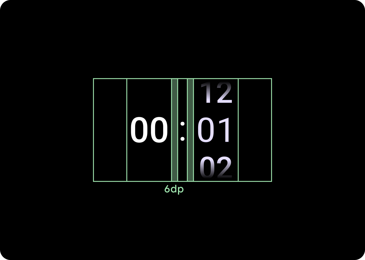
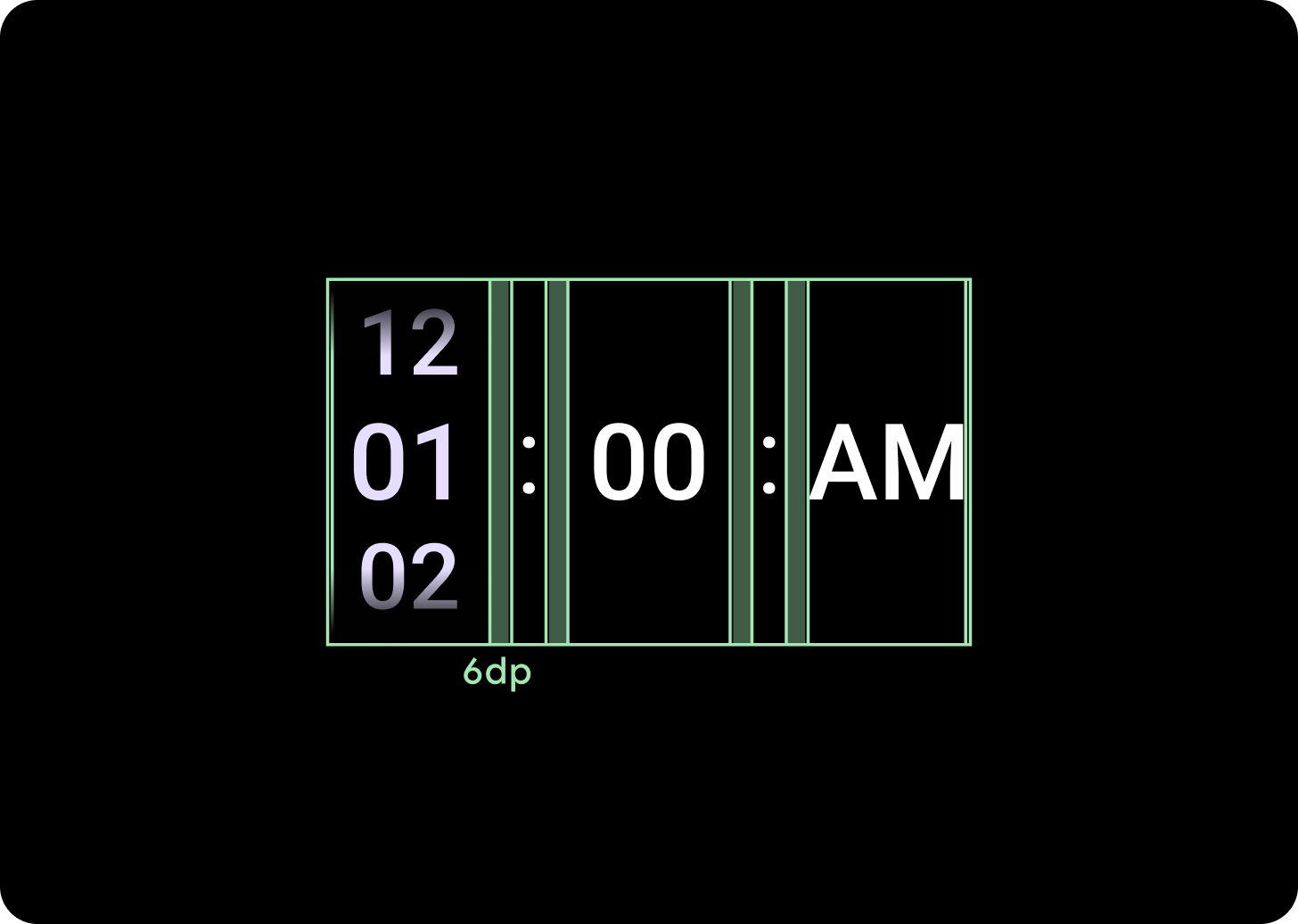
Column spacing increase
Column spacing scales past the 225+ Breakpoint, either starting at 2 dp or 4 dp and growing to 6 dp. This depends on which layout you’ve selected; either 2 or 3 column layouts
Two column layout
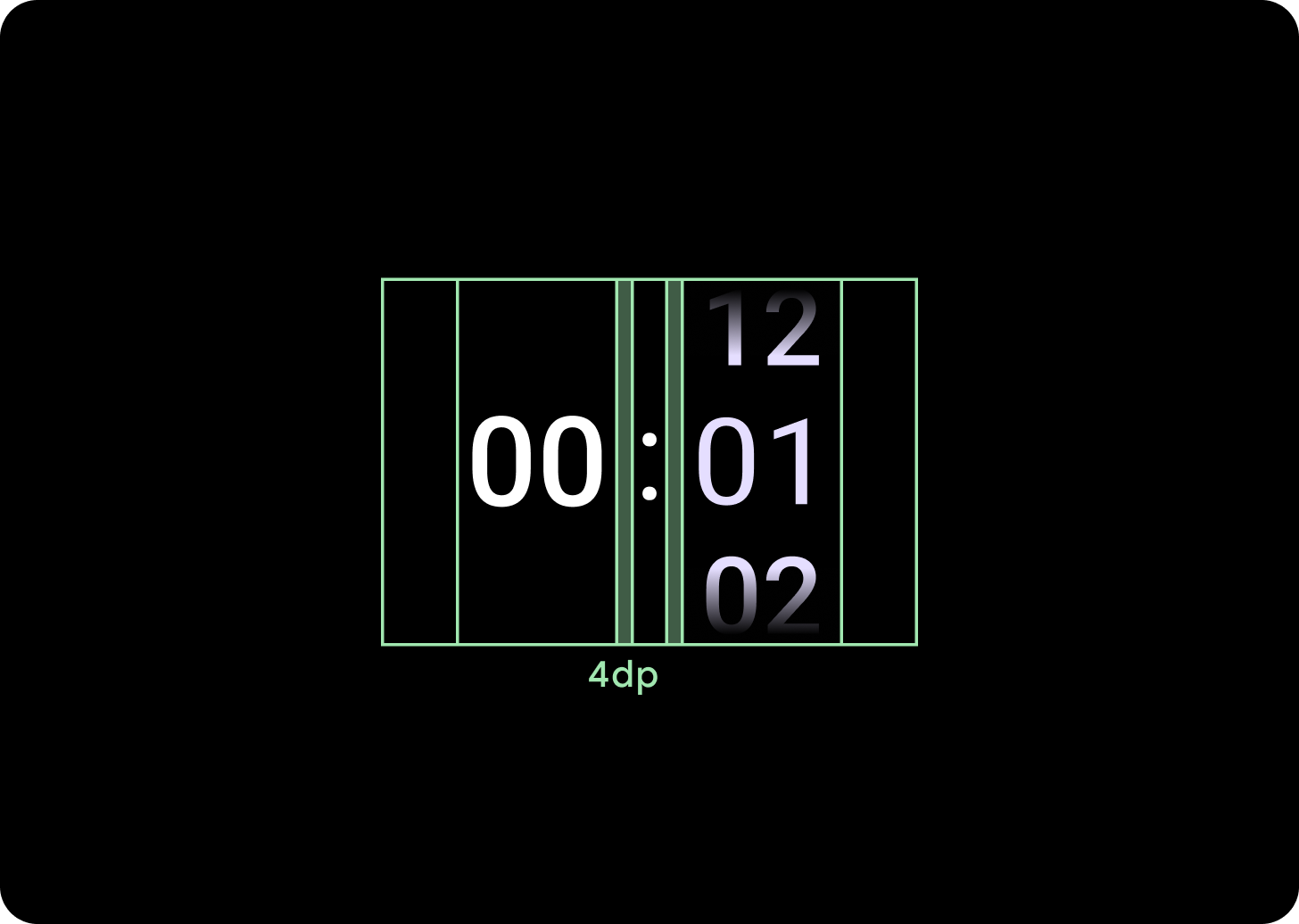
Below the 225 dp breakpoint
4 dp column gap
Above the 225 dp breakpoint
6 dp column gap
Three column layout
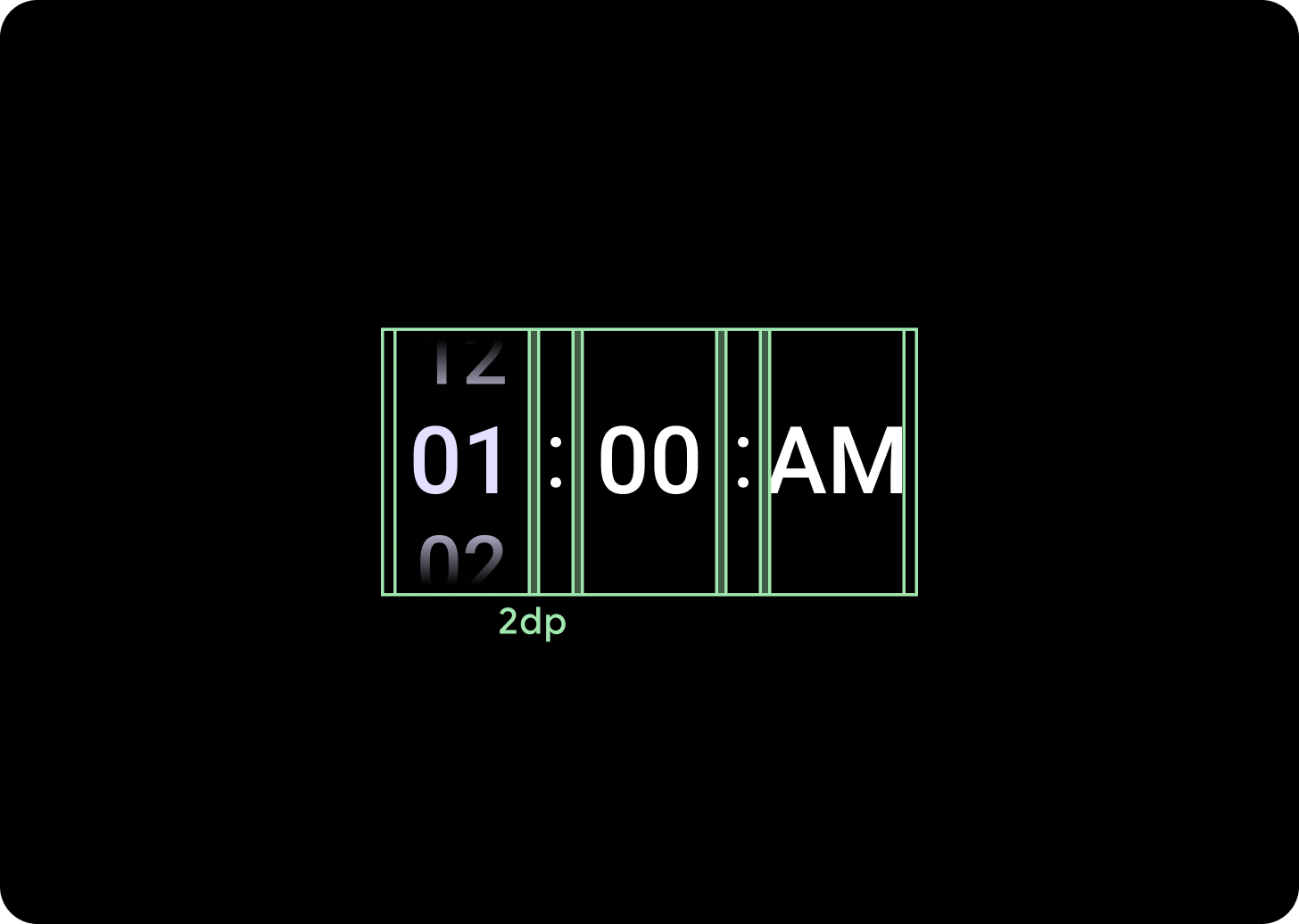
Below the 225 dp breakpoint
2 dp column gap
Above the 225 dp breakpoint
6 dp column gap