
按钮可帮助用户发起操作或流程。您可以从不同类型的按钮中进行选择,以突出显示内容。
资源
| 类型 | 链接 | 状态 |
|---|---|---|
| 设计 | 设计来源 (Figma) | 可用 |
| 实现 | Jetpack Compose | 可用 |
亮点
- 根据操作的重要性选择按钮类型。 操作越重要,按钮的强调程度就越高。
- 按钮应带有明确的标签,以指明其执行的操作。
- 在屏幕上合理放置按钮,将其放置在用户可能预计会找到它们的位置。
- 不要过度使用按钮。屏幕上的按钮过多会破坏视觉层次结构。
变体
按钮有 6 种类型:
- 填充按钮
- 轮廓按钮
- 图标按钮
- 轮廓图标按钮
- 长按按钮
- 图片按钮


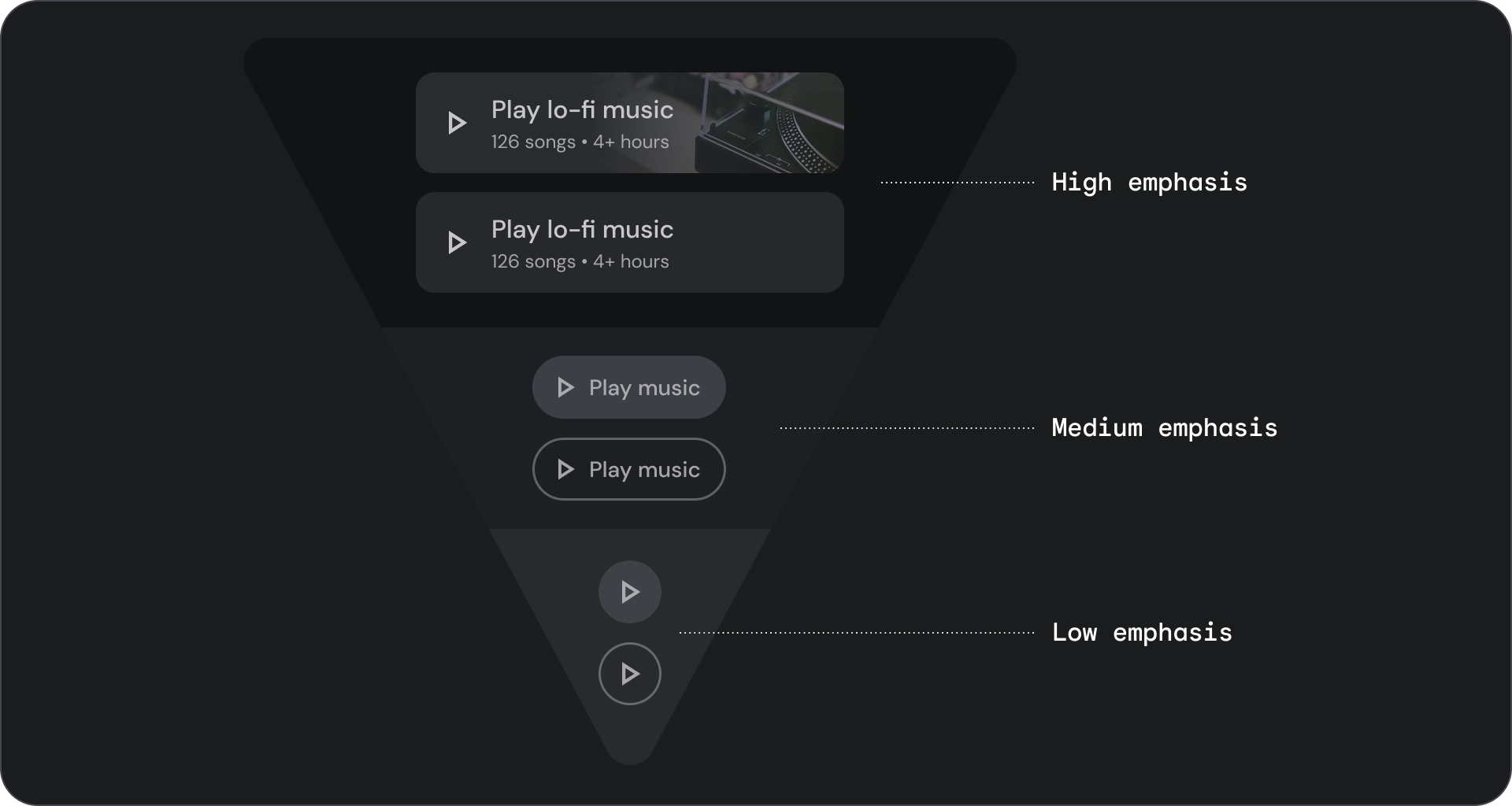
根据操作的重要性选择按钮类型。 操作越重要,其按钮应越醒目。
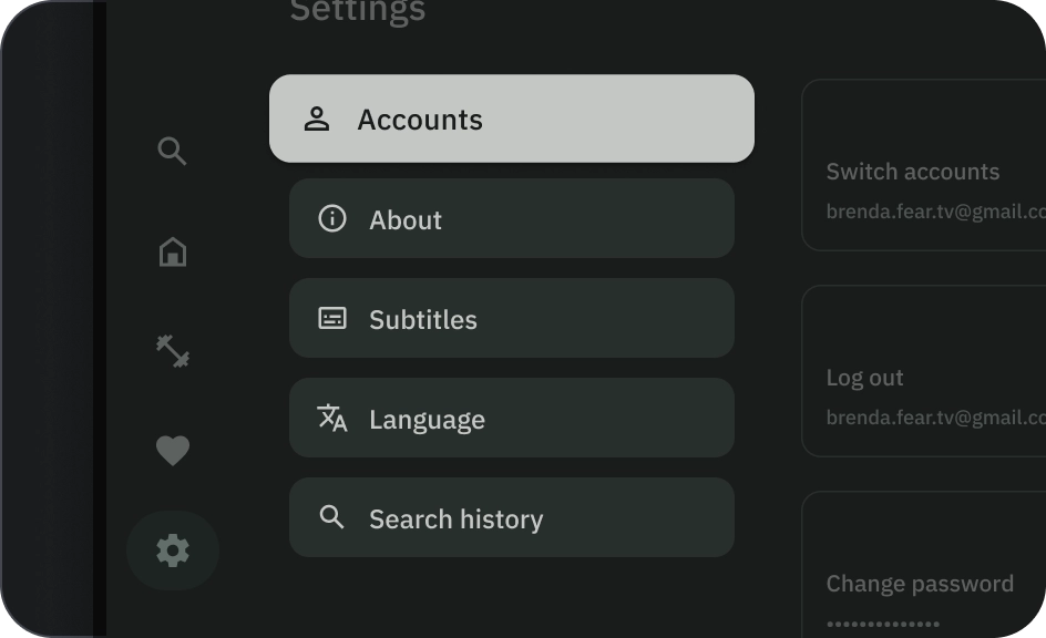
填充和轮廓按钮
填充型按钮的视觉效果最强,应用于完成流程的重要最终操作,例如“保存”“立即加入”“确认”或“下载”。
轮廓按钮是中度强调按钮。其中包含重要但不是应用中主要操作的操作。轮廓按钮与实心按钮搭配使用,可指示其他的次要操作。
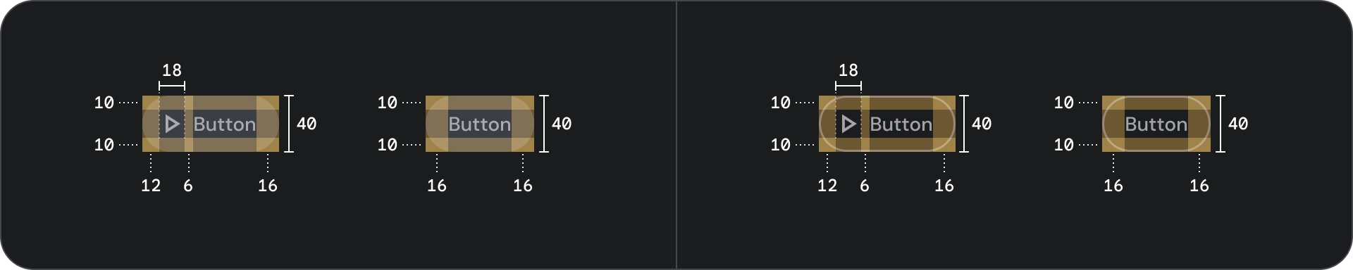
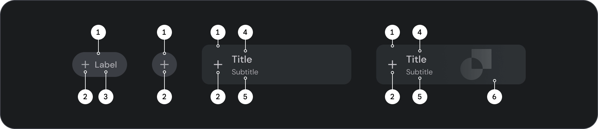
解剖学
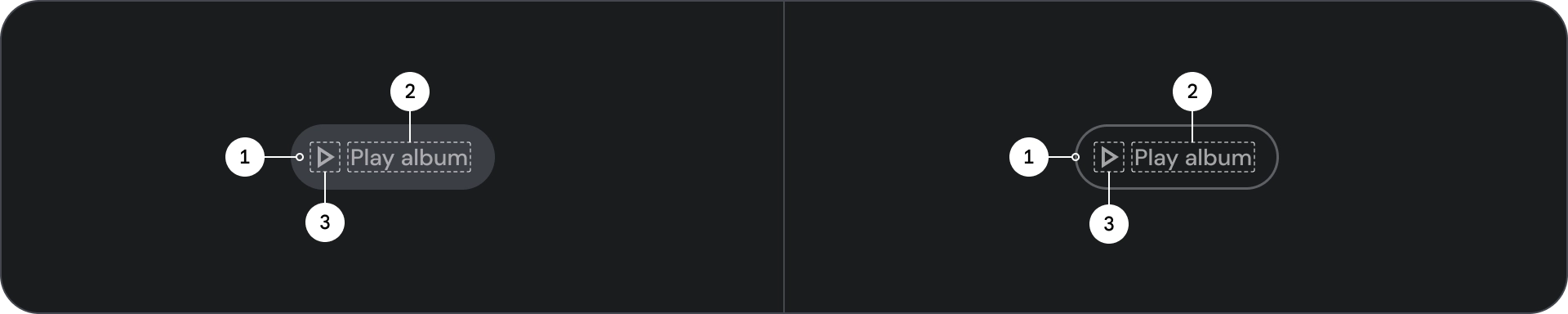
- 容器
- 标签文字
- 图标(可选)
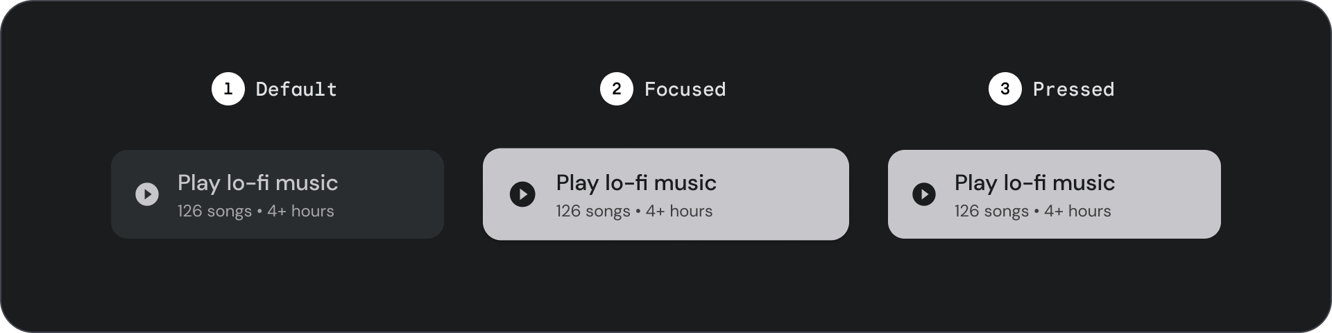
状态
以可视化方式呈现组件的状态。
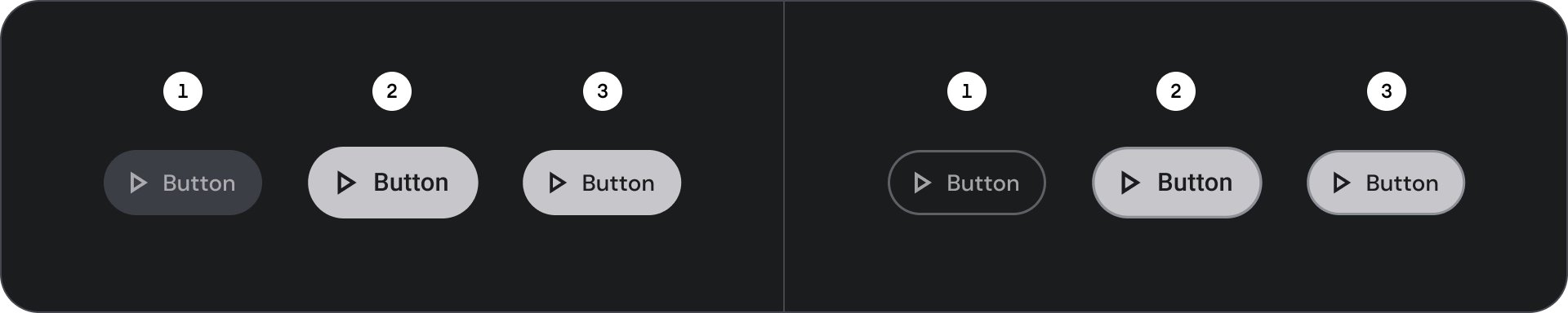
- 默认
- 专注
- 已按下
规范
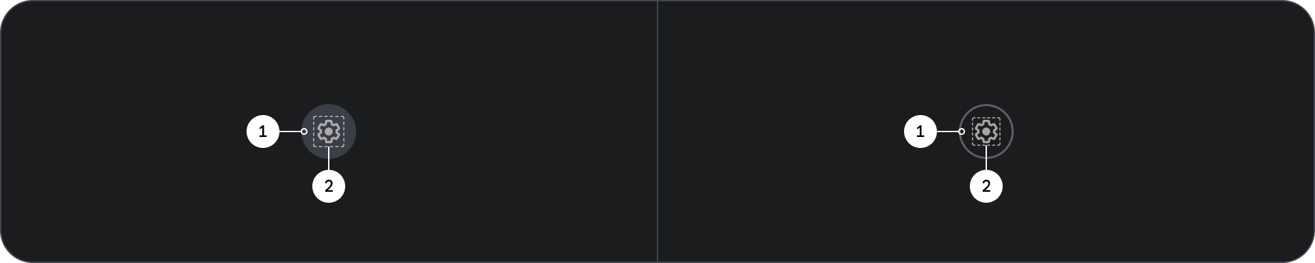
图标和轮廓图标按钮
使用图标按钮以紧凑的布局显示操作。图标按钮可以表示打开操作(例如打开菜单或搜索),也可以表示可开启和关闭的二进制操作(例如收藏或书签)。还可用于播放或暂停媒体。
图标按钮可定义为三种尺寸:小、中和大。
解剖学
- 容器
- 图标
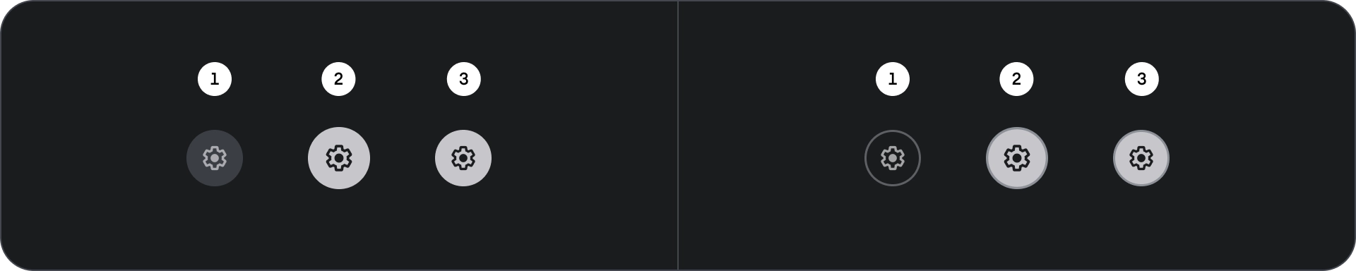
状态
- 默认
- 专注
- 已按下
状态是用于传达组件或交互元素状态的直观表示。
规格
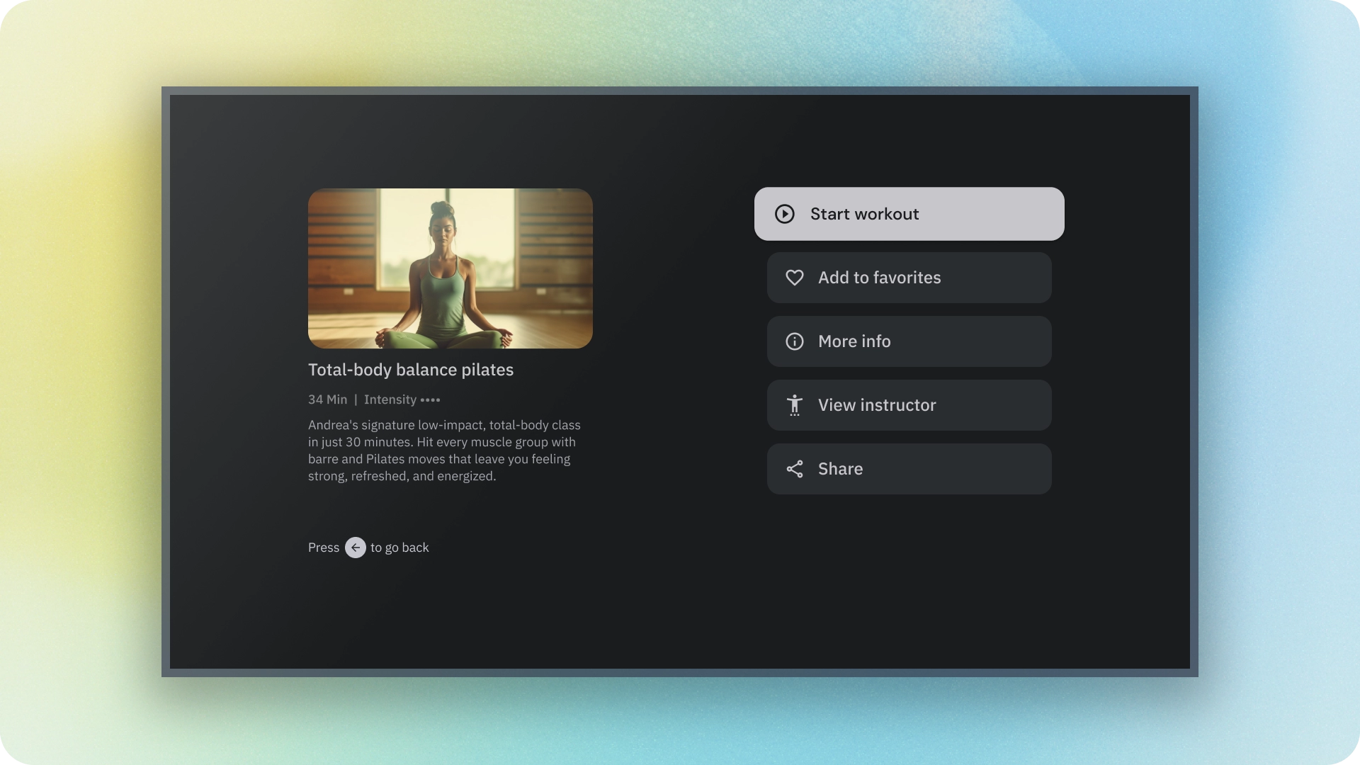
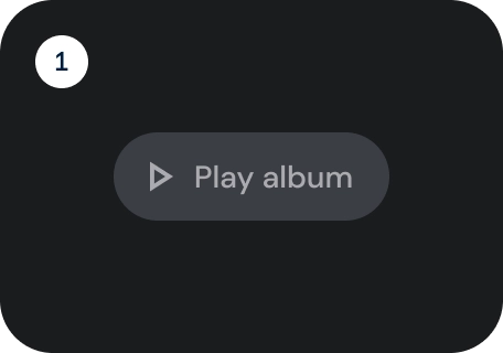
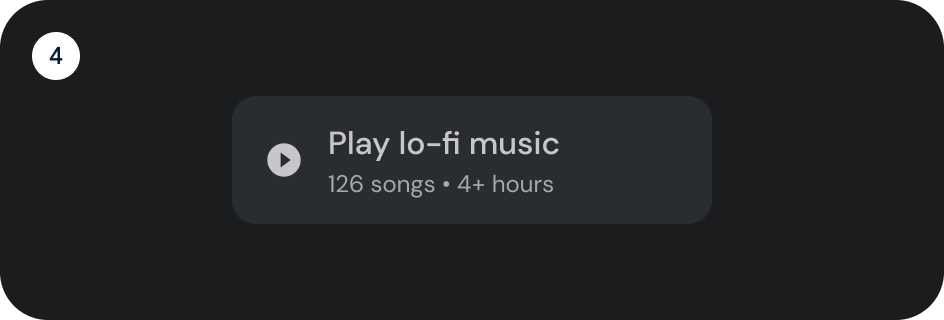
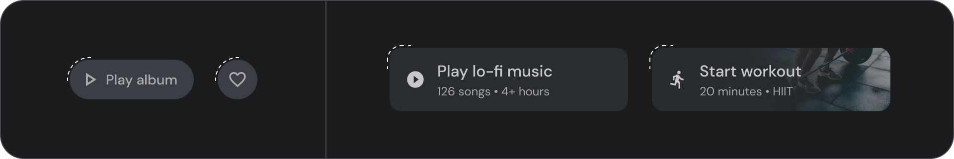
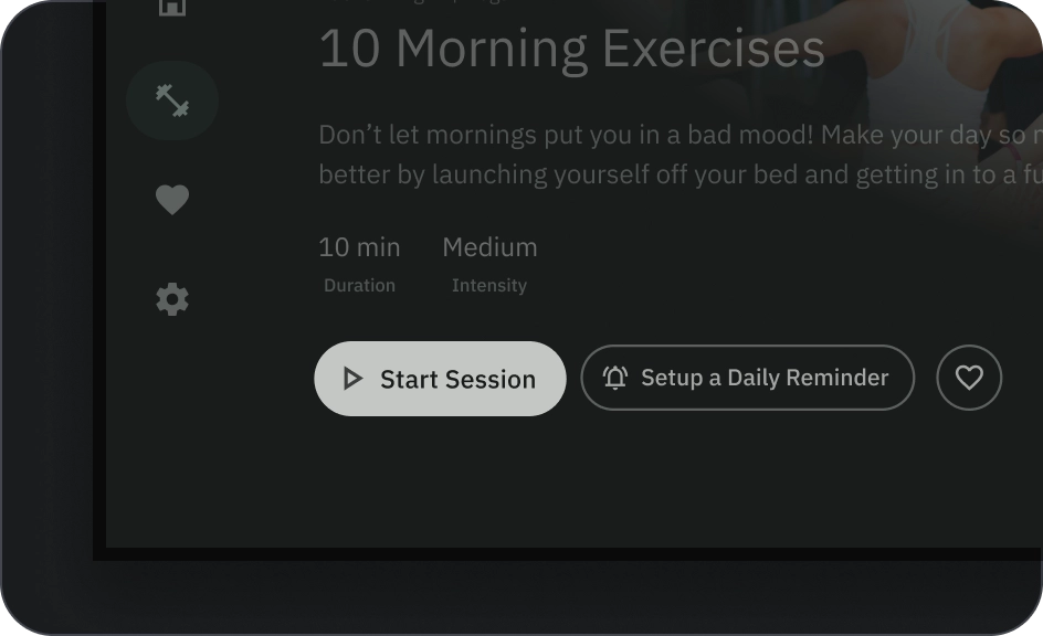
宽按钮
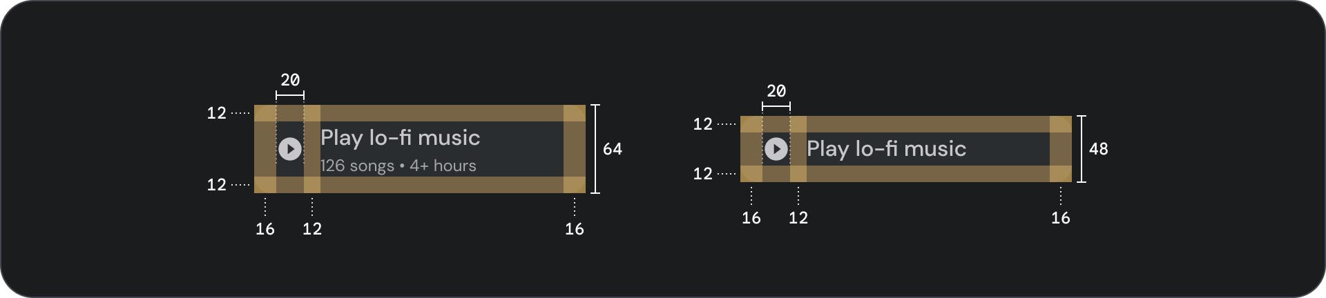
宽按钮比普通按钮更醒目。其中包含重要的操作。表示相关选项的按钮会归为一组。该组应共用一个常用 Surface。
解剖学
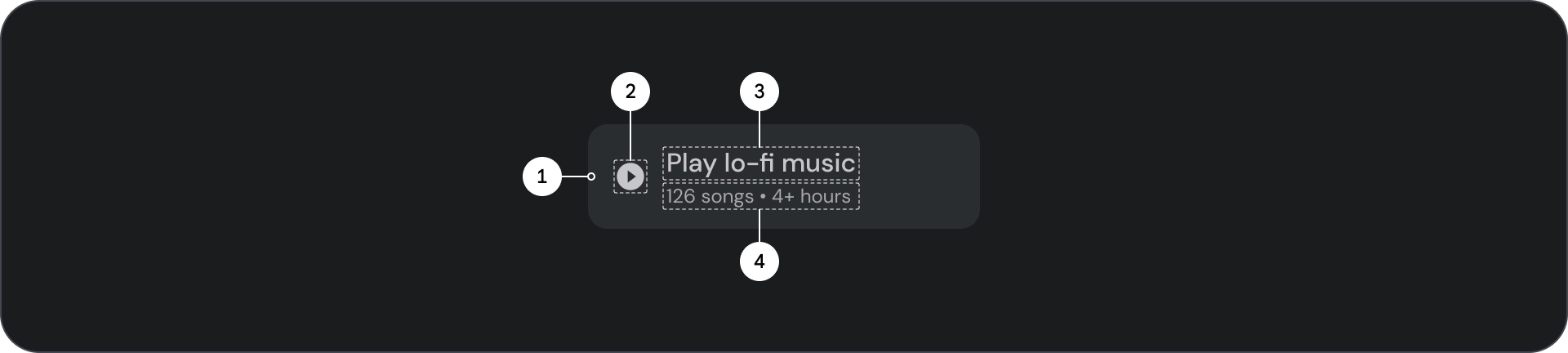
- 容器
- 前置图标
- 标题
- 副标题
状态
- 默认
- 专注
- 已按下
状态是用于传达组件或交互元素状态的直观表示。
规范
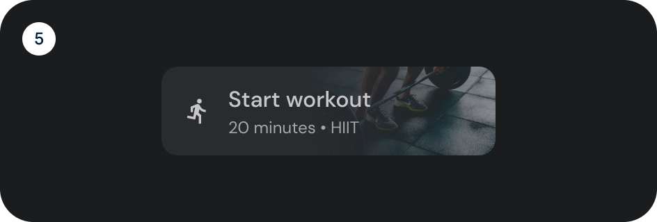
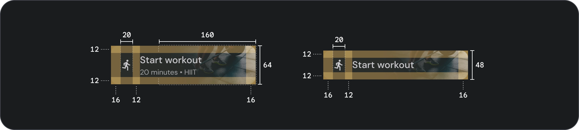
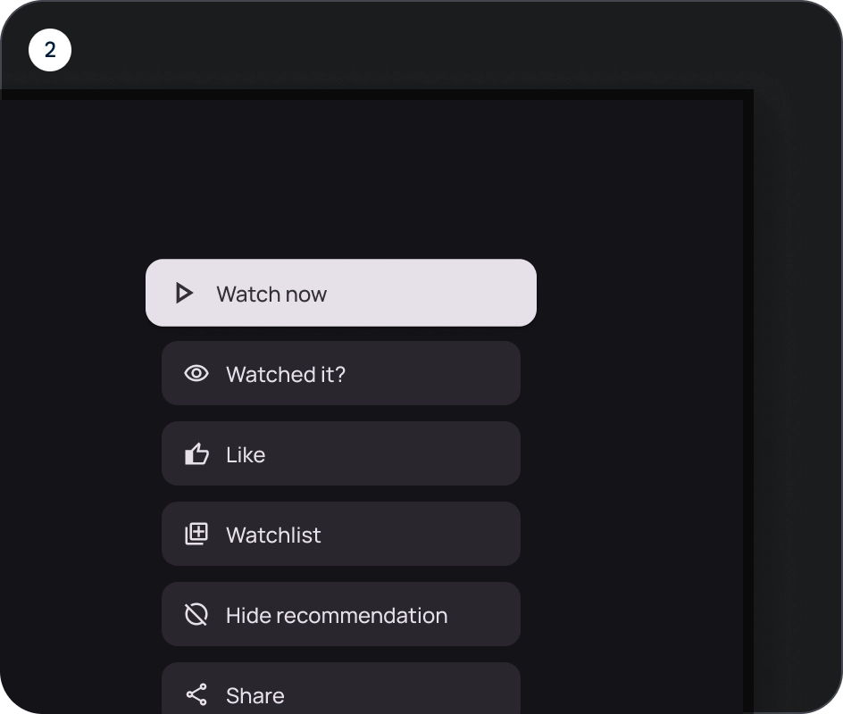
图片按钮
图片按钮通常用于显示下一级导航中可用内容的缩略图。它们通常与相关操作一起分组,并且该组应共用一个常用界面。
解剖学
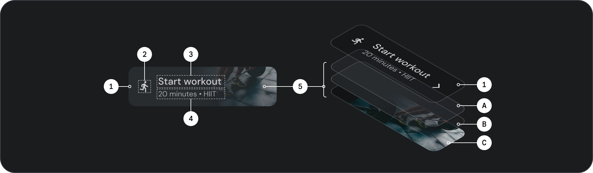
- 容器
- 前置图标
- 标题
- 副标题
- 图片层,由以下内容组成:
- 纱罩(状态叠加层)
- 渐变(基于 Surface 颜色)
- 图片
状态
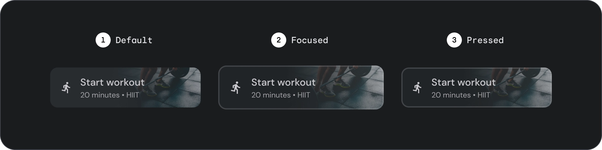
- 默认
- 专注
- 已按下
状态是用于传达组件或交互元素状态的直观表示。
规格
用法
按钮通常用于传达用户可以执行的操作。它们通常出现在对话框、模态窗口、表单、卡片和工具栏等界面元素中。
按钮只是在界面中表示操作的一种方式。请勿过度使用这些功能。屏幕上的按钮过多会破坏视觉层次结构。
- 容器
- 图标
- 标签文字
- 标题
- 副标题
- 图片
容器
按钮会在内容周围显示一个容器。容器在聚焦时会放大 1.1 倍,同时保持内部内边距。以下是一些与容器相关的注意事项:
- 根据内容设置容器宽度,并使用一致的内边距。
- 设置容器相对于自适应布局网格的相对位置。
- 为填充的按钮使用纯色容器。
- 为轮廓按钮使用聚焦时的描边和填充颜色。获得焦点后,容器会获得填充颜色和轮廓。
- 对于宽按钮和图片按钮,容器宽度会根据布局网格进行设置。
- 容器的大小、位置和对齐方式可能会随着其父级容器的缩放而发生变化。
文本和图标按钮容器采用完全圆角设计。宽按钮和图片按钮容器的圆角容器为 12dp。

正确做法

注意
图标
图标可直观地传达按钮的操作,并有助于吸引注意力。 它们应位于按钮的前端。图标始终在容器内垂直居中。
正确做法
错误做法
注意
标签文字
标签文本是按钮最重要的元素。它描述了用户点按按钮时发生的操作。
对按钮标签文本采用句首字母大写格式,首字母和专有名词应大写。避免换行。为确保标签文本清晰易读,请将其保持在一行。

正确做法

注意
图片
图片按钮始终在背景图片上方显示渐变叠加层和半透明层。渐变叠加层会根据容器颜色进行设置。 scrim 会根据状态而变化。
按钮组
按钮会在同一行或列中一起显示,以便在操作之间保持一致的导航。以下部分介绍了注意事项。
信息层次结构
每个界面都应有一个主要操作,该操作由一个醒目的按钮(通常是宽按钮)表示。按钮应更易于查看和理解。 其他按钮应不那么醒目,也不应分散用户对主要操作的注意力。
由于焦点会先落在该组中的第一个按钮上,因此该按钮会用作主要操作。
保持线性布局

- 行布局
- 列布局
合理使用变体
在列布局中,应保留单个按钮变体。在行布局中,不同的款式/规格可以按按钮组的形式归为一类,但逻辑应清晰明了。填充和轮廓按钮可以在同一组中使用,但请确保操作层次结构清晰。

正确做法
错误做法
注意
