
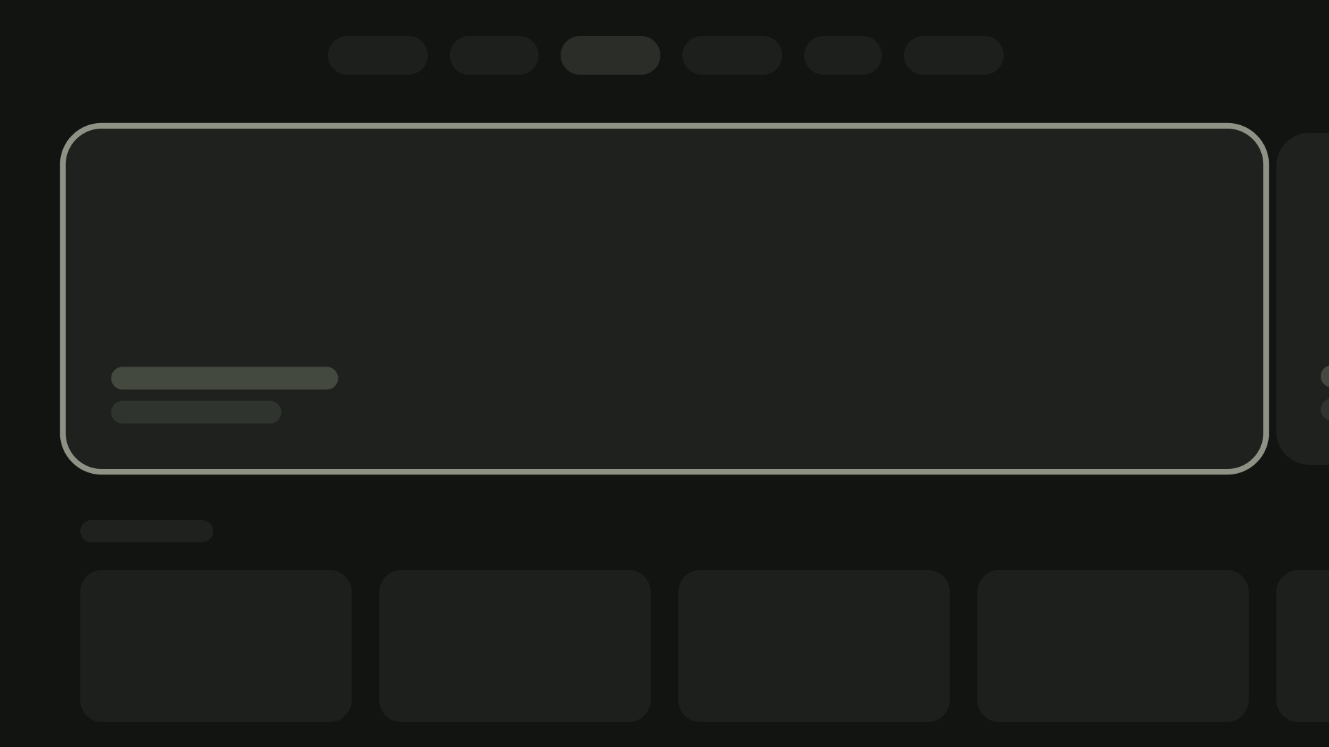
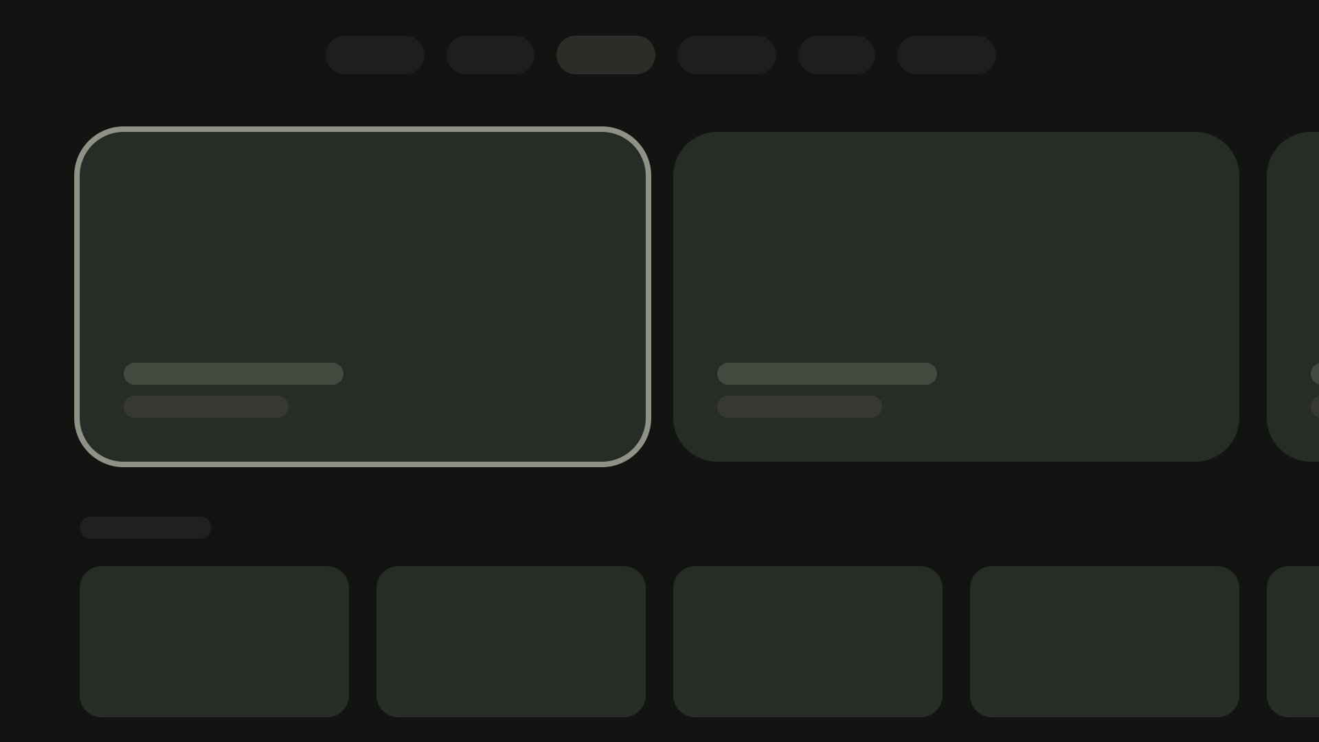
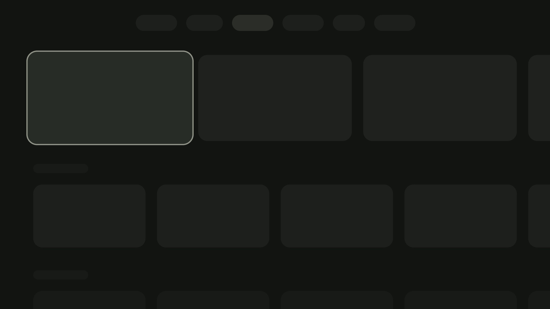
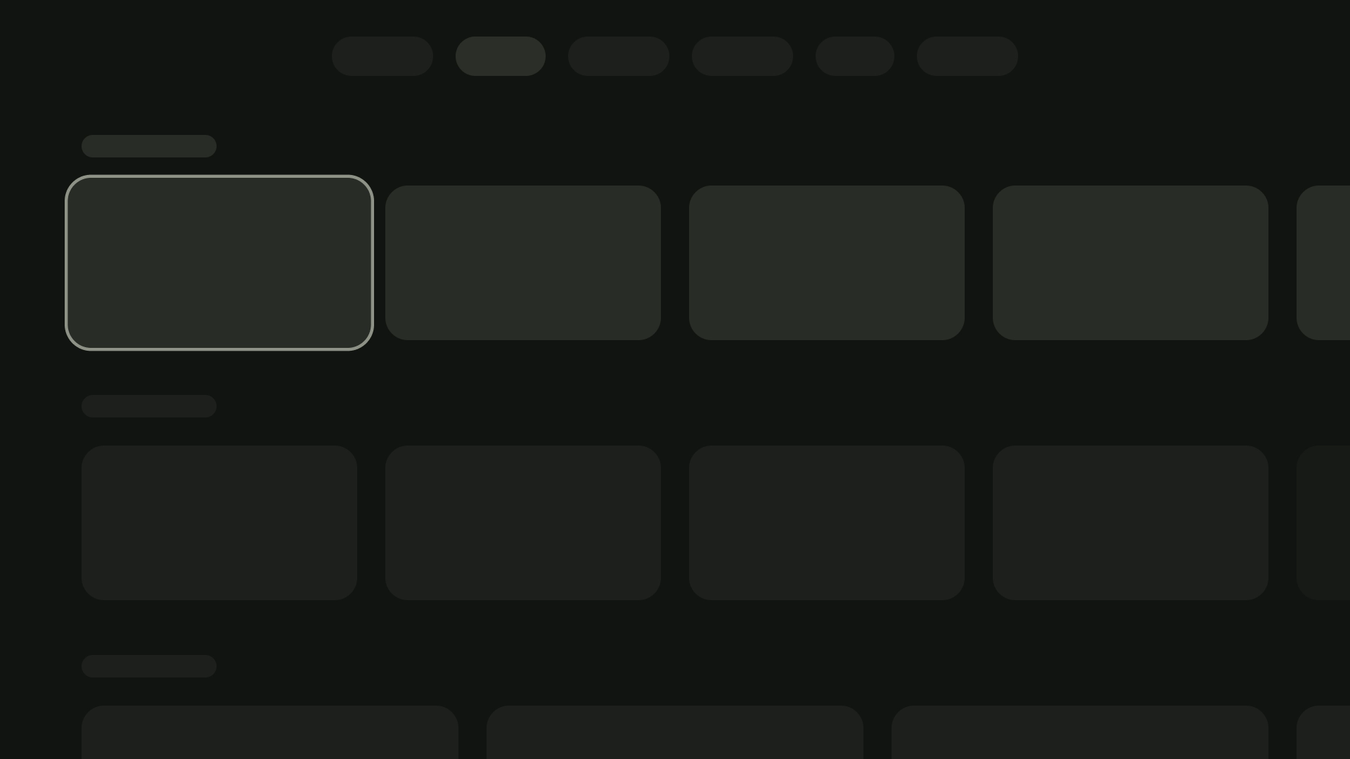
卡片是 TV 应用的基本构建块。
资源
| 类型 | 关联 | 状态 |
|---|---|---|
| 设计 | 设计源代码 (Figma) | 可用 |
| 实现 | Jetpack Compose | 可用 |
亮点
- 使用卡片可显示有关单个主题的内容。
- 卡片可以包含从图片到标题的所有内容,并且可以支持文本、按钮、列表和其他界面元素。
- 一张卡片不能与另一张卡片合并,也不能拆分为多张卡片。
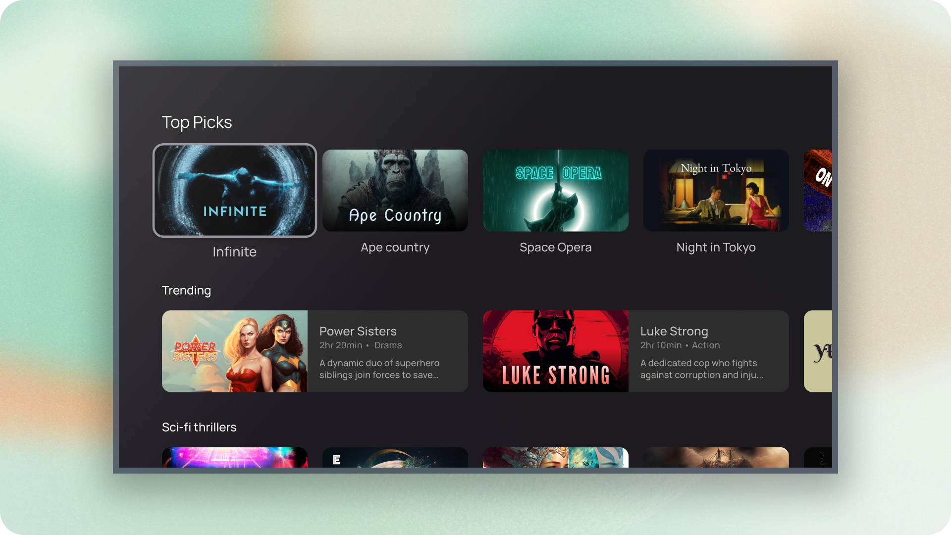
- 卡片有六种变体:标准、经典、紧凑、边衬区、宽标准和经典宽幅。
变体
卡片有五种类型,每种类型的使用场景各不相同:
- 标准
- 传统
- 较小
- 宽标准
- 宽幅经典
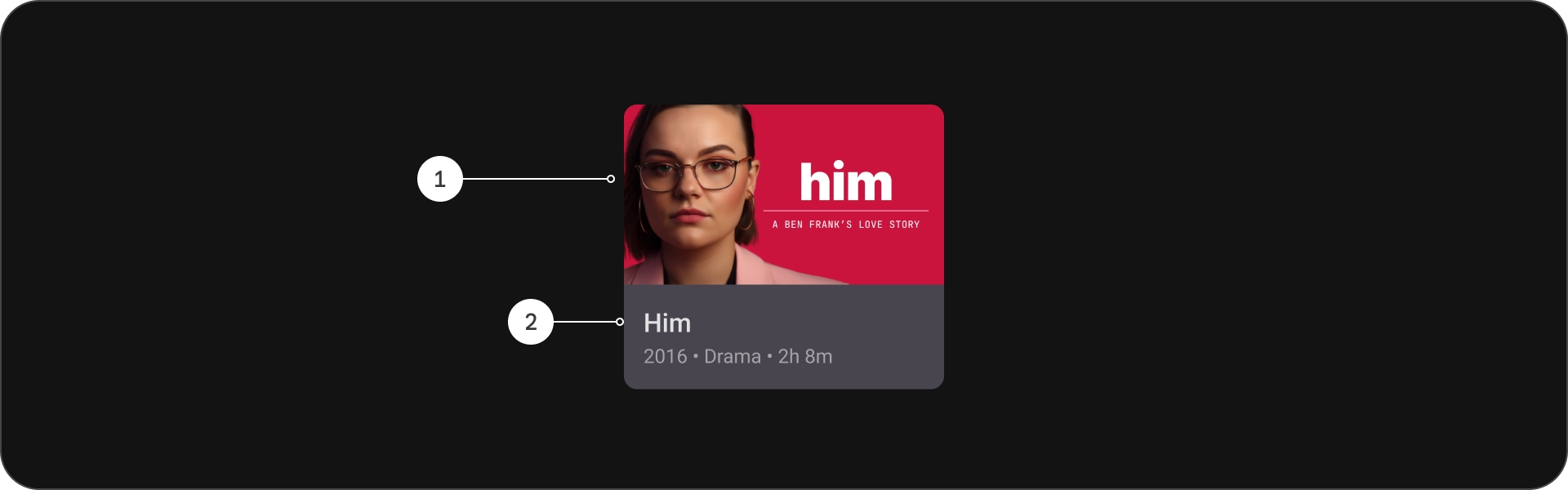
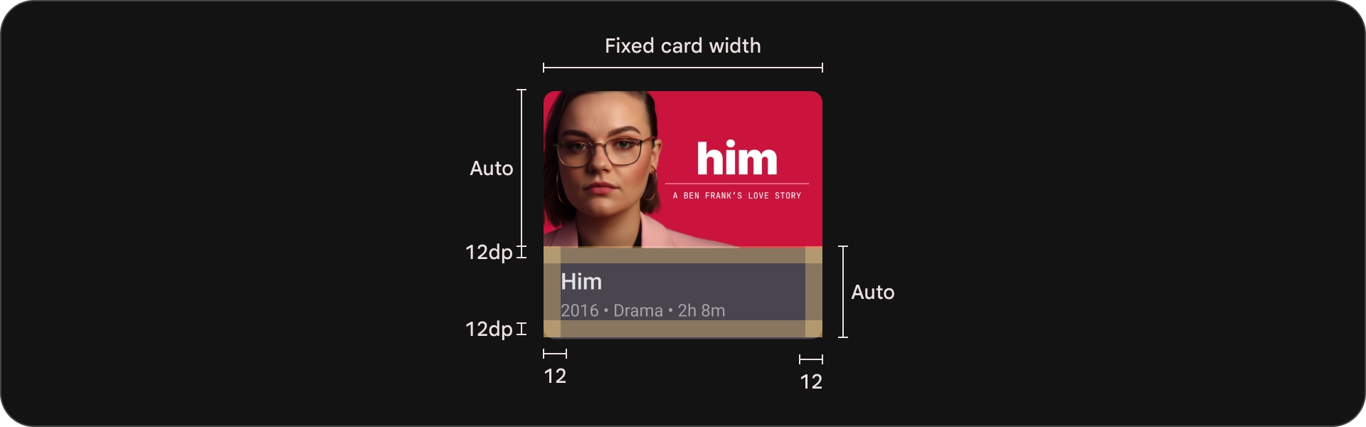
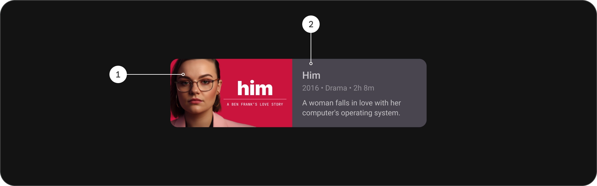
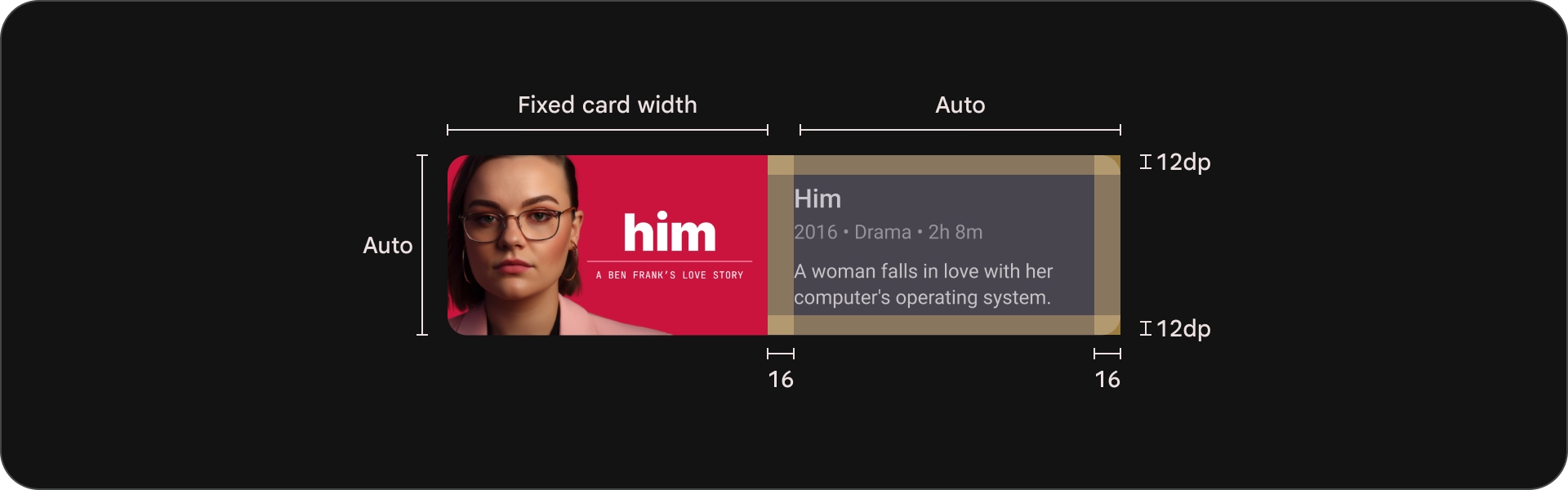
内容块
卡牌的内容会排列成不同的块。卡片视觉设计(包括强调效果)代表了层次结构。卡片本身的布局可调整卡片包含的内容类型。
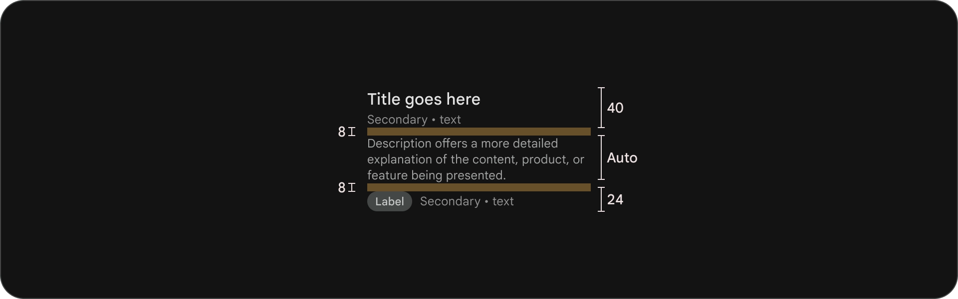
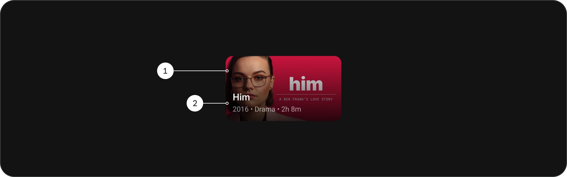
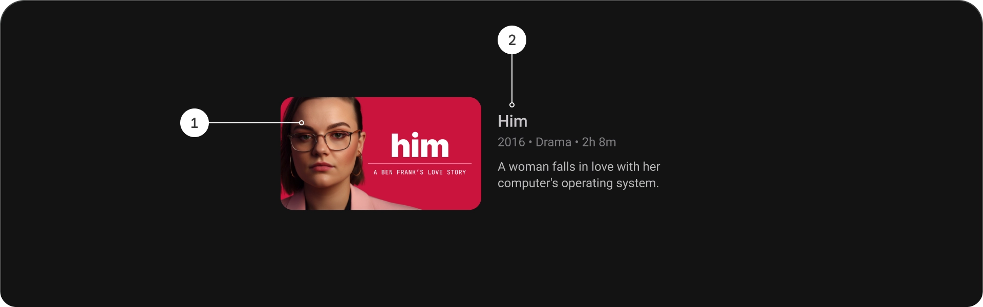
解剖学
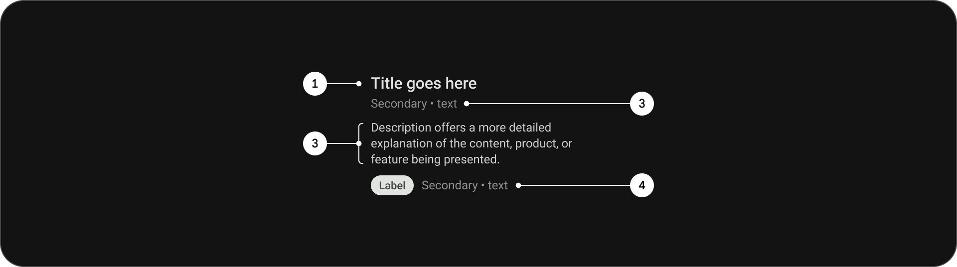
- 标题
- 副标题
- 说明
- 附加文本
规格
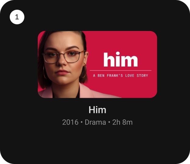
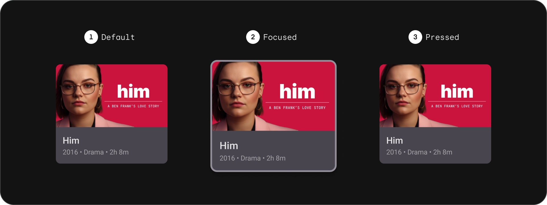
标准卡
解剖学
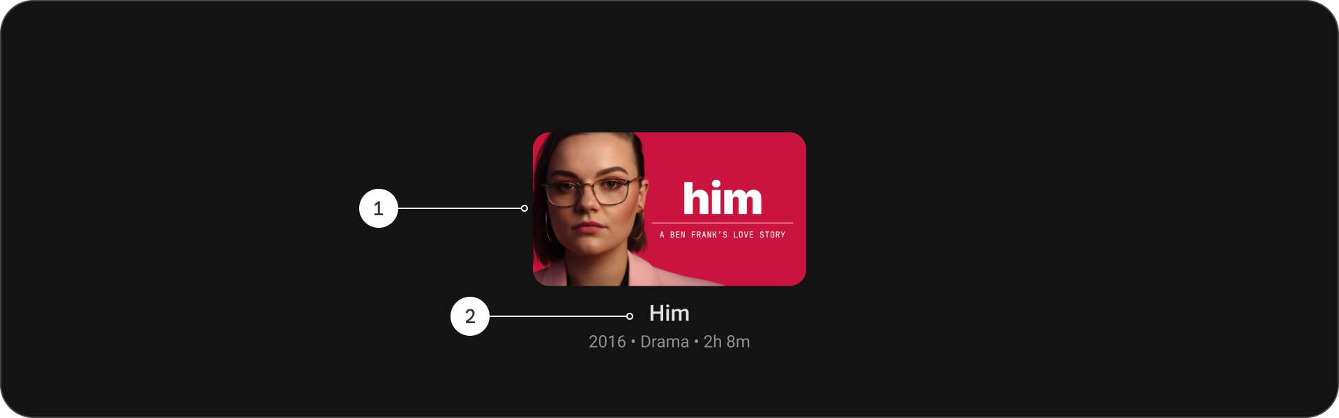
- 图片
- 内容块
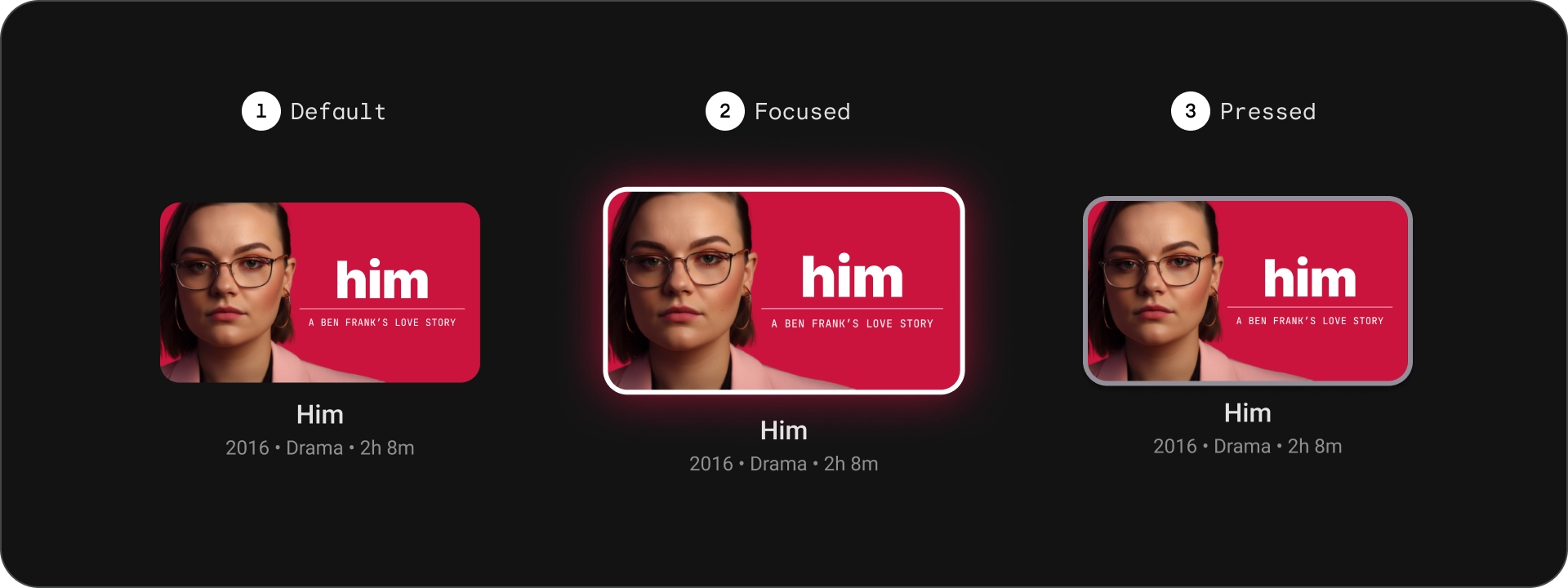
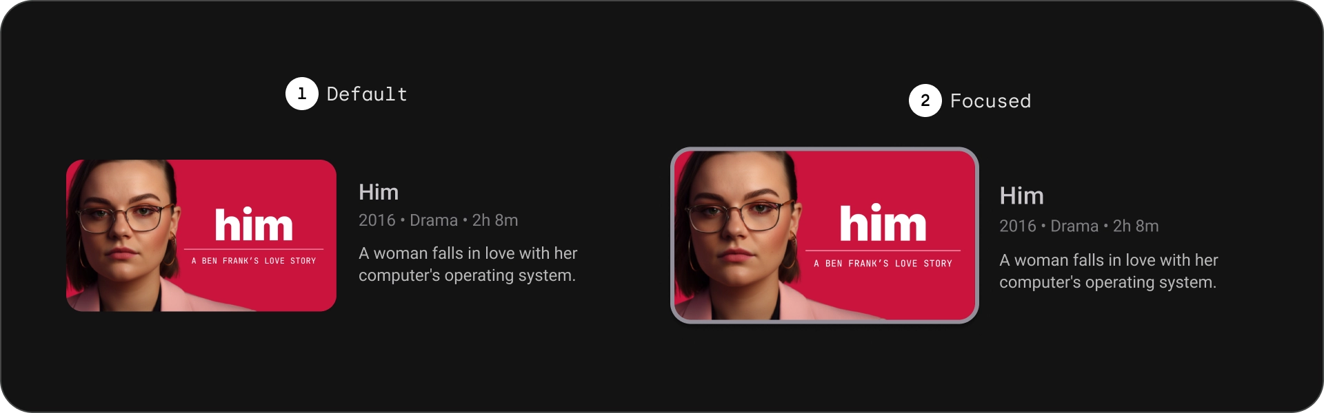
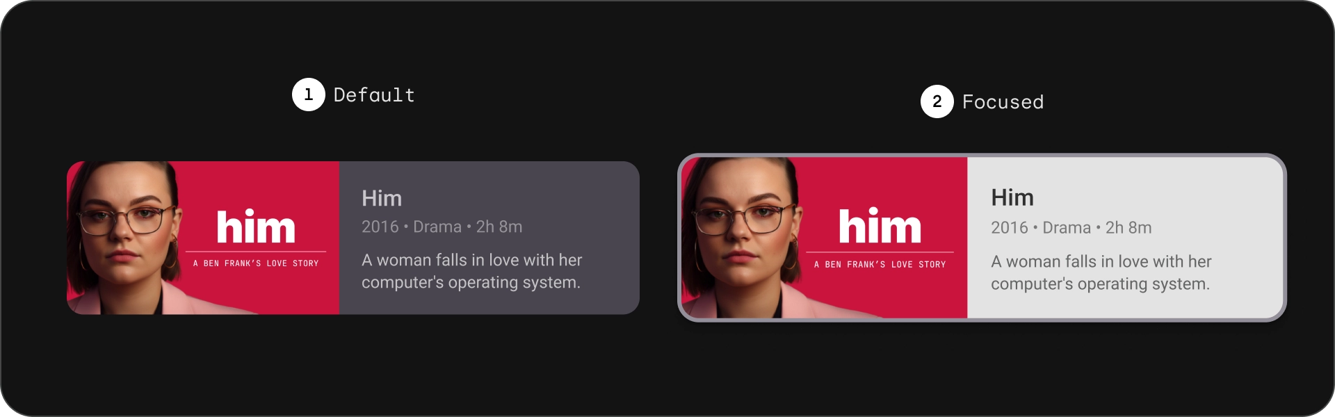
状态
规格
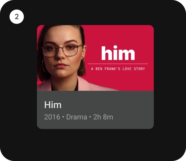
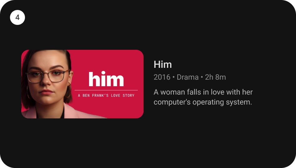
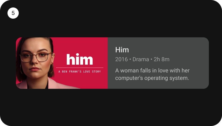
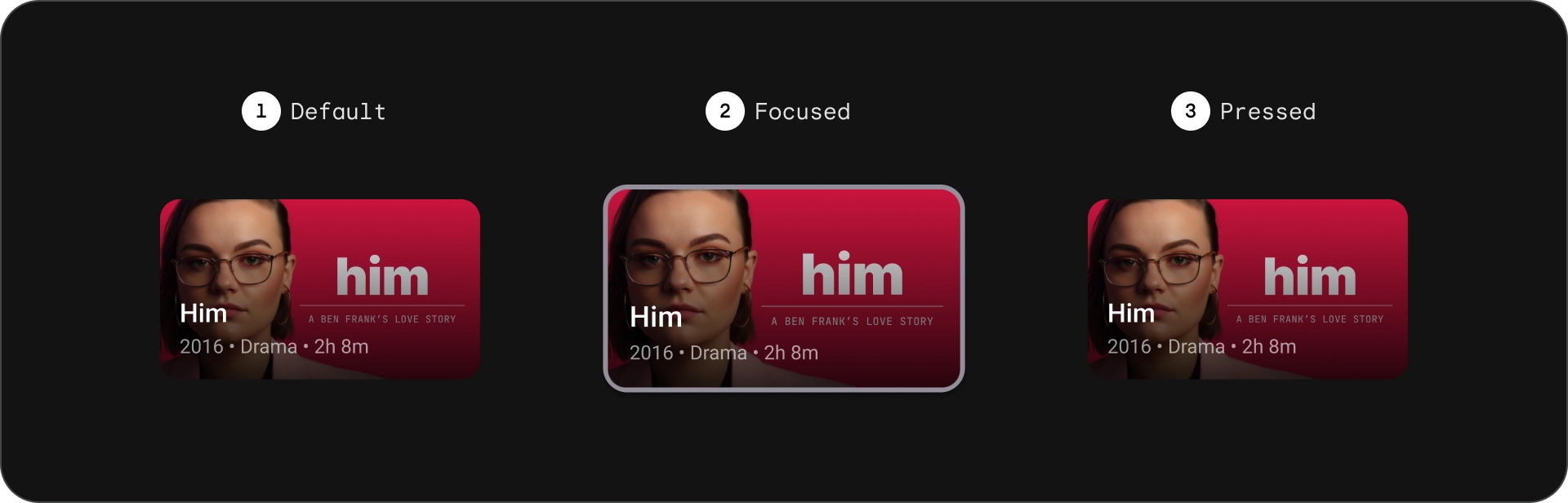
经典卡
解剖学
- 图片
- 内容块
状态
规格
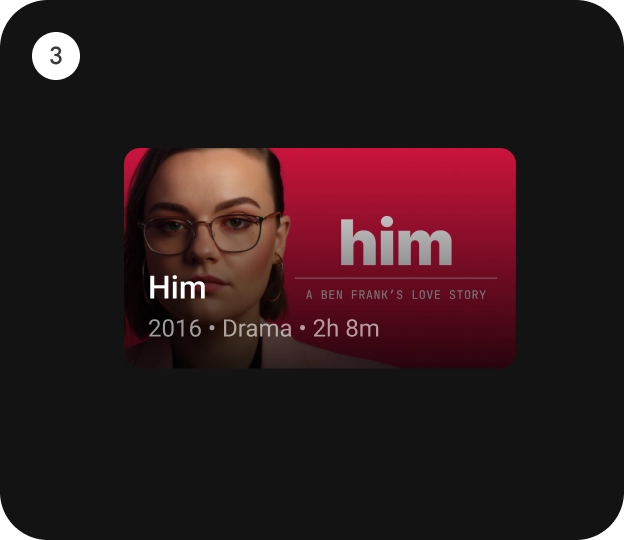
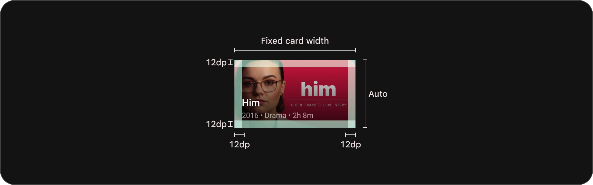
紧凑型卡片
解剖学
- 图片
- 内容块
状态
规格
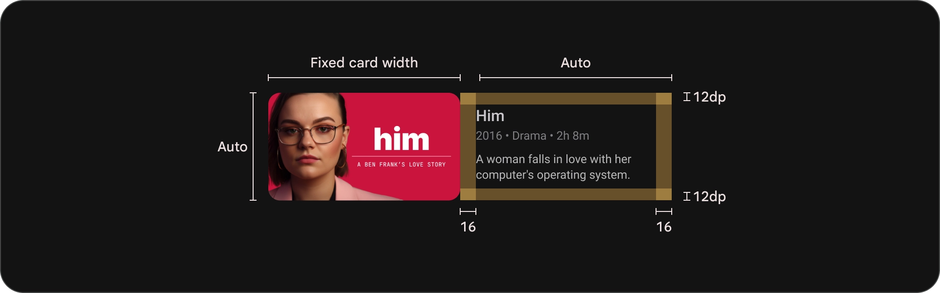
宽幅标准卡
解剖学
- 图片
- 内容块
状态
规格
宽幅传统卡
解剖学
- 图片
- 内容块
状态
规格
用法
卡片是一种多功能设计元素,可用于以具有视觉吸引力且人性化的方式显示各种内容。以下部分探讨了卡片设计注意事项。
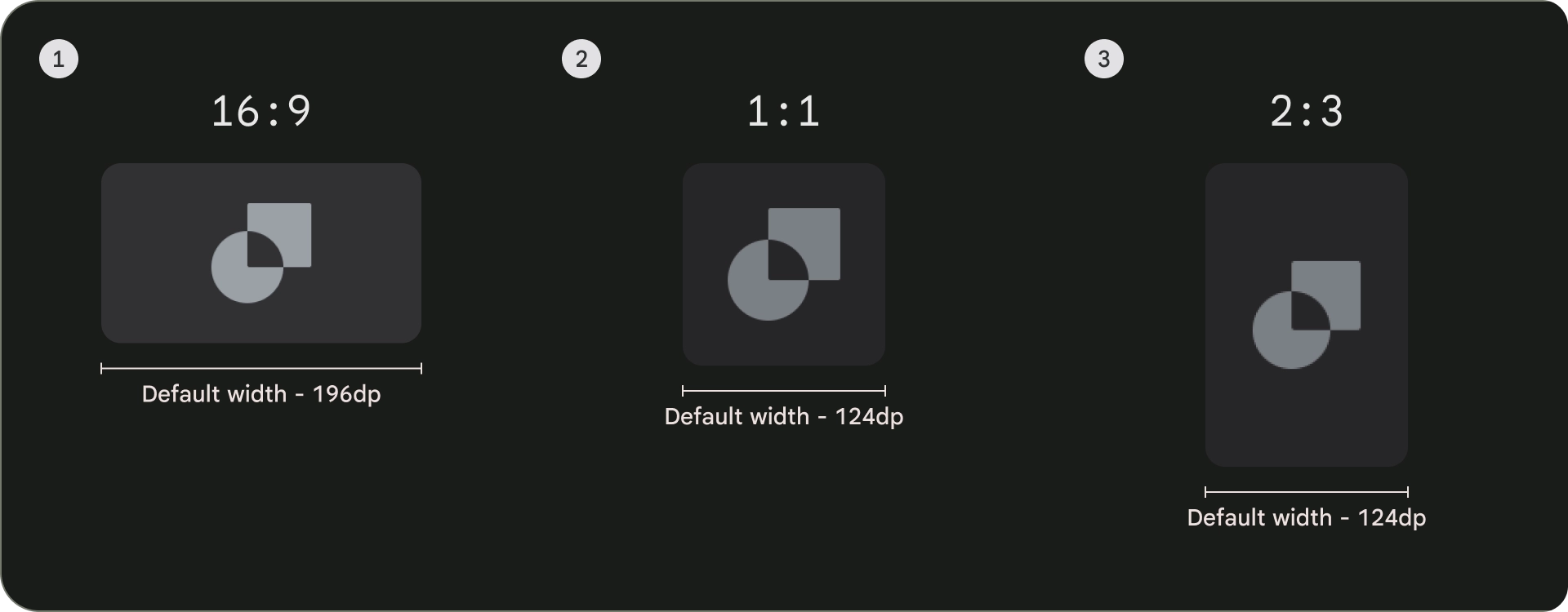
宽高比
卡片有三种常见的宽高比:16:9、1:1 和 2:3。 每种宽高比都有自己的优势,因此您的最佳选择取决于您的具体需求。
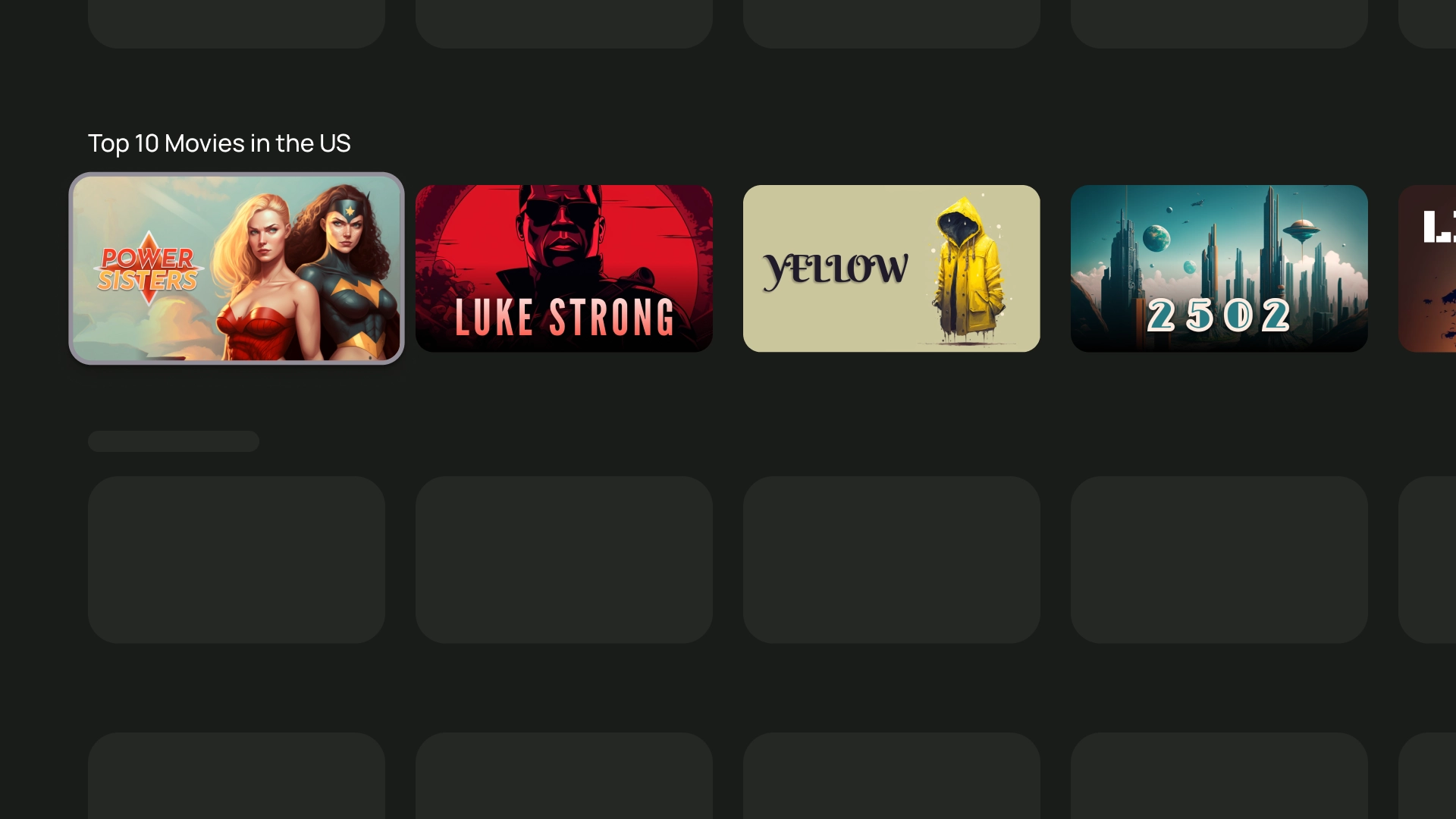
- 16:9 是卡片最常用的宽高比。它具有宽高的宽高比,非常适合显示图片和视频。
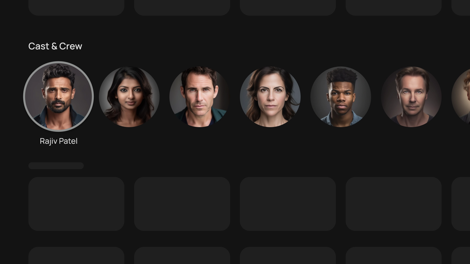
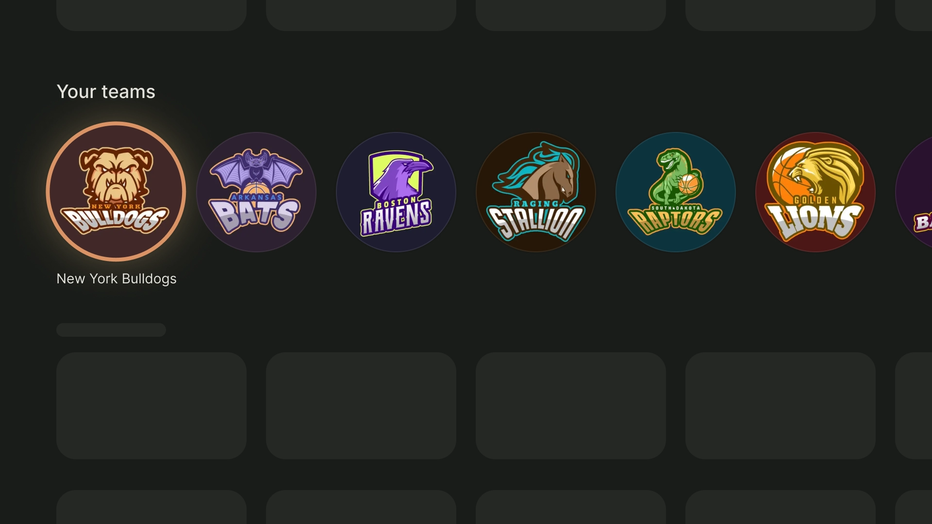
- 1:1 表示方形宽高比。它非常适合需要保持视觉平衡的卡片(例如演职人员、频道徽标或团队徽标)。
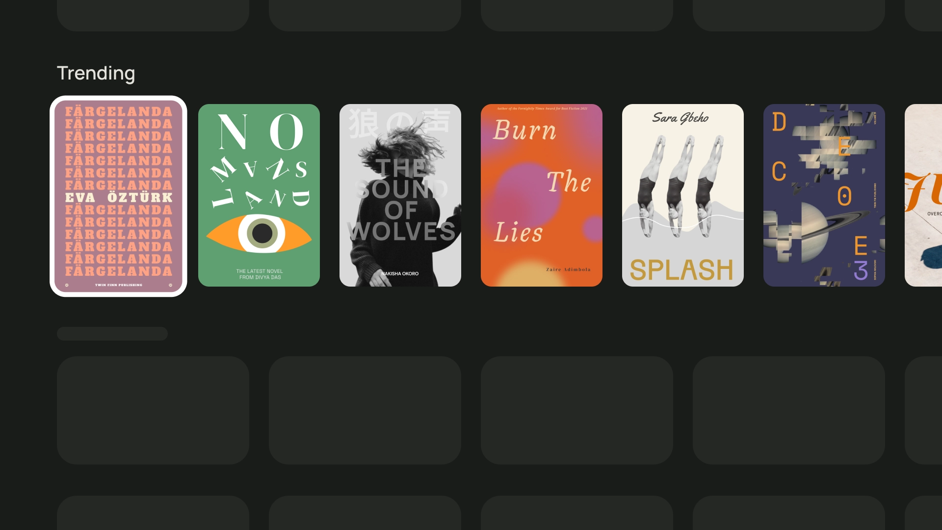
- 2:3 表示宽高比较高。如果您想拆分网格并加以强调,那么这是一个不错的选择。
归根结底,为卡片选择宽高比的最佳方式是尝试使用不同的选项,看看哪一种效果最好。
以下是不同宽高比的一些用法示例
1:1
演职人员
运动队徽标
2:3
热门图书
16:9
电影卡片
布局和间距
通过实现间隔为 20 dp 的适当峰值,可以根据屏幕上显示的卡片数量改变卡片宽度。
单张卡片布局
卡片的宽度 - 844dp
双卡片布局
卡片的宽度 - 412dp
三张卡片布局
卡片的宽度 - 268dp
四张卡片布局
卡片的宽度 - 196dp
5 张卡片布局
卡片的宽度 - 124dp
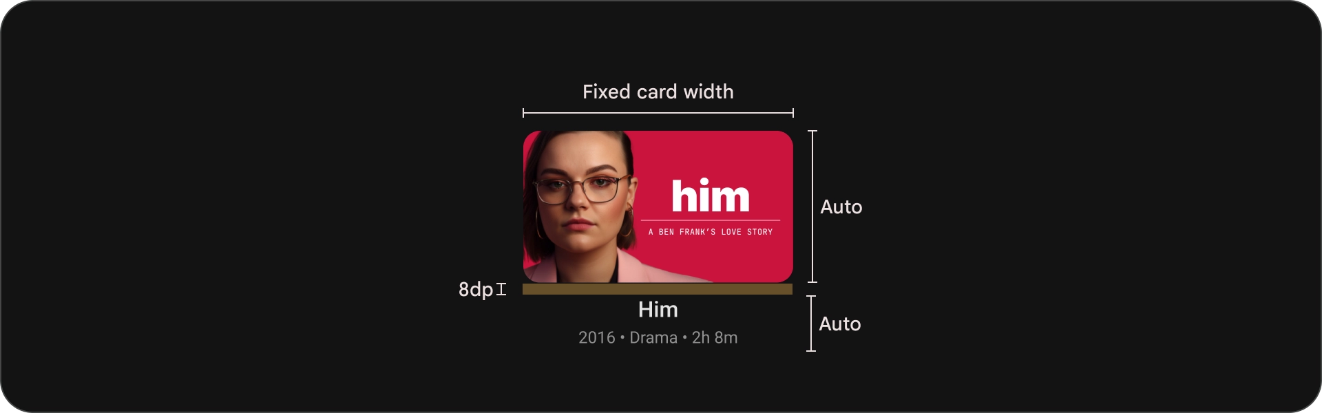
内容块
卡片中的内容块的宽度应与图片缩略图的宽度相同。如果您需要在内容块中显示更多文本,请使用较宽的卡片变体。
正确做法
使用宽卡片来显示简短的广告内容描述,但仅限于在绝对必要的情况下。说明的长度应仅为几个字。

错误做法
避免在纵向堆叠的卡片上添加冗长的说明。
紧凑型卡片
紧凑卡片应简洁明了、更易于阅读。背景图片之前的内容应简明扼要。避免使用过长的标题、副标题或说明。这样做可以让卡片看起来更吸引人,也更便于浏览。
为了提高图片上的文本可读性,请添加半透明的黑色渐变叠加层。这会调暗背景,但又不会过多遮住图片,使文字更易于查看。

正确做法
在图片背景上使用纱罩的紧凑卡。
错误做法
请勿使用在背景图片上方使用无纱罩的紧凑型卡片。