列表
使用集合让一切井井有条
根据您的偏好保存内容并对其进行分类。
列表是对一个或多个相关项的直观表示。它们通常用于显示一组选项。

资源
亮点
- 列表是文本或图片的连续集合。
- 列表应给人以自然的感觉,并且易于浏览。
- 列表由包含主要操作和补充操作(以图标和文本表示)的项组成。
变体
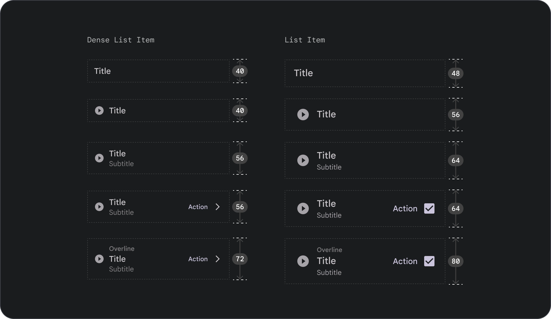
列表有三种类型:单行列表、双行列表和三行列表。

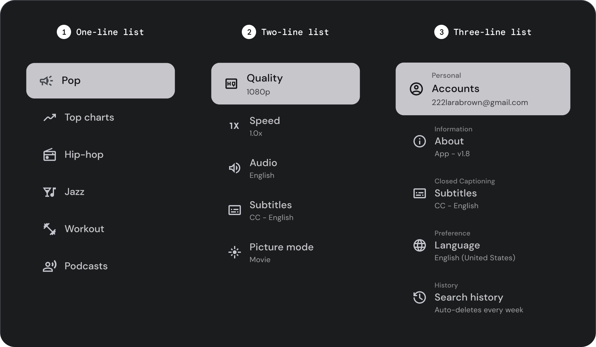
- 单行列表:使用单行来传达每个项。这种简单的设计可确保每项内容都与其他内容明显区分开来。
- 两行列表:使用两条平行线来传达每项内容。这种结构化设计可确保自然易读,并避免认知过载。
- 三线列表:使用三条平行线来表示每项内容。这种装饰设计可营造出极高的视觉醒目度。
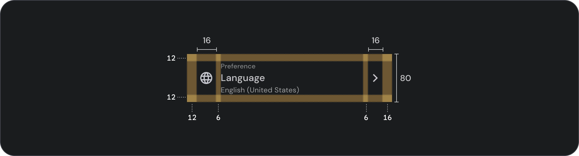
解剖学

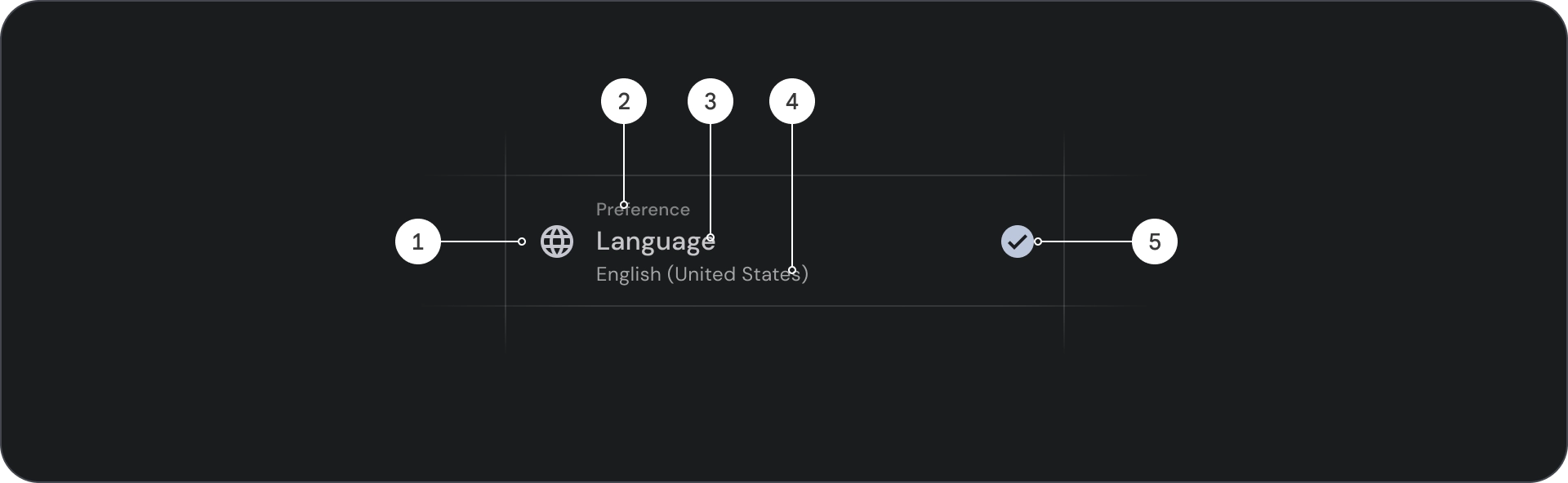
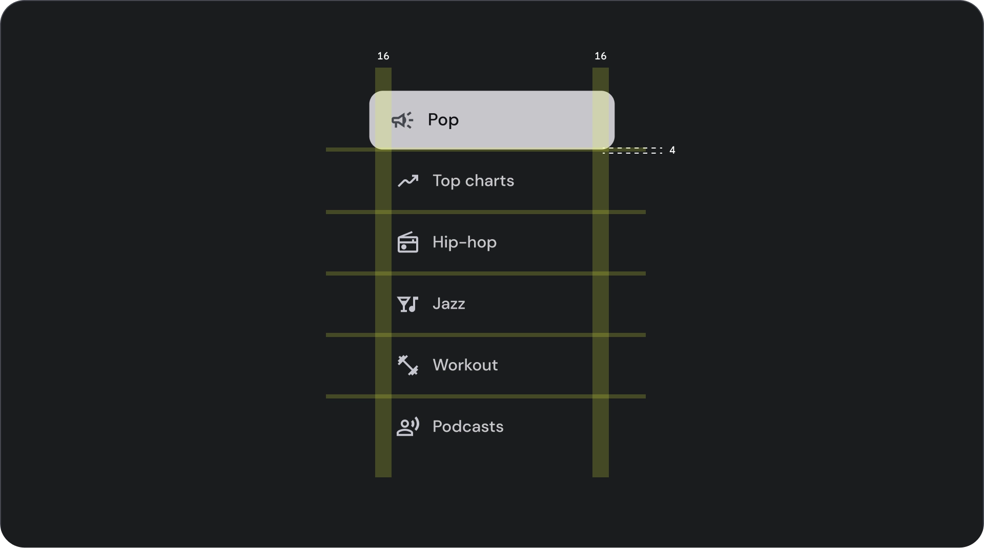
- 图标:表示特定对象或操作的小图形,通常用于直观地传达想法或概念。
- 上线:显示在标题或副标题上方的短文本行,通常用于提供更多背景信息或强调内容。
- 标题:大号粗体文本,用作设计元素或网页的主要标题。
- 副标题:在主标题下方提供额外信息或背景信息的一行较小文本。
- 控件:一种交互元素,可让用户输入决策。
状态

规格


用法
列表是垂直排列的文本和图片组。列表由单个连续的项列组成,专为提高阅读理解能力而优化。列表项可以包含由图标和文本表示的主要操作和补充操作。
check_circle
正确做法
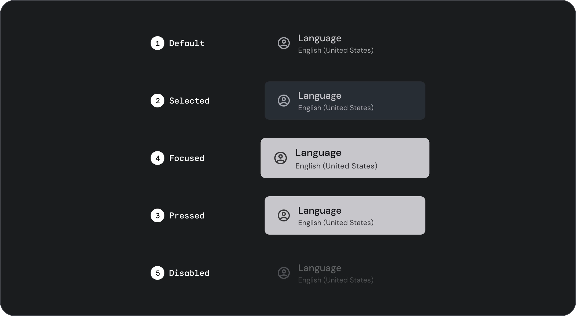
列表项不是按钮。这些项没有容器。默认情况下,列表项处于未选中和未聚焦状态。
warning
注意
仅在必要时为列表项使用容器背景。
选择控件
控件用于显示列表项的信息和操作。它们可以与列表项的前端或后端对齐。
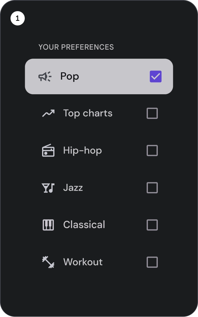
- 复选框:选择一个或多个列表项。
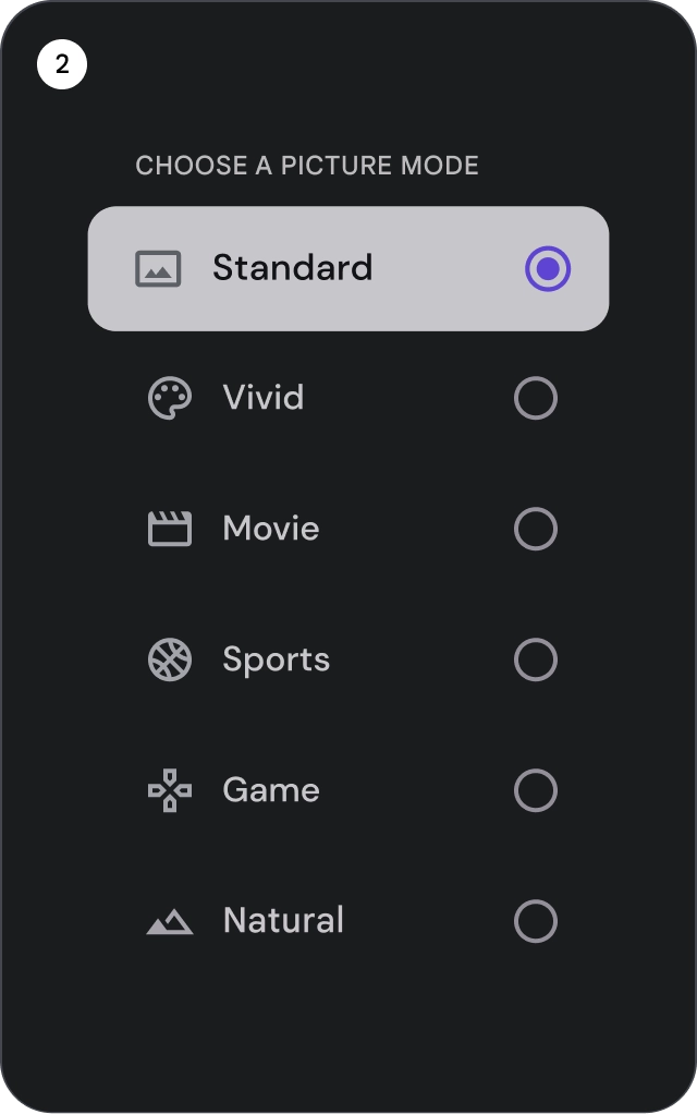
- 单选按钮:从列表中选择一个且仅选择一个项。
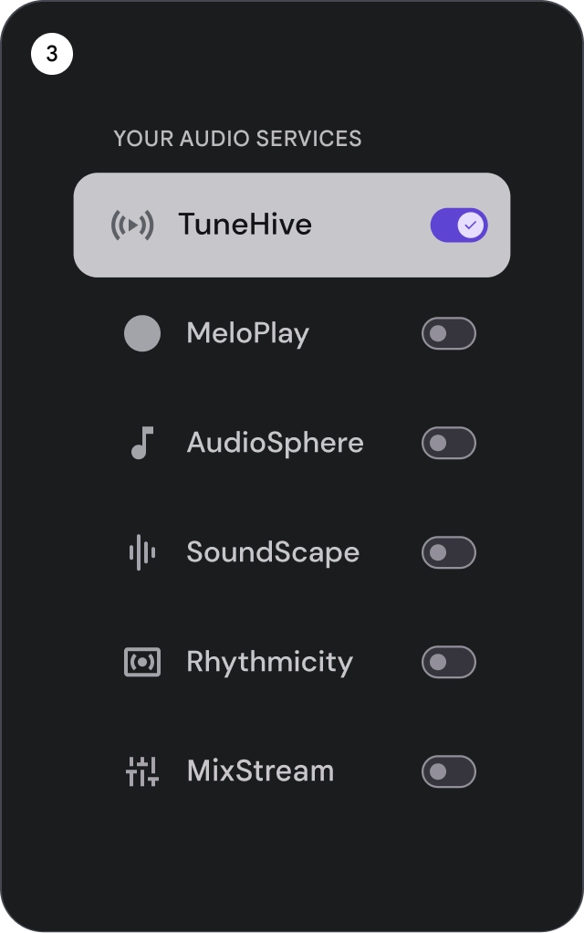
- 开关:开启或关闭控件。
check_circle
正确做法
使用图标选择指示器清晰显示列表中的所选项。这有助于用户轻松识别自己选择的项目,并改善整体用户体验。
cancel
错误做法
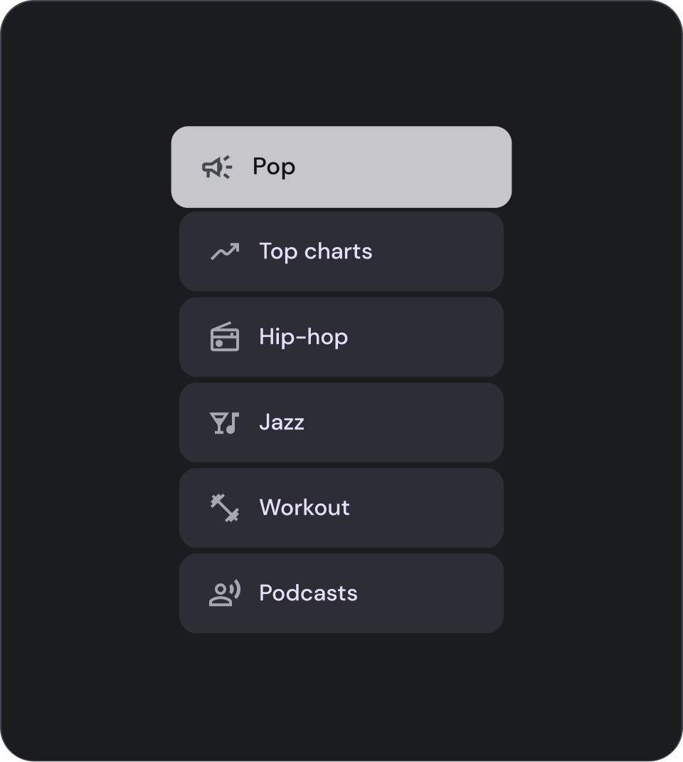
避免仅依靠背景颜色来指示列表中的选中项。
cancel
错误做法
避免在列表项中放置按钮,因为这可能会导致用户混淆当前处于焦点的元素。
图标
check_circle
正确做法
如果您要在列表中显示同一类型的内容,请省略图标,以减少视觉噪声并改善用户体验。如果图标没有用途且不提供额外信息,请避免在列表中使用图标。
cancel
错误做法
避免为列表中的所有项使用相同的图标。这可能会让用户感到视觉上的压力,并造成困惑。请仅在图标能够增强价值或提供额外信息时使用。
头像和图片
列表项可以包含经过圆形剪裁的图片,以代表人物或实体。

本页面上的内容和代码示例受内容许可部分所述许可的限制。Java 和 OpenJDK 是 Oracle 和/或其关联公司的注册商标。
最后更新时间 (UTC):2025-07-27。
[null,null,["最后更新时间 (UTC):2025-07-27。"],[],[],null,["# Lists are a visual representation of one or more related items.\nThey are commonly used to display a collection of options.\n\nResources\n---------\n\n| Type | Link | Status |\n|----------------|----------------------------------------------------------------------------------------------------------------------------------------------------------------------------------------------------------------------------------------------------------------------------------------------------------------------------------------------------------------------------------------------------------------------------------------------------------------------------------------------------------------------------------------------------------|-----------|\n| Design | [Design source (Figma)](https://goo.gle/tv-desing-kit) | Available |\n| Implementation | [Jetpack Compose](/reference/kotlin/androidx/tv/material3/package-summary#ListItem(kotlin.Boolean,kotlin.Function0,kotlin.Function0,androidx.compose.ui.Modifier,kotlin.Boolean,kotlin.Function0,kotlin.Function0,kotlin.Function0,kotlin.Function1,kotlin.Function0,androidx.compose.ui.unit.Dp,androidx.tv.material3.ListItemShape,androidx.tv.material3.ListItemColors,androidx.tv.material3.ListItemScale,androidx.tv.material3.ListItemBorder,androidx.tv.material3.ListItemGlow,androidx.compose.foundation.interaction.MutableInteractionSource)) | Available |\n\nHighlights\n----------\n\n- Lists are a continuous collection of text or images.\n- Lists should feel natural and be scannable.\n- Lists are made up of items containing primary and supplemental actions represented by icons and text.\n\nVariants\n--------\n\nThere are three types of lists: one-line list, two-line list, and\nthree-line list.\n\n1. **One-line list**: A single line to communicate each item. This simple design ensures each item is clearly distinct from the other.\n2. **Two-line list**: Uses two parallel lines to communicate each item. This structured design ensures natural readability and avoids cognitive overload.\n3. **Three-line list**: Uses three parallel lines to represent each item. This decorative design creates a high level of visual prominence.\n\nAnatomy\n-------\n\n1. **Icon**: A small graphic that represents a specific object or action, often used to visually communicate an idea or concept.\n2. **Overline**: A short line of text that appears above title or subtitle, often used to provide additional context or emphasis.\n3. **Title**: A large, bold line of text that serves as the main heading of a design element or page.\n4. **Subtitle**: A smaller line of text that provides additional information or context below a main title.\n5. **Control**: An interactive element that allows the user to input a decision.\n\nStates\n------\n\nSpec\n----\n\nUsage\n-----\n\nLists are vertically organized groups of text and images.\nOptimized for reading comprehension, a list consists of a single\ncontinuous column of items.\nList items can contain primary and supplemental actions represented\nby icons and text. \ncheck_circle\n\n### Do\n\nList items are not buttons. The items don't have containers. List items are, by default, unselected and unfocused. \nwarning\n\n### Caution\n\nUse container background for list items only when necessary.\n\n### Selection controls\n\nControls display information and actions for list items. They can be aligned\nto the leading or trailing edge of the list item.\n\n\n\u003cbr /\u003e\n\n1. **Checkboxes**: Select one or more list items.\n2. **Radio buttons**: Select exactly one item in the list.\n3. **Switches**: Toggle a control on or off.\n\ncheck_circle\n\n### Do\n\nUse an icon selection indicator to clearly show the selected item in a list. This will help users easily identify which item they have selected and improve the overall user experience. \ncancel\n\n### Don't\n\nAvoid relying solely on the background color to indicate selection in a list. \ncancel\n\n### Don't\n\nAvoid placing buttons inside a list item as it can cause confusion about which element is currently in focus.\n\n### Icons\n\ncheck_circle\n\n### Do\n\nIf you're showing the same type of content in the list, omit icons to reduce visual noise and improve the user experience. Avoid using icons in a list when they serve no purpose and don't provide additional information. \ncancel\n\n### Don't\n\nAvoid using the same icon for all items in a list. This can be visually overwhelming and confusing for users. Instead, use icons only when they add value or provide additional information.\n\n### Avatars and images\n\nList items can include images in a circular crop to represent a\nperson or entity."]]