
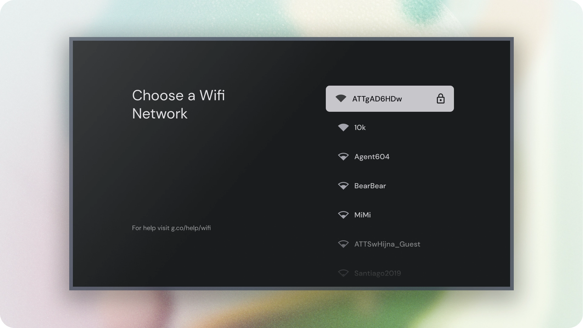
清單是一種視覺化呈現方式,可用於一或多個相關項目。通常用於顯示一組選項。
資源
| 類型 | 連結 | 狀態 |
|---|---|---|
| 設計 | 設計來源 (Figma) | 可使用 |
| 實作 | Jetpack Compose | 可使用 |
重點特色
- 清單是連續的文字或圖像集合。
- 清單應讓使用者感覺自然,且易於瀏覽。
- 清單由項目組成,這些項目包含主要和輔助動作,並以圖示和文字表示。
版本
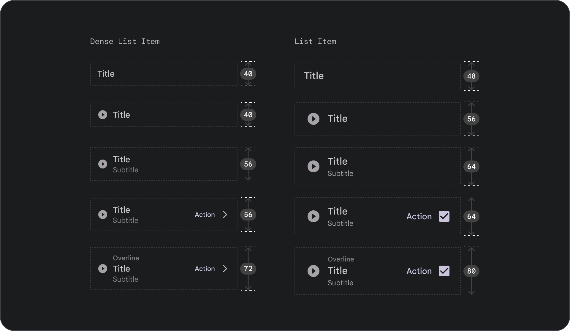
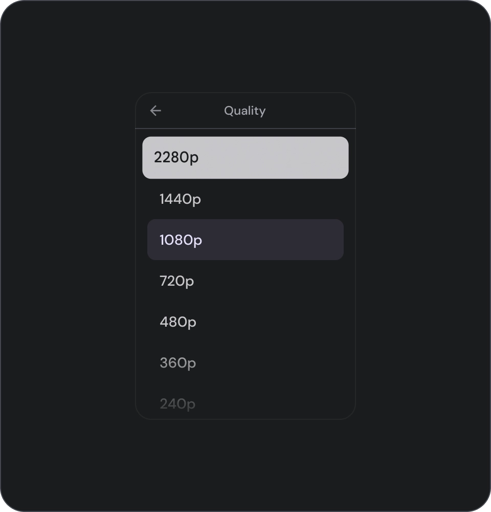
清單分為三種類型:單行清單、雙行清單和三行清單。
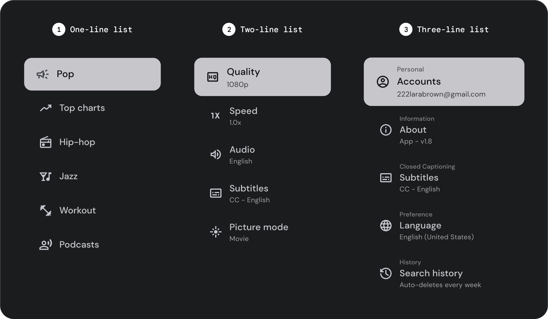
- 單行清單:單行清單可用於傳達每個項目。這項簡單的設計可確保每個項目都與其他項目清楚區隔。
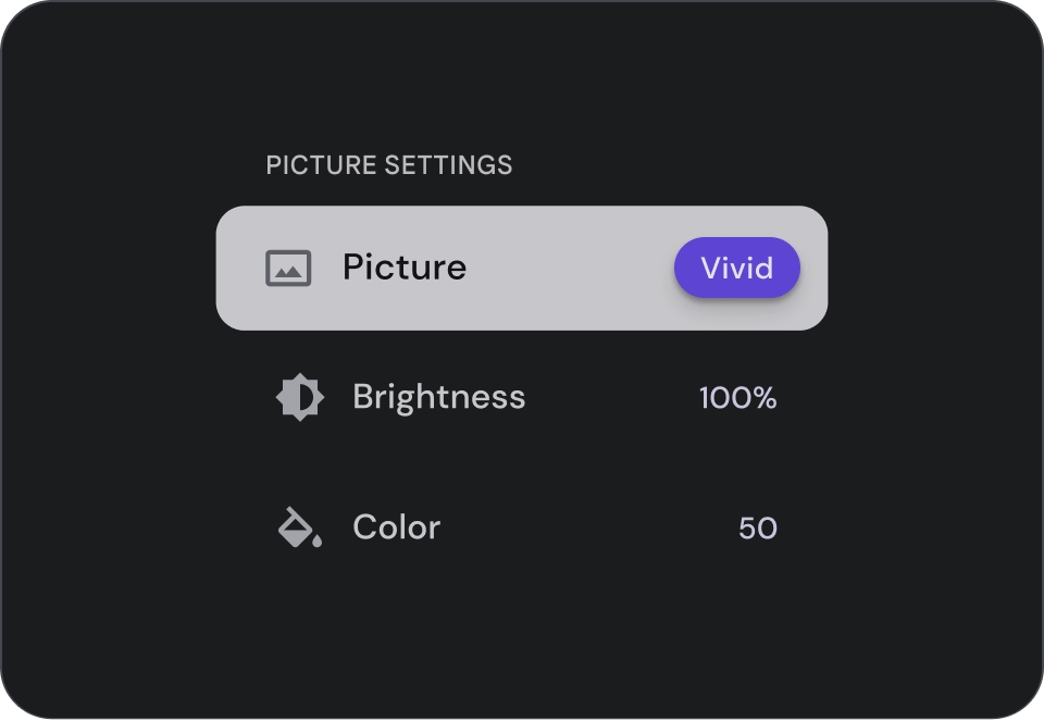
- 兩行清單:使用兩個平行線來顯示每個項目。這種結構化設計可確保自然可讀性,並避免認知超載。
- 三行清單:使用三條平行線代表每個項目。這種裝飾設計可營造出極高的視覺效果。
圖解
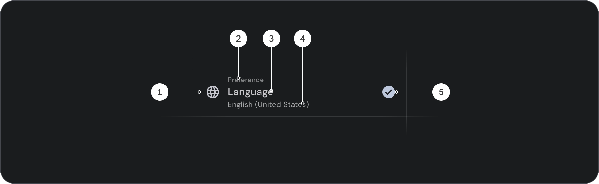
- 圖示:代表特定物件或動作的小型圖形,通常用於以視覺方式傳達想法或概念。
- 上線:顯示在標題或副標題上方的短行文字,通常用於提供額外的背景資訊或強調。
- 標題:大型粗體文字,可做為設計元素或網頁的主要標題。
- 副標題:在主要標題下方提供額外資訊或背景資訊的較小文字行。
- 控制項:可讓使用者輸入決策的互動式元素。
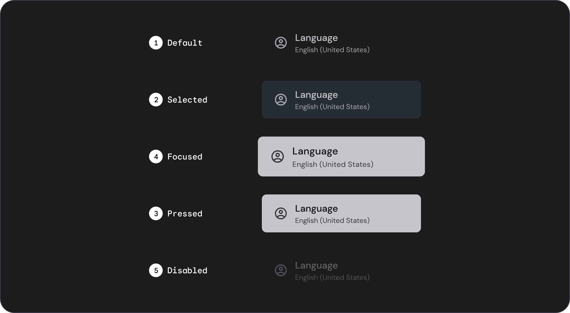
狀態
規格

用量
清單是垂直排列的文字和圖片群組。清單是為了提升閱讀理解能力而最佳化,由單一連續的項目欄所組成。清單項目可包含主要和輔助動作,並以圖示和文字表示。
正確做法
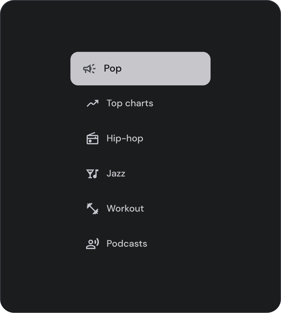
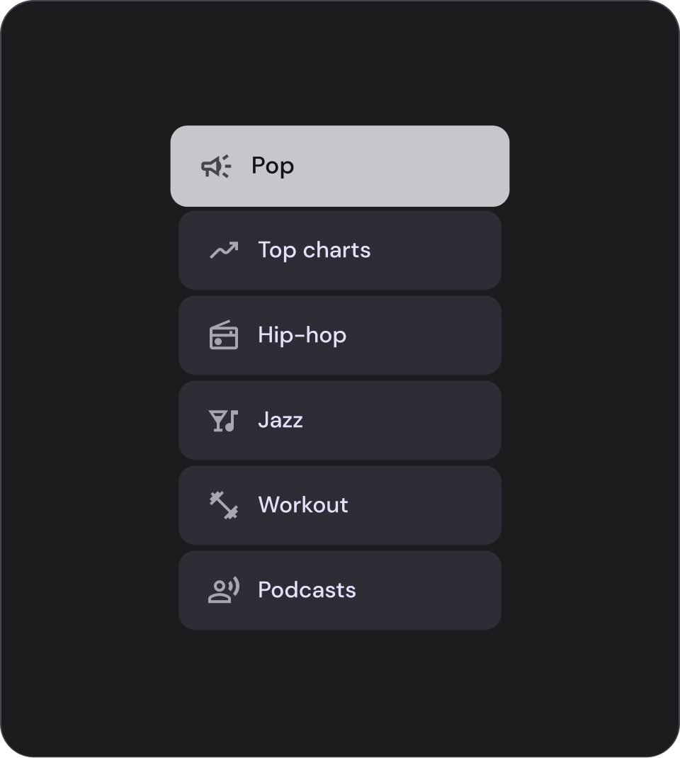
清單項目並非按鈕。項目沒有容器。根據預設,清單項目不會選取或聚焦。
注意
請只在必要時為清單項目使用容器背景。
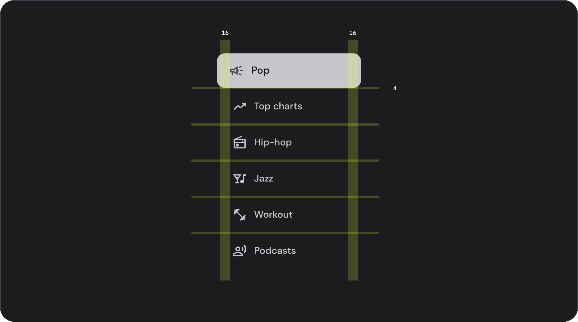
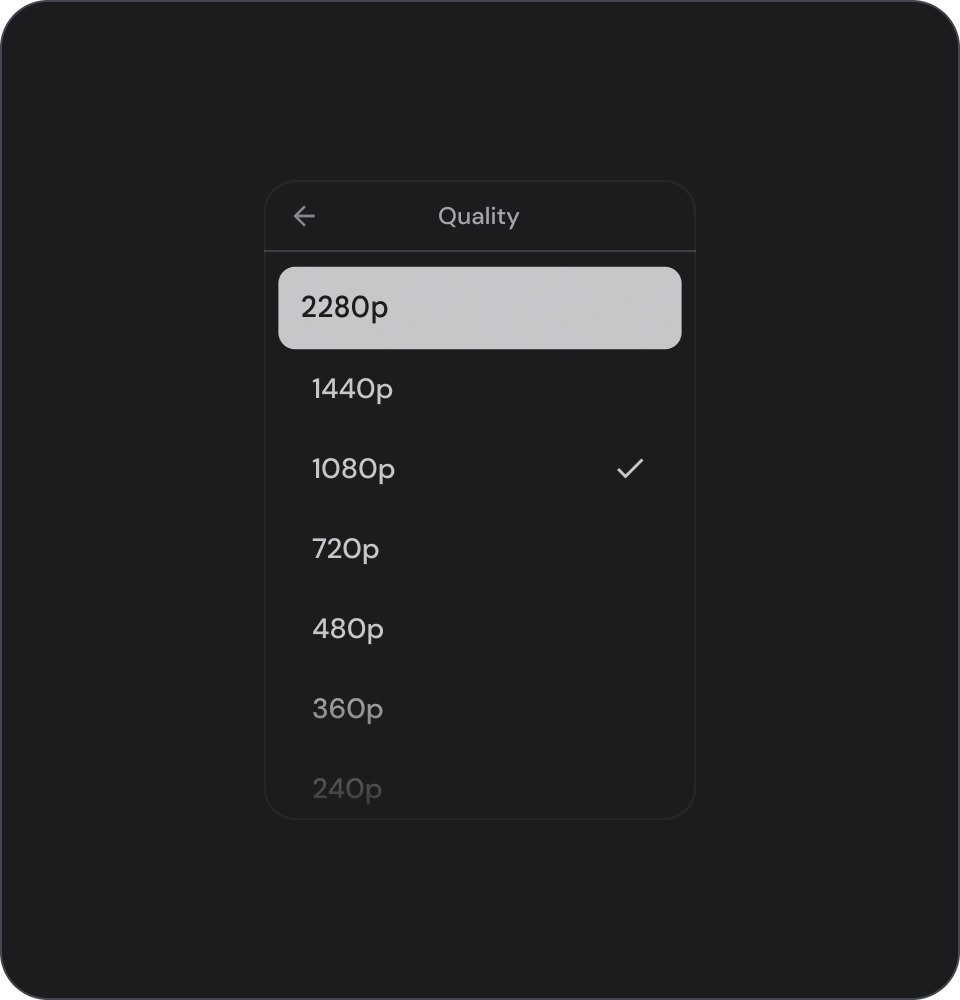
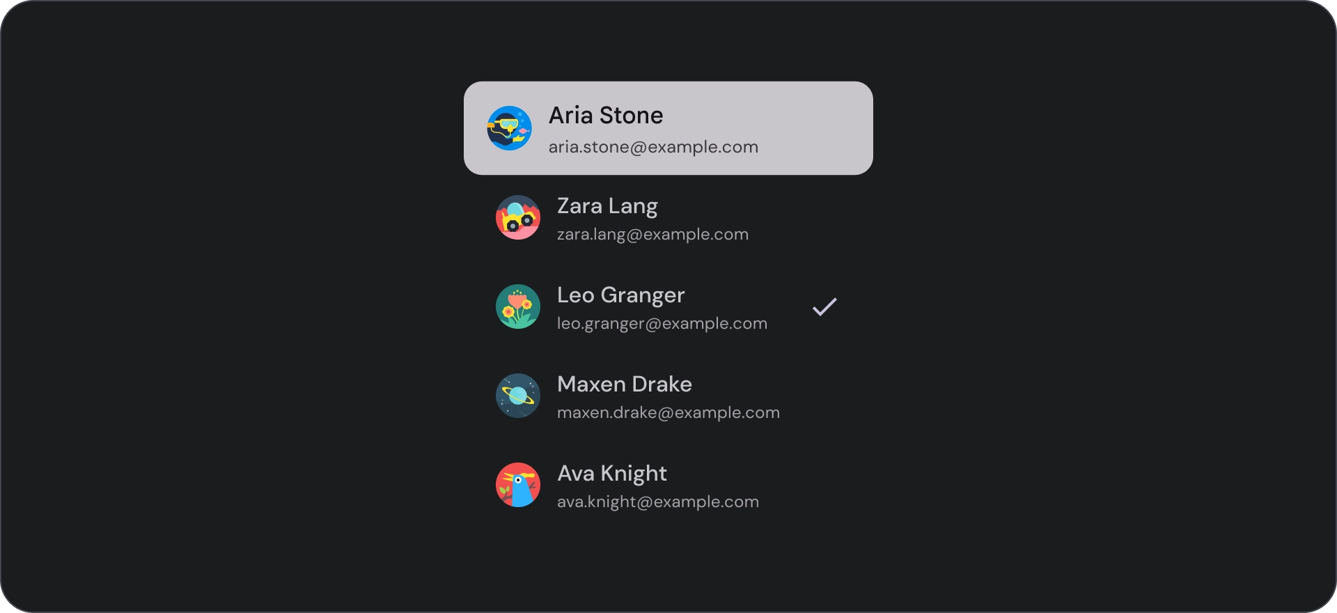
選取控制項
控管清單項目的顯示資訊和動作。可對齊清單項目的前端或尾端。
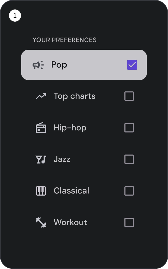
- 核取方塊:選取一或多個清單項目。
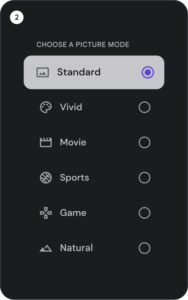
- 圓形按鈕:在清單中選取單一項目。
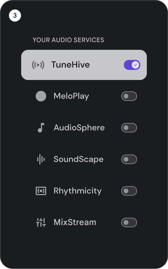
- 切換鈕:切換控制項的開啟或關閉狀態。
正確做法
使用圖示選取指標,清楚顯示清單中的所選項目。這有助於使用者輕鬆辨識所選項目,並改善整體使用者體驗。
錯誤做法
請勿只依靠背景顏色來指出清單中的選取項目。
錯誤做法
請勿在清單項目中放置按鈕,否則使用者可能會混淆,不知道目前焦點在哪個元素上。
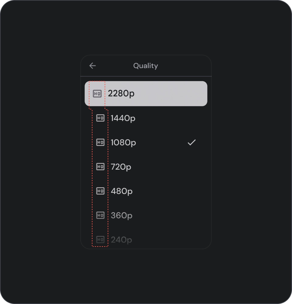
圖示
正確做法
如果清單中顯示的是相同類型的內容,請省略圖示,以減少視覺干擾並改善使用者體驗。避免在清單中使用圖示,除非圖示有用途,且可提供額外資訊。
錯誤做法
避免在清單中的所有項目中使用相同的圖示。這可能會讓使用者感到視覺疲勞和困惑。請只在圖示可提供額外資訊或價值時使用。
顯示圖片和圖片
清單項目可包含圓形裁剪的圖片,用來代表人物或實體。