नेविगेशन ड्रॉअर, किसी भी टीवी ऐप्लिकेशन के लिए ज़रूरी कॉम्पोनेंट होते हैं. इनकी मदद से, उपयोगकर्ता अलग-अलग डेस्टिनेशन और सुविधाओं को ऐक्सेस कर सकते हैं. नेविगेशन ड्रॉअर, ऐप्लिकेशन के इन्फ़ॉर्मेशन आर्किटेक्चर का मुख्य हिस्सा होता है. इससे ऐप्लिकेशन में नेविगेट करने का तरीका साफ़ और आसान हो जाता है.
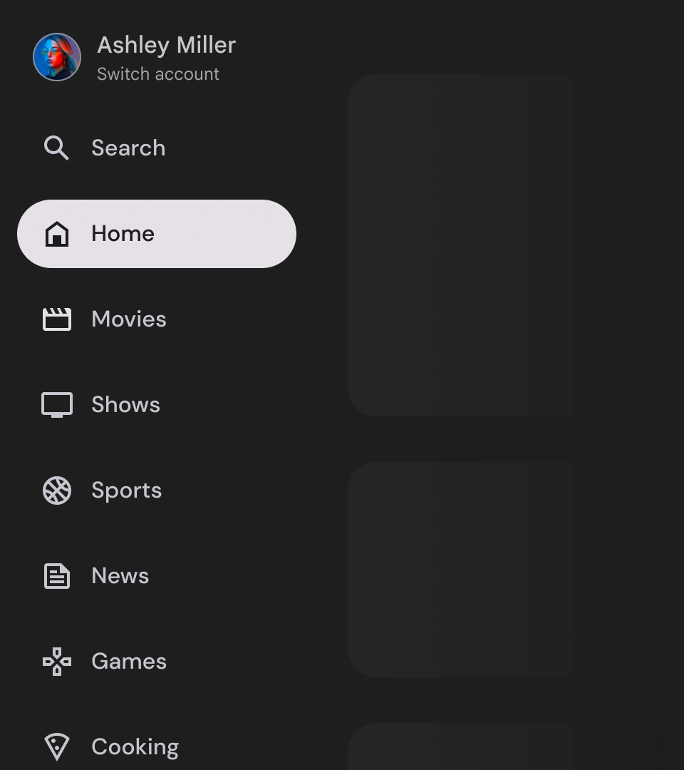
मोबाइल नेविगेशन ड्रॉअर के मुकाबले, टीवी पर नेविगेशन ड्रॉअर में उपयोगकर्ता को बड़ा और छोटा किया गया स्टेटस, दोनों दिखते हैं.
संसाधन
| टाइप | लिंक | स्थिति |
|---|---|---|
| डिज़ाइन | डिज़ाइन का सोर्स (Figma) | उपलब्ध है |
| लागू करना |
Jetpack Compose (NavigationDrawer)
Jetpack Compose (ModalNavigationDrawer) |
उपलब्ध है |
हाइलाइट
- डेस्टिनेशन को उपयोगकर्ता की ज़रूरत के हिसाब से क्रम में लगाया जाता है. इसमें अक्सर इस्तेमाल होने वाले डेस्टिनेशन पहले और मिलते-जुलते डेस्टिनेशन को एक साथ रखा जाता है.
- स्टैंडर्ड और मॉडल नेविगेशन ड्रॉअर, दोनों के लिए नेविगेशन रेल ज़रूरी है.
वैरिएंट
नेविगेशन ड्रॉअर के दो स्टाइल होते हैं:
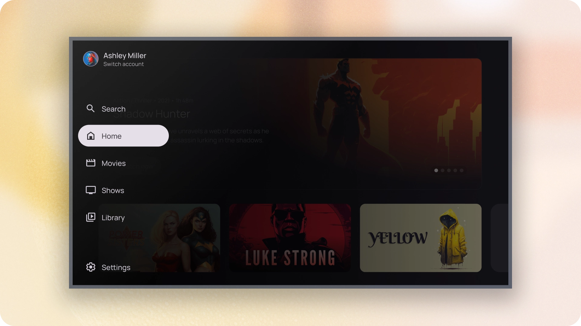
- स्टैंडर्ड नेविगेशन पैनल — यह नेविगेशन के लिए ज़्यादा जगह बनाने के लिए बड़ा हो जाता है. इससे पेज का कॉन्टेंट साइड में चला जाता है.
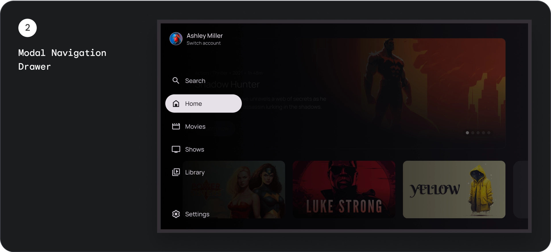
- मोडल नेविगेशन ड्रॉअर — यह ऐप्लिकेशन के कॉन्टेंट के ऊपर, स्क्रीम के साथ ओवरले के तौर पर दिखता है. इससे ड्रॉअर को बड़ा करने पर, कॉन्टेंट को पढ़ने में आसानी होती है.
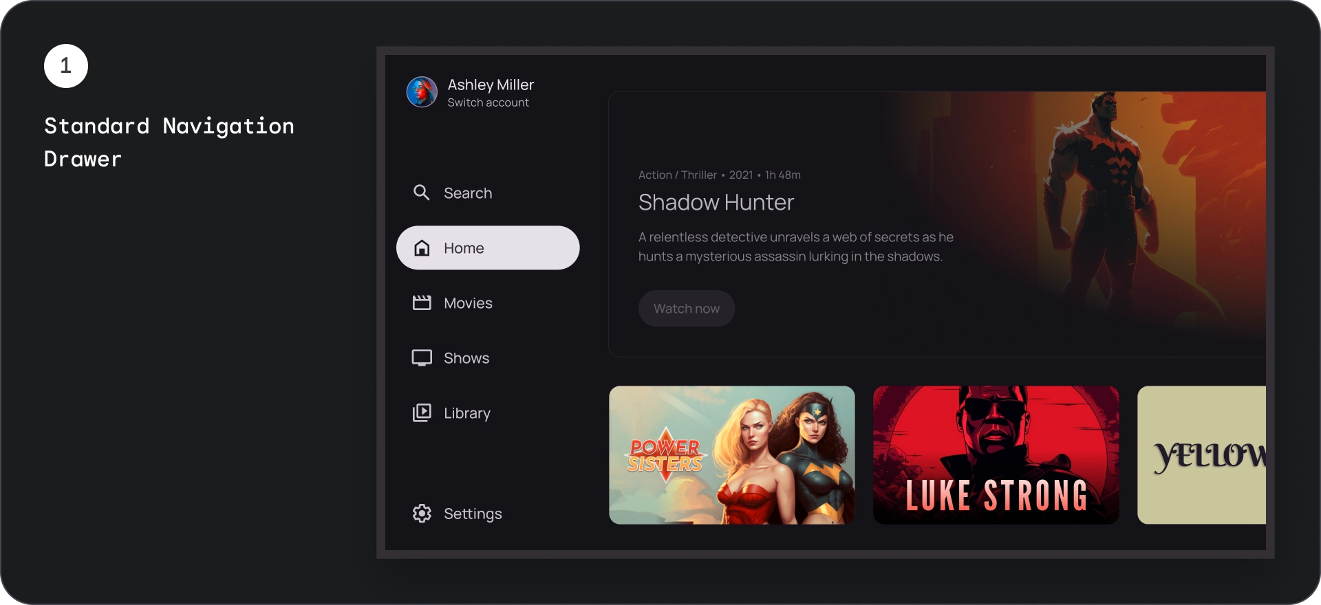
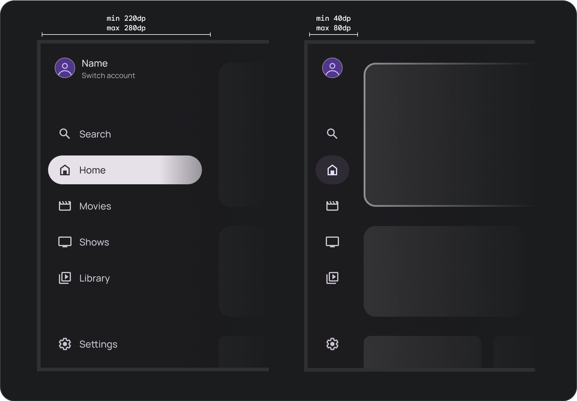
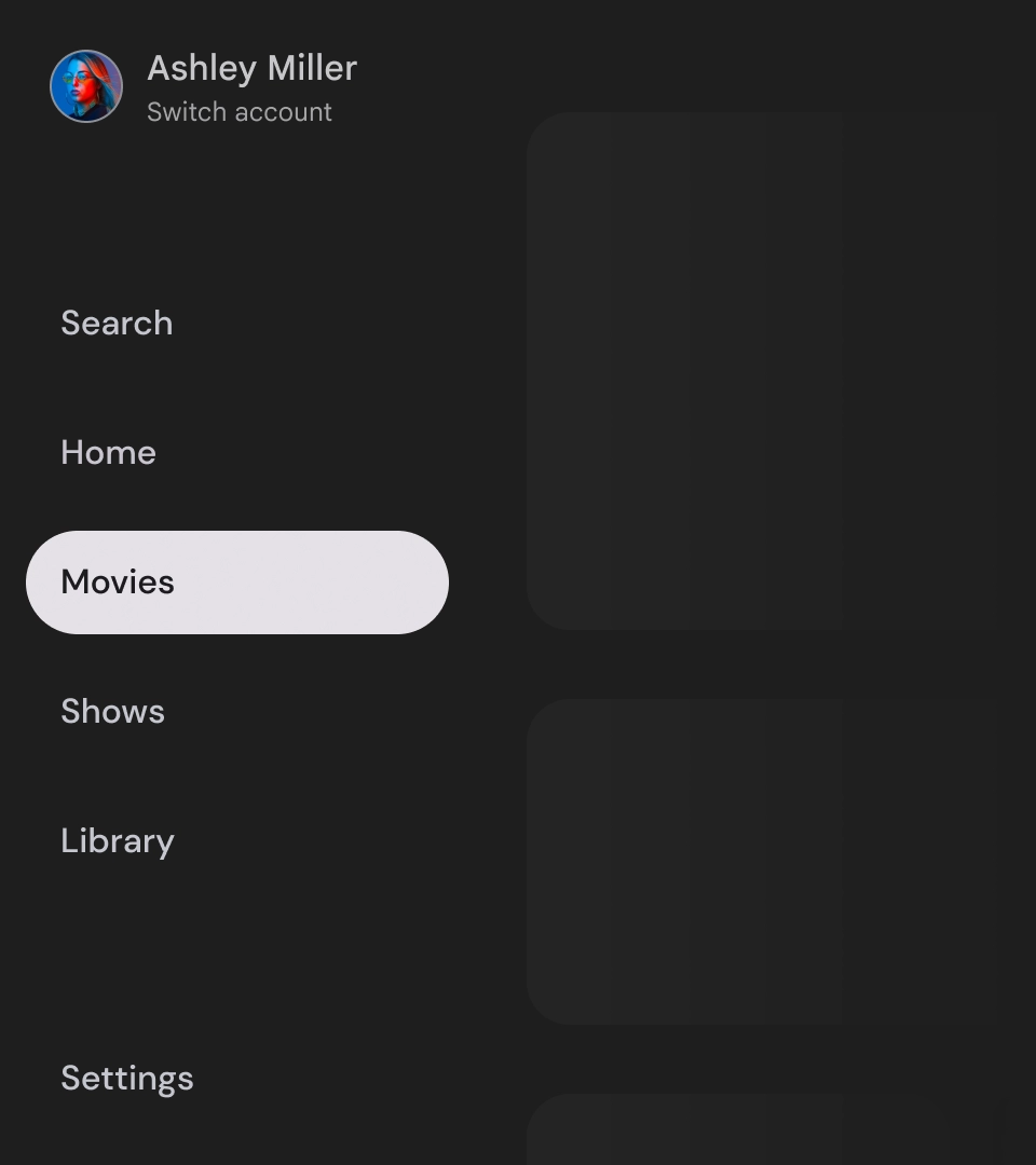
स्टैंडर्ड नेविगेशन पैनल
शरीर-रचना विज्ञान
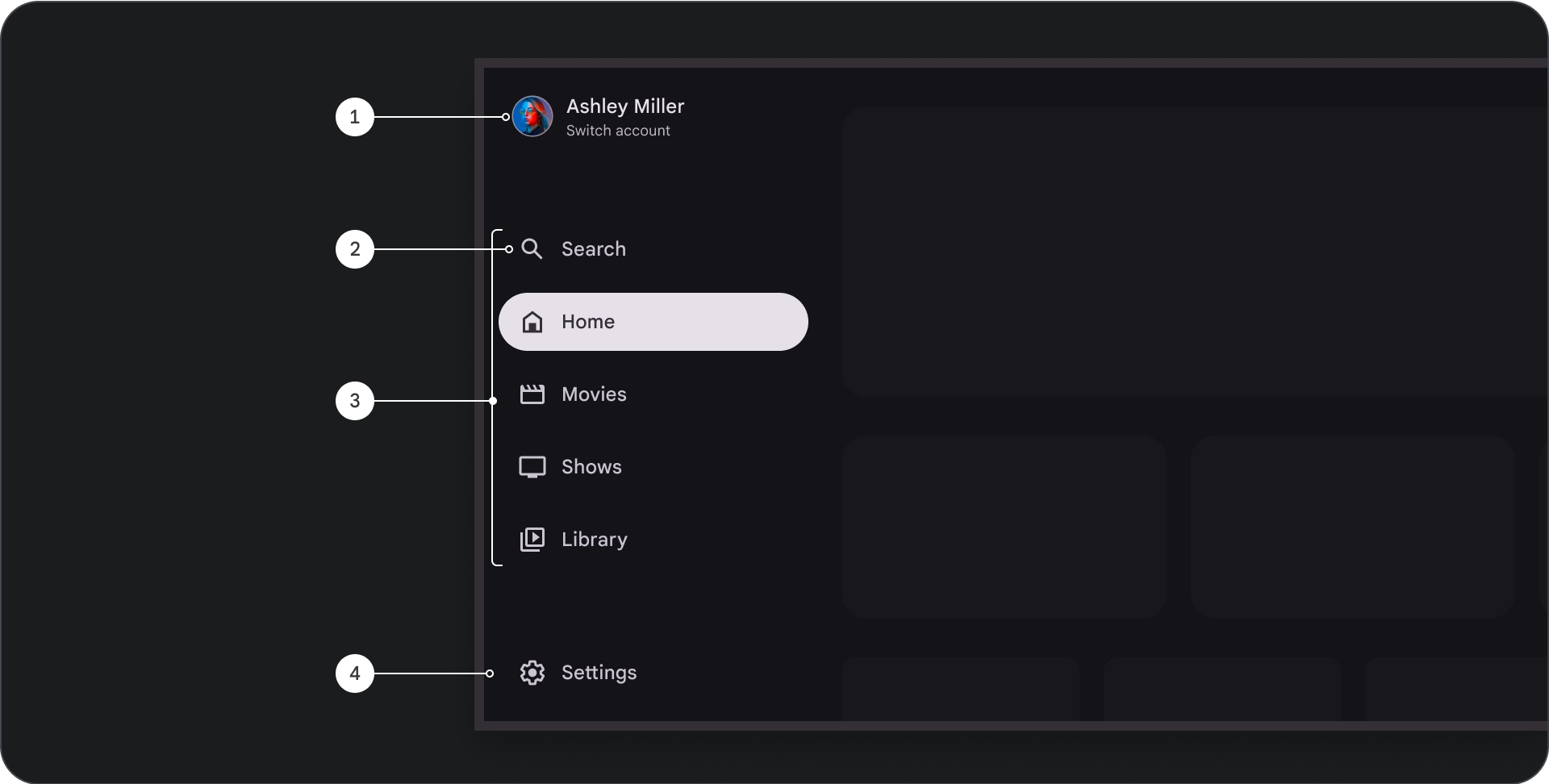
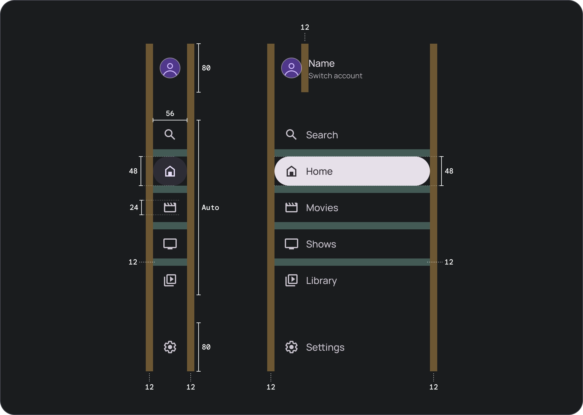
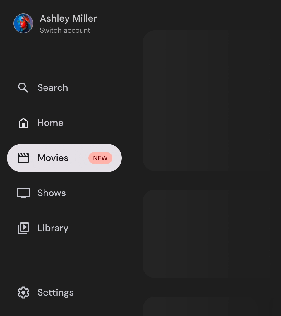
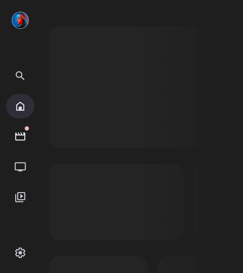
- टॉप सेक्शन: इसमें ऐप्लिकेशन का लोगो दिखता है. यह बटन, प्रोफ़ाइलों को स्विच करने या खोज कार्रवाई को ट्रिगर करने के लिए इस्तेमाल किया जाता है. छोटा होने पर, सबसे ऊपर मौजूद कंटेनर में सिर्फ़ आइकॉन दिखता है.
- नेविगेशन आइटम: नेविगेशन रेल में मौजूद हर आइटम में, आइकॉन और टेक्स्ट का कॉम्बिनेशन होता है. छोटा किए जाने पर, सिर्फ़ आइकॉन दिखता है.
- नेविगेशन रेल: नेविगेशन रेल एक कॉलम होता है, जिसमें मुख्य मेन्यू के तौर पर काम करने वाले तीन से सात ऐप्लिकेशन डेस्टिनेशन दिखते हैं. हर डेस्टिनेशन के लिए एक टेक्स्ट लेबल और एक आइकॉन होता है. साथ ही, बेहतर संदर्भ के लिए मेन्यू आइटम को ग्रुप करने का विकल्प भी होता है.
- सबसे नीचे मौजूद सेक्शन: इसमें एक से तीन ऐक्शन बटन हो सकते हैं. ये बटन, सेटिंग, सहायता या प्रोफ़ाइल जैसे पेजों के लिए सबसे सही होते हैं.
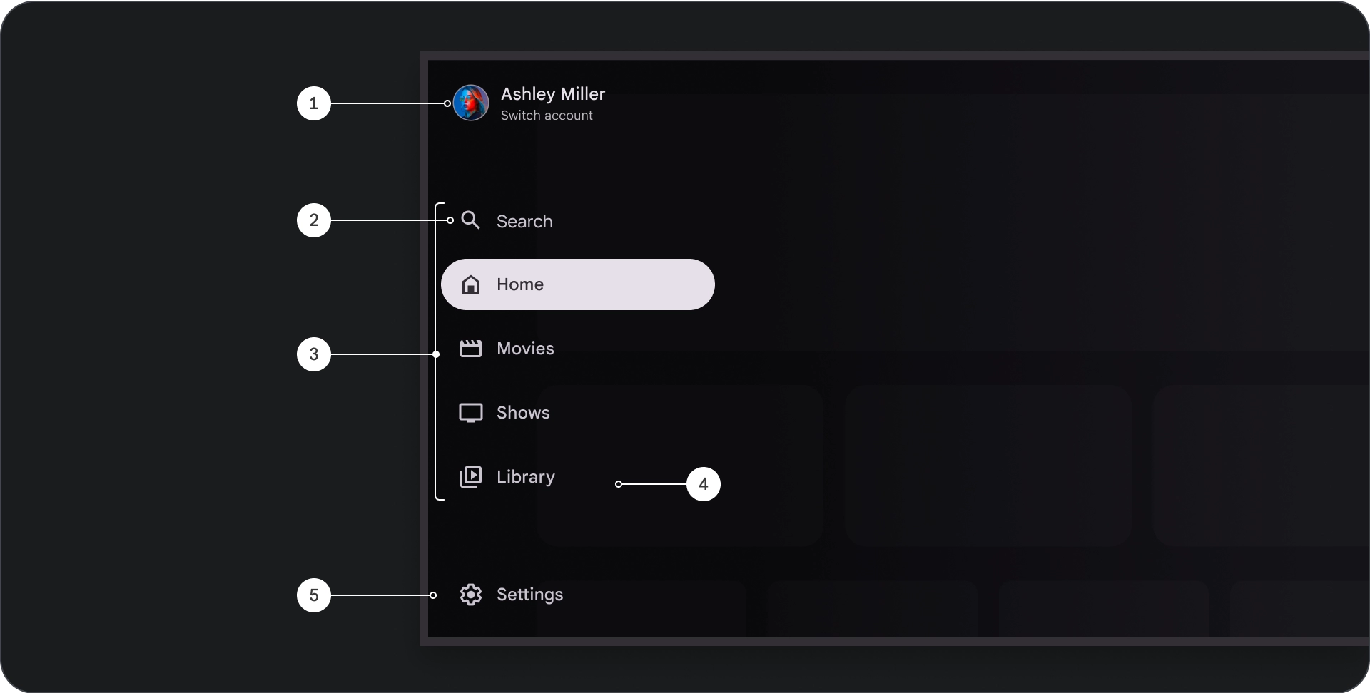
व्यवहार
- नेविगेशन ड्रॉअर को बड़ा करना: स्टैंडर्ड नेविगेशन ड्रॉअर को बड़ा करने पर, पेज के कॉन्टेंट को दबा दिया जाता है, ताकि नेविगेशन के बड़े किए गए वर्शन के लिए जगह बनाई जा सके.
- नेविगेशन अपडेट: नेविगेशन के एक आइटम से दूसरे आइटम पर जाने पर, पेज अपने-आप नई जगह पर अपडेट हो जाता है.
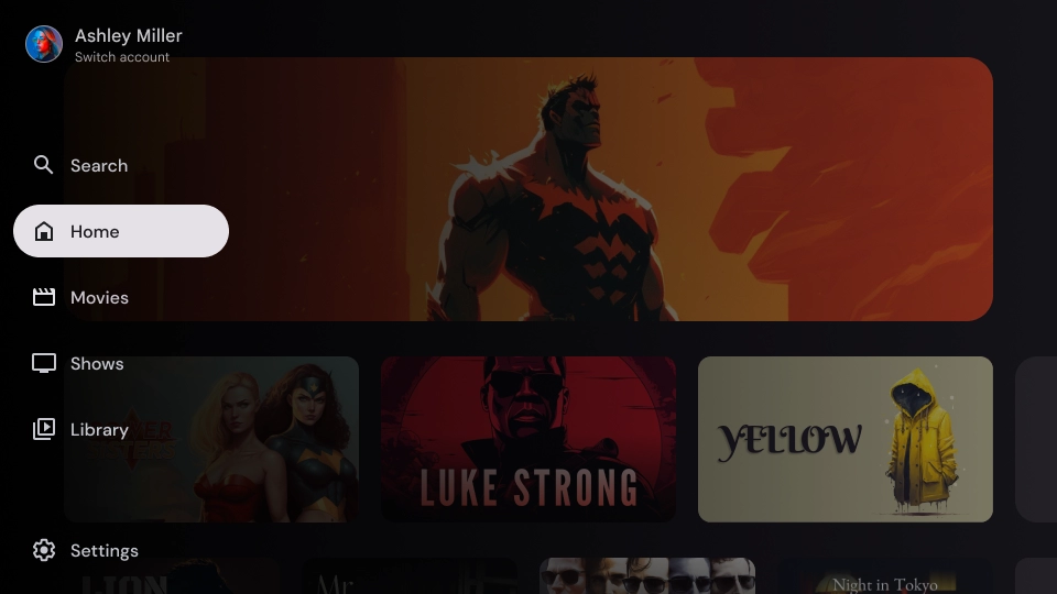
मॉडल नेविगेशन पैनल
शरीर-रचना विज्ञान
- टॉप सेक्शन: इसमें ऐप्लिकेशन का लोगो दिखता है. प्रोफ़ाइलों को स्विच करने या खोज कार्रवाई को ट्रिगर करने के लिए बटन के तौर पर काम करता है. छोटा किया गया आइकॉन, सबसे ऊपर मौजूद कंटेनर में दिखता है.
- नेविगेशन आइटम: नेविगेशन रेल में मौजूद हर आइटम में आइकॉन और टेक्स्ट का कॉम्बिनेशन होता है. छोटा किए जाने पर, सिर्फ़ आइकॉन दिखता है.
- नेविगेशन रेल: यह कॉलम, मुख्य मेन्यू के तौर पर काम करता है. इसमें तीन से सात ऐप्लिकेशन डेस्टिनेशन दिखते हैं. हर डेस्टिनेशन के लिए एक टेक्स्ट लेबल और एक आइकॉन होता है. साथ ही, बेहतर संदर्भ के लिए मेन्यू आइटम को ग्रुप करने का विकल्प भी होता है.
- स्क्रीम: नेविगेशन आइटम के टेक्स्ट को बेहतर तरीके से पढ़ने के लिए.
- सबसे नीचे मौजूद सेक्शन: इसमें एक से तीन ऐक्शन बटन हो सकते हैं. ये बटन, सेटिंग, सहायता या प्रोफ़ाइल जैसे पेजों के लिए सबसे सही होते हैं.
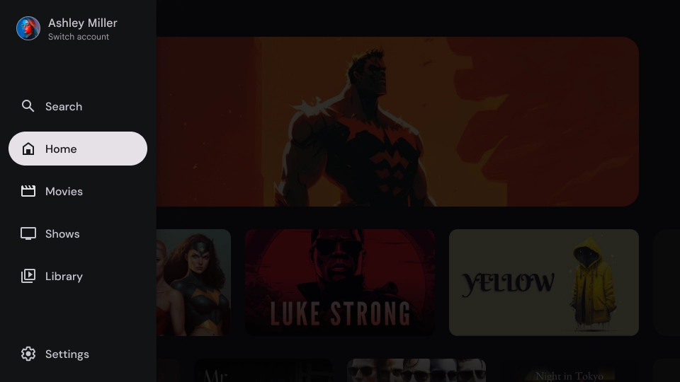
व्यवहार
- ड্রॉअर को बड़ा करना: यह ऐप्लिकेशन के कॉन्टेंट के ऊपर, ओवरले के तौर पर दिखता है. इसमें एक स्क्रीम होती है, जो ड्रॉअर को बड़ा करने पर पढ़ने में आसानी होती है.
- नेविगेशन अपडेट: ये तब होते हैं, जब उपयोगकर्ता कोई नेविगेशन आइटम चुनता है.
स्क्रीम
मोडल नेविगेशन पैनल के लिए, पैनल के पीछे स्क्रीम होने से यह पक्का होता है कि पैनल का कॉन्टेंट पढ़ा जा सकता है. यूज़र इंटरफ़ेस (यूआई) के अलग-अलग वैरिएशन बनाने के लिए, नेविगेशन पैनल के पीछे ग्रेडिएंट या सॉलिड प्लैटफ़ॉर्म का इस्तेमाल किया जा सकता है.
ग्रेडिएंट स्क्रिम
सॉलिड स्क्रिम
खास जानकारी

इस्तेमाल
ऐक्टिव इंडिकेटर
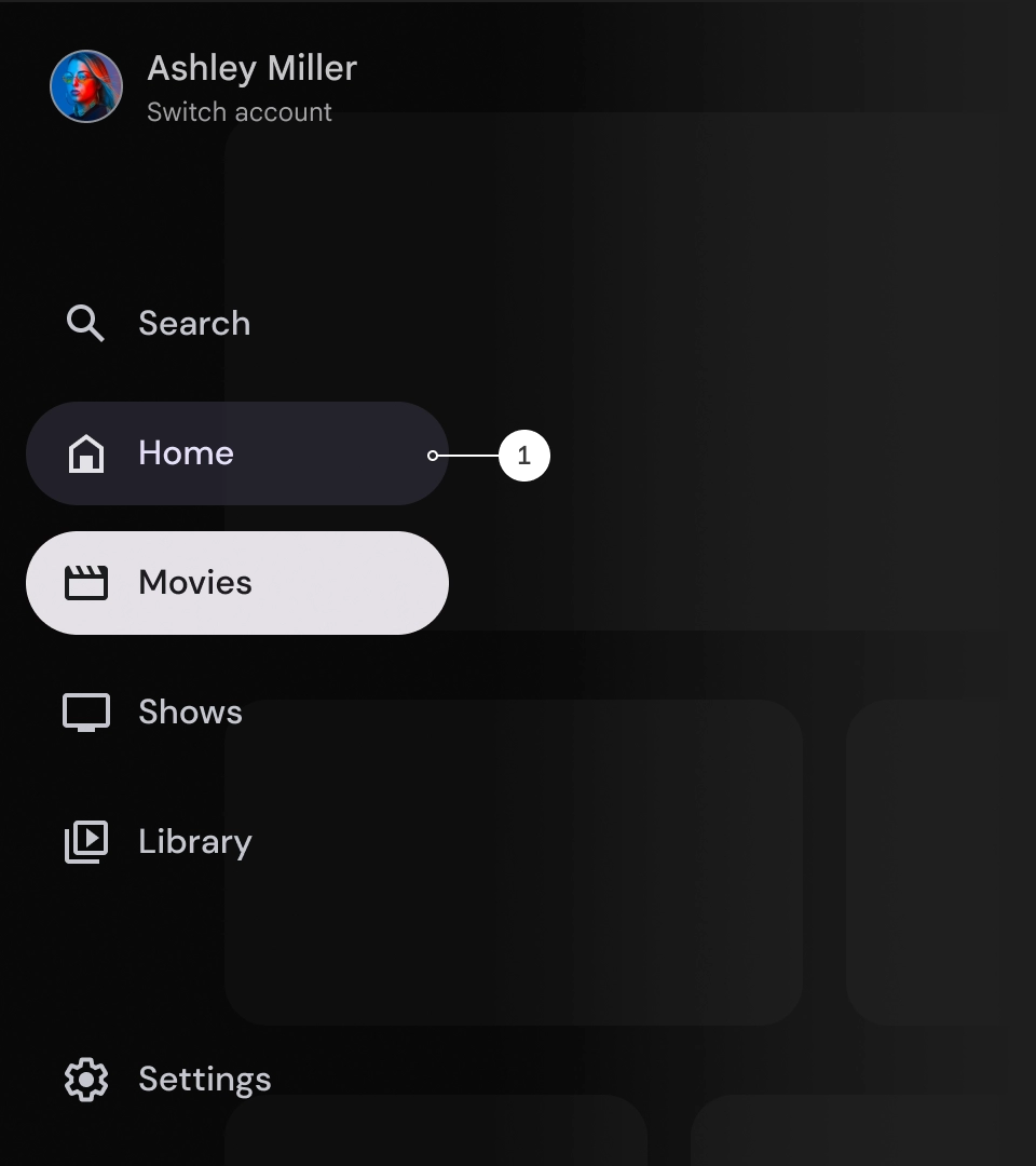
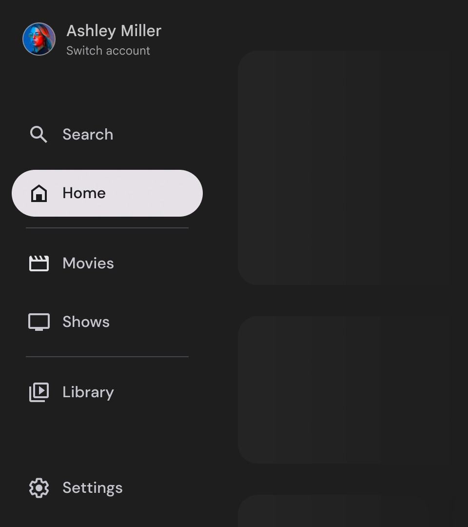
ऐक्टिव इंडिकेटर एक विज़ुअल क्यू है, जो नेविगेशन ड्रॉअर के दिखने वाले डेस्टिनेशन को हाइलाइट करता है. इंडिकेटर को आम तौर पर बैकग्राउंड के आकार से दिखाया जाता है. यह आकार, ड्रॉअर में मौजूद अन्य आइटम से अलग दिखता है. ऐक्टिव इंडिकेटर से उपयोगकर्ताओं को यह समझने में मदद मिलती है कि वे ऐप्लिकेशन में कहां हैं और किस डिस्टिनेशन को ब्राउज़ कर रहे हैं. पक्का करें कि चालू होने का इंडिकेटर साफ़ तौर पर दिख रहा हो और नेविगेशन ड्रॉअर में मौजूद अन्य आइटम से आसानी से अलग दिख रहा हो.
डिवाइडर (ज़रूरी नहीं)
नेविगेशन ड्रॉर में डेस्टिनेशन के ग्रुप को बेहतर तरीके से व्यवस्थित करने के लिए, डिवाइडर का इस्तेमाल किया जा सकता है. हालांकि, इनका इस्तेमाल कम से कम करना ज़रूरी है, क्योंकि बहुत ज़्यादा डिवाइडर से विज़ुअल नॉइज़ हो सकता है. साथ ही, उपयोगकर्ताओं को ग़ैर-ज़रूरी जानकारी भी मिल सकती है.
बैज
बैज, विज़ुअल क्यू होते हैं. इन्हें नेविगेशन आइटम में जोड़ा जा सकता है, ताकि ज़्यादा जानकारी दी जा सके. उदाहरण के लिए, किसी स्ट्रीमिंग ऐप्लिकेशन में उपलब्ध नई फ़िल्मों की संख्या दिखाने के लिए बैज का इस्तेमाल किया जा सकता है. बैज का इस्तेमाल कम और सिर्फ़ ज़रूरत पड़ने पर करें, क्योंकि इनसे यूज़र इंटरफ़ेस (यूआई) काफ़ी व्यस्त और गड़बड़ा हुआ लग सकता है. बैज का इस्तेमाल करते समय, पक्का करें कि वे साफ़ और आसानी से समझ में आएं. साथ ही, वे उपयोगकर्ता के ऐप्लिकेशन को नेविगेट करने में रुकावट न डालें.
बैज बड़ा किया गया
बैज छोटा किया गया
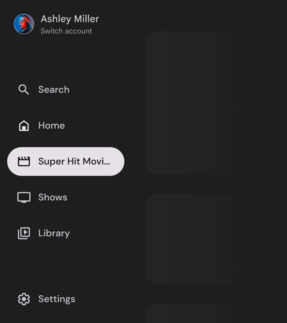
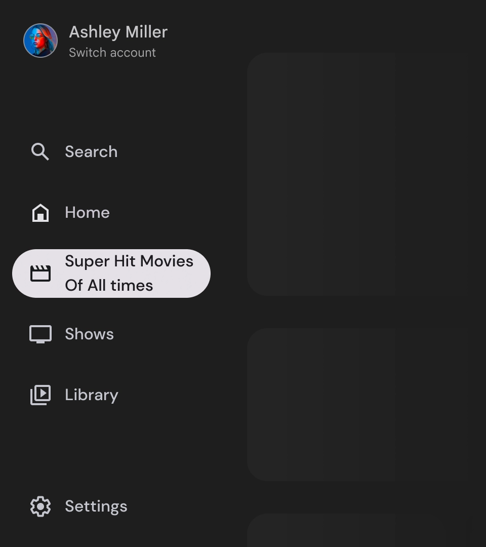
लेबल
नेविगेशन ड्रॉअर में मौजूद लेबल साफ़ और कम शब्दों में होने चाहिए, ताकि उन्हें पढ़ना आसान हो.
सावधान
यह न करें
यह न करें
यह न करें
नेविगेशन ड्रॉअर, आपके ऐप्लिकेशन की हैरारकी को दिखाने वाले बुनियादी एलिमेंट होते हैं. इनका इस्तेमाल, सिर्फ़ पांच से छह मुख्य नेविगेशन डेस्टिनेशन की सूची बनाने के लिए किया जाना चाहिए.

यह करें