
抽屉式导航栏是任何 TV 应用中必不可少的组件,因为它允许用户访问不同的目的地和功能。抽屉式导航栏是应用信息架构的支柱,可提供清晰直观的方式来浏览应用。
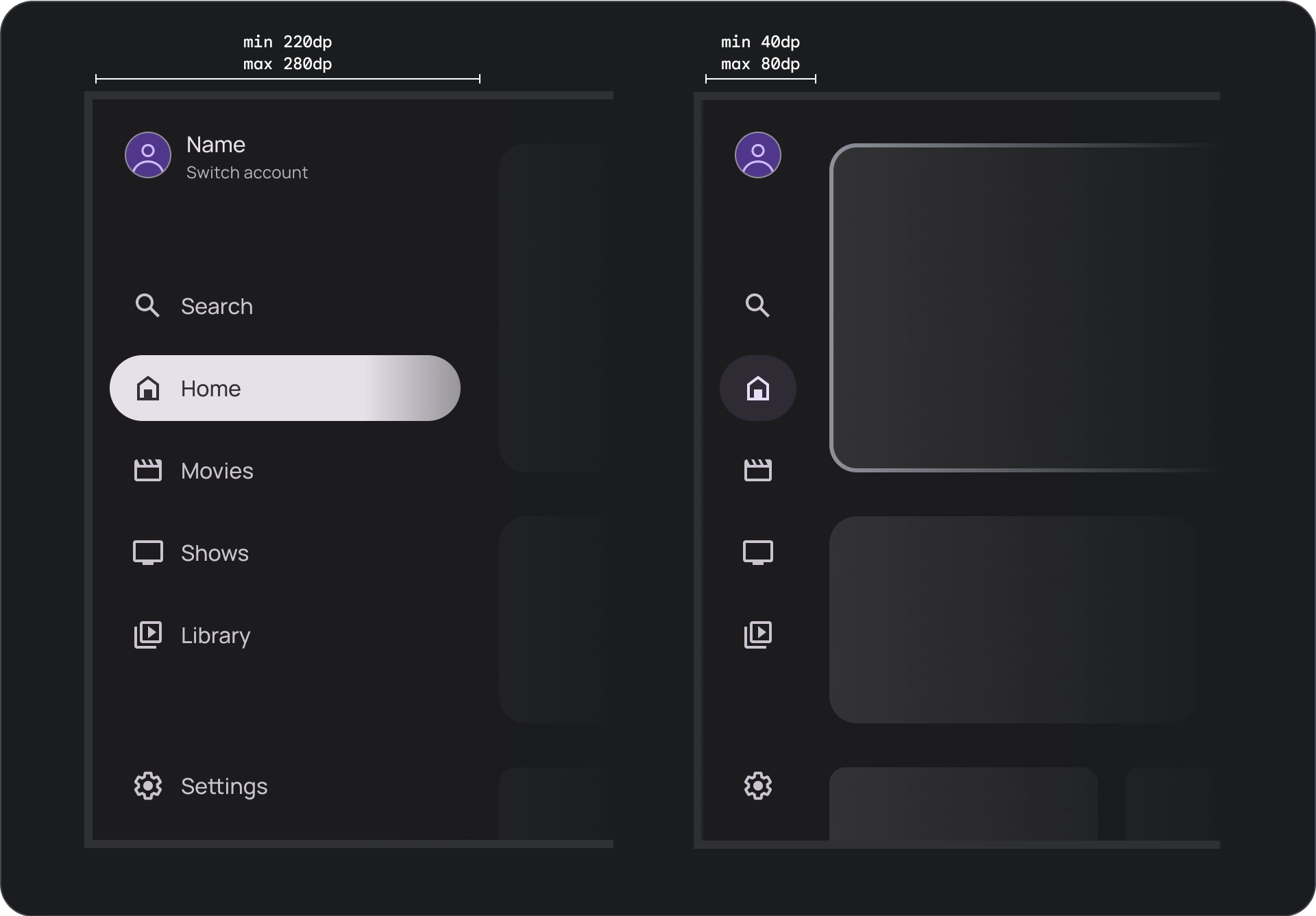
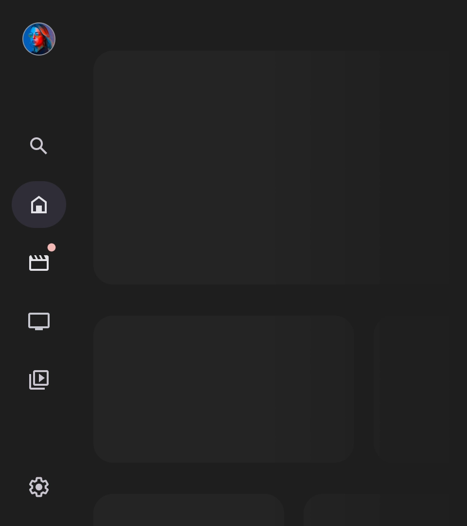
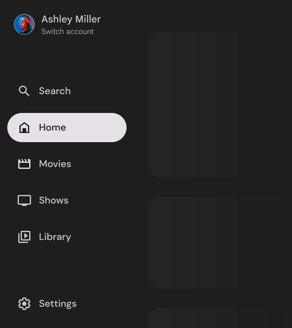
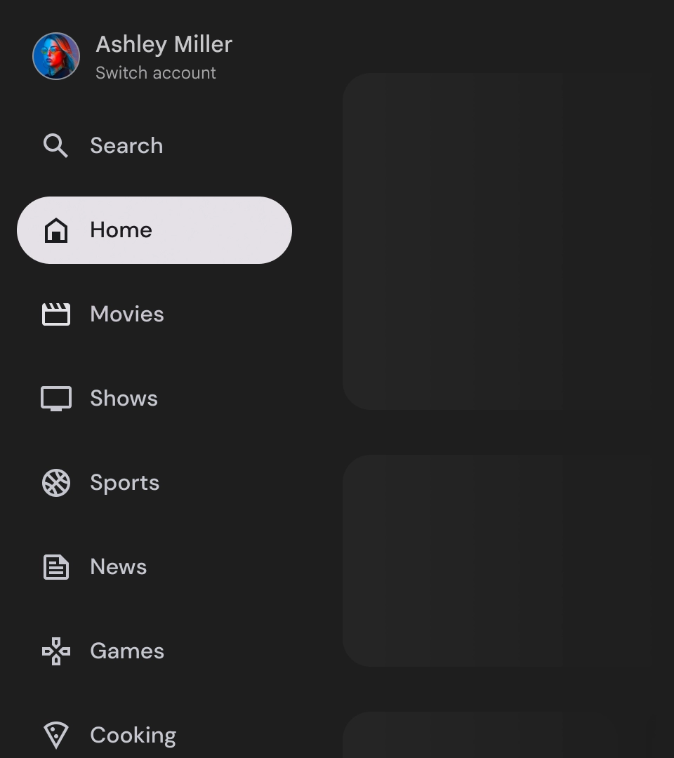
与移动设备上的抽屉式导航栏不同,电视上的抽屉式导航栏既有展开状态,也有对用户可见的收起状态。
资源
| 类型 | 链接 | 状态 |
|---|---|---|
| 设计 | 设计来源 (Figma) | 可用 |
| 实现 |
Jetpack Compose (NavigationDrawer)
Jetpack Compose (ModalNavigationDrawer) |
可用 |
亮点
- 目的地会按用户重要性排序,经常访问的目的地会排在前面,相关目的地会归为一组。
- 标准抽屉式导航栏和模态抽屉式导航栏在收起时都需要导航侧边栏。
变体
抽屉式导航栏样式有两种:
- 标准抽屉式导航栏 - 展开即可创建额外的导航空间,将页面内容推到一边。
- 模态抽屉式导航栏 - 显示为应用内容之上的叠加层,并带有遮罩,有助于在抽屉式导航栏展开时提高可读性。
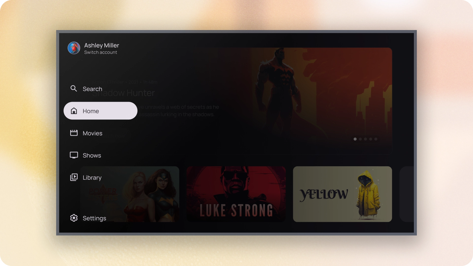
标准抽屉式导航栏
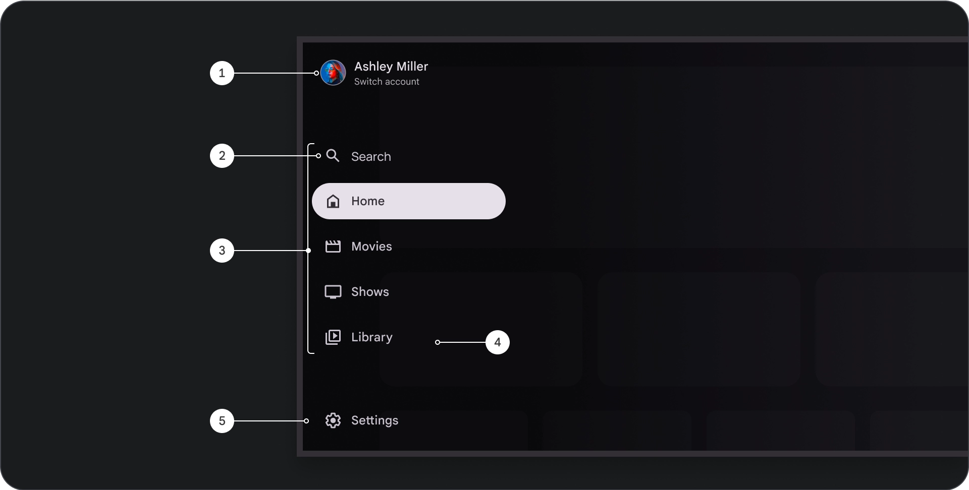
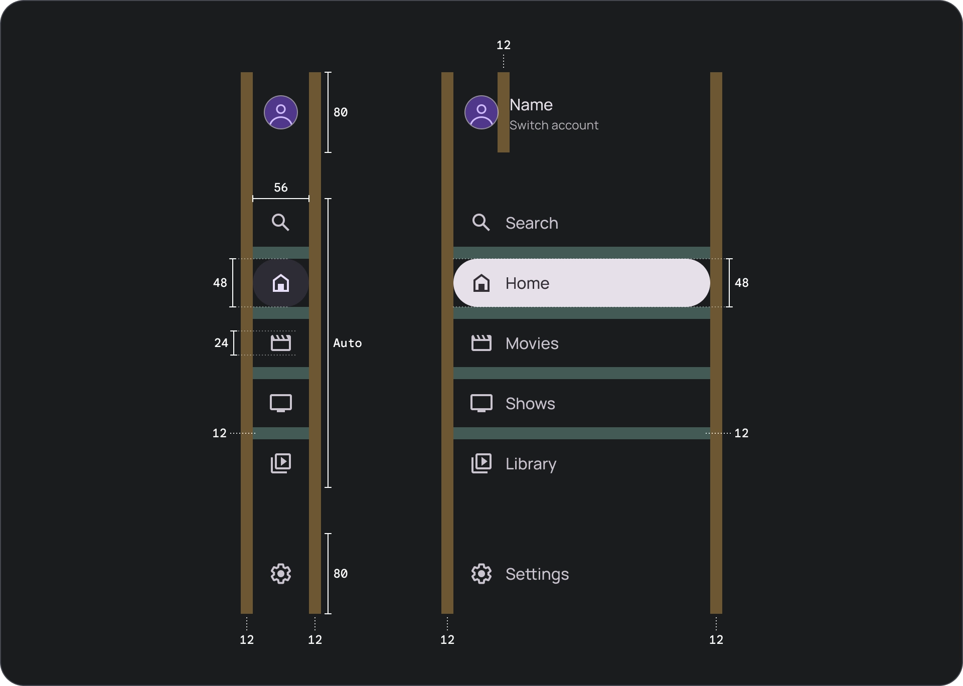
解剖学
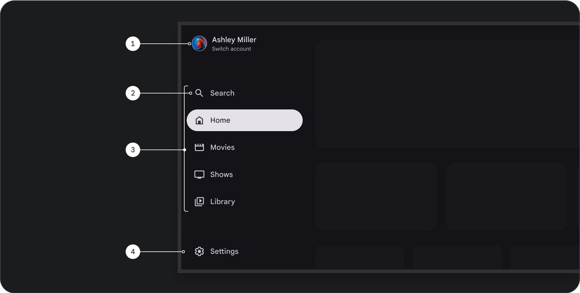
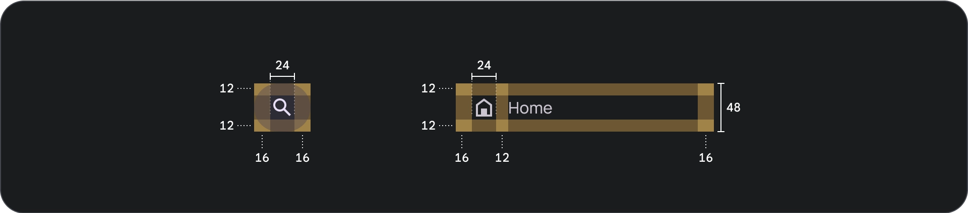
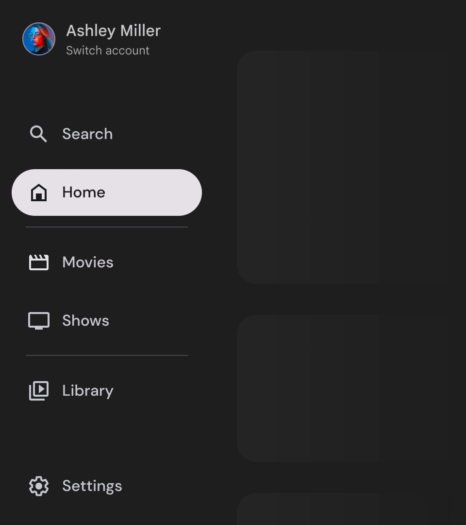
- 顶部部分:显示应用徽标。用作切换个人资料或触发搜索操作的按钮。在收起状态下,顶部容器中只会显示图标。
- 导航项:侧边导航栏中的每个项都包含图标和文本,在收起状态下,系统只会显示图标。
- 侧边导航栏:侧边导航栏是一个列,用于显示 3 到 7 个应用目的地,充当主菜单。每个目的地都有文本标签和可选图标,您可以选择对菜单项进行分组,以便更好地体现上下文。
- 底部部分:可以包含 1 到 3 个操作按钮,非常适合用于“设置”“帮助”或“个人资料”等页面。
行为
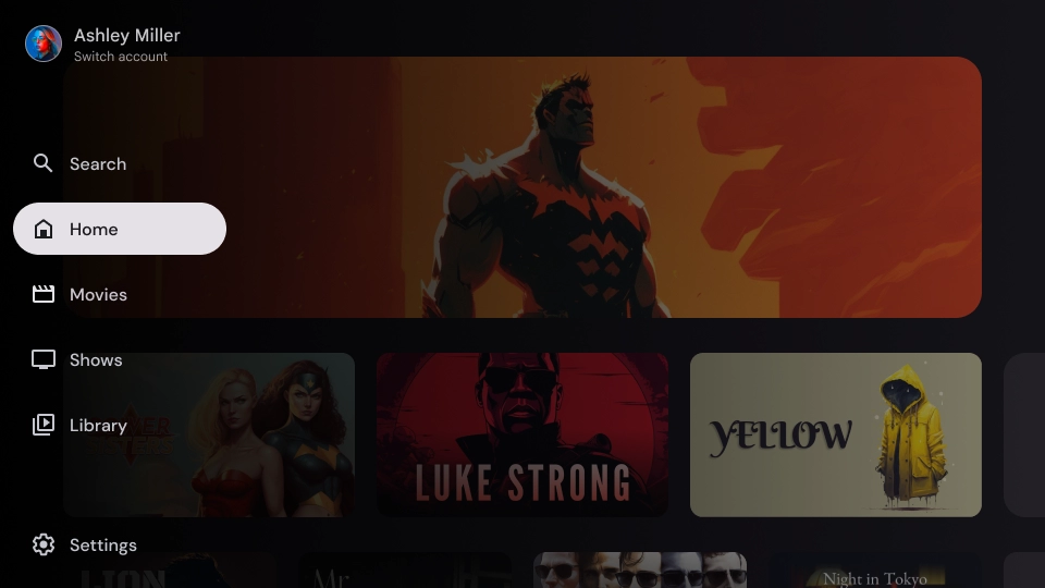
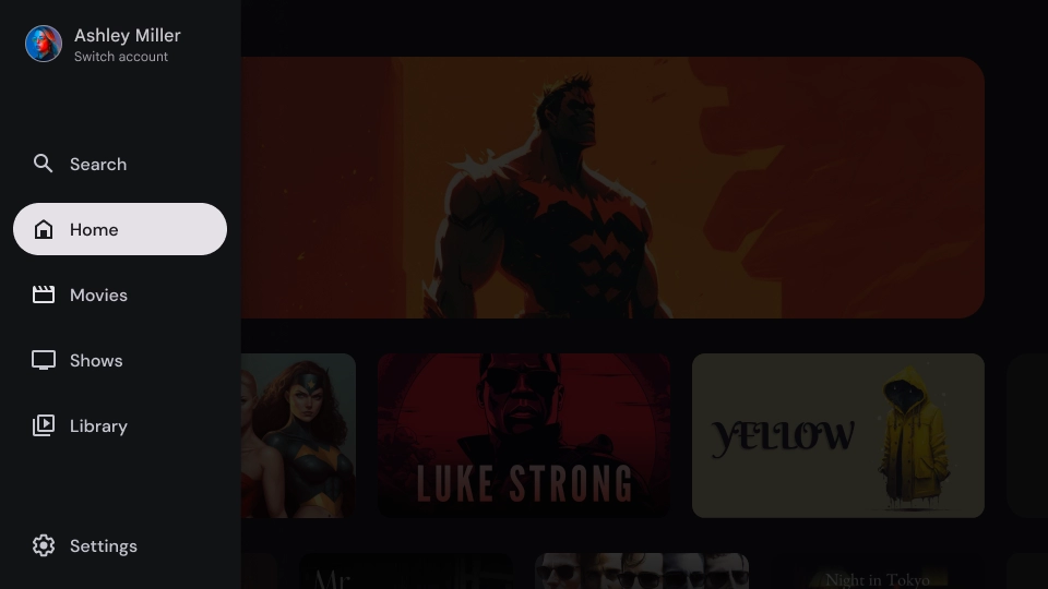
- 抽屉式导航栏展开:展开后,标准抽屉式导航栏会推送页面内容,为导航栏的展开版本留出空间。
- 导航栏更新:从一个导航栏项移动到另一个导航栏项时,页面会自动更新到新目的地。
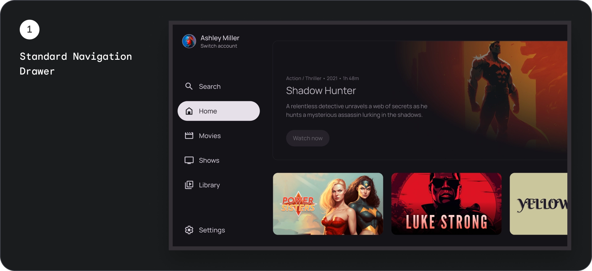
模态抽屉式导航栏
解剖学
- 顶部部分:显示应用徽标。用作切换个人资料或触发搜索操作的按钮。在收起状态下,顶部容器中仅会显示图标。
- 导航项:侧边导航栏中的每个项都包含图标和文本的组合,在收起状态下,系统只会显示图标。
- 侧边导航栏:显示三到七个应用目的地的列,用作主菜单。每个目的地都有一个文本标签和一个可选图标,您可以选择将菜单项分组,以便更好地体现上下文。
- 模糊处理:提高导航项文本的可读性。
- 底部部分:可以包含 1 到 3 个操作按钮,非常适合用于“设置”“帮助”或“个人资料”等页面。
行为
- 抽屉展开:在应用内容上方显示为叠加层,并带有遮罩,以便在抽屉展开时提高可读性。
- 导航更新:在用户选择导航项时发生。
纱罩
对于模态抽屉式导航栏,抽屉后面的遮罩可确保抽屉内容可读。您可以在抽屉式导航栏后面使用渐变或纯色 Surface,以创建界面的不同变体。
渐变纱罩
纯色纱罩
规格
用法
活动指示器
活动指示器是一种视觉提示,用于突出显示的抽屉式导航栏目的地。指示器通常由与抽屉中其他项在视觉上明显不同的背景形状表示。活跃指示器可帮助用户了解自己在应用中的位置以及正在浏览的目的地。确保活动指示器清晰可见,并且更容易与抽屉式导航栏中的其他项区分开来。

分隔线(可选)
分隔线可用于在抽屉式导航栏中分隔一组目的地,以便更好地进行整理。不过,请务必谨慎使用分隔线,因为分隔线过多可能会造成视觉干扰,并给用户带来不必要的认知负担。
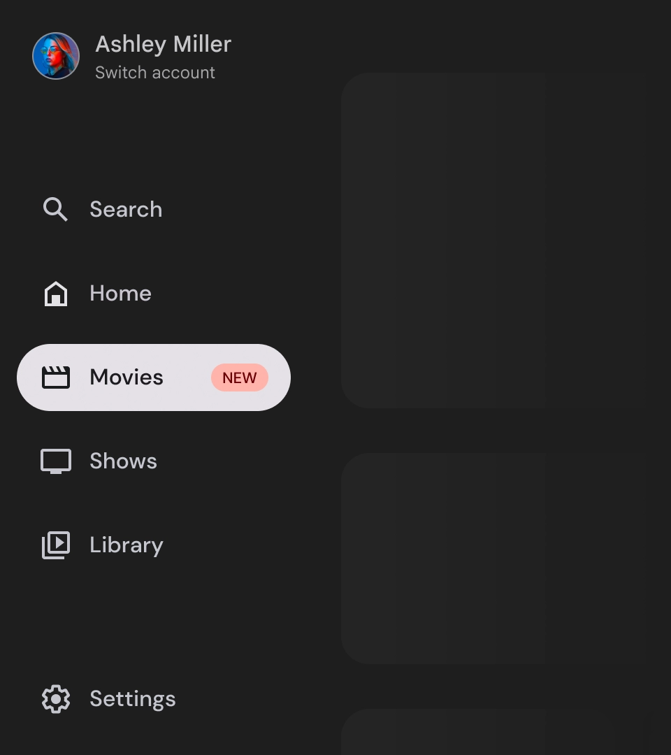
徽章
标记是一种视觉提示,可添加到导航项中以提供额外信息。例如,徽章可用于指示在线播放应用中提供的新电影数量。请谨慎使用徽章,仅在必要时使用,因为徽章可能会使界面看起来繁杂无序。使用徽章时,请确保徽章清晰易懂,并且不会干扰用户浏览应用。
徽章已展开
徽章已收起
标签
抽屉式导航栏中的标签应简洁明了,以便于阅读。

注意
如果无法避免使用长标签,请使用省略号截断标签。

错误做法
避免使用需要换行的长文本标签。
错误做法
避免创建没有图标的抽屉式导航栏,因为这可能会使用户难以浏览应用。
错误做法
避免将图标导航项与非图标导航项混合使用,因为这可能会让用户感到困惑。
抽屉式导航栏是代表应用层次结构的基础元素,应仅用于列出五到六个主要导航目的地。
正确做法
将抽屉式导航栏中的主要导航目的地数量限制为 5 到 6 个,以便提供更好的用户体验。
错误做法
避免添加过多导航项,因为这可能会导致垂直滚动,使用户更难于浏览应用。