
導覽匣是任何 TV 應用程式中不可或缺的元件,因為它可讓使用者存取不同的目的地和功能。導覽匣是應用程式資訊架構的骨幹,可提供清晰直覺的應用程式瀏覽方式。
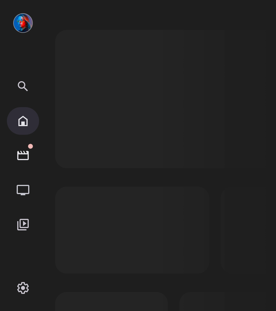
與行動裝置的導覽匣不同,電視上的導覽匣會同時顯示展開和收合狀態,供使用者查看。
資源
| 類型 | 連結 | 狀態 |
|---|---|---|
| 設計 | 設計來源 (Figma) | 可使用 |
| 實作 |
Jetpack Compose (NavigationDrawer)
Jetpack Compose (ModalNavigationDrawer) |
可使用 |
重點特色
- 目的地會依使用者的重要性排序,最常造訪的目的地會排在最前面,相關目的地則會分組顯示。
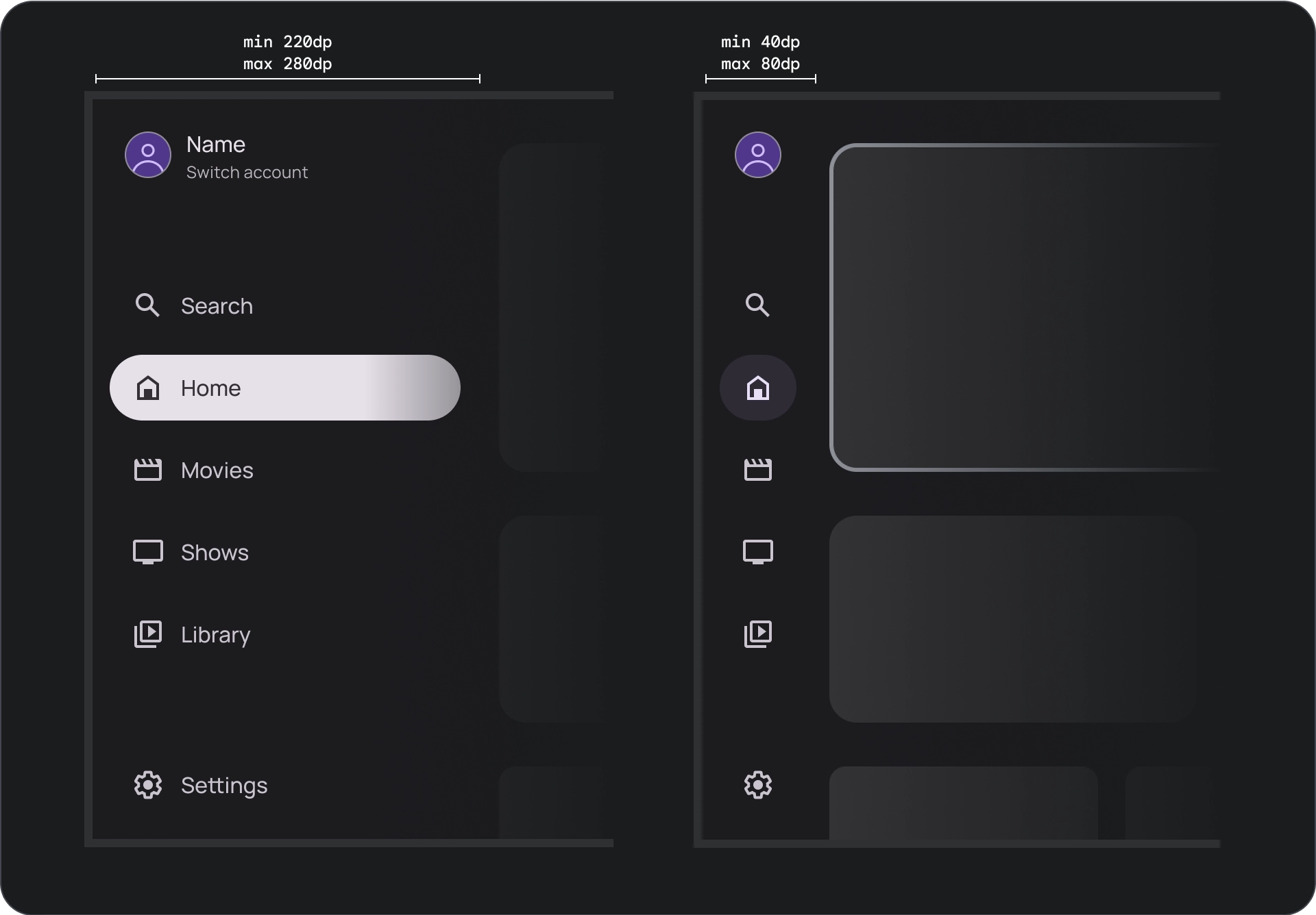
- 標準和模態導覽匣在收合時,都需要導覽軌。
版本
導覽匣樣式分為兩種:
- 標準導覽匣:展開後可為導覽功能提供額外空間,將頁面內容推到旁邊。
- 模態導覽匣:會以疊加的方式顯示在應用程式內容上方,並搭配遮罩,有助於在展開導覽匣時提高可讀性。
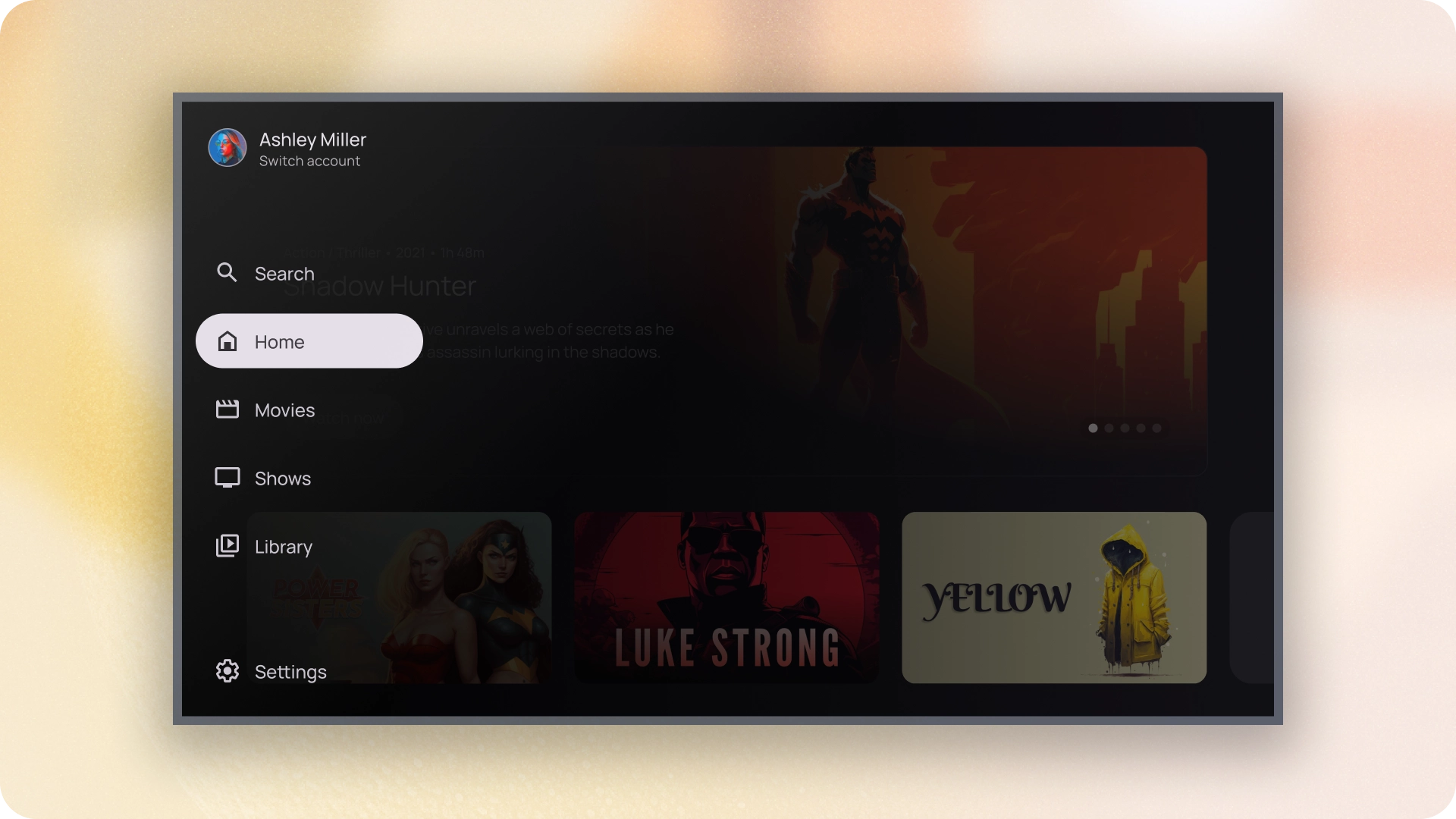
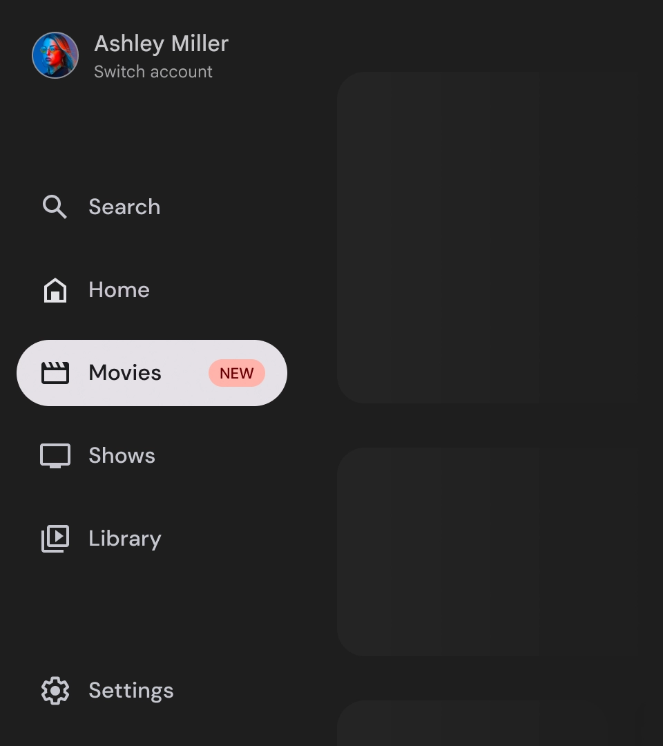
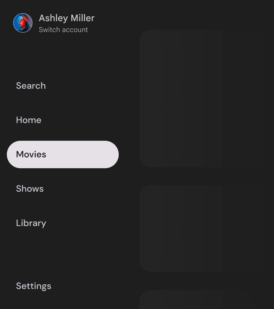
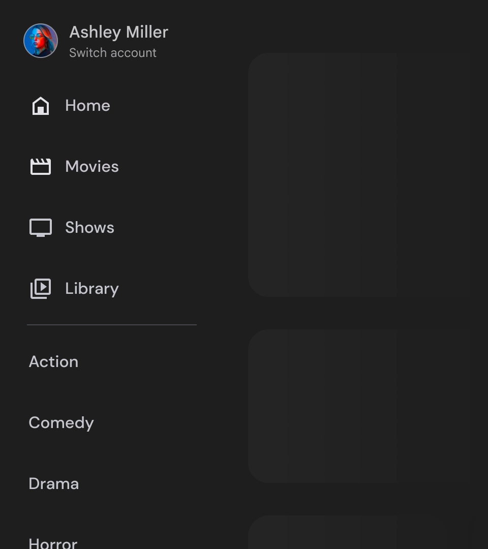
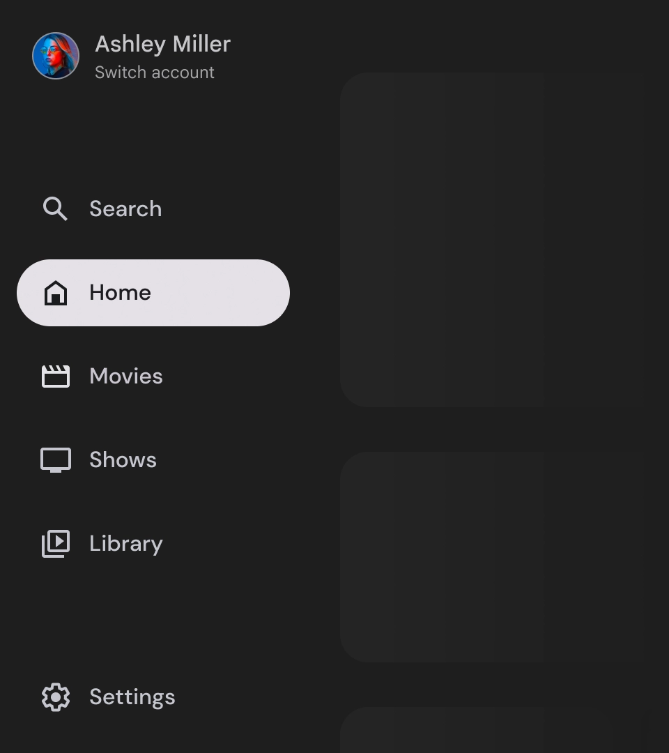
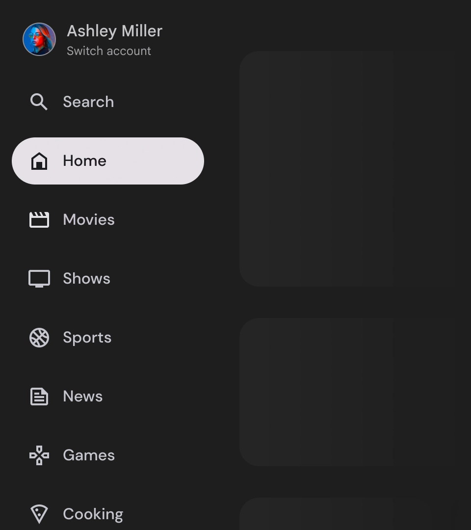
標準導覽匣
圖解
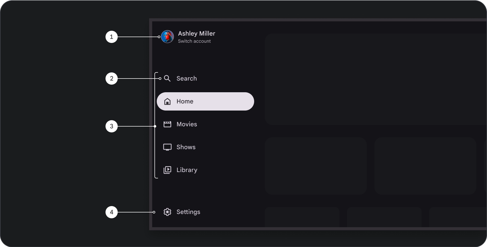
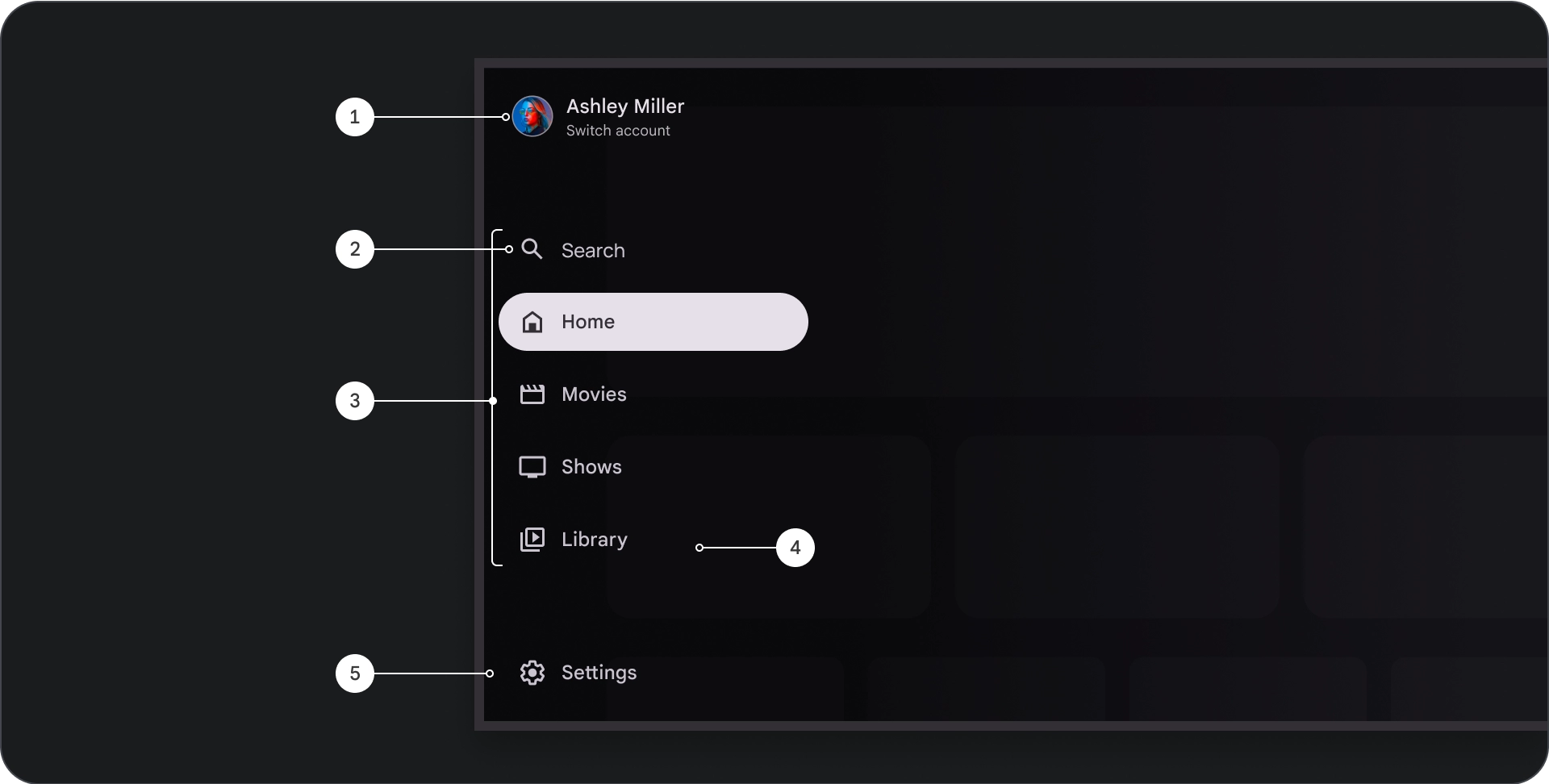
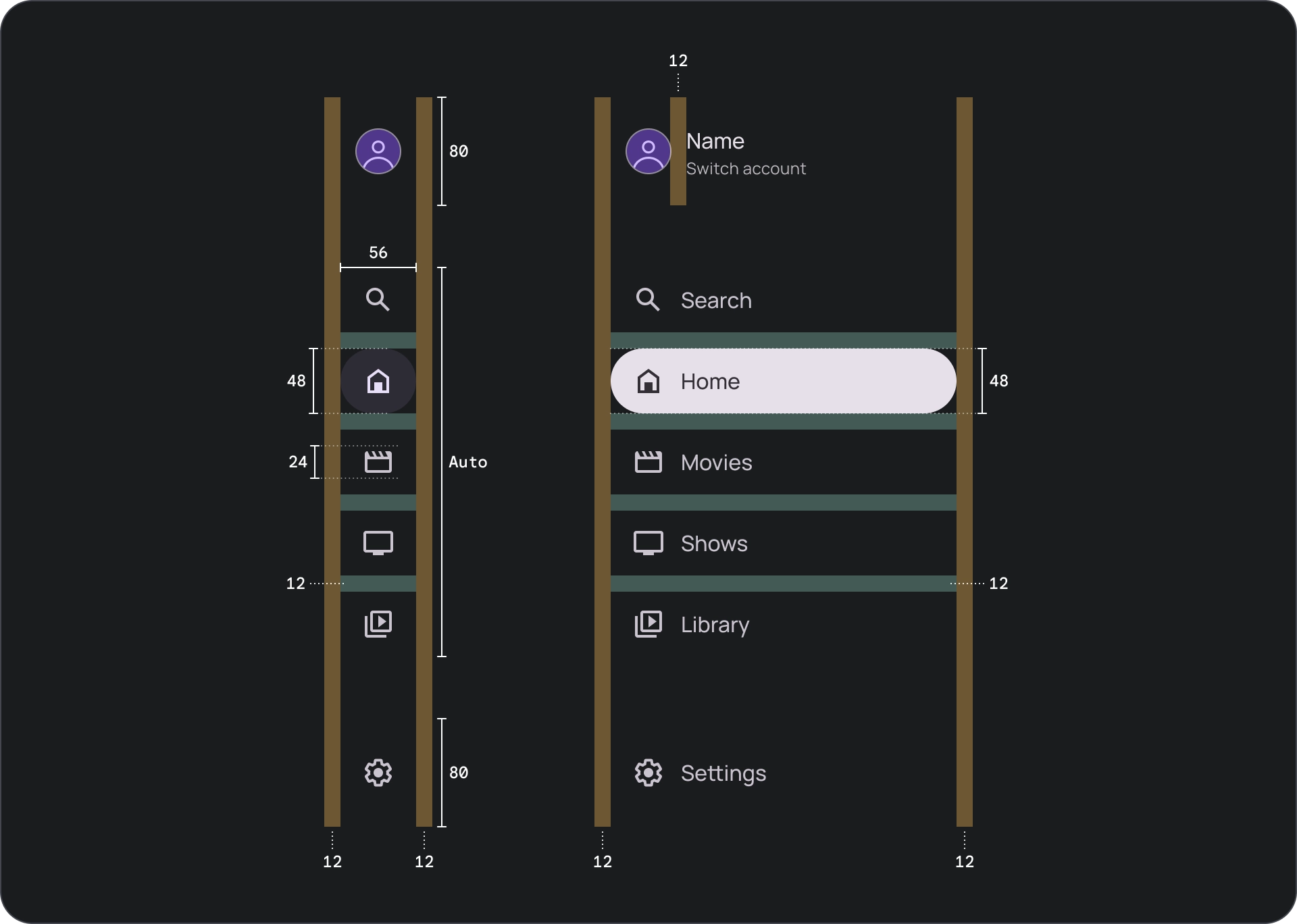
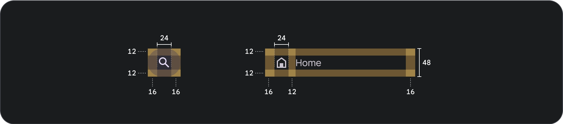
- 頂端部分:顯示應用程式標誌。可做為切換設定檔或觸發搜尋動作的按鈕。在收合狀態下,頂層容器中只會顯示圖示。
- 導覽項目:導覽邊欄中的每個項目都會結合圖示和文字,且在收合狀態下只會顯示圖示。
- 導覽邊欄:導覽邊欄是一欄顯示 3 到 7 個應用程式目的地的列,可做為主選單。每個目的地都有文字標籤和選用圖示,可選擇將選單項目分組,以便提供更貼近情境的內容。
- 底部區段:可放置一到三個動作按鈕,非常適合設定、說明或個人資料等頁面。
行為
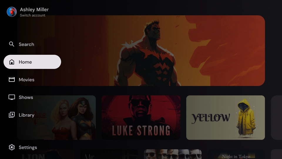
- 導覽匣展開:展開標準導覽匣時,系統會推送頁面內容,為導覽匣的展開版本騰出空間。
- 導覽更新:從一個導覽項目移動到另一個導覽項目時,頁面會自動更新至新目的地。
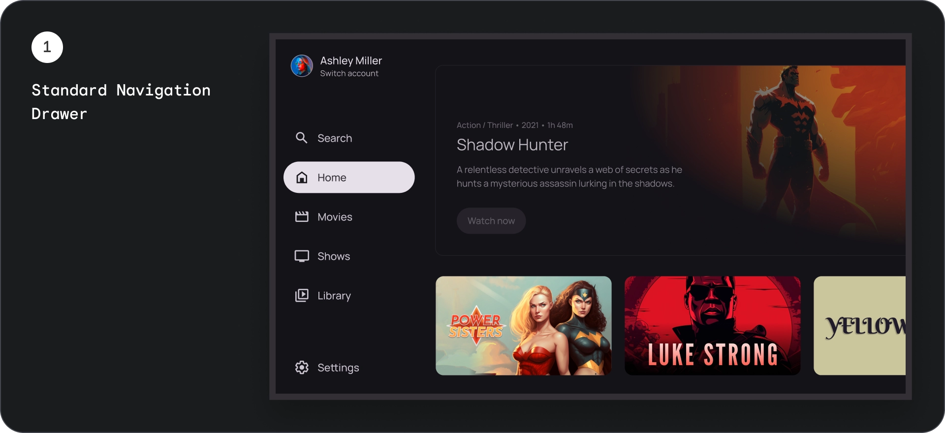
強制回應導覽匣
圖解
- 頂端部分:顯示應用程式標誌。可做為切換設定檔或觸發搜尋動作的按鈕。在收合狀態下,頂層容器中只會顯示圖示。
- 導覽項目:導覽邊欄中的每個項目都會結合圖示和文字,且在收合狀態下只會顯示圖示。
- 導覽列:顯示三到七個應用程式目的地的資料欄,做為主選單。每個目的地都有文字標籤和選用圖示,您可以選擇將選單項目分組,以便提供更貼近情境的內容。
- 預覽畫面:可讓使用者更容易閱讀導覽項目文字。
- 底部區段:可放置一到三個動作按鈕,適合設定、說明或個人資料等頁面。
行為
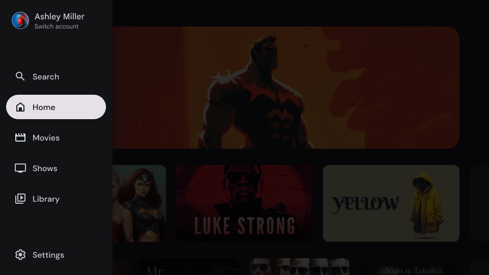
- 展開抽屜:會在應用程式內容上方顯示重疊層,並在展開抽屜時顯示遮罩,以利閱讀。
- 導覽更新:使用者選取導覽項目時發生。
紗罩
對於強制回應導覽匣,導覽匣後方的遮罩可確保導覽匣內容可讀。您可以使用導覽匣後方的漸層或實心表面,建立不同的 UI 變化版本。
漸層紗罩
實體紗罩
規格
用量
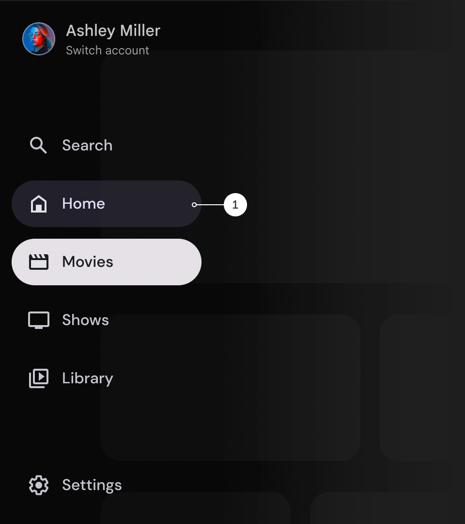
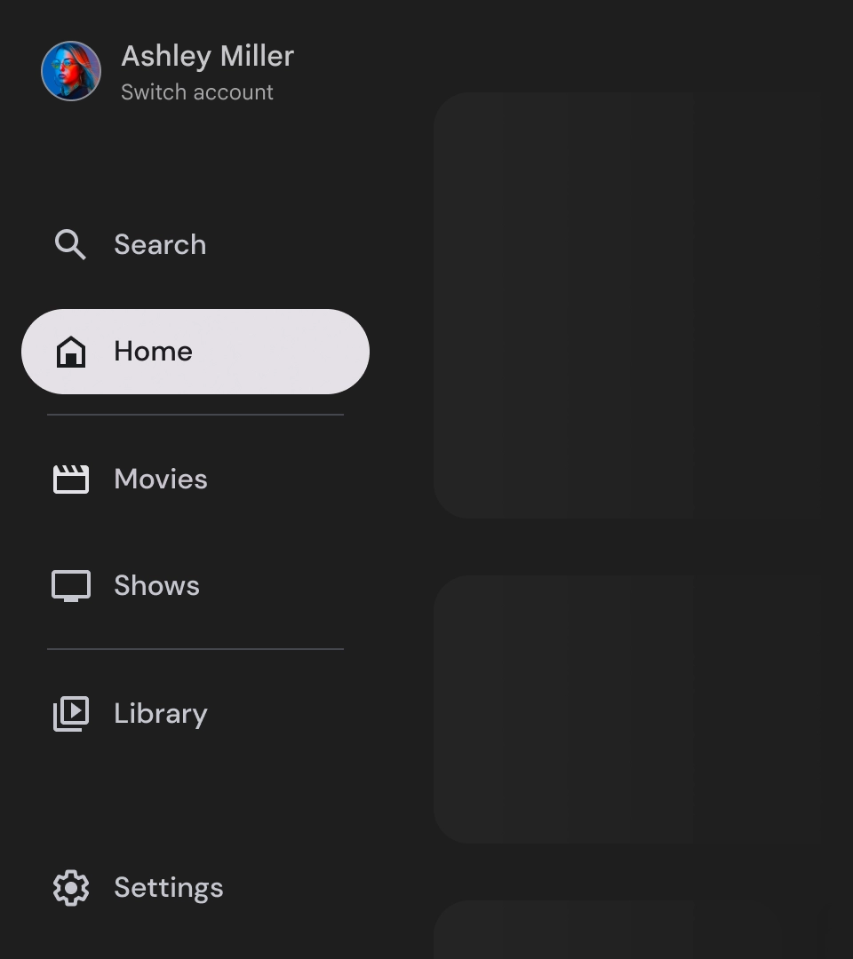
使用中指標
活動指標是一種視覺提示,用來強調顯示的導覽匣目的地。指標通常會以背景圖形表示,與抽屜中的其他項目在視覺上有所區隔。活動指標可協助使用者瞭解自己在應用程式中的位置,以及正在瀏覽的目的網頁。請確保活動指標清晰可見,並能輕易與導覽匣中的其他項目區分。
分隔線 (選用)
您可以使用分隔線,在導覽匣中分隔不同群組的目的地,以便進行整理。不過,請務必謹慎使用分隔符,因為分隔符過多可能會造成視覺干擾,並為使用者帶來不必要的認知負荷。
徽章
徽章是可新增至導覽項目的視覺提示,用於提供額外資訊。舉例來說,您可以使用徽章來表示串流應用程式中可用的全新電影數量。徽章可能會讓使用者介面看起來雜亂,因此請謹慎使用,並僅在必要時使用。使用徽章時,請確保徽章清晰易懂,且不會妨礙使用者瀏覽應用程式。
已展開的徽章
徽章已收合
標籤
導覽匣中的標籤應簡明扼要,方便使用者閱讀。
注意
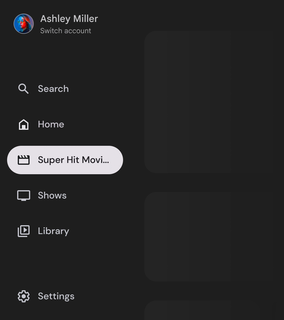
如果無法避免使用長標籤,請使用省略號截斷標籤。
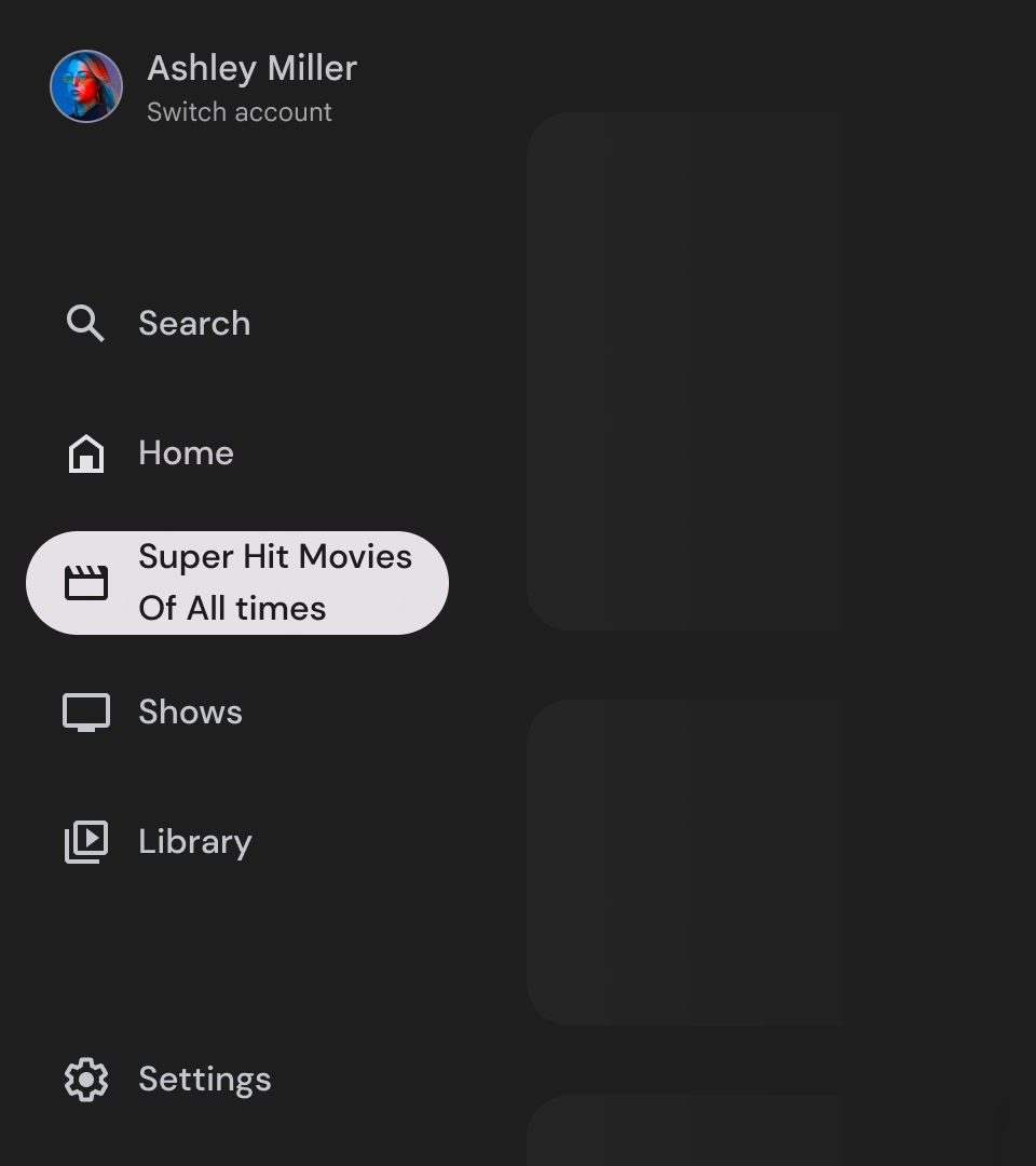
錯誤做法
避免使用需要換行的長文字標籤。
錯誤做法
請勿建立沒有圖示的導覽匣,否則使用者可能會難以瀏覽應用程式。
錯誤做法
請勿混用圖示導覽項目和非圖示導覽項目,否則可能會讓使用者對導覽體驗感到困惑。
導覽匣是代表應用程式階層的基礎元素,應只用於列出五到六個主要導覽目的地。
正確做法
為提供更優質的使用者體驗,請將導覽匣中的主導覽目的地數量限制在五到六個。
錯誤做法
避免加入過多導覽項目,因為這可能會導致垂直捲動,使用者也會更難瀏覽應用程式。