
标签页用于整理不同屏幕、数据集和互动中的内容。标签页可用于在包含不同且相关的信息组的视图之间切换。
资源
| 类型 | 关联 | 状态 |
|---|---|---|
| 设计 | 设计源代码 (Figma) | 可用 |
| 实现 | Jetpack Compose | 可用 |
亮点
- 标签页可以水平滚动。界面可以根据需要包含任意数量的标签页。
- 标签页可对内容进行分类,以帮助用户快速找到不同类型的信息。
- 这些标签页按重要性相同类别并排显示为类似应用。
变体
标签页指示器分为以下两种类型:
- 药丸指示符
- 条形指示器
根据强调效果选择合适的类型。建议使用药丸指示器标签页来整理整个页面。它们显示主要内容目的地。条形指示器标签页用于在内容区域内进一步分隔相关内容并建立层次结构。
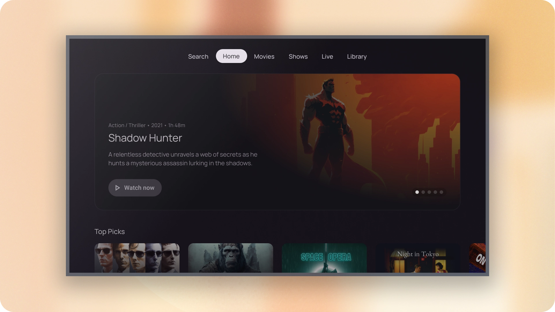
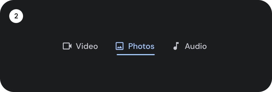
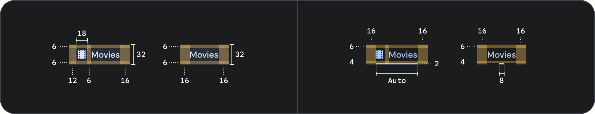
解剖学
- 图标(可选)
- 标签
- 活动指示器
- 药丸
- 酒吧
- 容器
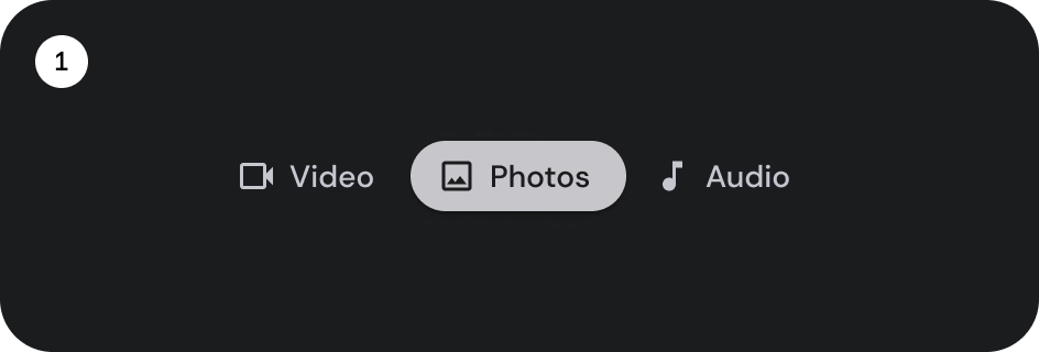
状态
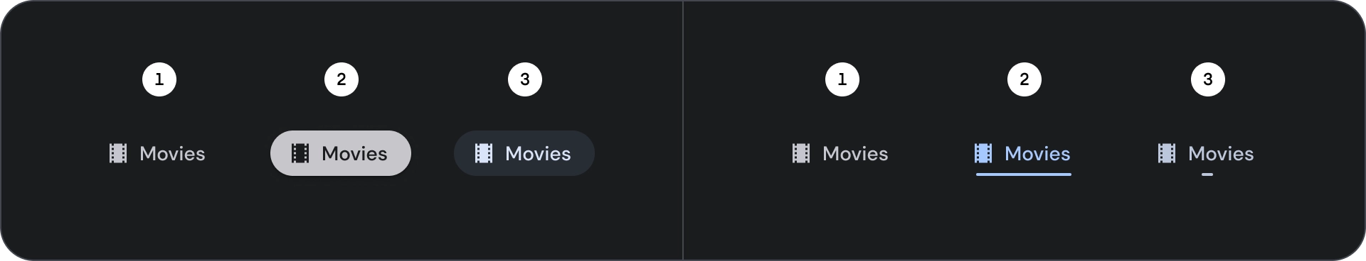
- 默认
- 专注
- 已选择
规格
行为
从一个标签页移动到下一个标签页时,以下内容也会根据标签页的移动情况左右滑动。