
ট্যাবগুলি বিভিন্ন স্ক্রীন, ডেটা সেট এবং মিথস্ক্রিয়া জুড়ে সামগ্রী সংগঠিত করে। ট্যাবগুলি স্বতন্ত্র এবং সম্পর্কিত তথ্যের গ্রুপগুলির ভিউগুলির মধ্যে স্যুইচ করতে ব্যবহার করা যেতে পারে।
সম্পদ
| টাইপ | লিঙ্ক | স্ট্যাটাস |
|---|---|---|
| ডিজাইন | ডিজাইন সোর্স (ফিগমা) | পাওয়া যায় |
| বাস্তবায়ন | জেটপ্যাক রচনা | পাওয়া যায় |
হাইলাইট
- ট্যাবগুলি অনুভূমিকভাবে স্ক্রোল করতে পারে। একটি UI-তে যতগুলি প্রয়োজন ততগুলি ট্যাব থাকতে পারে।
- ব্যবহারকারীদের বিভিন্ন ধরনের তথ্য দ্রুত খুঁজে পেতে সাহায্য করার জন্য ট্যাবগুলি বিষয়বস্তুকে বিভাগগুলিতে সংগঠিত করে৷
- ট্যাবগুলি সমান গুরুত্বের বিভাগে সমবয়সীদের হিসাবে একে অপরের পাশে প্রদর্শিত হয়।
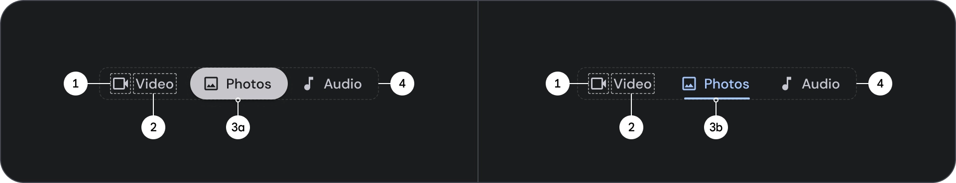
বৈকল্পিক
দুটি ধরণের ট্যাব সূচক রয়েছে:


- পিল সূচক
- বার নির্দেশক
জোর অনুযায়ী সঠিক টাইপ নির্বাচন করুন. সম্পূর্ণ পৃষ্ঠাগুলি সংগঠিত করার জন্য পিল নির্দেশক ট্যাবগুলি সুপারিশ করা হয়। তারা প্রধান বিষয়বস্তু গন্তব্য প্রদর্শন. বার নির্দেশক ট্যাবগুলি একটি বিষয়বস্তুর এলাকার মধ্যে ব্যবহার করা হয় যাতে সংশ্লিষ্ট বিষয়বস্তুকে আরও আলাদা করা যায় এবং শ্রেণীবিন্যাস স্থাপন করা হয়।
অ্যানাটমি
- আইকন (ঐচ্ছিক)
- লেবেল
- সক্রিয় সূচক
- পিল
- বার
- ধারক
রাজ্যগুলি
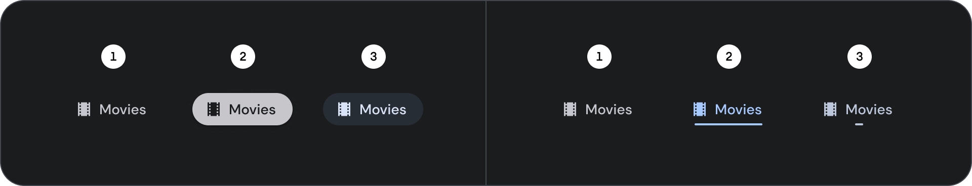
- ডিফল্ট
- নিবদ্ধ
- নির্বাচিত
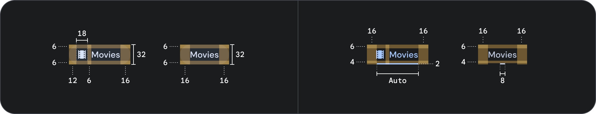
চশমা
আচরণ
একটি ট্যাব থেকে পরবর্তীতে যাওয়ার সময় নীচের বিষয়বস্তুটি ট্যাব চলাচলের উপর ভিত্তি করে বাম বা ডান দিকে স্লাইড করে।