
与触摸界面不同,TV 在很大程度上依赖于不同的主要状态(默认、聚焦、按下)来吸引用户的注意力。这将作为导航的起点。
亮点
- 焦点系统由多个可聚焦元素部分组成。
- 焦点指示标志是突出显示聚焦元素的视觉设备。
- 当某个元素处于聚焦状态或被选中时,缩放指示会按 x 系数调整元素。
- 虽然背景颜色是静态的,但 Surface 颜色在聚焦时可能会发生变化。
侧重点
焦点是 TV 设计的关键状态定义。导航功能仅限于遥控器上可用的方向键交互。用户可以使用箭头键进行移动,使用中间的按钮进行选择,使用返回键返回。遥控器允许用户一次进行一次互动。元素的状态变化使用焦点指示器表示,以帮助用户进行可视化。
可聚焦的元素和组
“可聚焦元素”是 TV 界面不可或缺的一部分。“可聚焦元素”可以是任何组件,例如按钮、卡片、列表项或自定义的 Surface。在任何给定时间,用户都应该能够仅专注于一个可聚焦的元素。
另一方面,“可聚焦的群组”包含一个或多个“可聚焦元素”。可以有任意数量的嵌套“可聚焦组”。可聚焦组用于在逻辑上对不同的可聚焦元素进行分组,以实现用户友好的导航。
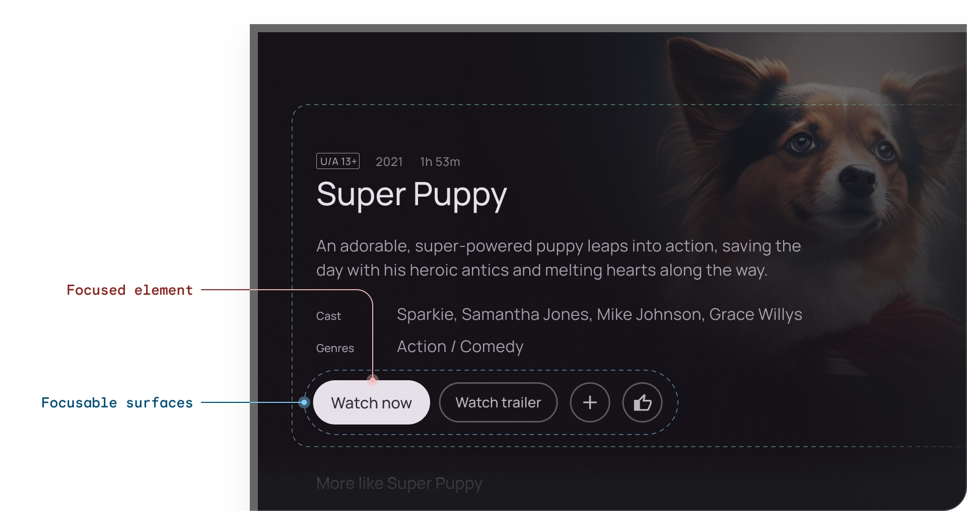
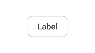
对焦指示标志
焦点指示标志是对焦点元素的独特可视化。 选择某个元素后,该元素会进入“按下”状态,直到松开遥控器按钮。
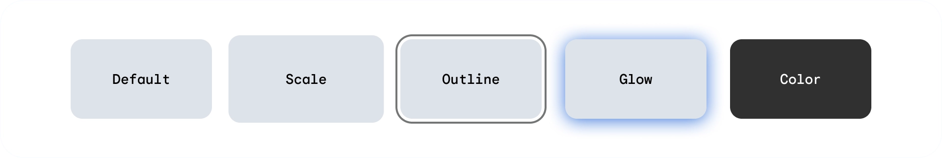
您可以通过调整以下属性来配置可聚焦元素的每种状态:
- 缩放 - 更改聚焦元素的大小
- 边框 - 在元素周围绘制轮廓
- 发光 - 在元素下创建阴影(通常用于卡片)
- 颜色 - 更改元素背景和内容颜色
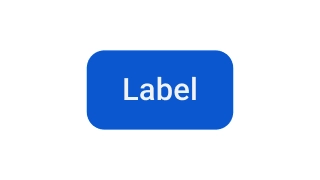
比例指示
在聚焦或选择元素时缩放元素。默认扩缩值为:1.025、1.05 和 1.1x。使用此指示图标可针对导航提供明确反馈。不同元素的缩放值可能会因元素大小而异。

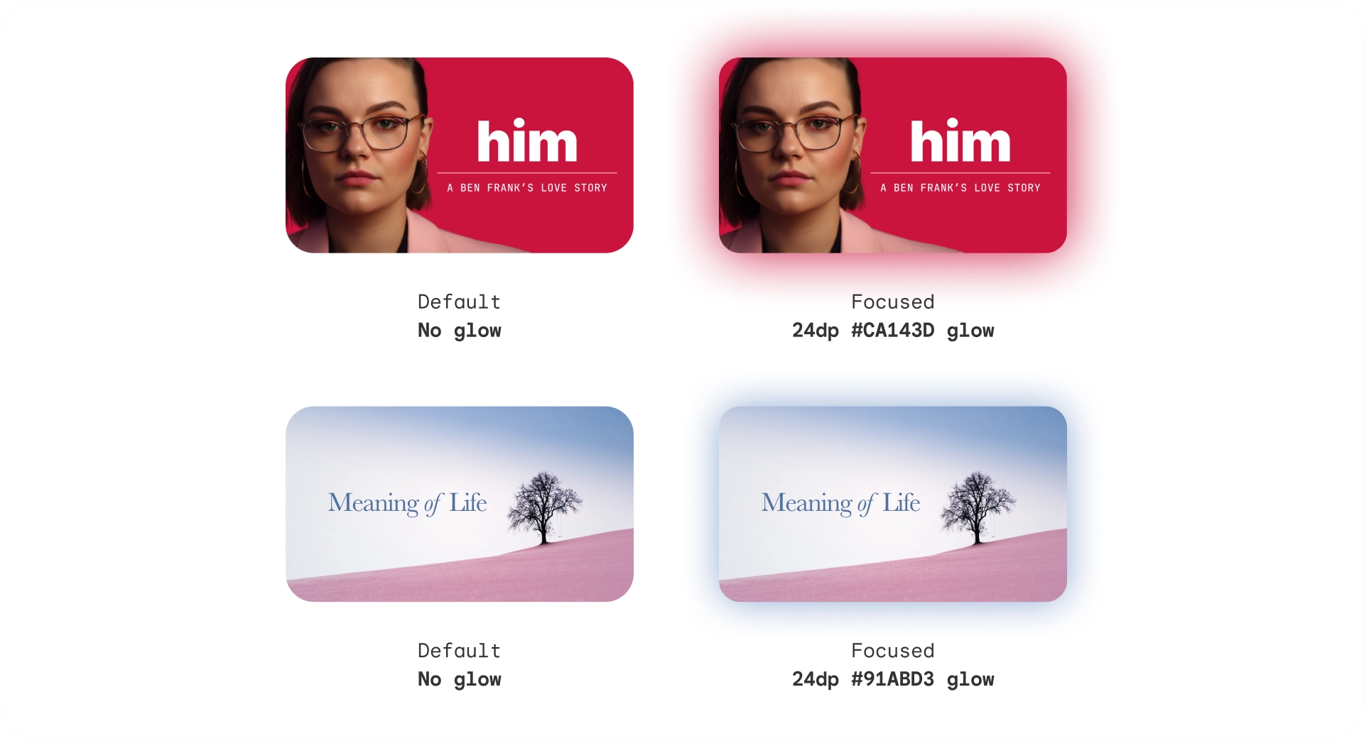
发光指示
在元素周围添加漫射光晕或阴影。发光指示采用以下参数:
- 发光级别:建议元素的高度,范围为 2dp - 32dp
- 发光颜色:可以根据图片或品牌颜色指定
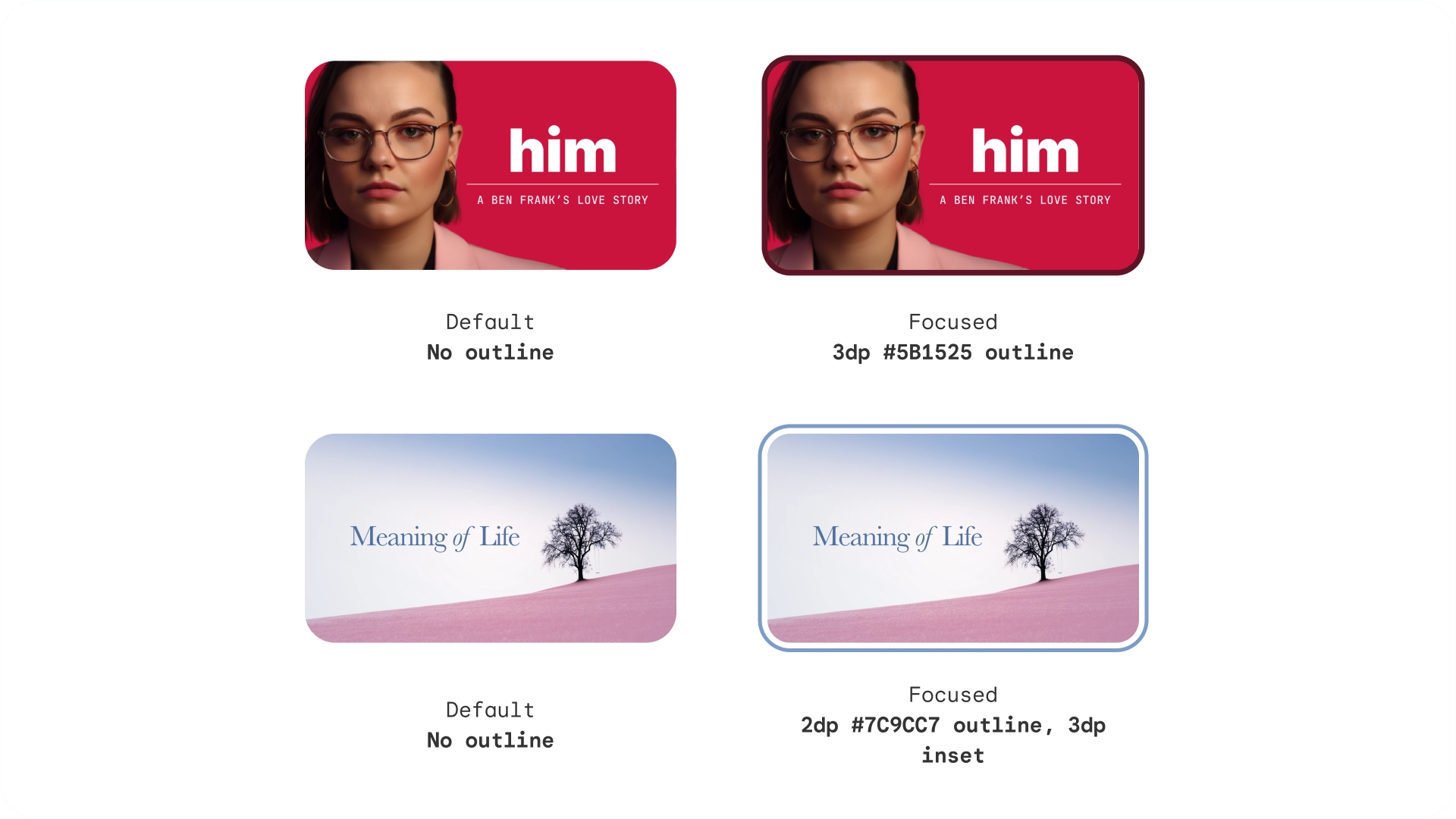
轮廓指示
在元素周围添加独立于边框的轮廓。轮廓指示使用了以下参数:
- 轮廓宽度:元素外的表单
- 轮廓边衬区:元素与其轮廓之间的间距
- 轮廓颜色:可根据图片或品牌颜色指定
颜色指示
元素可通过适应颜色来改变状态。颜色指示使用以下参数:
- 背景颜色:更改元素的表面颜色
- 内容颜色:更改 Surface 上内容的颜色

色调高度
虽然背景颜色是静态的,但 Surface 颜色可以更改。高度为 +1 到 +5 的表面通过基于主要颜色的颜色叠加层进行着色。这会在 Surface 基准中引入色调变化。
色调 Surface 具有许多优势:
- 创建高度效果,以区分不同的元素和文本
- 针对无障碍优势建立对比
- 打造视觉互动体验,并柔化互动元素之间的过渡效果
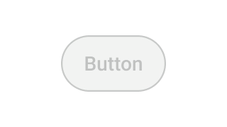
已停用
在停用状态下,背景颜色和不透明度会以较低的显眼程度显示,以表示相应对象不可点击。
用例
可聚焦元素有 3 种主要状态:默认、聚焦和按下,还有更多状态:已启用、已停用和选中(形成一个矩阵)。
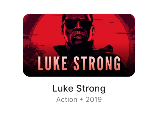
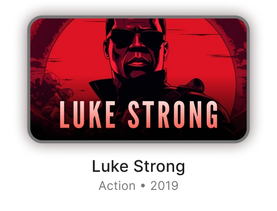
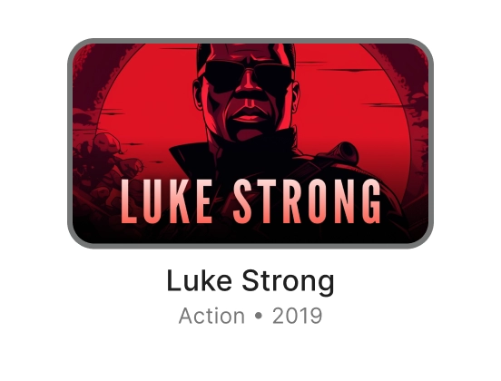
卡片
| 默认 | 专注 | 已按下 | |
|---|---|---|---|
| 已启用 |
|
|
|
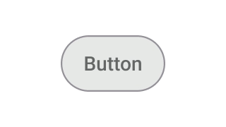
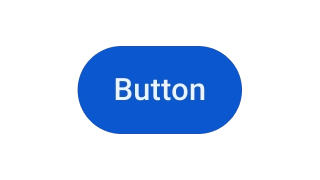
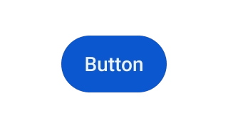
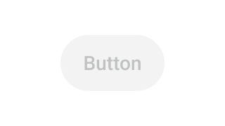
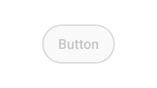
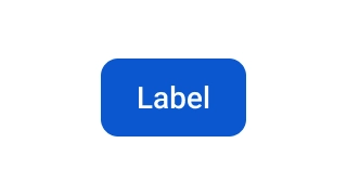
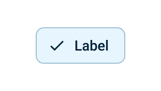
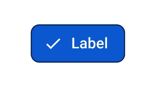
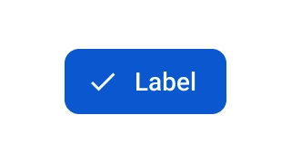
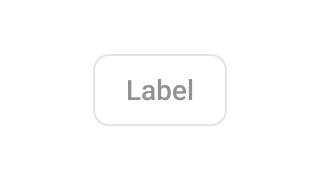
按钮
| 默认 | 专注 | 已按下 | |
|---|---|---|---|
| 已启用 |
|
|
|
| 已停用 |
|
|
|
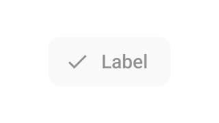
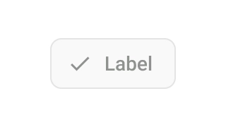
条状标签
| 默认 | 专注 | 已按下 | |
|---|---|---|---|
| 已启用 |
|
|
|
| 已启用 + 已选择 |
|
|
|
| 已停用 |

|
|

|
| 已停用 + 已选择 |
|
|

|