
本指南介绍了如何创建适用于 Android TV 的横幅和启动器图标。
要点总结
以下是本页要点总结:
- AndroidManifest.xml 中有两种适用于 Android TV OS 应用的图标类型:
android:icon(标准,必需)android:banner(横幅,必需)
- 强烈建议使用自适应图标。
- 图标和横幅都必须符合本指南中列出的设计准则。
- 使用官方 Figma 模板生成横幅和图标
- Android TV 操作系统不支持带主题的图标。
概览
Google TV 和 Android OS 以三种方式使用通过您的 AndroidManifest.xml 提供的图标:
- 启动器图标(宽高比为 1x1)
- 圆形启动器图标(宽高比为 1x1,但为圆形)
- 横幅徽标(宽高比为 16x9)
这些数据在不同用例中使用不同的位置,例如您的应用行、设置或安装进度。
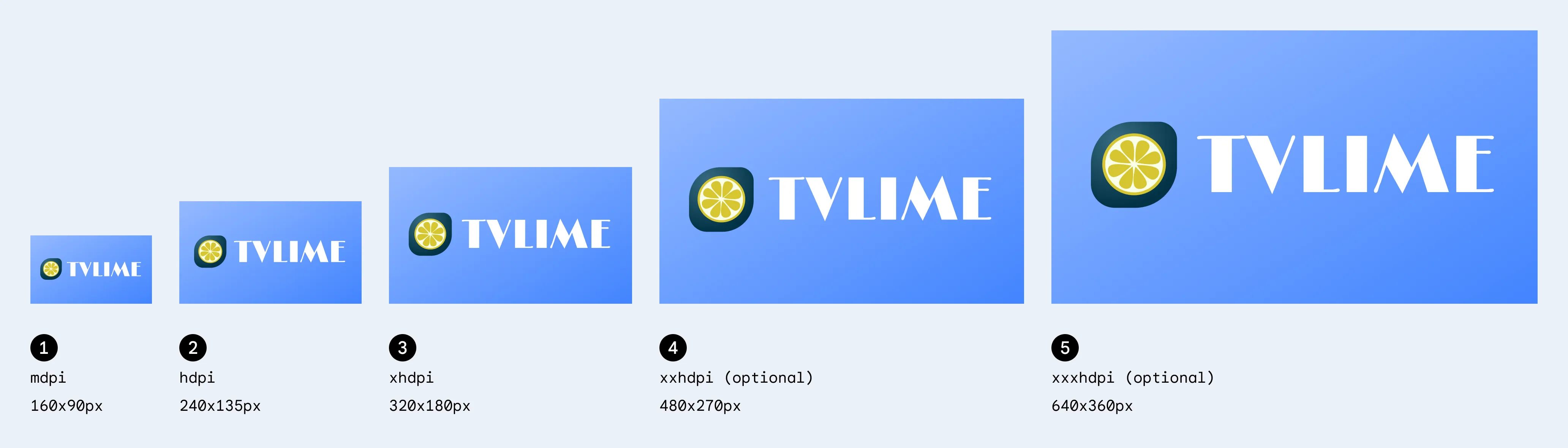
横幅
横幅徽标是一个宽高比为 16x9 的徽标,在 Android TV OS 中用于显示您的应用启动器。我们建议 TV 应用提供具有以下规范的 16:9 自适应横幅广告。使用 API 级别 25 或更低级别时,您还可以提供大小为 320 x 180px 的 xhdpi 资源。
| 密度 | 最小大小 | 文件夹位置(在 res 下) | 像素比 |
|---|---|---|---|
| mdpi | 160x90 像素 | mipmap-mdpi | 1 |
| hdpi | 240x135 像素 | mipmap-hdpi | 1.5 |
| xhdpi | 320x180 像素 | mipmap-xhdpi | 2 |
| xxhdpi | 480x270 像素 | mipmap-xxhdpi | 3 |
| xxxhdpi | 640x360 像素 | mipmap-xxxhdpi | 4 |
启动器图标
“启动器”图标是一种宽高比为 1x1 的资源,可用于 Android TV 上的“设置”和“媒体会话集成”(“正在播放”卡片)等多个位置。启动器图标也可以在 Google TV 上的您的应用行中使用。
| 密度 | 最小大小 | 文件夹位置(在 res 下) | 像素比 |
|---|---|---|---|
| mdpi | 80x80 像素 | mipmap-mdpi | 1 |
| hdpi | 120x120 像素 | mipmap-hdpi | 1.5 |
| xhdpi | 160x160 像素 | mipmap-xhdpi | 2 |
| xxhdpi | 240x240 像素 | mipmap-xxhdpi | 3 |
| xxxhdpi | 320x320 像素 | mipmap-xxxhdpi | 4 |
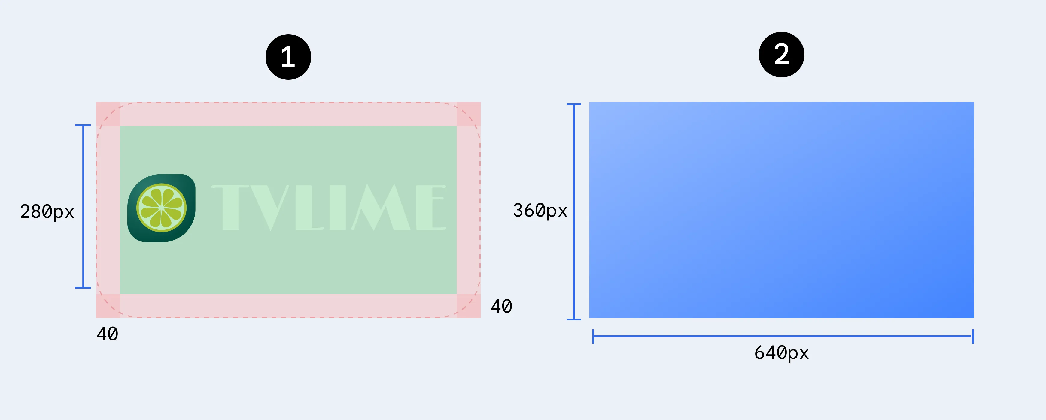
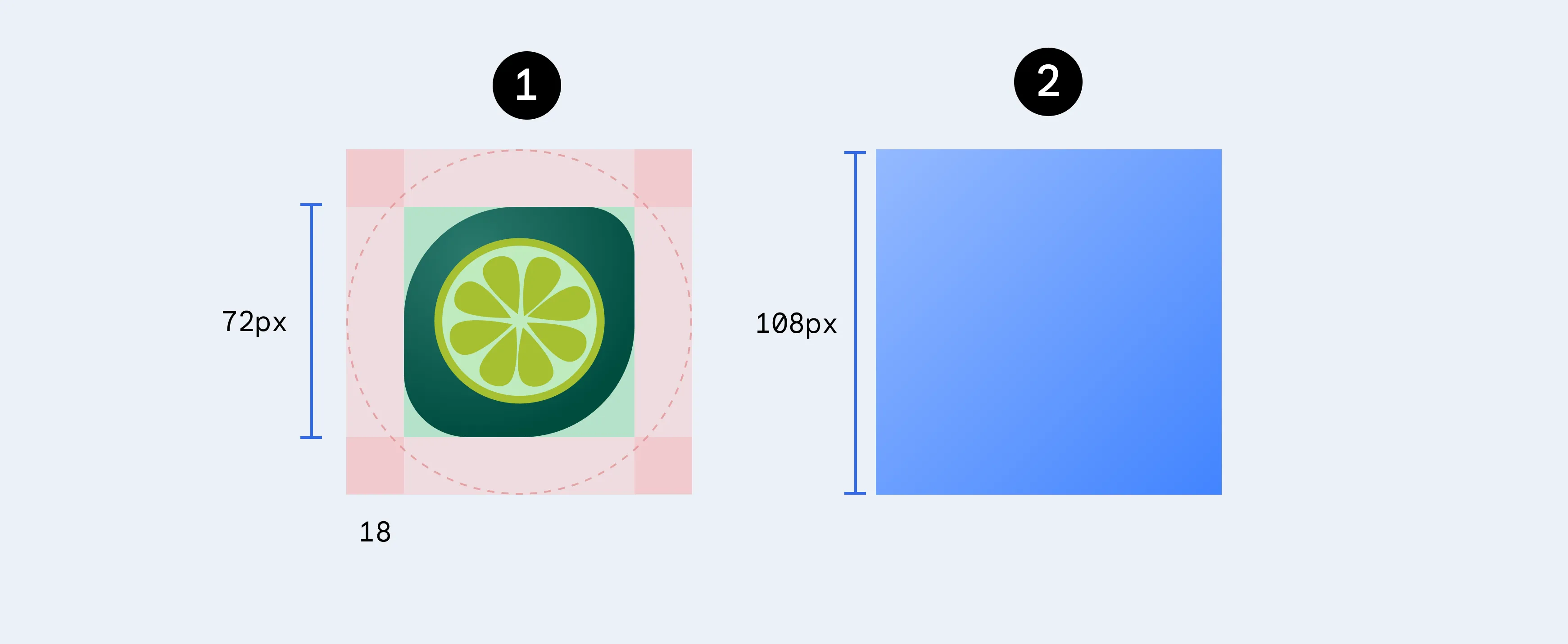
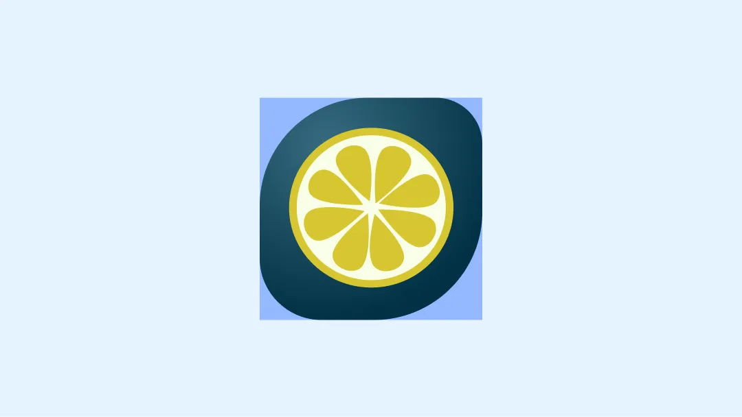
自适应图标
自 Android 8.0 版本(API 级别 26)起,开始支持自适应启动器图标,这可以提高应用图标的灵活性和有趣的视觉效果。对于开发者来说,这意味着应用图标由两个图层组成:前景图层和背景图层。
自适应横幅广告
您还可以将自适应横幅广告与旧版横幅广告搭配使用,这类似于启动器图标横幅广告,也有两个图层。
自适应启动器图标
为确保自适应图标支持不同的形状和视觉效果,设计必须满足以下要求:
为图标的颜色版本提供两个图层:一个用于前景,一个用于背景。
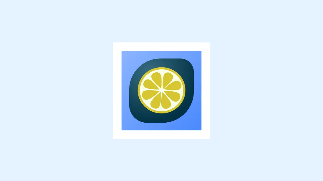
使用前景图层和背景图层来定义自适应图标。第一张图片中的 72 x 72 安全区域显示了图标和前景图层绝不会被形状蒙版裁剪的位置。
不需要提供单色版本的图标,因为 Android TV 不支持带主题的图标。
示例
以下是在设计 TV 应用图标时需要考虑的一些正确做法和错误做法。
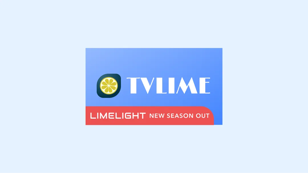
横幅广告示例
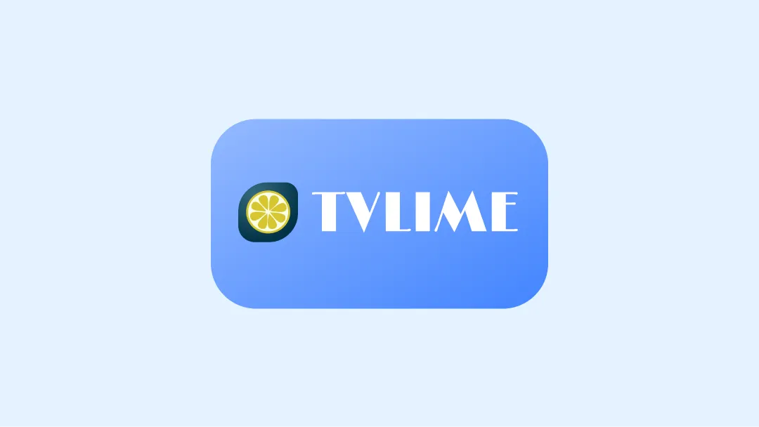
正确做法
遵循指南,确保徽标位于安全区域
错误做法
避免使用文字或图形元素来指示任何其他信息。
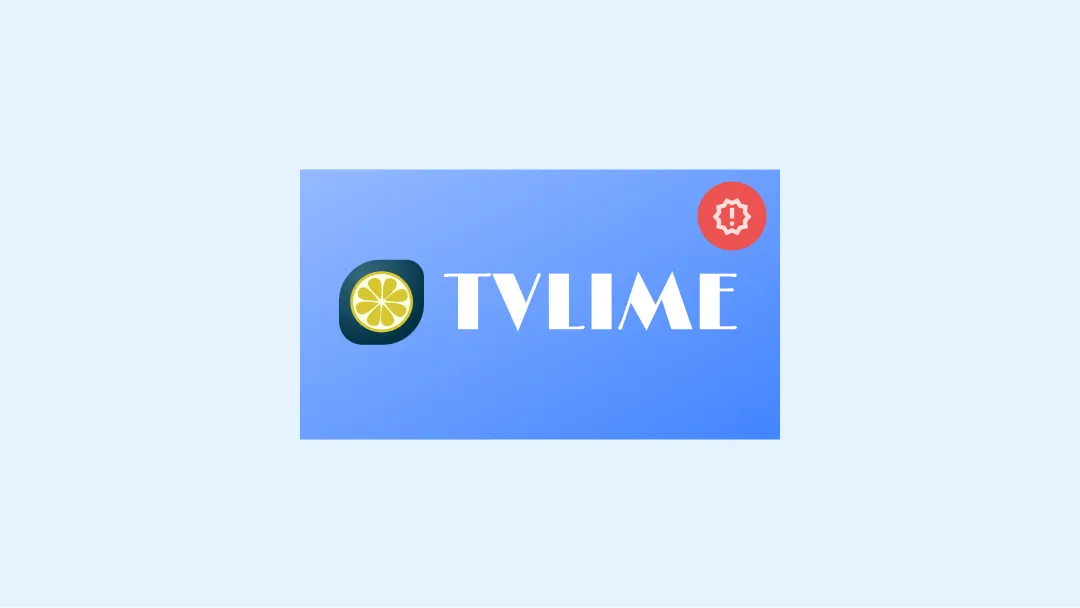
错误做法
请勿使用可能会误导用户的文字或图形元素
错误做法
请勿将徽标洒出安全区域
错误做法
徽标剪裁后,应避免在徽标周围添加任何边框,以免造成未经抛光的视觉效果。
错误做法
避免剪裁徽标
注意
使用横幅时,建议您展示完整的徽标、图标 + 文字。
启动器示例
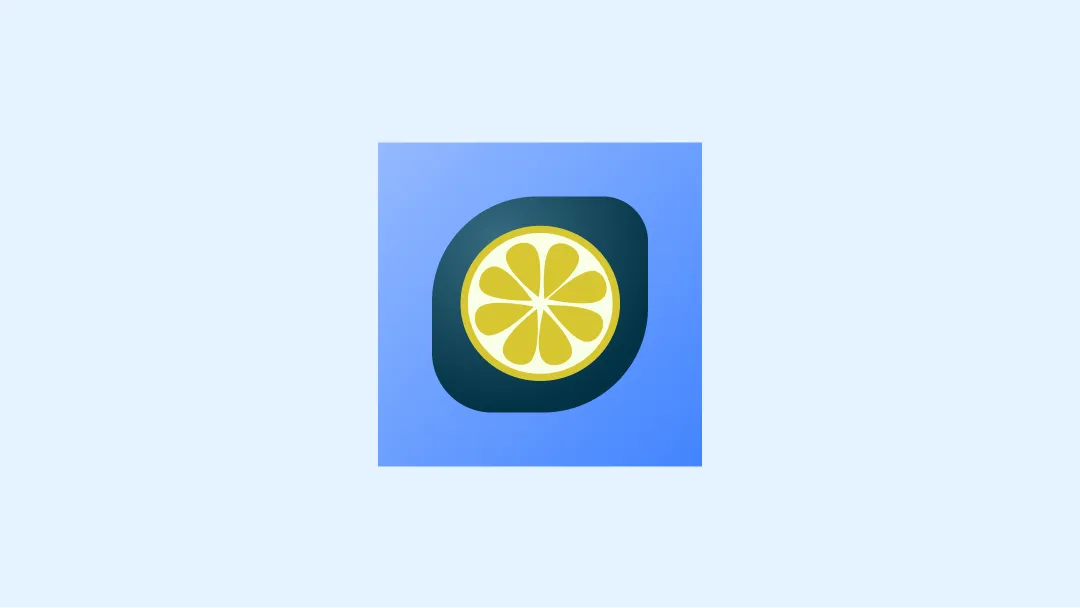
正确做法
遵循指南,确保徽标位于安全区域
错误做法
请勿使用文字或图形元素表示任何其他信息。
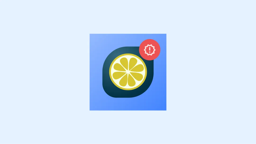
错误做法
请勿使用可能会误导用户的文字或图形元素
错误做法
请勿将徽标洒出安全区域
错误做法
徽标剪裁后,应避免在徽标周围添加任何边框,以免造成未经抛光的视觉效果。
错误做法
避免剪裁徽标
资源
- 横幅和图标的官方 Figma 模板