
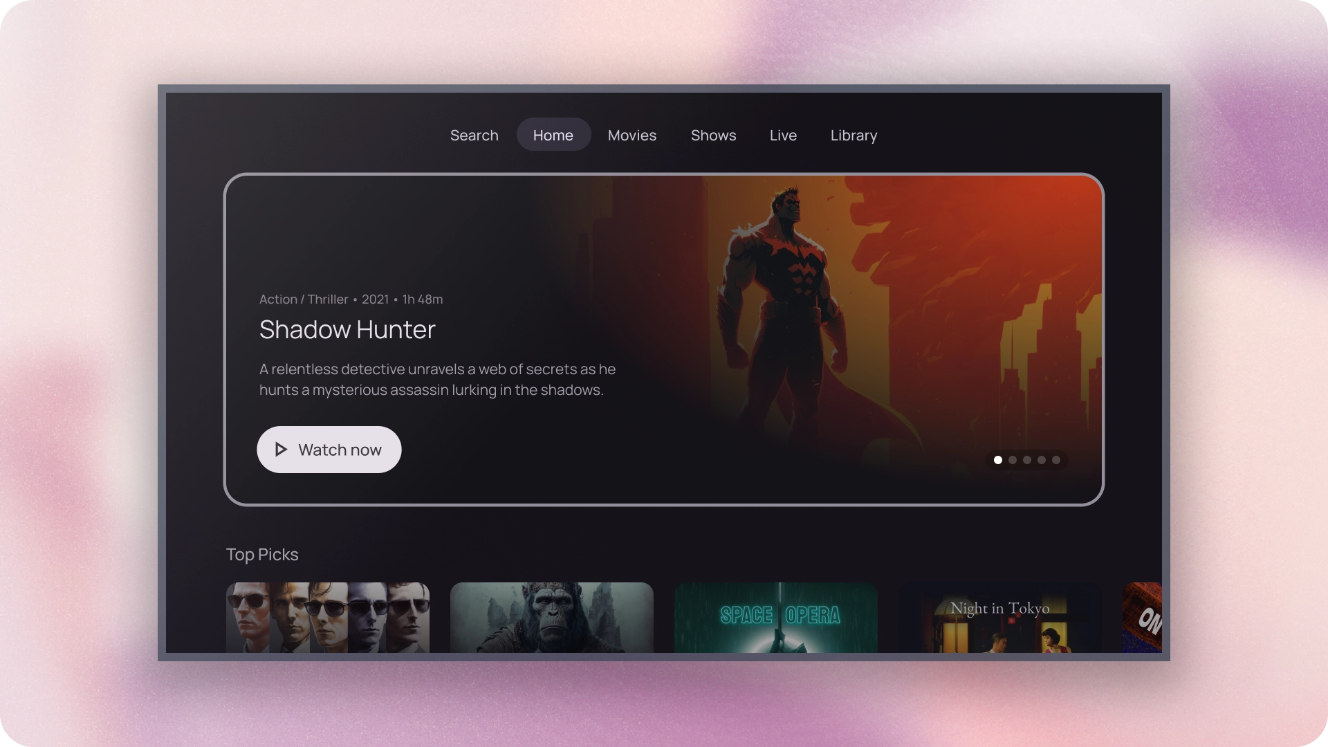
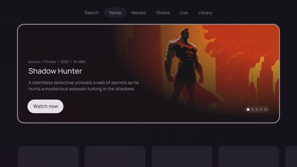
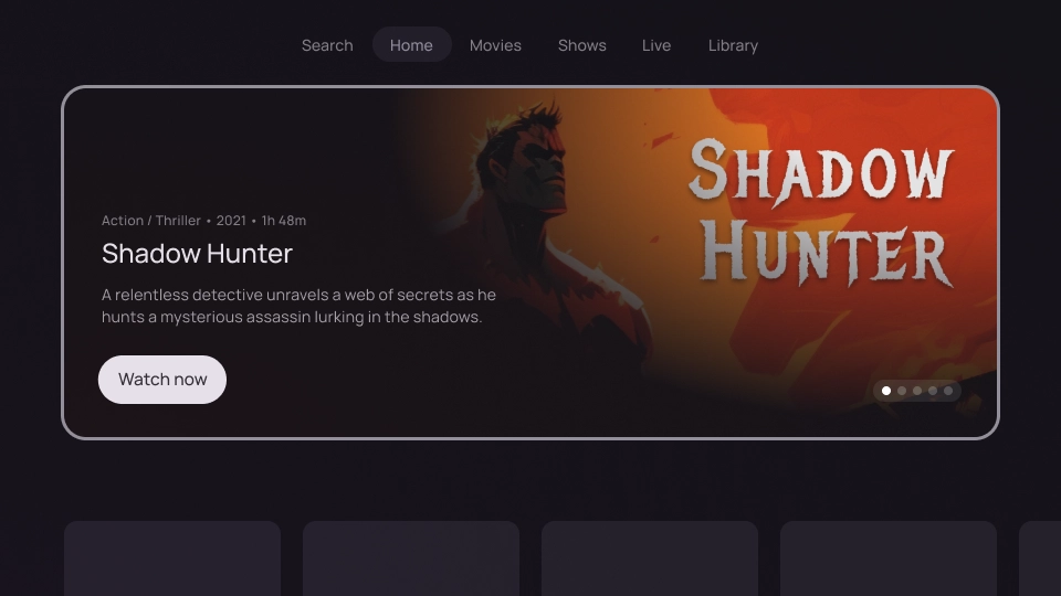
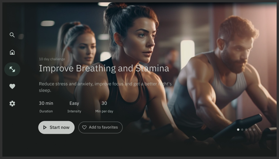
Featured carousels showcase a selection of content relevant to the user.
Resources
| Type | Link | Status |
|---|---|---|
| Design | Design source (Figma) | Available |
| Implementation | Jetpack Compose | Available |
Highlights
- Use featured carousels to highlight specific content.
- Featured carousels can include UI elements such as images, headlines, content details, videos, actions, and pagination controls.
- Carousels are usually located on the app's homepage or landing page, which makes them readily accessible.
- Featured carousels are visually appealing to help engage the user, and create an immersive experience.
- The content displayed can be personalized based on the user's viewing history, preferences, or current trends.
Variants
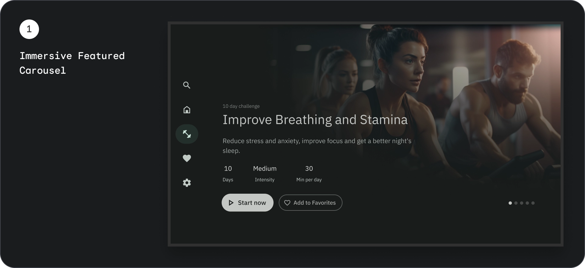
There are two different ways of integrating featured carousels:
- Immersive
- Card
Content block
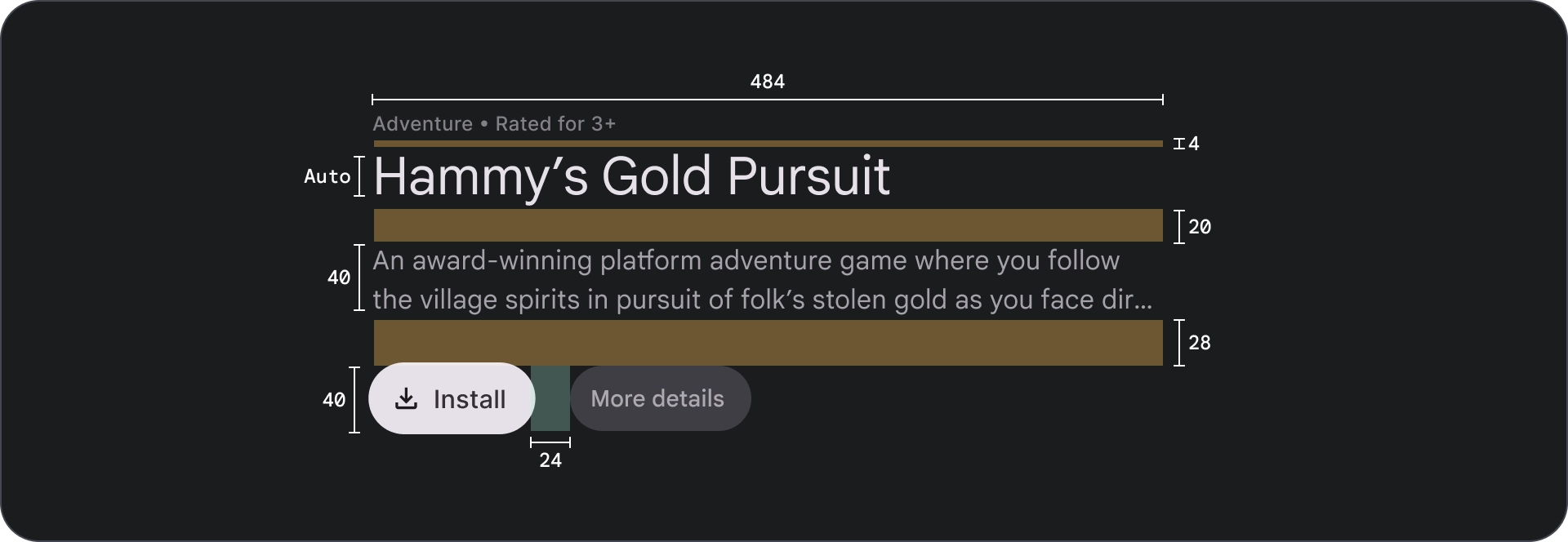
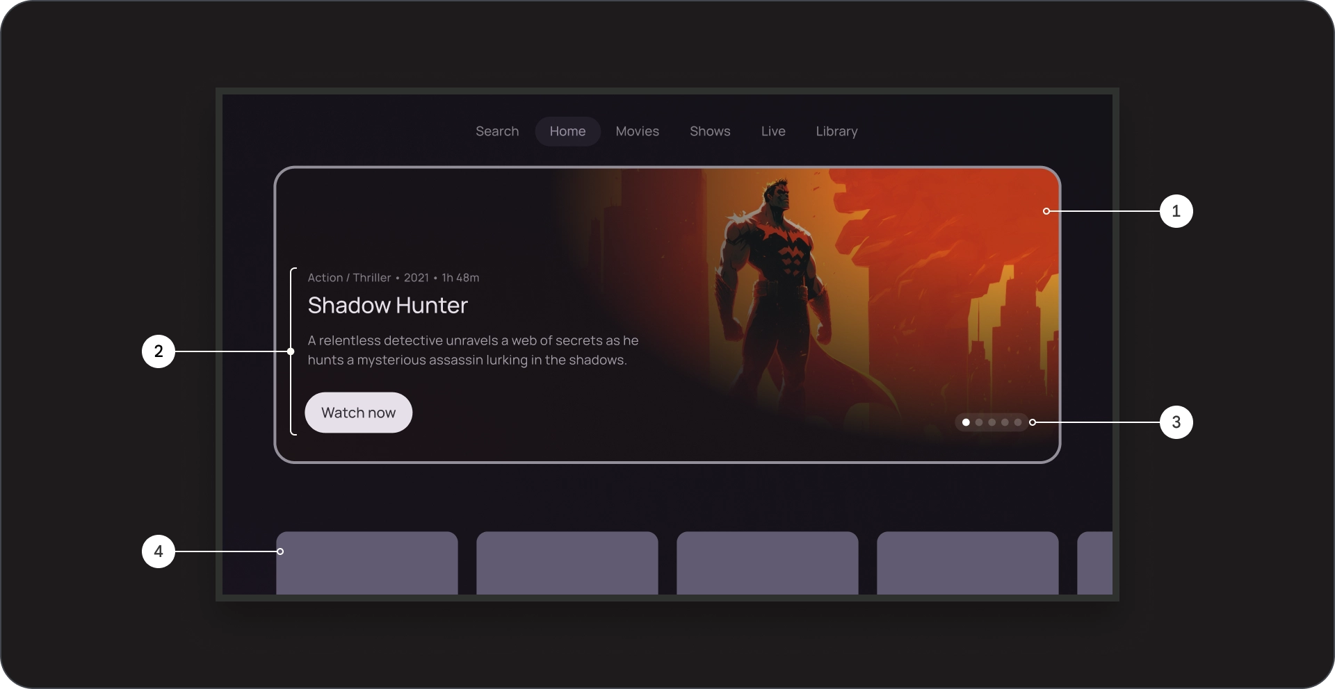
Anatomy
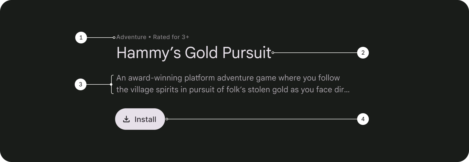
- Overline text
- Title
- Description
- Button
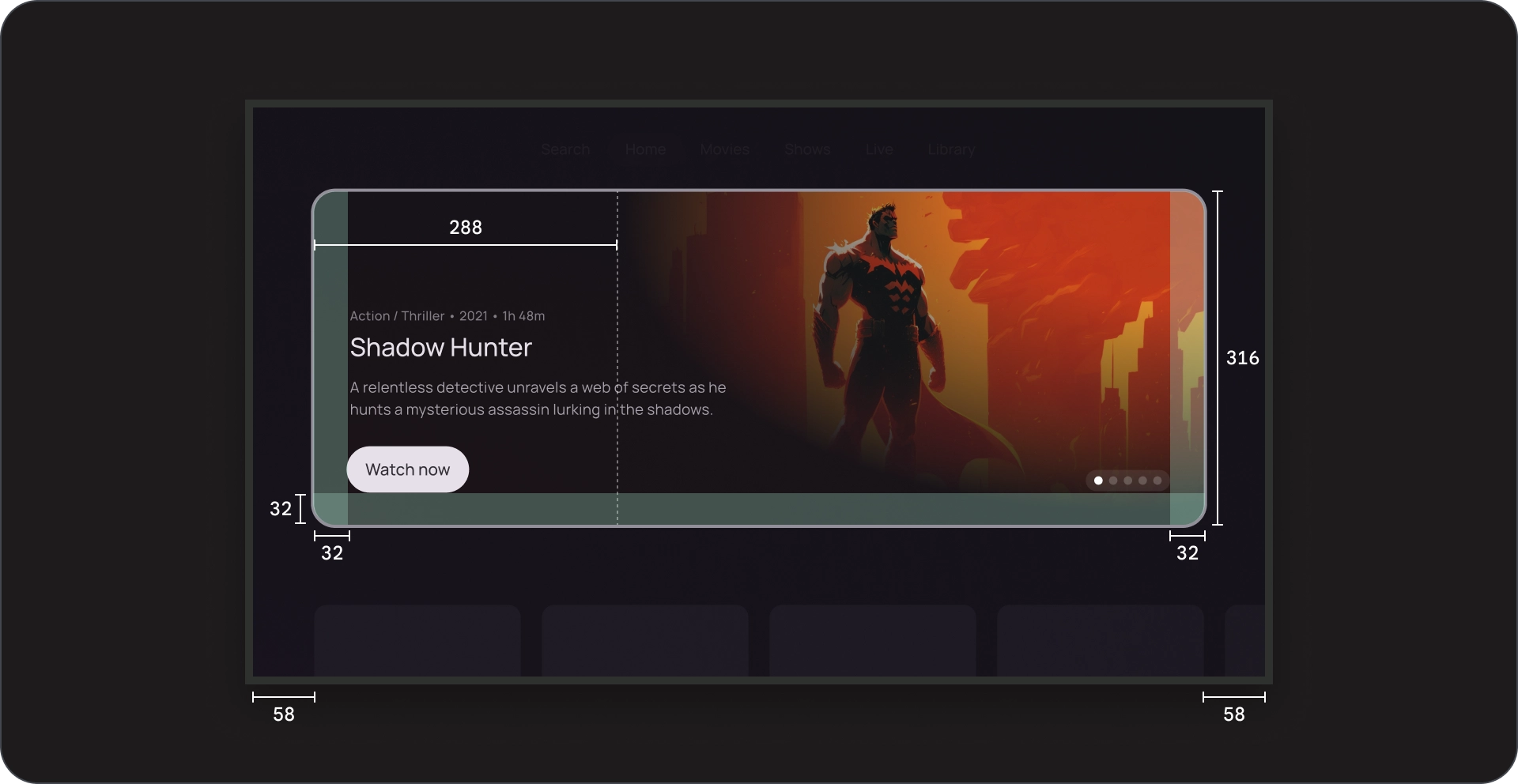
Specs
Pagination
Anatomy

- Background
- Active element
- Inactive elements
- Total elements
Specs

Immersive
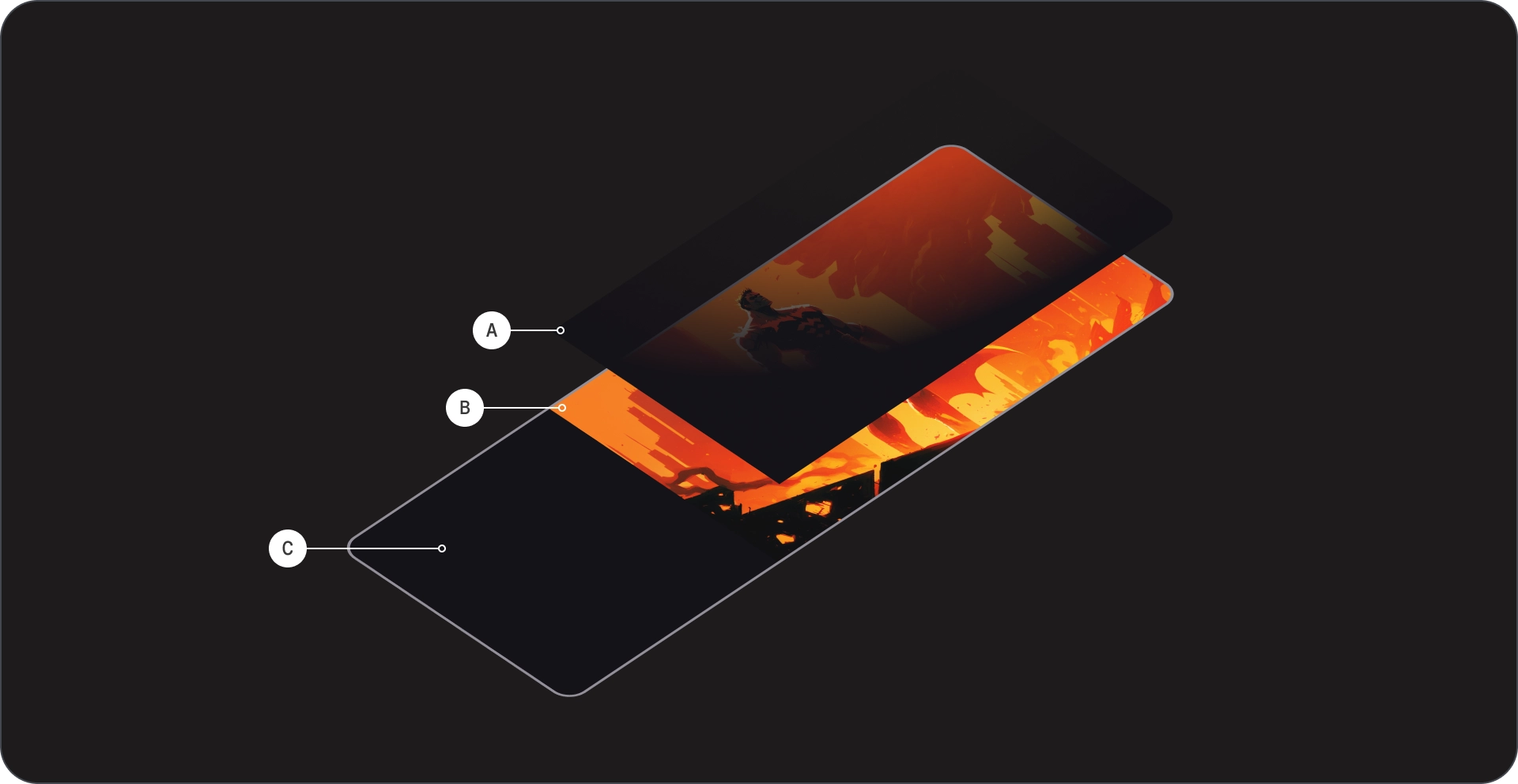
Anatomy
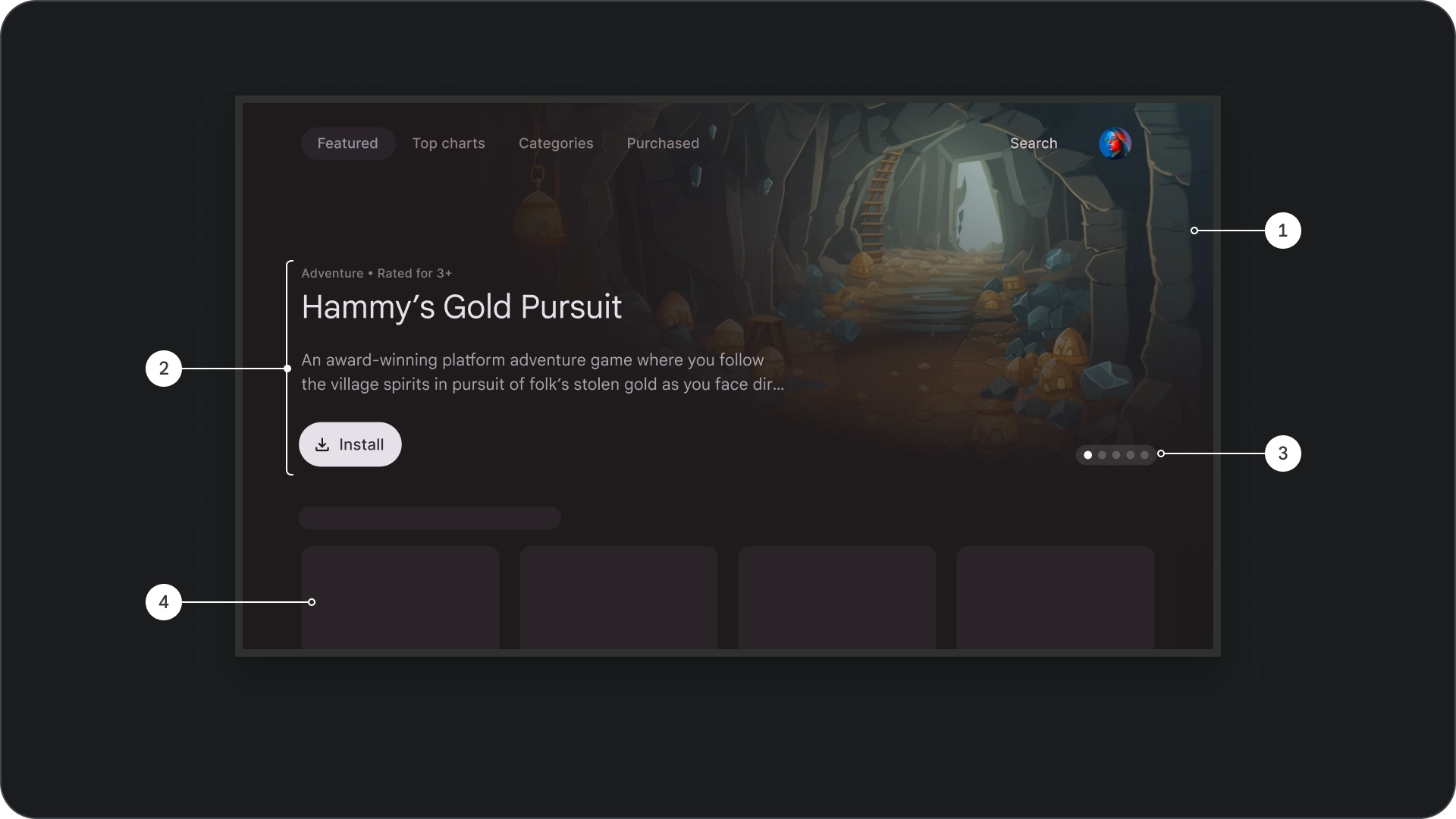
- Image background
- Cinematic scrim
- Poster
- Background color
- Content block
- Pagination
- Content grid
Specs
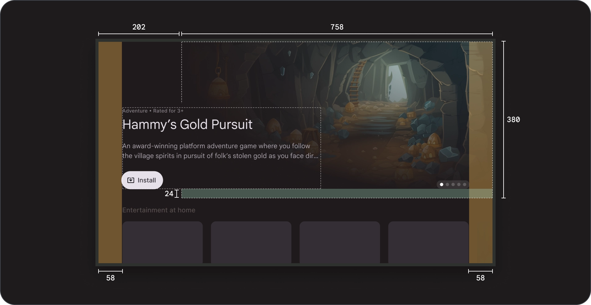
Card
Anatomy
- Image background
- Cinematic scrim
- Poster
- Card background
- Content block
- Pagination
- Content grid
Specs
Usage
Use featured carousels to showcase and promote a curated selection of content in an engaging, visually appealing, and simple to navigate format.
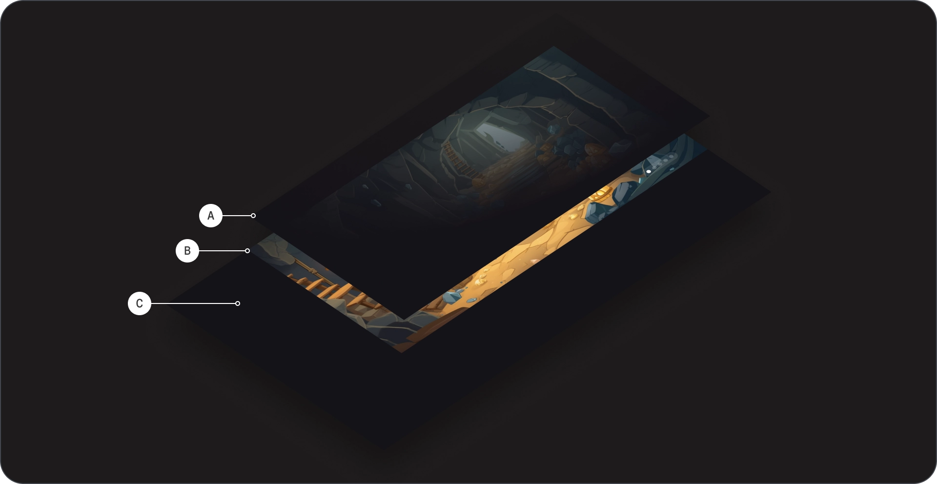
Images in backgrounds
Images in backgrounds play a crucial role in enhancing user engagement in a streaming app featured carousel.
High quality imagery
Use high-resolution images that are visually appealing and relevant to the content of the focused card.
Do
Keep images clean, visually appealing, and relevant to the content block.
Don't
Avoid using images with text in the background.
Obvious visual hierarchy
Ensure that the background does not distract from the focused card's content by using a scrim over the image; this helps the user maintain focus on the card's title, description, and call-to-action button.
Do
Use a scrim to improve readability and content digestion.
Don't
Make sure the background doesn't affect readability and visibility
of the rest of the content on the screen.