布局
使用集合让一切井井有条
根据您的偏好保存内容并对其进行分类。
布局是结构模板,可提供一个框架,以便在整个应用中保持视觉一致性。通过定义视觉网格、间距和版块,布局可建立一个协调有序的结构,以呈现信息和界面元素。
亮点
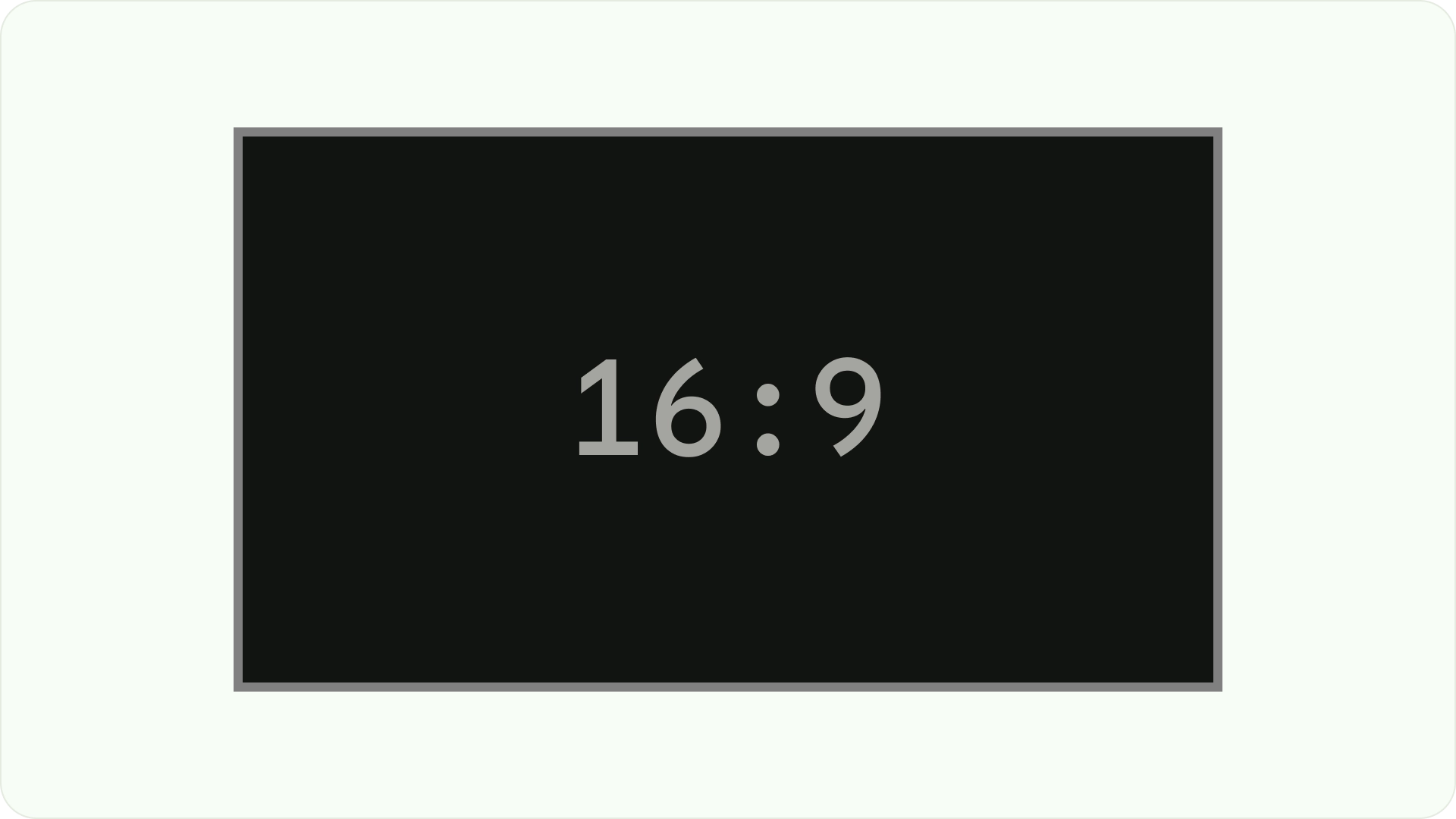
- 与网站或移动设备不同,电视的屏幕宽高比固定为 16:9。
- 优化水平和垂直轴的布局,以便于使用和控制。
原则
这些准则可帮助您在设计 TV 布局时做出设计决策。
专为大屏幕而设计
自高清电视普及以来,宽高比为 16:9 的矩形电视已成为常态。从历史上看,电视机采用的是方形设计,宽高比为 4:3 或 1.33:1。
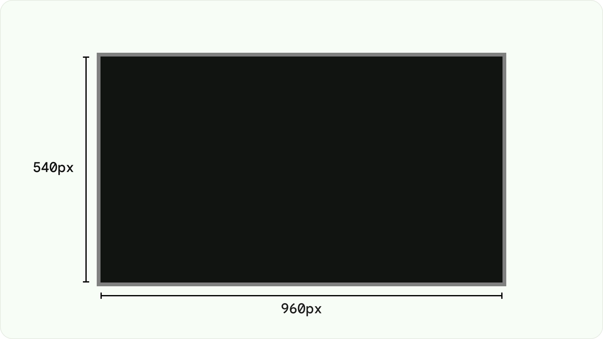
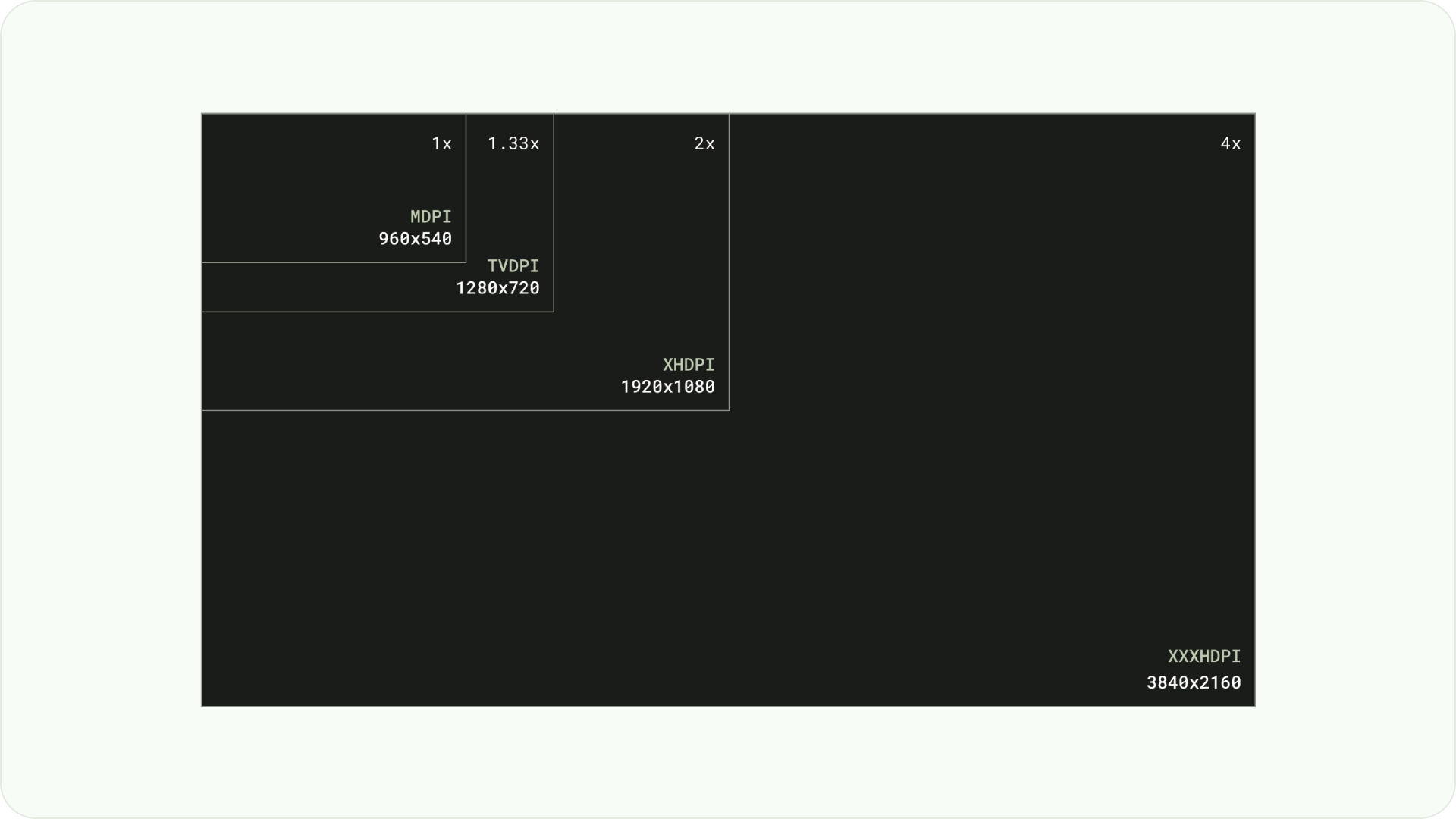
在设计时,请使用 dp 在密度不同的屏幕上均匀显示元素,就像在任何其他 Android 设备上一样。始终以 MDPI 分辨率(960 像素 * 540 像素)进行设计。
在 MDPI 下,1px = 1dp。
素材资源应以 1080p 为目标分辨率。这样,Android 系统就可以在必要时将布局元素分辨率缩小到 720p。
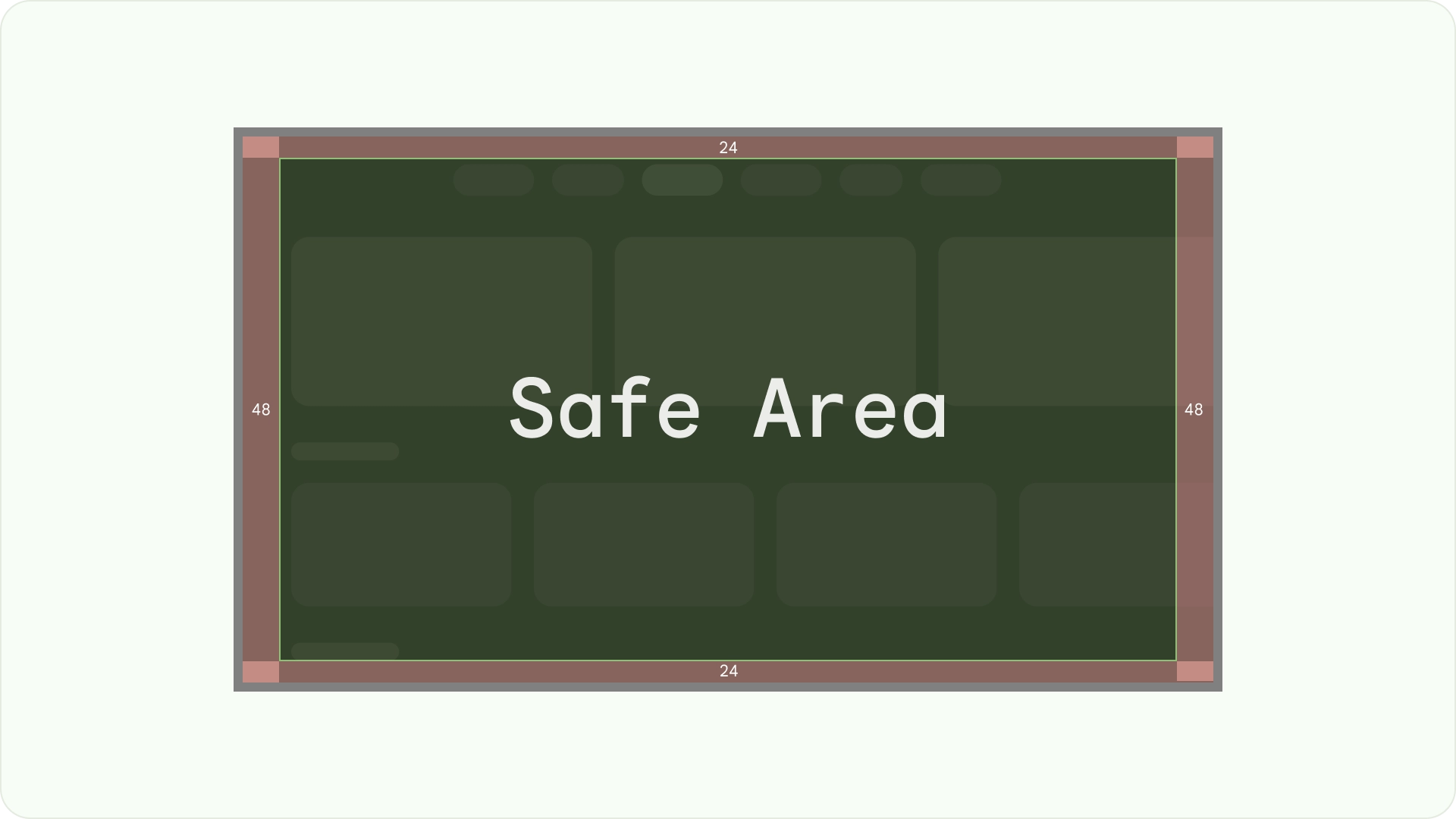
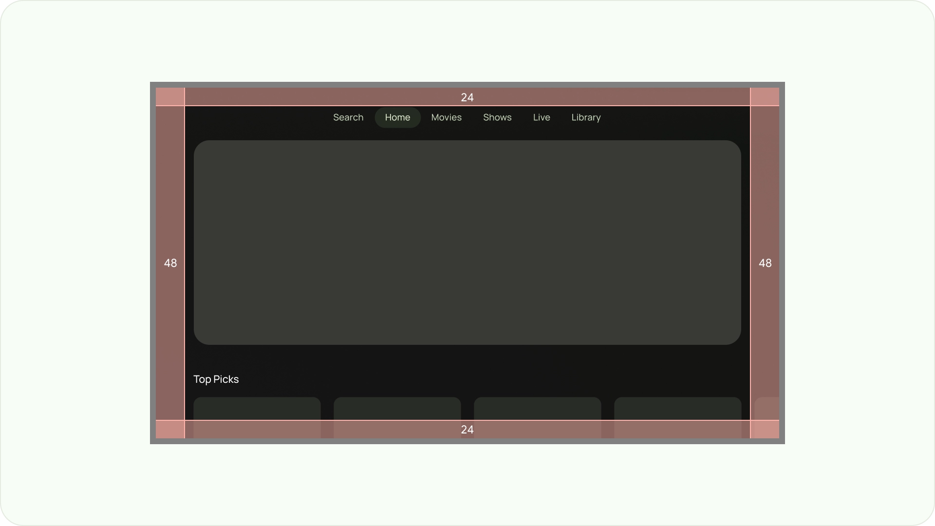
确保可见性和过扫安全
确保重要元素始终可供用户看到。为此,请在布局的左右侧为元素设置 48dp 的外边距 (5%),并在布局的顶部和底部为元素设置 27dp 的外边距。这样可确保布局的屏幕元素位于过扫范围内。
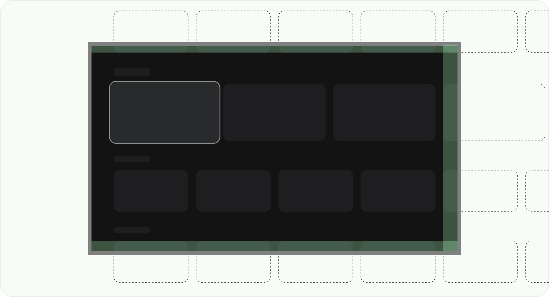
填充整个屏幕
请勿将背景屏幕元素调整或剪裁到过扫描安全区域。而是允许部分显示屏幕外元素。这样可确保所有屏幕都正确显示背景和屏幕外元素。
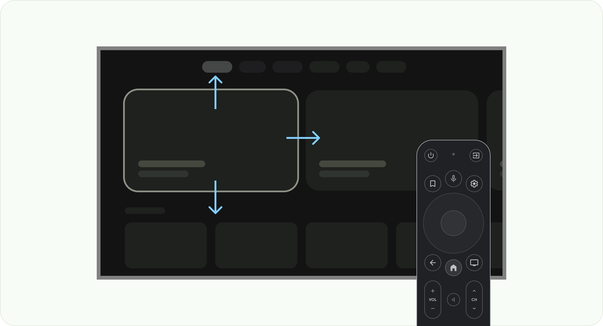
使用轴进行优化
考虑用户如何使用遥控器控制电视。确保电视界面易于使用遥控器。为每个方向(向上、向下、向左、向右)设计明确的用途和导航模式,以帮助用户了解如何浏览大量选项。
布局
电视屏幕尺寸因设备而异。由于新型电视的宽高比为 16:9,因此建议您在设计应用时采用 960 x 540 像素的屏幕尺寸。这样可确保所有元素都能按比例调整大小,以适应 HD 或 4K 屏幕。

过扫描边距
过扫边距是指内容与屏幕左侧和右侧边缘之间的间距。
960 * ~5% = 48dp
540 * ~5% = 27dp round off to 24dp
这些边框边距可保护主要元素免受潜在的过扫问题的侵害。为确保内容和信息的安全,请使用 5% 外边距布局(侧边为 58dp,顶部和底部边缘为 28dp)。
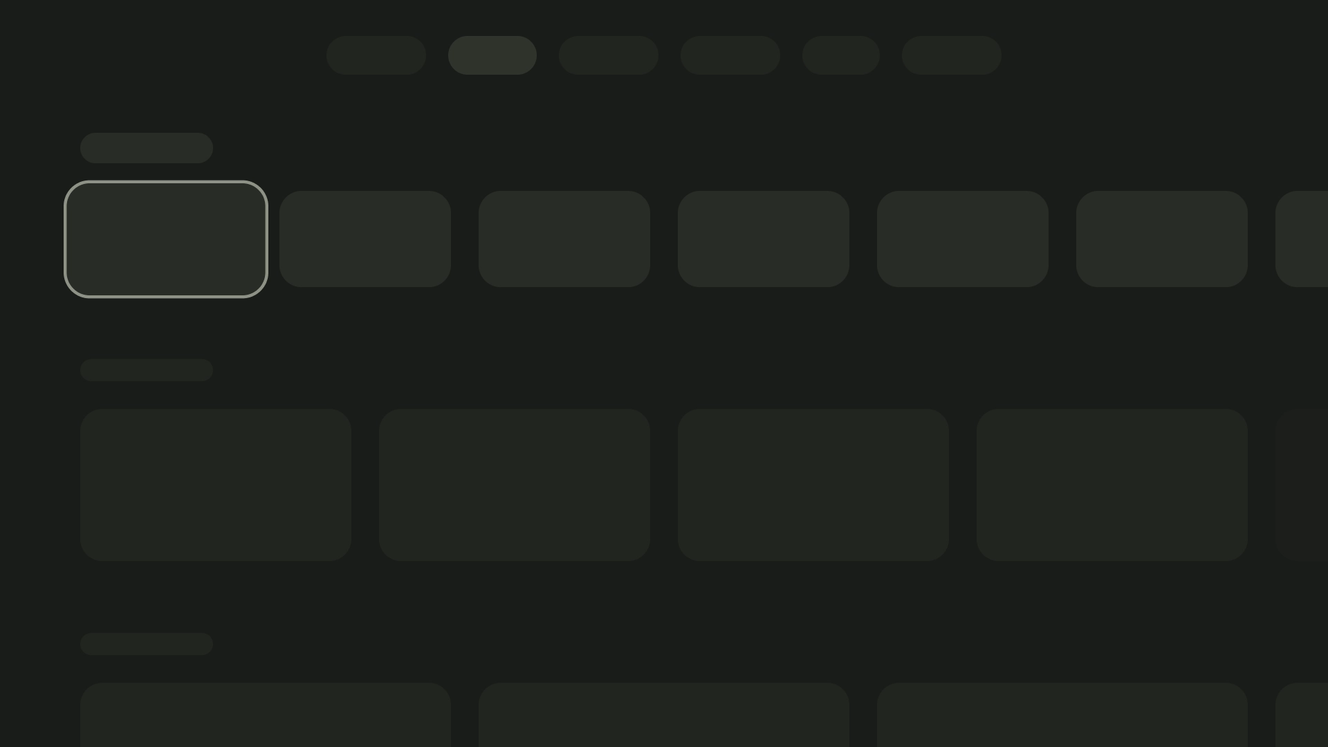
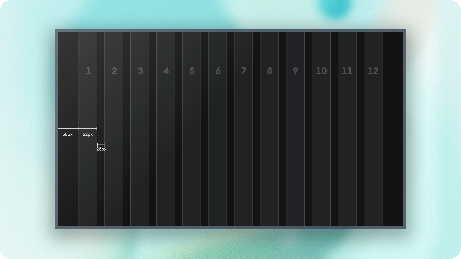
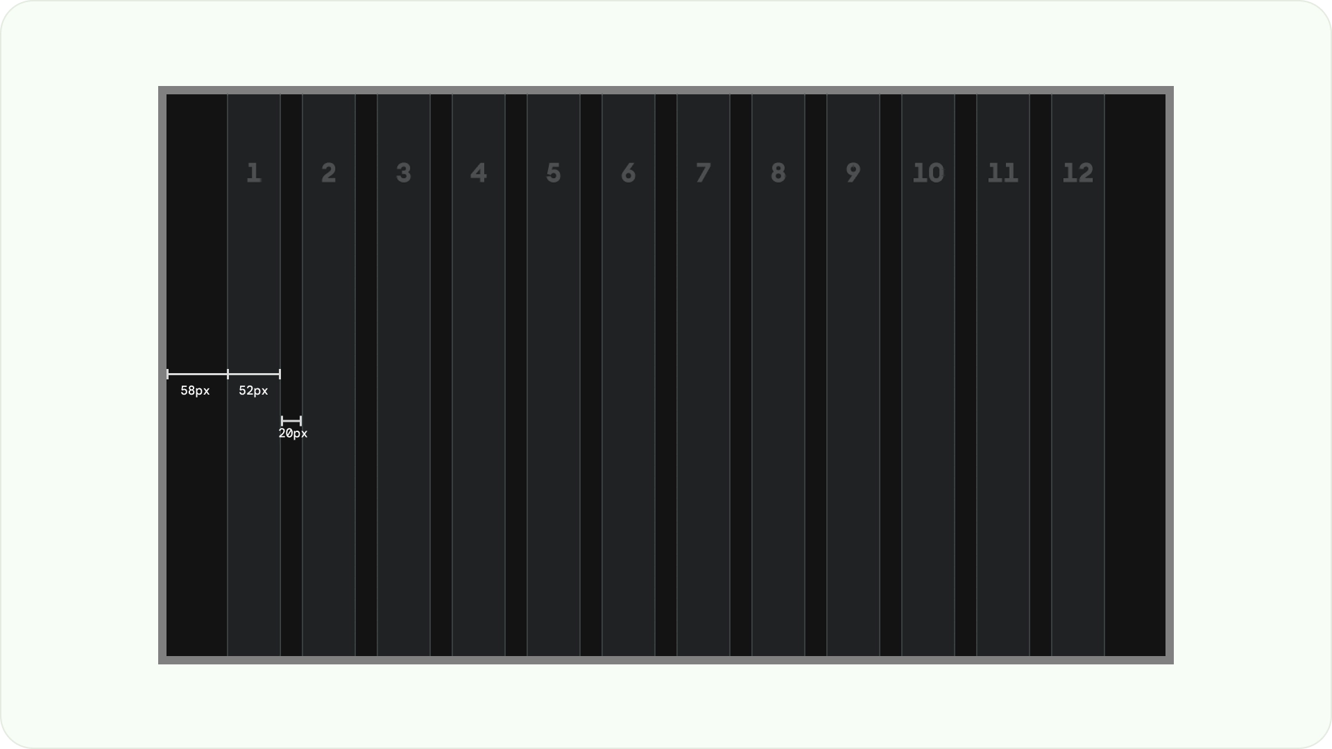
列和边线
内容会放置在屏幕上具有列和边线的区域中。网格系统包含 12 列。边线是列之间的空白,有助于划分内容。
使用 12 个宽度为 52dp 且彼此间隔 20dp 的列。
两侧需要留出 58dp 的空间,行与行之间的垂直间距为 4dp。

布局模式
有三种布局模式可供选择,具体取决于您的预期用途和显示设备:水平堆叠布局、垂直堆叠布局和网格布局。
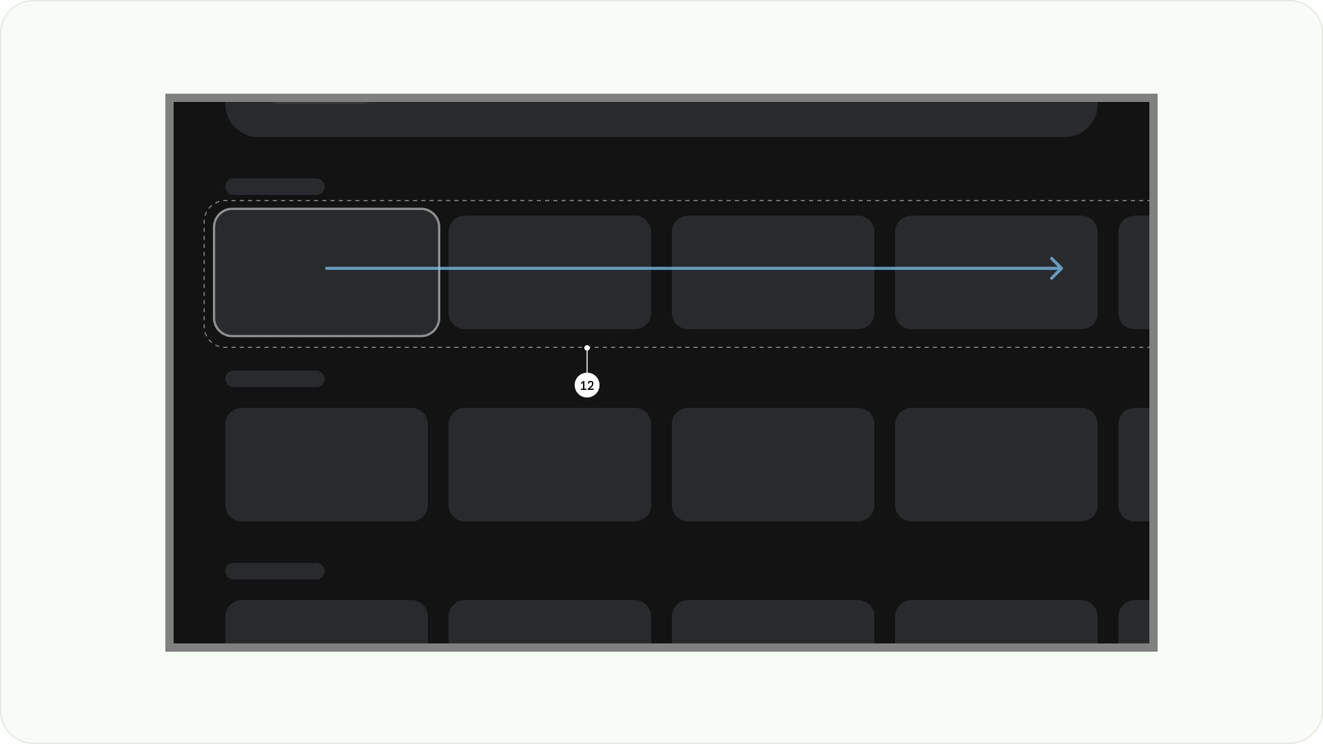
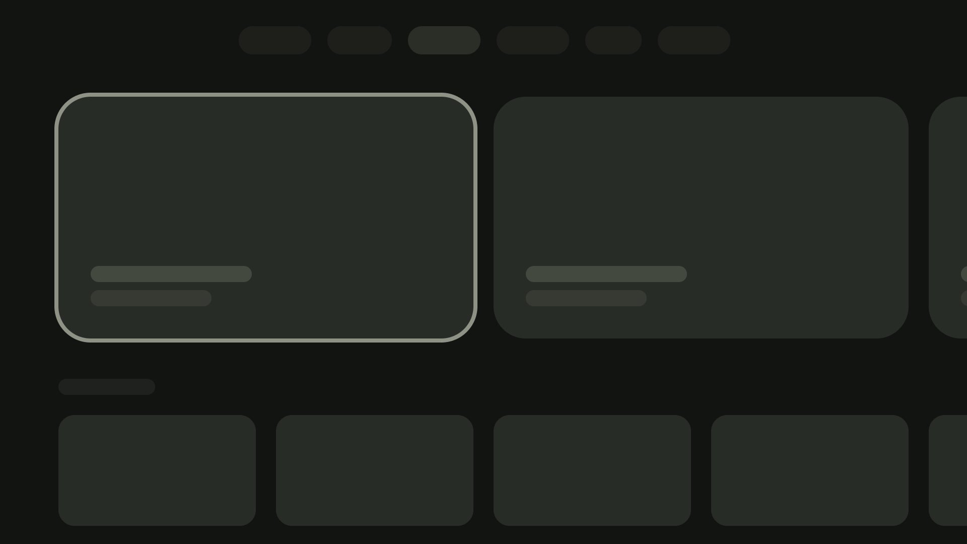
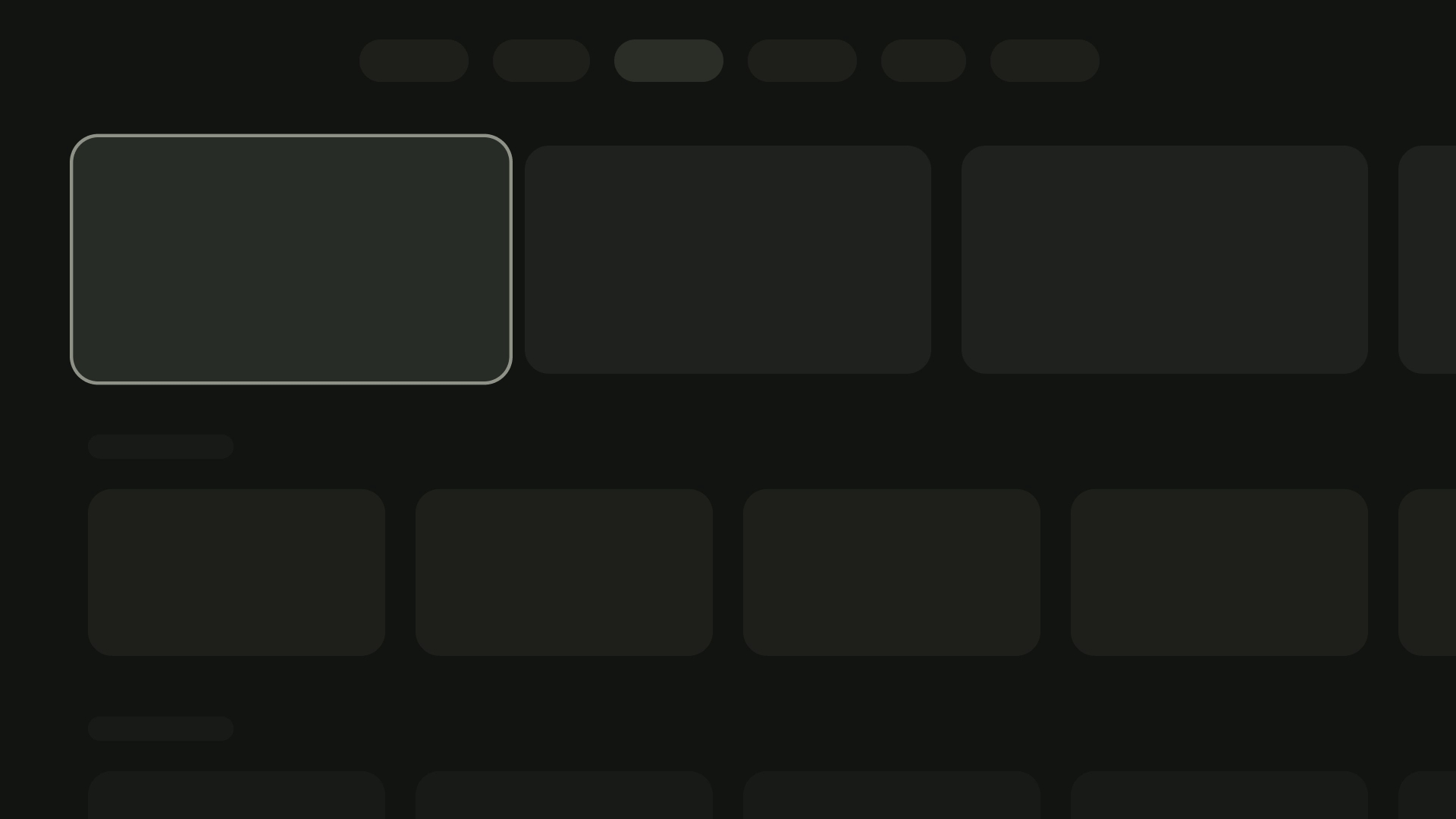
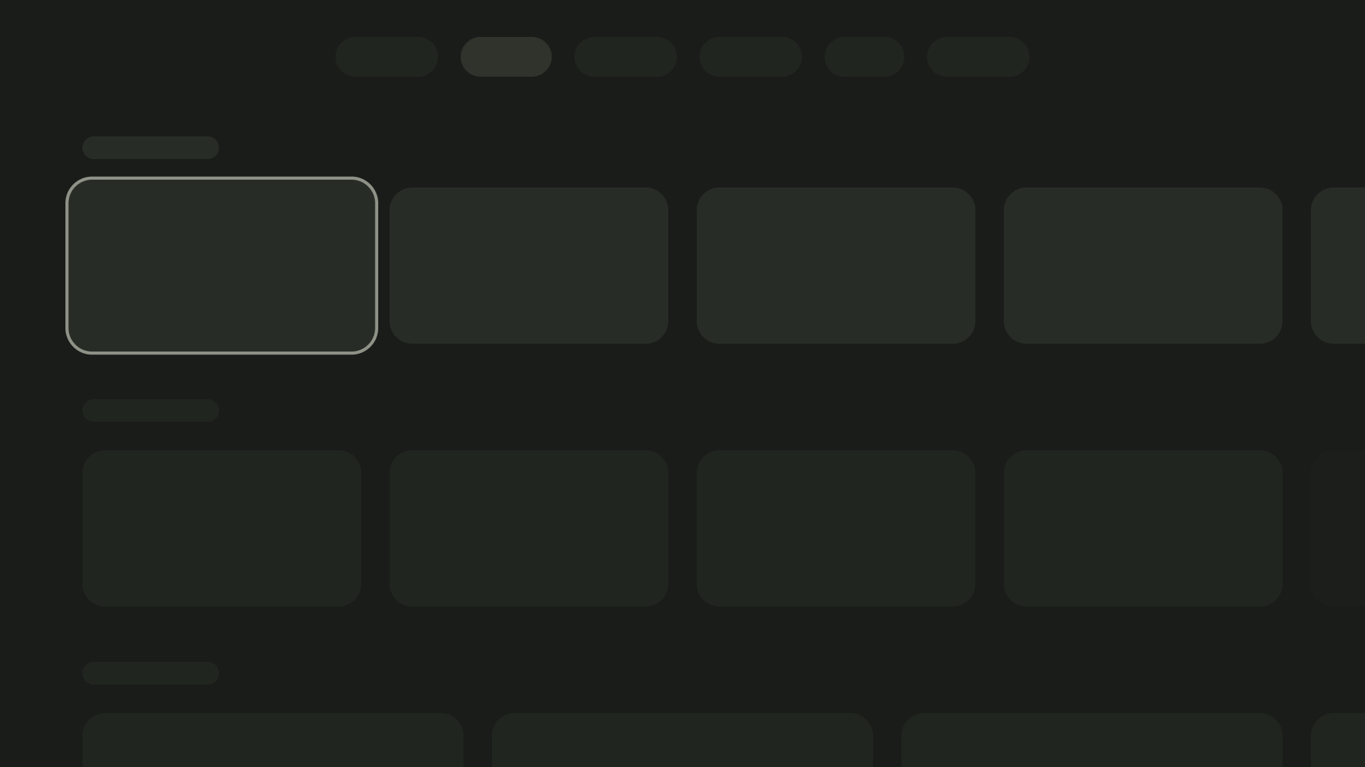
水平堆叠布局
水平堆叠布局会水平排列组件。
它们的尺寸、比例或格式可能会有所不同。此布局通常用于对内容和组件进行分组。
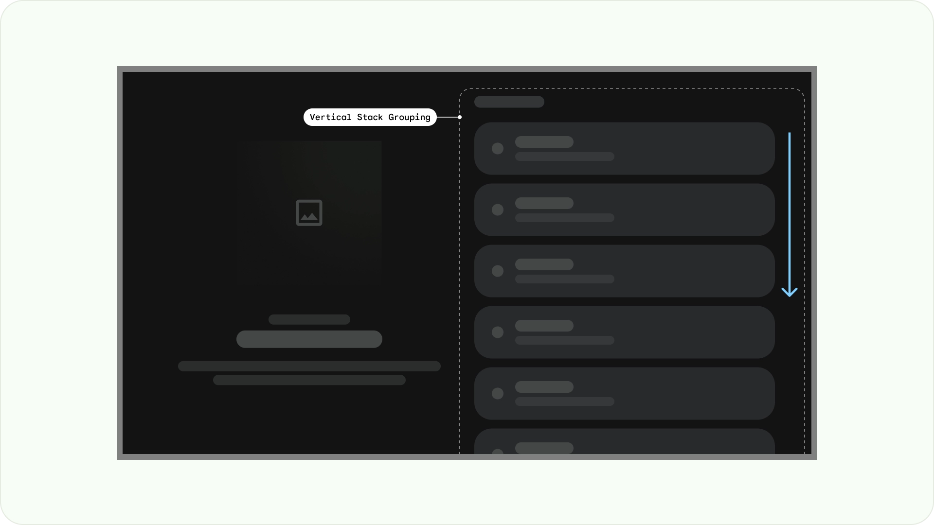
垂直堆叠布局
垂直堆叠布局以垂直方式排列组件,支持灵活的大小、比率和格式。它通常用于将不同类型的文本、交互式组件和布局模式组合在一起。

网格布局
网格是一系列交叉的列和行,网格布局会在此网格中显示内容。它以逻辑方式排列内容,让用户能够轻松浏览和导航。

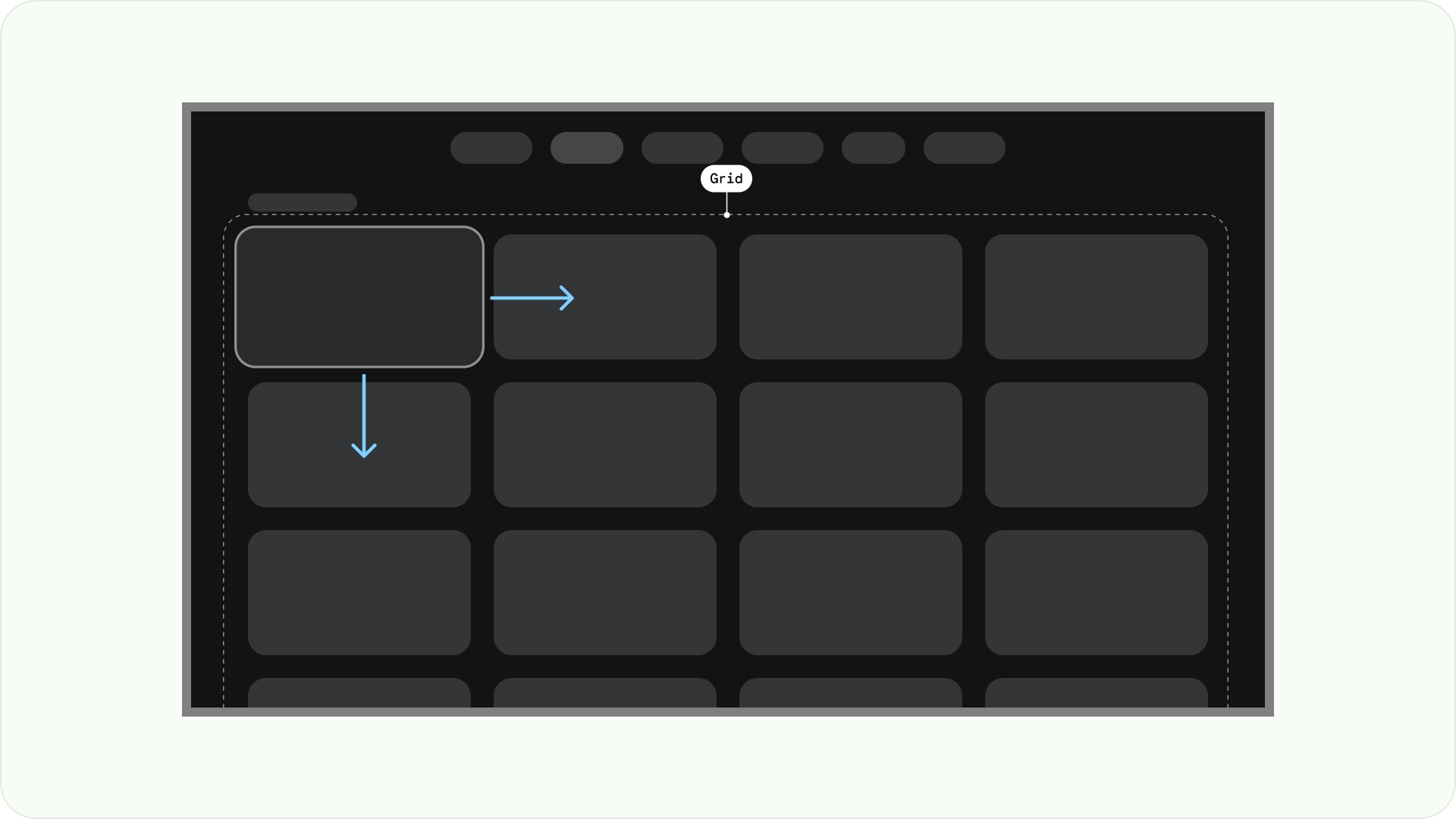
为防止重叠,请务必考虑项之间的内边距以及聚焦状态的尺寸增加。例如,当聚焦的组件(例如卡片)突出显示时。如果您使用的是我们建议的网格布局(12 列,每列 52dp,边线间距 20dp),请参阅“卡片”,了解建议的组件布局和预览。
布局结构
以下是一些布局结构,可帮助您在设计 TV 布局时做出更好的决策。通过水平划分电视屏幕,可以帮助分隔不同类型的组件,传达信息层次结构和导航逻辑。一个窗格可以包含多个单元列。
每个面板都可以托管不同的布局模式,例如堆叠布局和网格布局。
单窗格布局
单窗格布局有助于吸引用户注意主要内容。将其与以内容为主的体验和重要信息页面搭配使用。
双窗格布局
当网页显示分层内容时,双窗格布局的效果会更好。它广泛用于任务型体验。
认知过载
复杂且不明确的内容可能会导致用户感到困惑和烦恼,进而降低互动度。使设计一目了然、整洁有序,并仅显示必要的信息。
避免使用过多面板来分组内容。这会给用户带来不必要的认知负担和层次结构。
check_circle
正确做法
将相关内容放置在一个面板中。这有助于用户了解内容的分组。
cancel
错误做法
避免使用过多面板来分组内容。这会给用户带来不必要的认知负担和层次结构。
表达层次结构和导航
面板可从视觉上区分和整理内容。它们有助于引导用户,并可打造更直观的界面,从而提升用户体验。
check_circle
正确做法
根据用户的阅读路径对内容进行分组。确保焦点路径与层次结构或决策逻辑保持一致。
cancel
错误做法
请勿让用户的注意力在面板之间来回切换。这会导致焦点路径不自然,不符合用户的阅读习惯。
布局模板
布局模板有助于实现有序、一致和熟悉的效果。该设计可打造舒适的界面体验,清晰地传达用户当前所在的位置以及可以前往的位置。
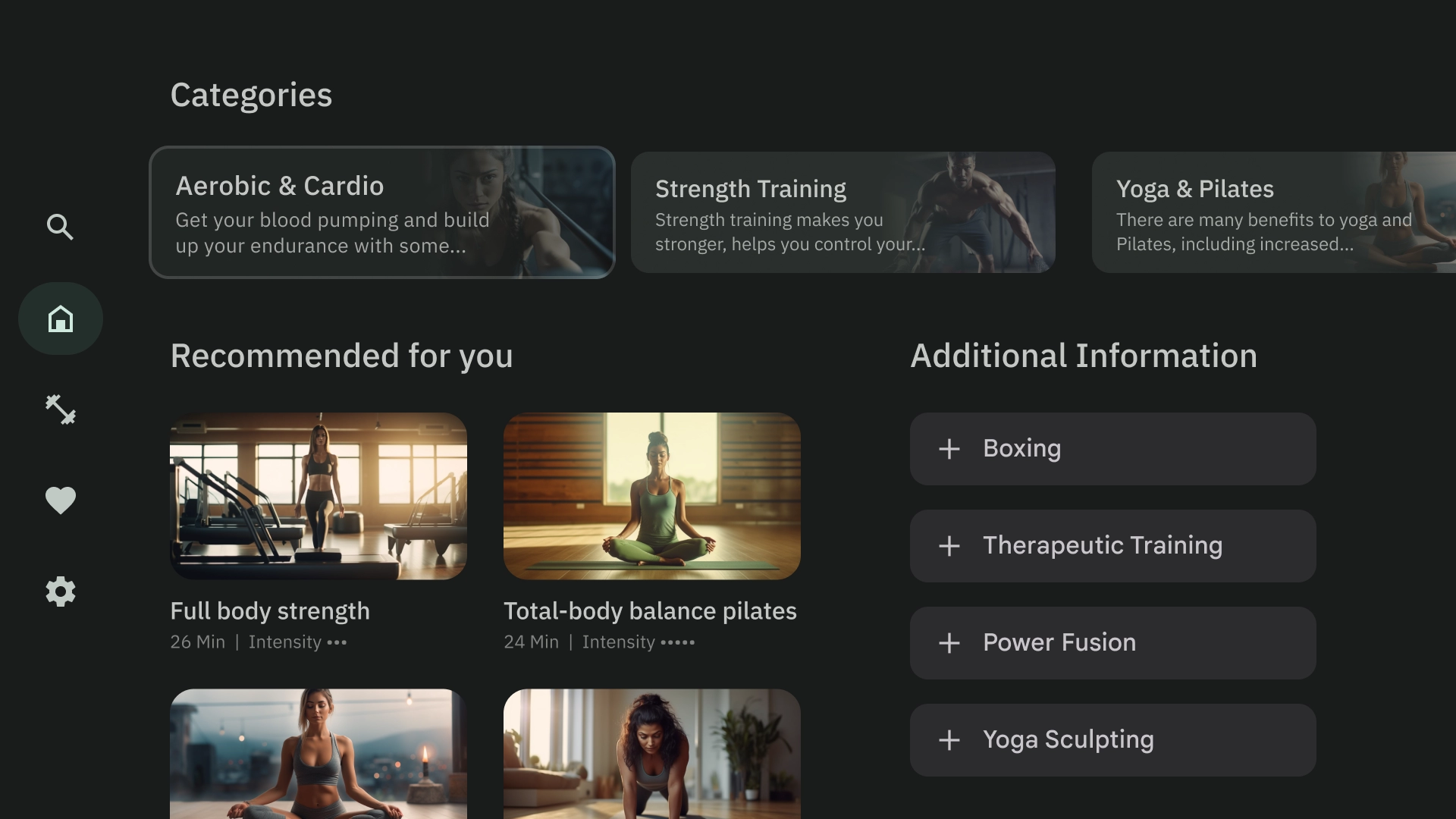
浏览
浏览器模板会以垂直堆叠的形式显示媒体内容“集群”或行。用户可以上下移动来浏览行,也可以左右移动来浏览特定行的具体内容。
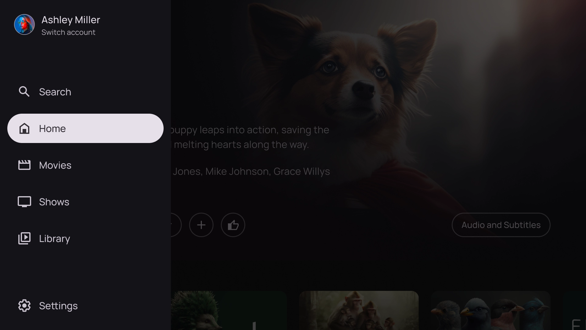
左侧叠加层
左侧导航栏模板会在屏幕左侧显示叠加层面板。它通常会显示与后台内容相关的导航栏或可执行操作的项。
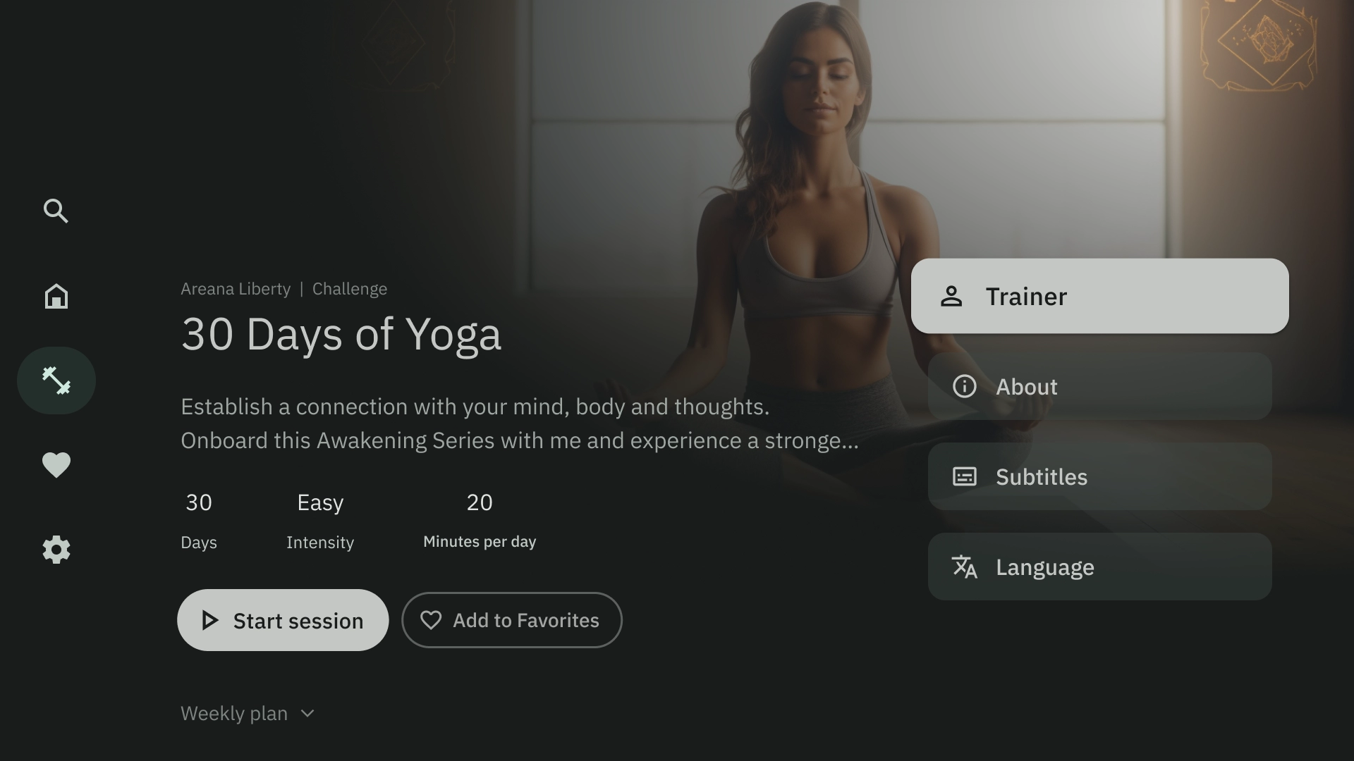
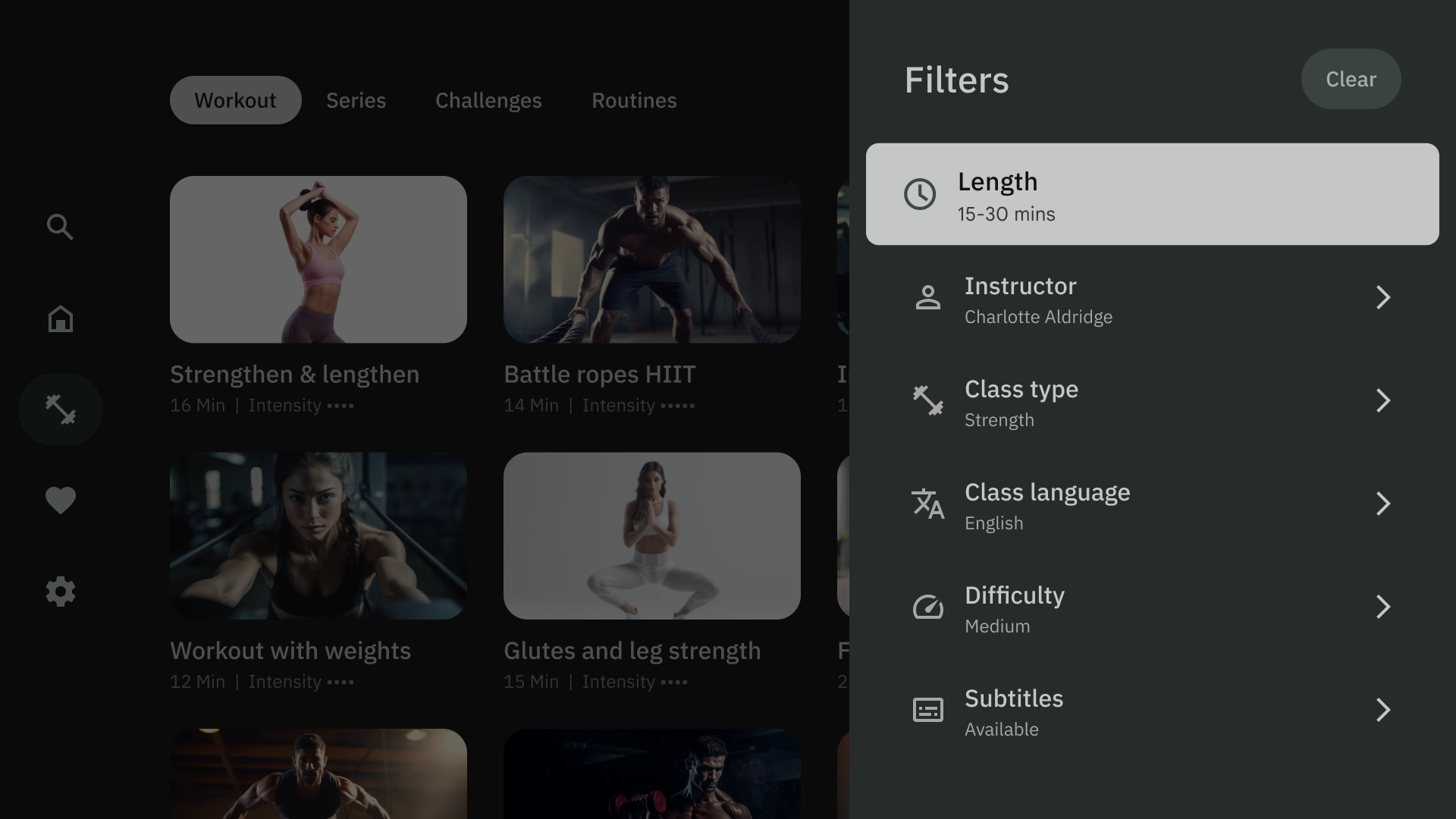
右侧叠加层
右侧的叠加层模板会在屏幕右侧显示叠加层面板。它通常会显示您可以独立于后台内容执行操作的内容。
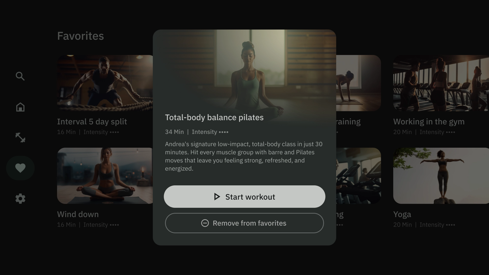
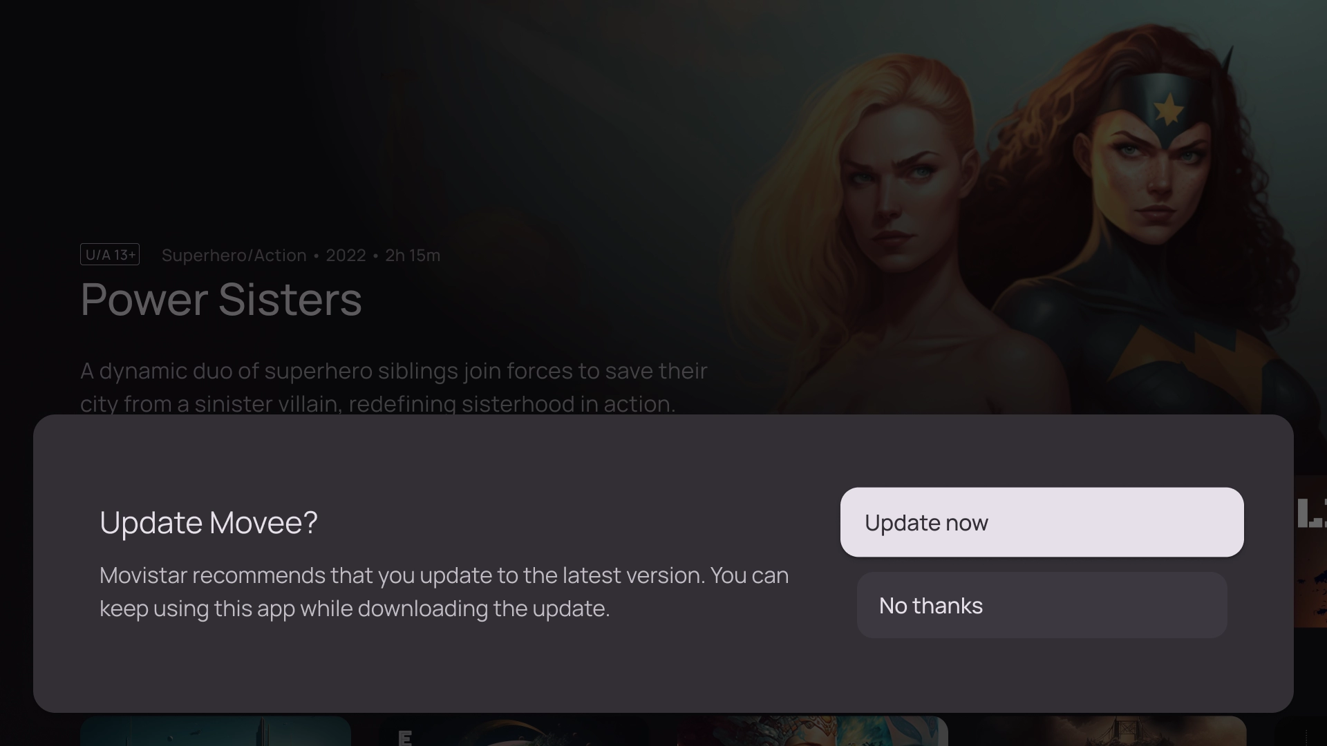
居中叠加层
中心叠加层模板会显示叠加在现有视图上的模态元素。用于传达紧急信息或促成决策。
底部叠加层
底部叠加层模板通常用于底部动作条。底部动作条是指包含锚定到屏幕底部的补充内容的界面。借助它们,您无需丢失当前网页的上下文即可创建迷你流程。
操作
操作模板在左侧显示标题和副标题,在右侧显示选项或操作。系统通常会要求用户使用此模板做出选择或执行操作。
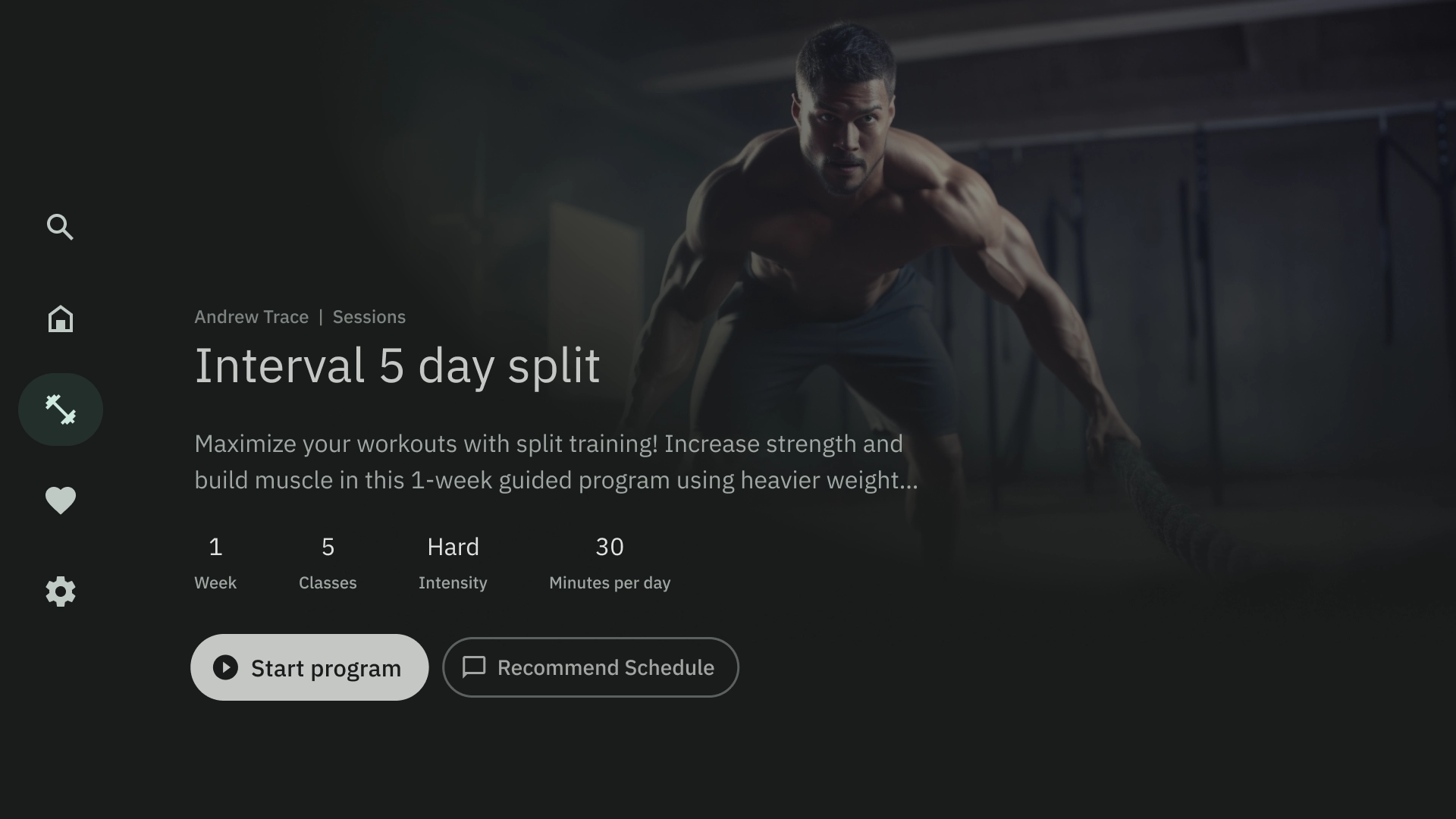
内容详情
内容详情模板会以横向堆叠布局显示内容。内容通常包括标题、元数据、简短说明、快捷操作和相关信息集群。
编译
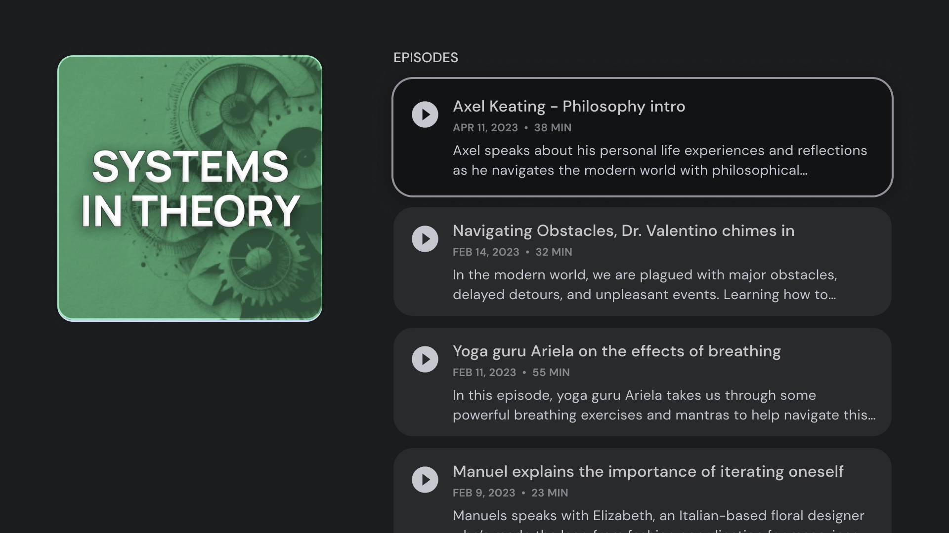
合集模板会在屏幕左侧显示项目的详细信息(例如播客),并在右侧面板中显示其元素(例如分集)。
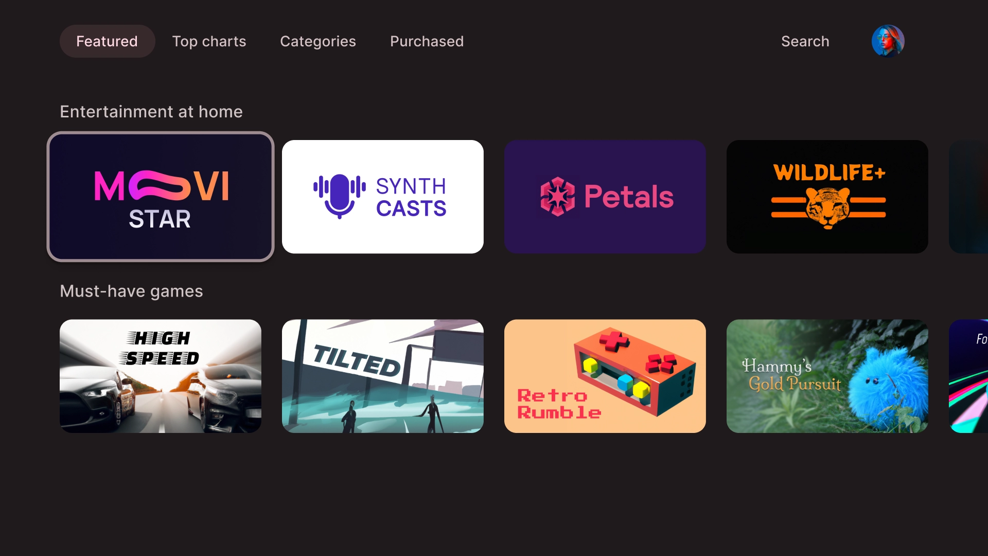
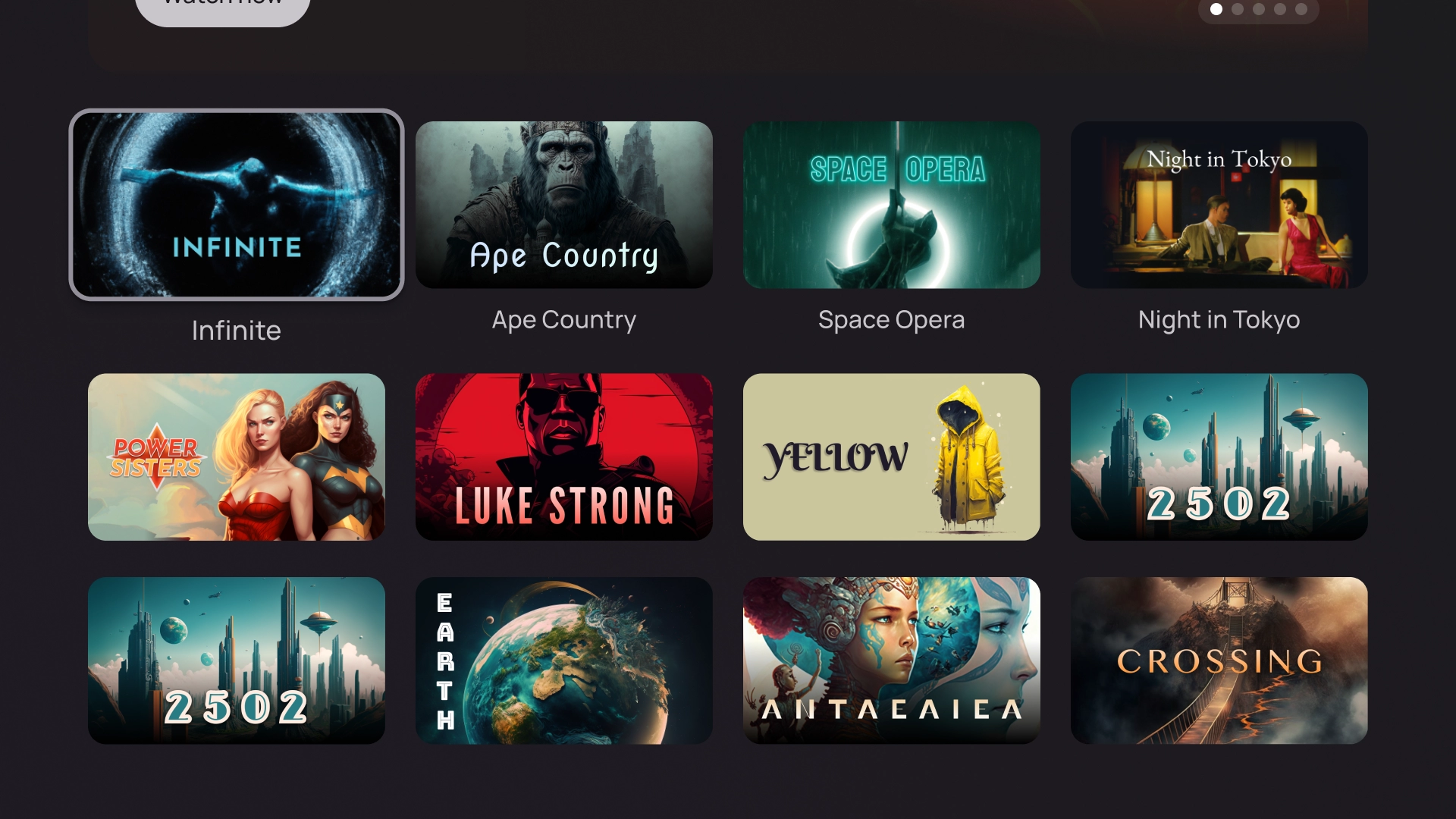
网格
网格模板会以有序的网格形式显示内容集合。它采用清晰的远程导航逻辑,提供最佳浏览体验,以便用户查看内容。
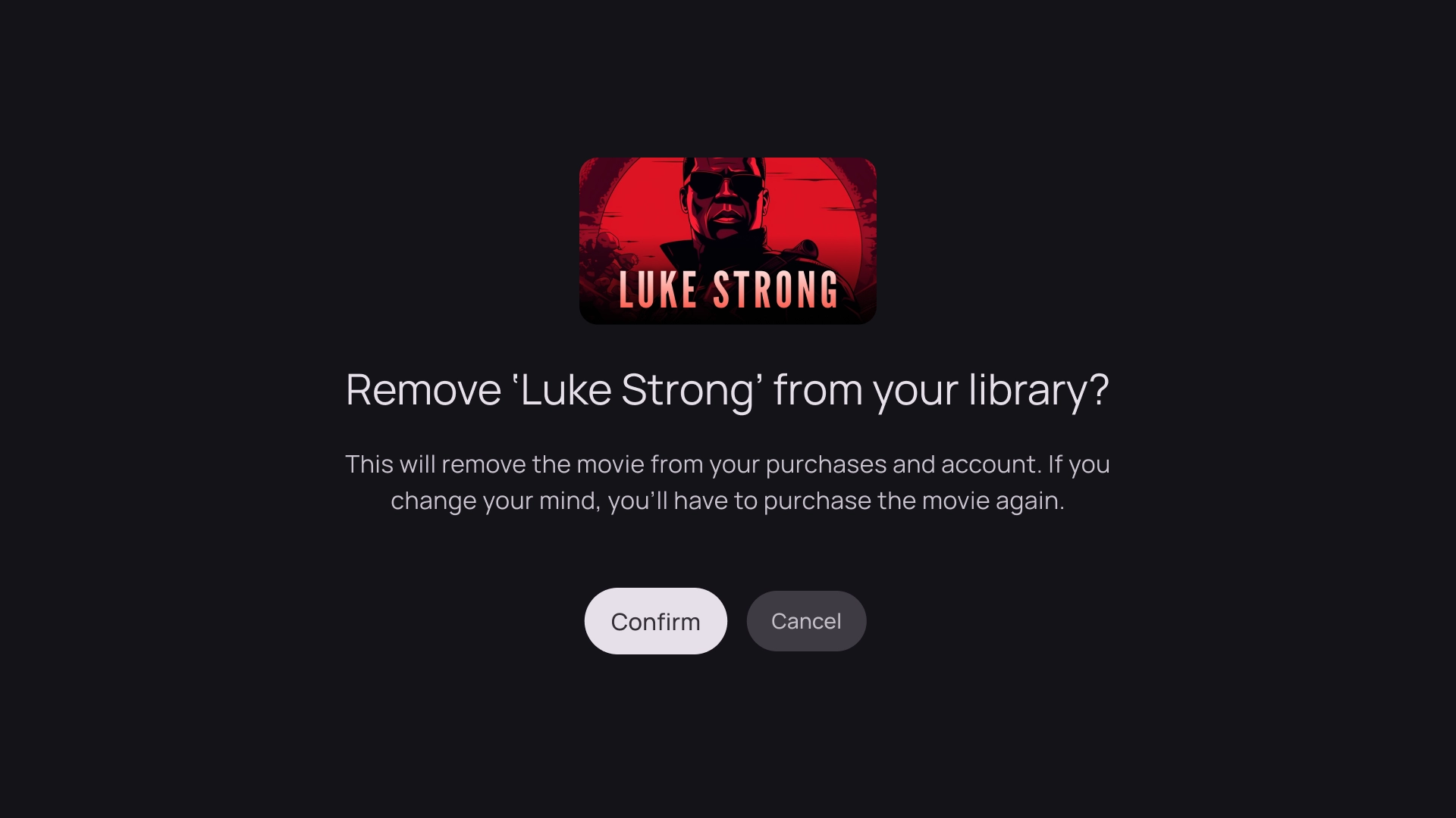
提醒
提醒模板会显示全屏消息。通常需要执行操作才能取消屏蔽提醒并返回上一屏幕。
卡片列
1 张卡片布局
卡片宽度 - 844dp
2 张卡片的布局
卡片宽度 - 412dp
3 张卡片的布局
卡片宽度 - 268dp
4 张卡片的布局
卡片宽度 - 196dp
5 张卡片的布局
卡片宽度 - 124dp
本页面上的内容和代码示例受内容许可部分所述许可的限制。Java 和 OpenJDK 是 Oracle 和/或其关联公司的注册商标。
最后更新时间 (UTC):2025-07-27。
[null,null,["最后更新时间 (UTC):2025-07-27。"],[],[],null,["# Layouts are structural templates that provide a framework for maintaining\nvisual consistency across your application. By defining visual grids, spacing,\nand sections, layouts establish a cohesive and organized structure for the\npresentation of information and UI elements. \n\nHighlights\n----------\n\n- Unlike web or mobile, TVs have a fixed screen aspect ratio of 16:9.\n- Optimize layouts along horizontal and vertical axes for ease of use and control.\n\nPrinciples\n----------\n\nGuidelines to help you make design decisions when designing TV layouts.\n\n\n### Design for large screens\n\nSince the popularization of HDTV, rectangular TVs with an aspect ratio of 16:9\nhave become the norm. Historically, televisions were manufactured in a square\nshape known as 4:3 or 1.33 to 1 aspect ratio.\n\n\u003cbr /\u003e\n\n\n### Design on Android platform\n\nWhen designing, use dp to display elements uniformly on screens with different\ndensities, as with any other Android-powered device. Always design at MDPI\nresolution at 960px \\* 540px.\n\nAt MDPI 1px = 1dp.\n\nAssets need to aim for 1080p. This allows the Android system to downscale layout\nelements to 720p, if necessary.\n\n\u003cbr /\u003e\n\n\n### Ensure visibility and overscan safety\n\nEnsure important elements are always visible to users. To do this, position the\nelements with a 5% margin of 48dp on the left and right sides, and 27dp on the\ntop and bottom of a layout. This ensures that the layout's screen elements are\nwithin the overscan.\n\n\u003cbr /\u003e\n\n\n### Fill the full screen\n\nDon't adjust or clip background screen elements to the overscan safe area.\nInstead, allow partial display of offscreen elements. This ensures that all\nscreens correctly display the background and offscreen elements.\n\n\u003cbr /\u003e\n\n\n### Optimize with axes\n\nConsider how people use the remote control with their TV. Make sure your TV\ninterface is simple to use with the remote. Design each direction\n(up, down, left, right) to have a clear purpose and navigation pattern to help\nusers understand how to move through large groups of options.\n\n\u003cbr /\u003e\n\nLayout\n------\n\nTV screen sizes differ from device to device. Since a modern TV has a\n16:9 aspect ratio, it is recommended to design your app with a\n960px x 540px screen size. This ensures all elements can be\nresized proportionally for HD or 4K screens.\n\n### Overscan margins\n\nOverscan margins are the spaces between content, and the\nleft and right edges of the screen. \n\n 960 * ~5% = 48dp\n 540 * ~5% = 27dp round off to 24dp\n\nThese border margins protect primary elements from potential overscan issues.\nTo keep your content and information safe, use a 5% margin layout\n(58dp on the sides and 28dp on the top and bottom edges).\n\n| **Note:** Most modern TVs no longer have overscan issues.\n\n### Columns and gutters\n\nContent is put into areas of the screen that have columns and gutters.\nThe grid system has 12 columns. Gutters are the spaces between\nthe columns that help divide the content.\n\nUse 12 columns that are 52dp wide with 20dp of space between them.\nThere needs to be 58dp of space on both sides and 4dp of vertical\nspacing between lines.\n\nLayout patterns\n---------------\n\nThere are three layout patterns available depending on your intended\npurpose and display device: Horizontal Stack Layout, Vertical Stack Layout,\nand Grid Layout.\n\n### Horizontal Stack Layout\n\nA Horizontal Stack Layout arranges components horizontally.\nThey can vary in size, ratio, or format. This layout is often\nused to group content and components.\n\n### Vertical Stack Layout\n\nA Vertical Stack Layout arranges components in a vertical manner,\nallowing for a flexible size, ratio, and format. It is commonly\nused to group various types of text, interactive components, and\nlayout patterns together.\n\n### Grid Layout\n\nA grid is a collection of intersecting columns and rows, and a Grid\nLayout displays content in this grid. It arranges content in a logical\nway, making it simple for users to navigate and browse.\n\nTo prevent overlapping, it's important to consider the padding between\nitems and the size increase of focused states. For instance, when a focused\ncomponent (like a card) is highlighted. If you're utilizing our suggested\nGrid Layout (12 columns in 52dp, with gutters in 20dp), see Cards for\nrecommended component layouts and previews.\n\nLayout structures\n-----------------\n\nHere are some layout structures to help you make better\ndecisions when designing TV layouts. By dividing the TV screens horizontally,\nit can help separate different types of components, communicate information\nhierarchy and navigation logic. A pane can contain multiple unit columns.\nEach panel can host different layout patterns such as Stack Layout\nand Grid Layout.\n\n\n### Single-pane layout\n\nA single-pane layout can help drive attention to primary content. Use it with\ncontent-forward experience and critical information pages.\n\n\u003cbr /\u003e\n\n\n### Two-pane layout\n\nA 2-pane layout performs better when the page shows hierarchical content. It is\nwidely used on task-forward experiences.\n\n\u003cbr /\u003e\n\n### Cognitive overload\n\nComplicated and unclear content can lead to confusion, annoyance and a dip in\nengagement. Make your design scannable, uncluttered and present\nonly essential information.\n\nAvoid using too many panels to group contents. This creates\nunnecessary cognitive load and hierarchy to users. \ncheck_circle\n\n### Do\n\nPlace related contents together in one panel. This helps users understand the grouping of content. \ncancel\n\n### Don't\n\nAvoid using too many panels to group contents. This creates unnecessary cognitive load and hierarchy to users.\n\n### Express hierarchy and navigation\n\nPanels visually separate and organize content. They help guide users,\nand can create a more intuitive interface that enhances the experience. \ncheck_circle\n\n### Do\n\nGroup contents based on user reading path. Ensure the focus path is aligned with hierarchy or the decision-making logic. \ncancel\n\n### Don't\n\nDon't direct user attention back-and-forth between panels. This creates unnatural focus paths that are not aligned with user reading habits.\n\nLayout templates\n----------------\n\nLayout templates promote order, consistency, and familiarity. The design\ncreates a comfortable UI experience that clearly communicates where the\nuser is, and where they can go. \n\n### Browse\n\nThe browser template displays media content \"clusters\" or rows in a vertical stack. Users navigate up and down to browse the rows, and navigate right and left to browse content of a specific row.\n\n### Left overlay\n\nThe left navigation template shows an overlay panel on the left side of the screen. It usually surfaces navigation or items that you can act on relevant to the content in the background.\n\n### Right overlay\n\nThe right overlay template shows an overlay panel on the right side of the screen. It usually surfaces items that you acn act on independent to the content in the background.\n\n### Center overlay\n\nThe center overlay template shows a modal element that overlays on top of an existing view. It is used to communicate urgent information or prompt a decision.\n\n### Bottom overlay\n\nThe bottom overlay template is commonly used for bottom sheets. Bottom sheets are surfaces containing complementary content anchored to the bottom of the screen. They let you create mini flows without losing the context of the current page.\n\n### Actions\n\nThe action template shows title and subtitle on the left, with options or actions on the right. Users are usually asked to make an option or perform an action with this template.\n\n### Content Details\n\nThe content detail template shows content in a Horizontal Stacked Layout. Content commonly includes title, metadata, short description, quick actions, and related information clusters.\n\n### Compilation\n\nThe compilation template shows details of an item on the left side of the screen, such as a podcast, with its elements, for example its episodes, on the right panel.\n\n### Grid\n\nThe grid template displays collections of content in an organized grid. It showcases content with clear remote navigation logic, and optimal browsing experience.\n\n### Alert\n\nThe alert template displays a full screen message. It usually requires an action to unblock the alert and go back to the previous screen.\n\nCard columns\n------------\n\n### 1 card layout\n\nCard width --- 844dp\n\n### 2 card layout\n\nCard width --- 412dp\n\n### 3 card layout\n\nCard width --- 268dp\n\n### 4 card layout\n\nCard width --- 196dp\n\n### 5 card layout\n\nCard width --- 124dp"]]