随时随地,通过大屏幕无缝访问自己喜爱的电影、电视节目、音乐等。
资源
| 类型 | 关联 | 状态 |
|---|---|---|
| 设计 | 设计源代码 (Figma) | 可用 |
| Inter (Google Fonts) | 可用 | |
| 实现 | Jetpack Compose (GitHub) | 可用 |
主题
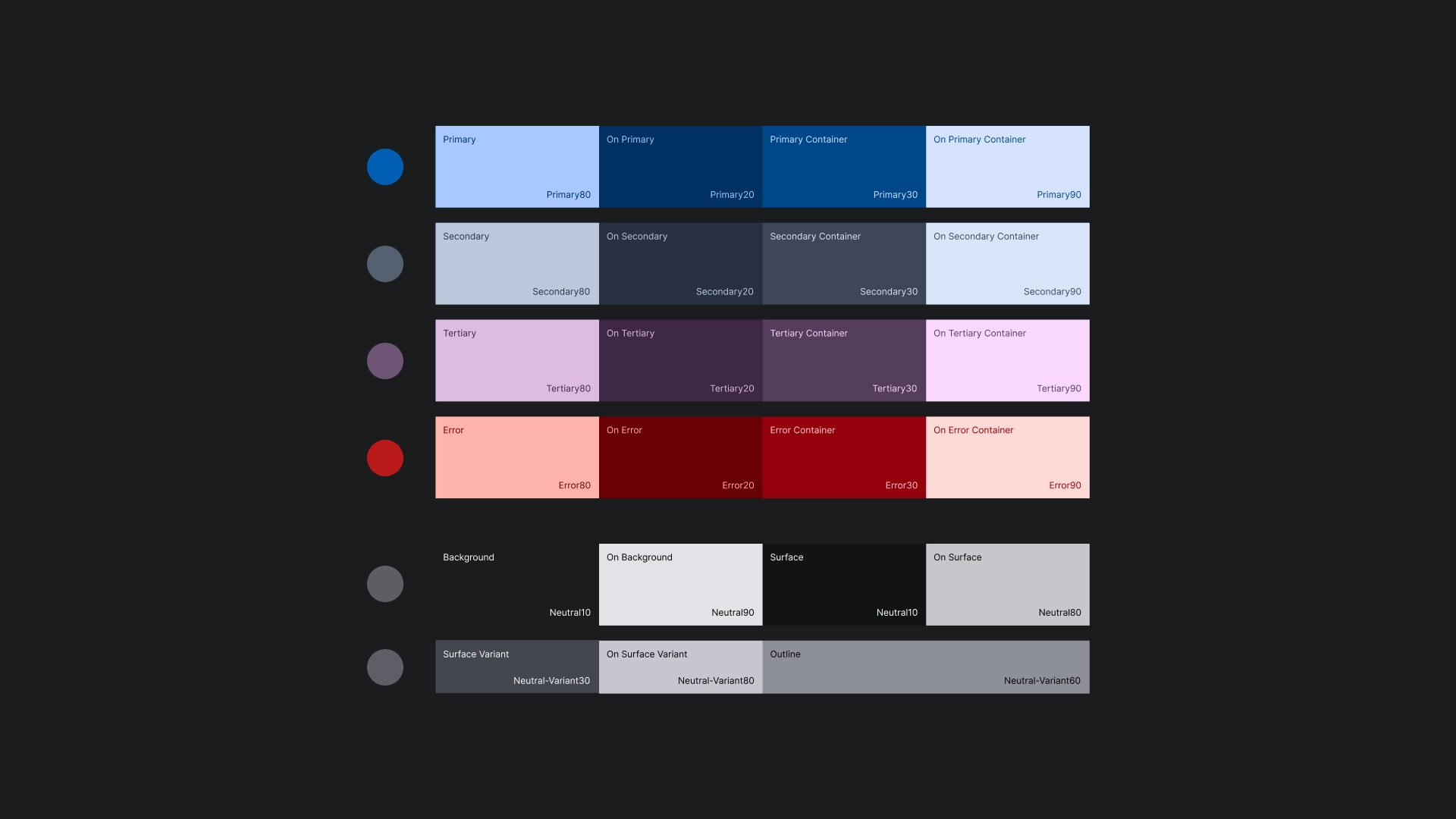
色彩主题
颜色主题是使用 Material Design 3 主题生成器生成的。
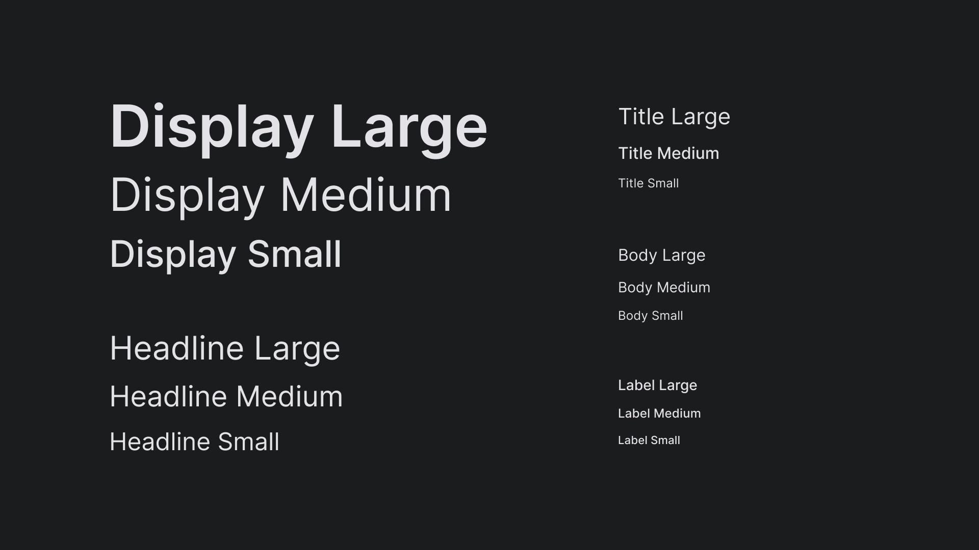
排版
JetStream 的字体比例使用 Interface 为电视屏幕打造简单清晰的外观。
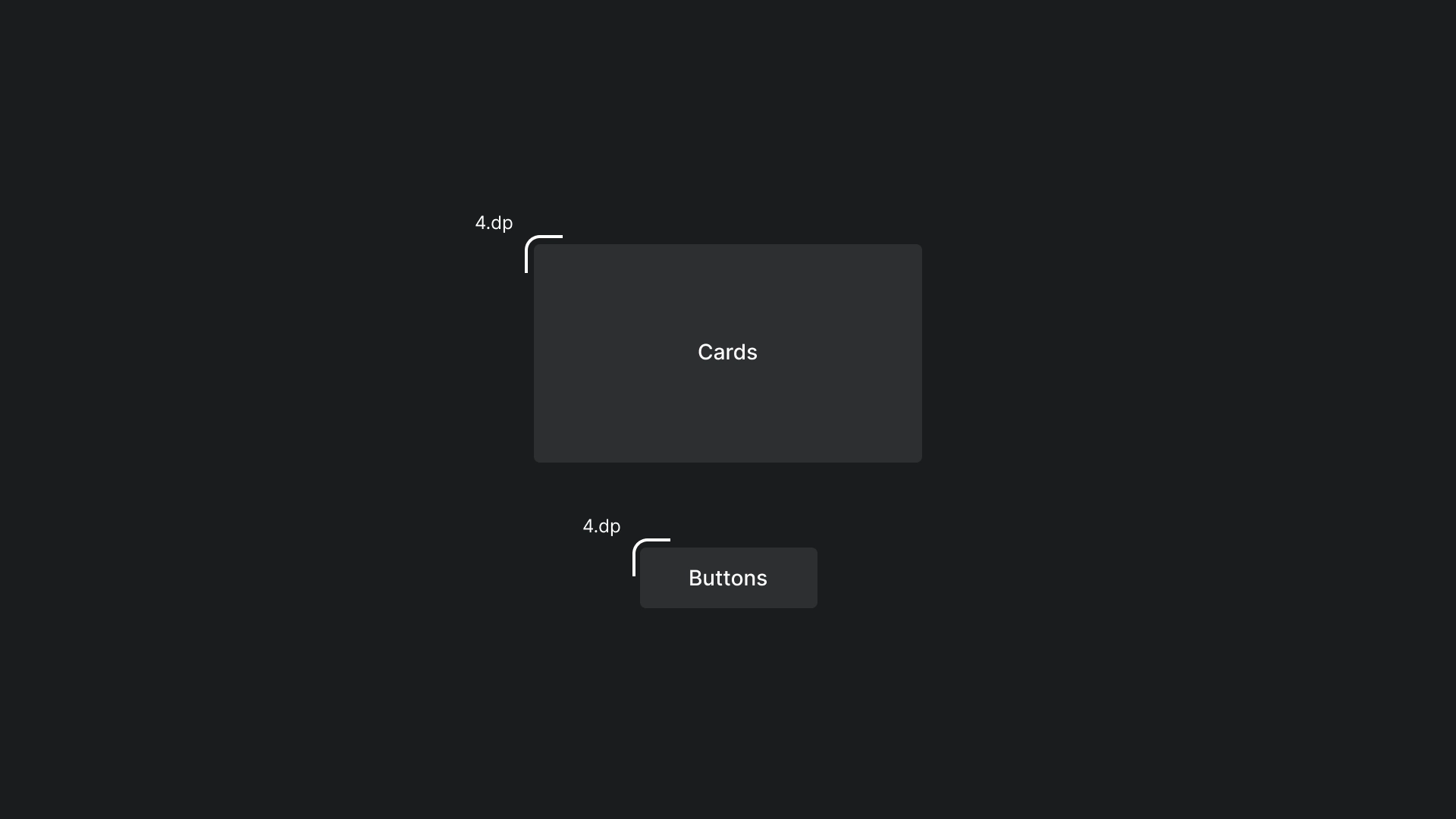
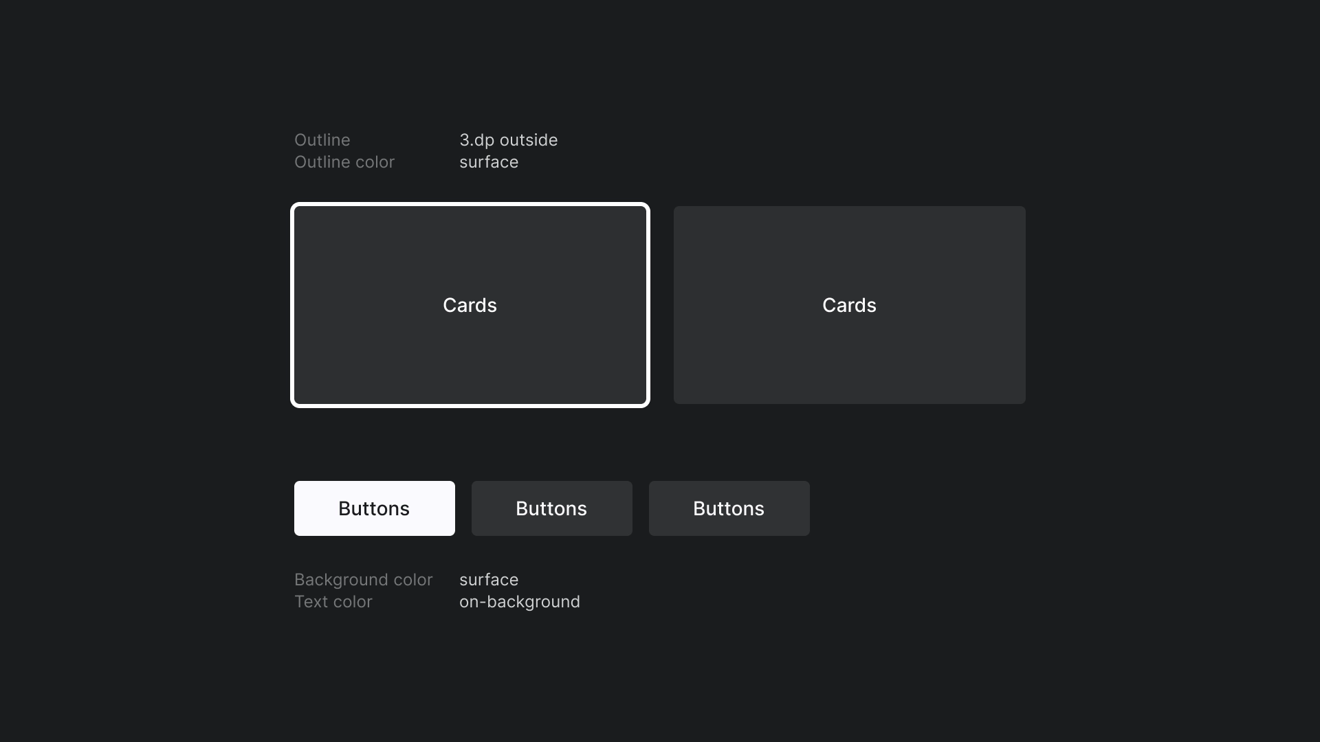
形状
我们在卡片和按钮上应用微小的半径,打造出友好且易上手的边缘。
焦点
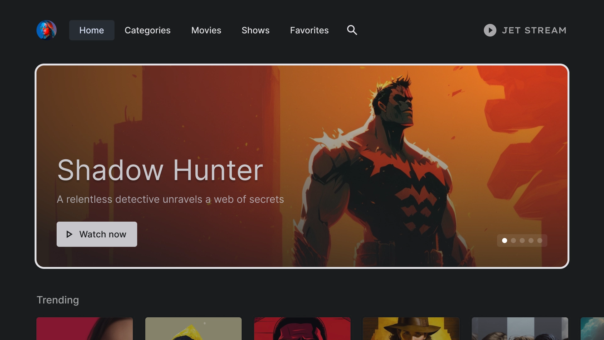
JetStream 使用带轮廓颜色的 3dp 轮廓。
主屏幕
主屏幕
JetStream 应用的着陆页。
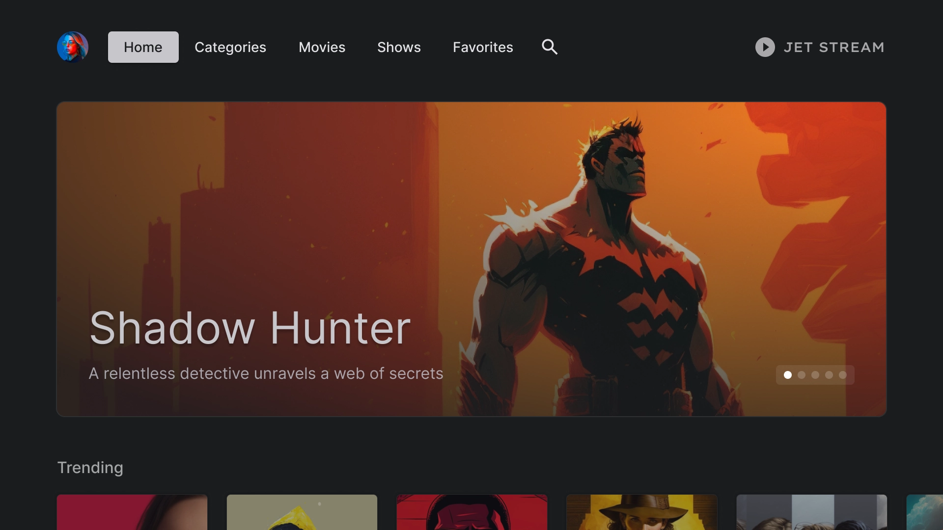
精选轮播内容
采用卡片式布局的轮播界面。
内容行
JetStream 采用 5 列布局的标准卡片样式,宽高比为 2:3。
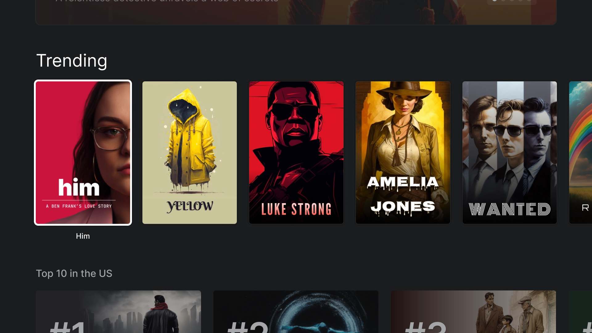
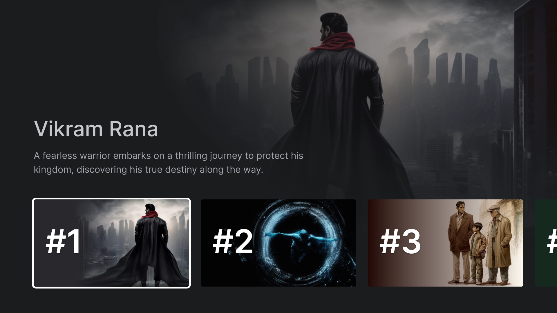
沉浸式列表
使用沉浸式列表组件突出显示应用中的特殊内容,例如十大热门电影。
类别
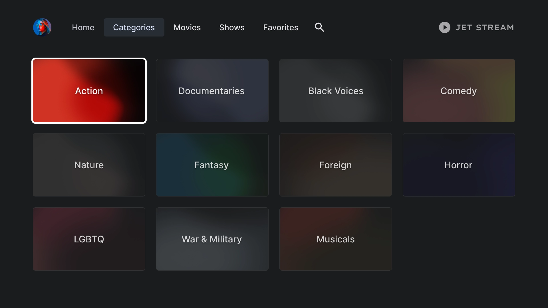
类别
“类别”页面以网格格式显示类型,以便于导航和访问。
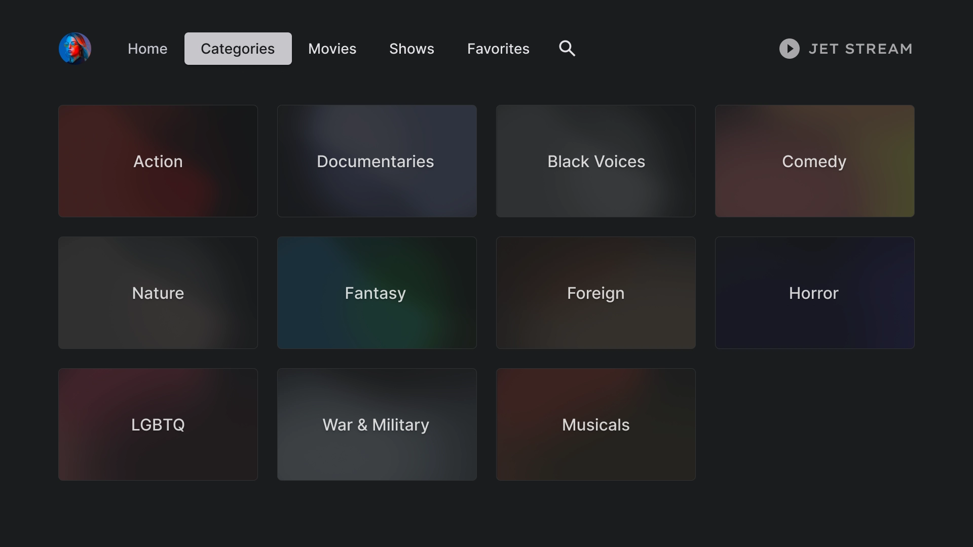
类别卡片
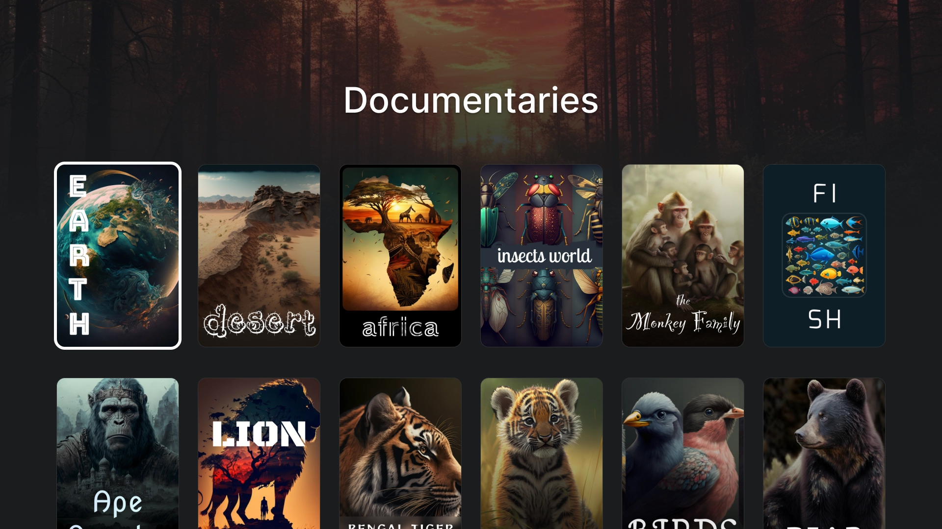
类别详情
使用标题为 2:3 的卡片网格来创建“类别详情”页面。
媒体
电影
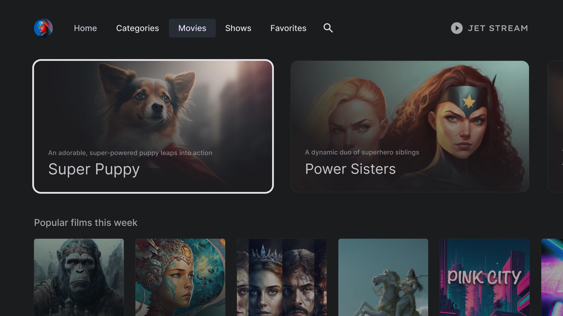
一个标准“电影”标签页,顶部是 16:9 精选卡片,底部是内容网格。
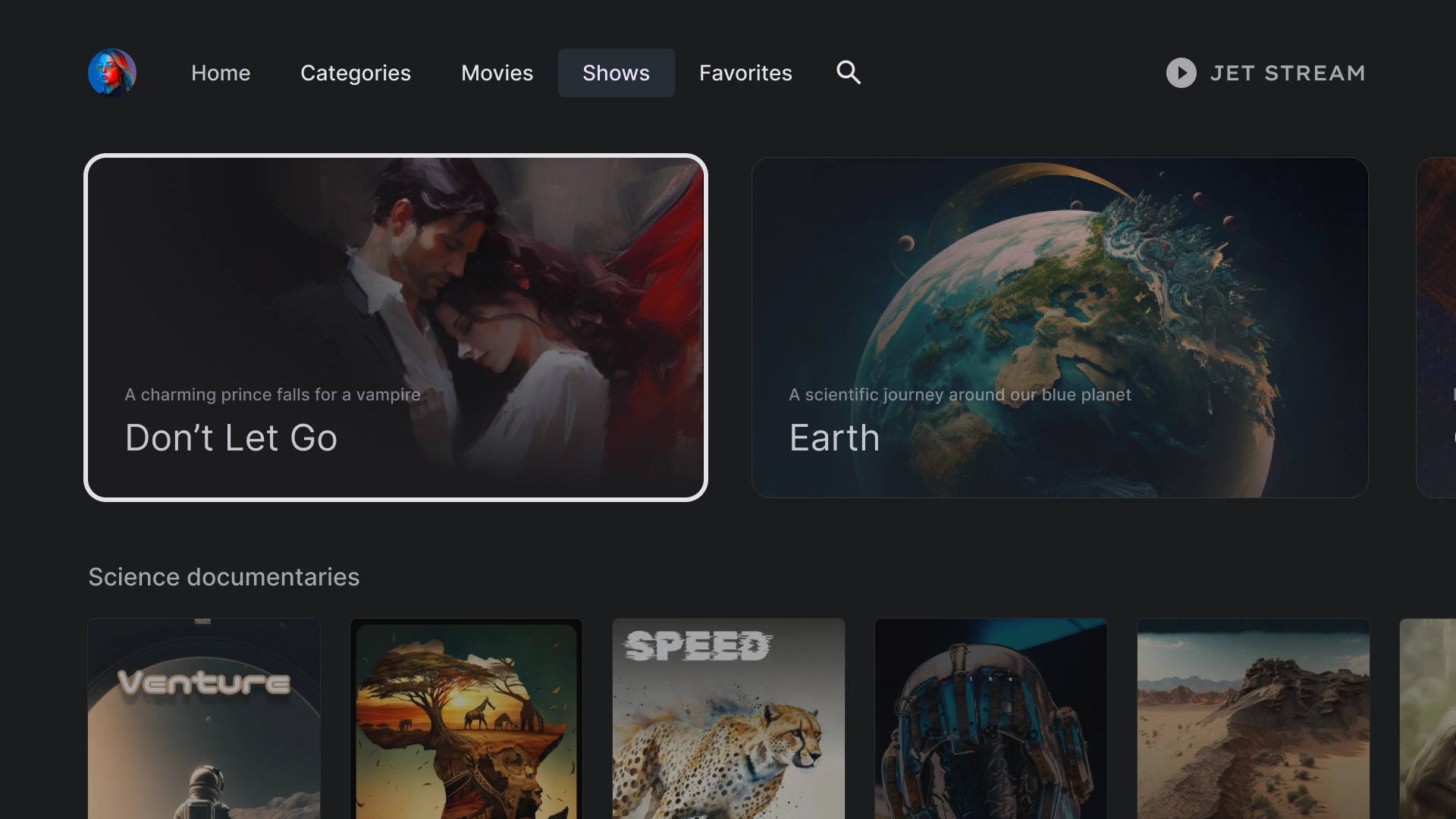
节目
媒体库
收藏夹
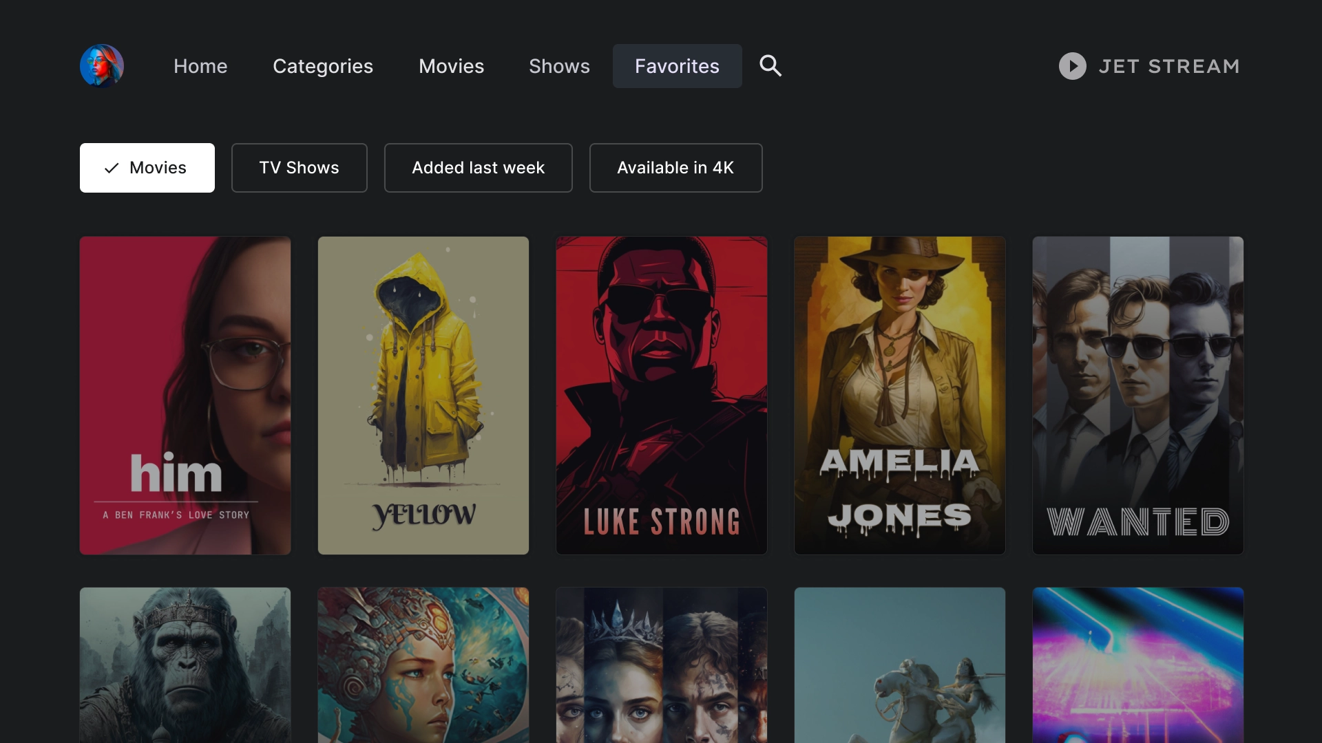
“收藏夹”标签页在屏幕顶部包含过滤条状标签,以便您快速搜索内容。
搜索
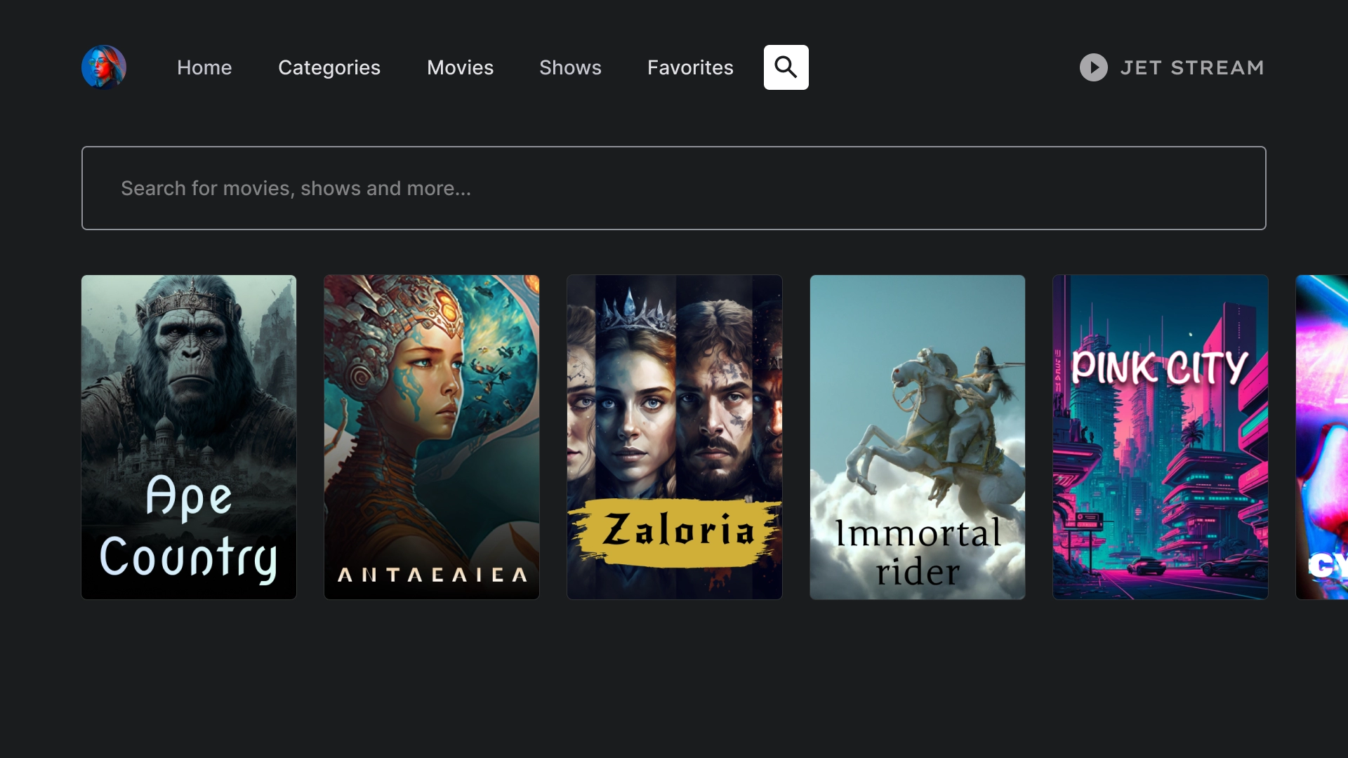
搜索着陆页
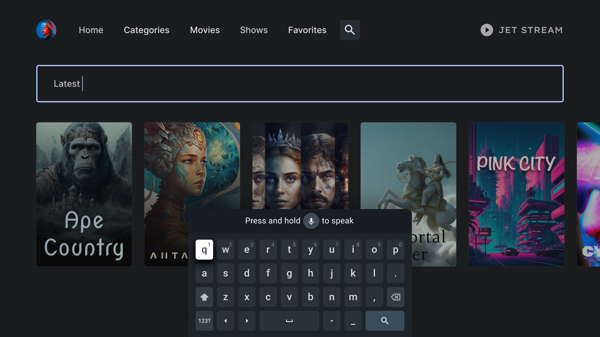
搜索页上有一个搜索栏,其中包含系统根据近期搜索建议的搜索查询。
有效搜索
当用户将焦点放到搜索栏上时,键盘会弹出,下面的结果会随着用户输入而动态更新。
实体详情
详情着陆页
详情页面会显示电影视图,其中包含简短的情节摘要和醒目的观影号召性用语按钮。
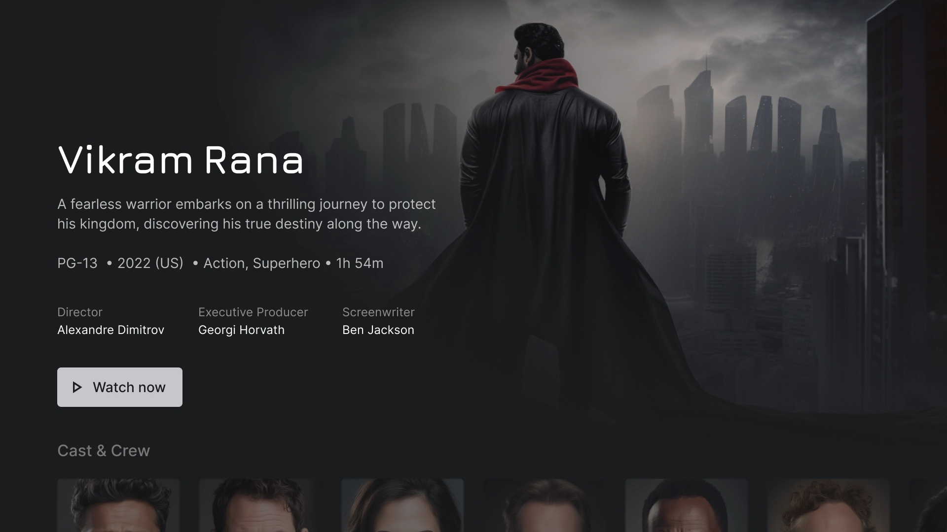
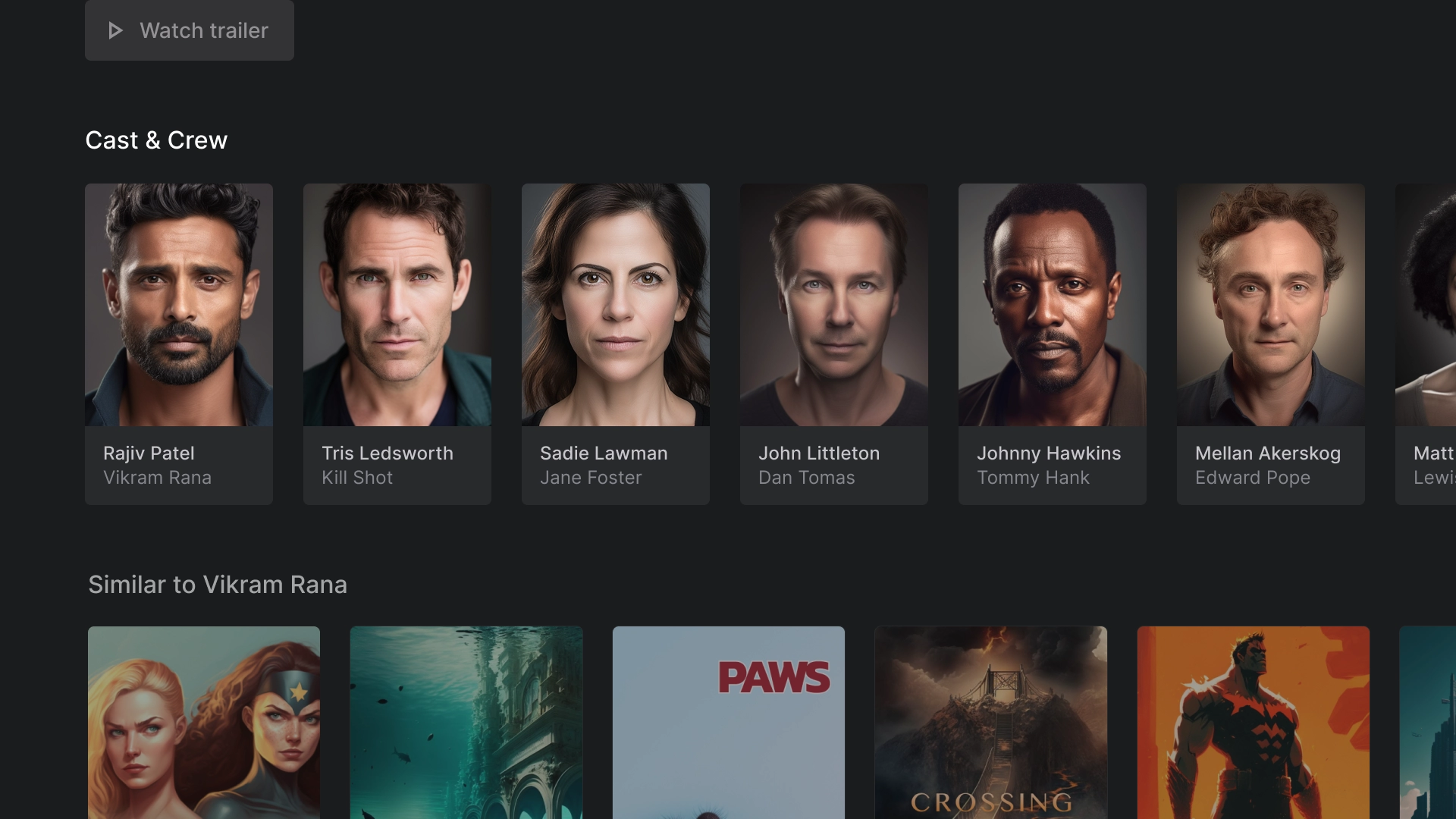
演职人员
“演职人员和工作人员”部分包含一行经典卡片和标题和说明,每张卡片都配有 2:3 的图片素材资源。
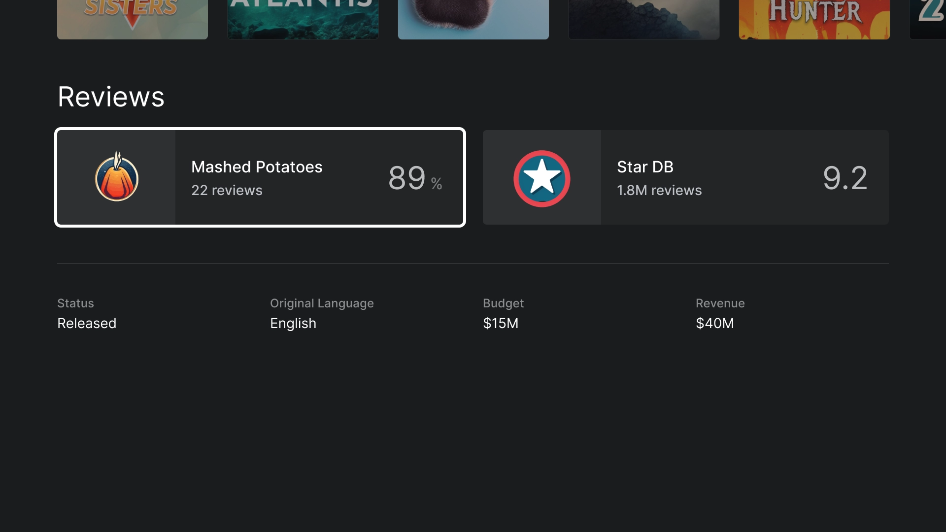
评分
“评分”部分有一个自定义的经典宽卡片,其中包含了更多信息。
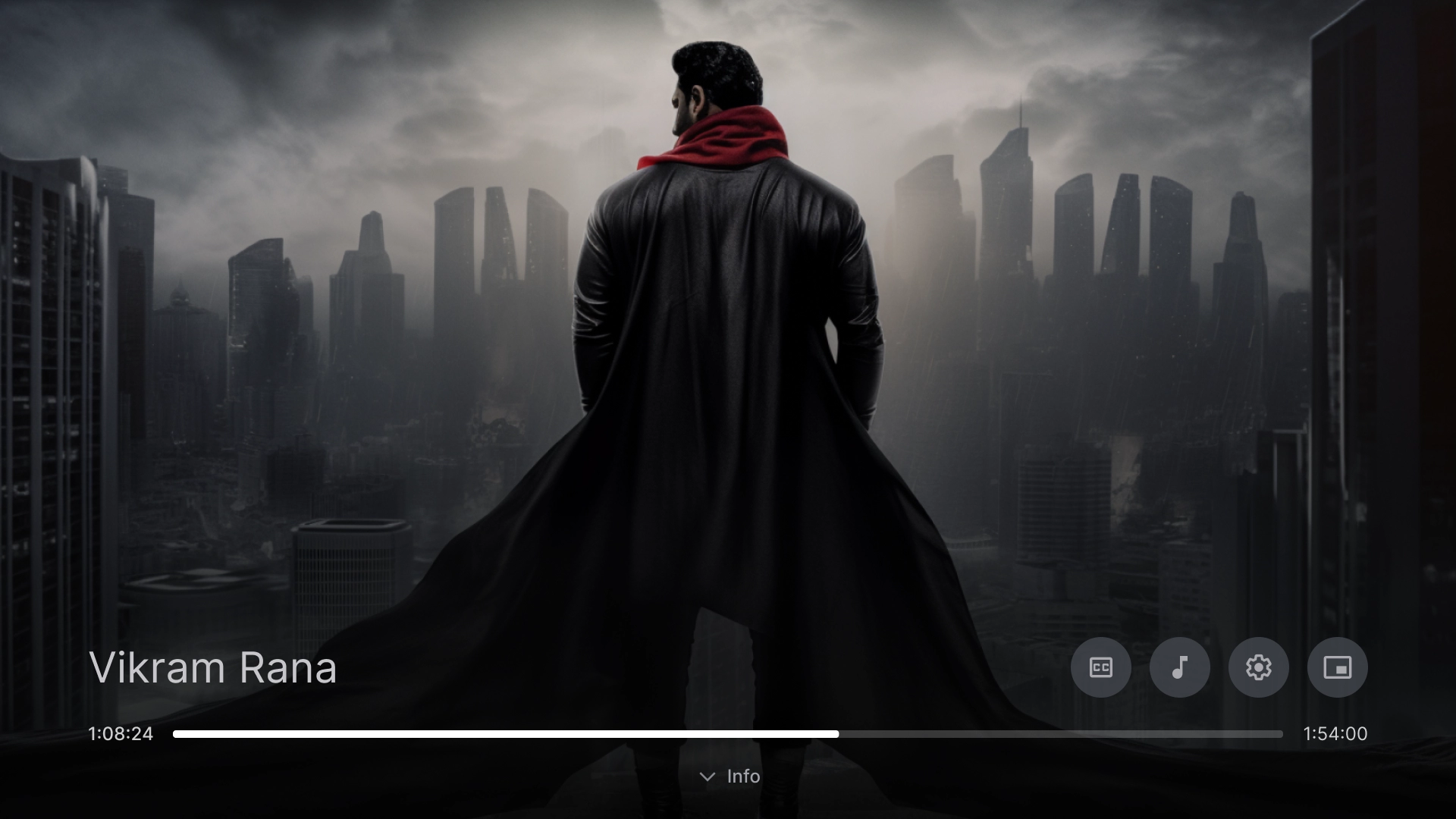
播放
视频播放器
遵循最佳做法的标准视频播放器。
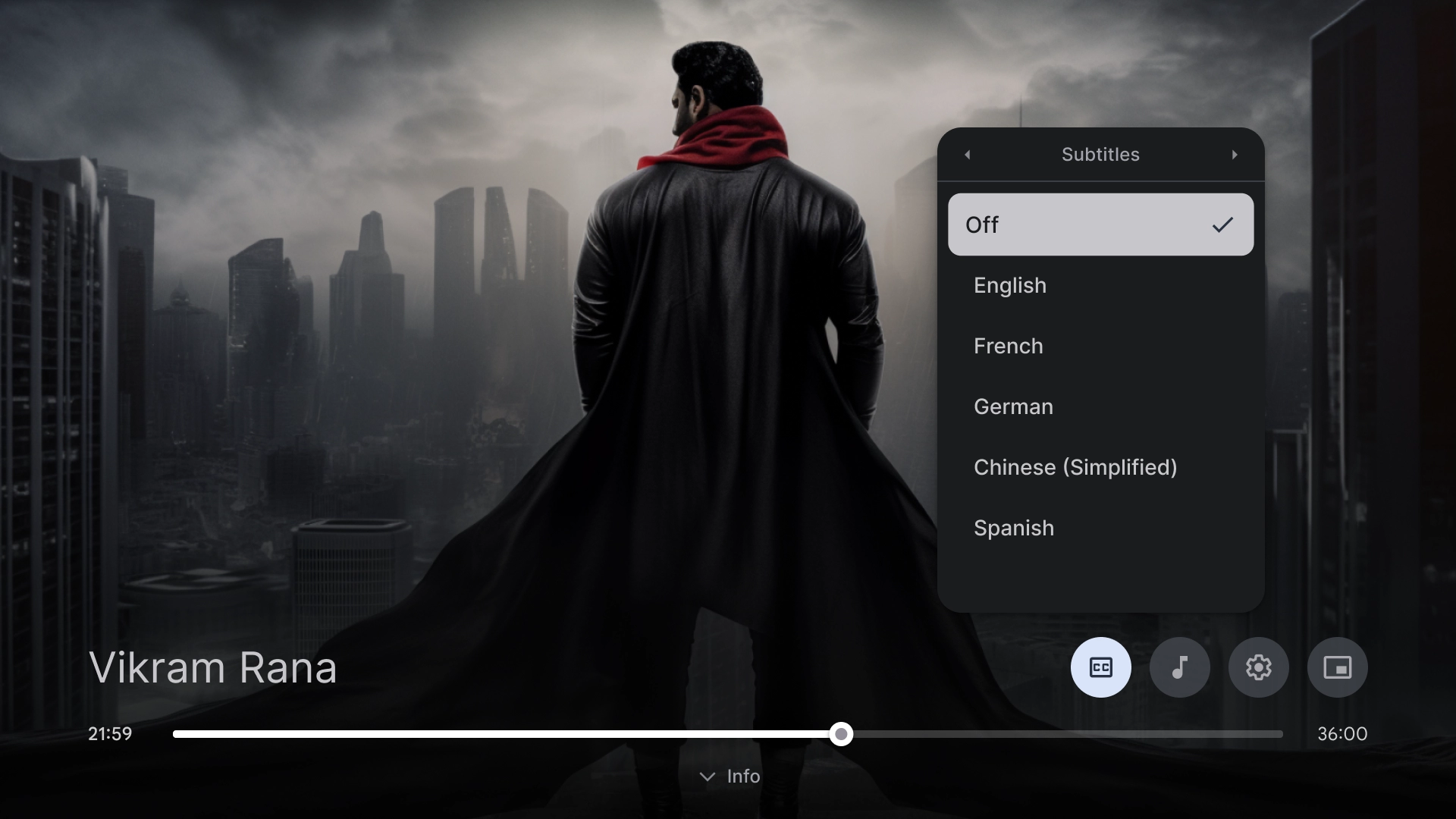
视频播放器设置
视频播放器上的字幕弹出式窗口。
设置
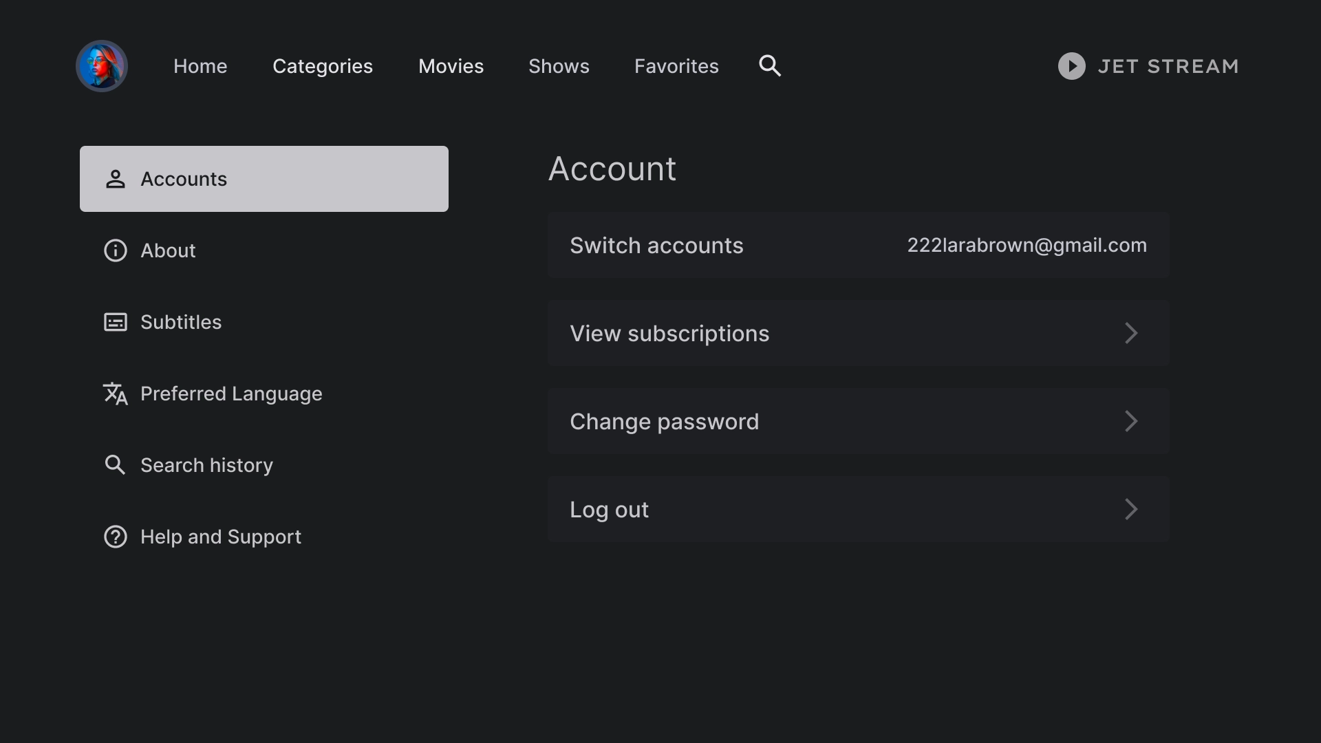
帐号设置
帐号页面布局采用双列设计,左侧为列表组件,右侧为自定义卡片组件,以网格格式排列。
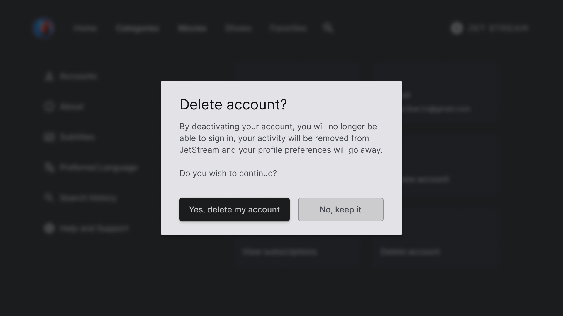
“删除帐号”对话框
该对话框采用了对比鲜明的背景,使其与屏幕的其余部分明显区分开来。对话框中的两个按钮左对齐,以获得简洁有序的外观。
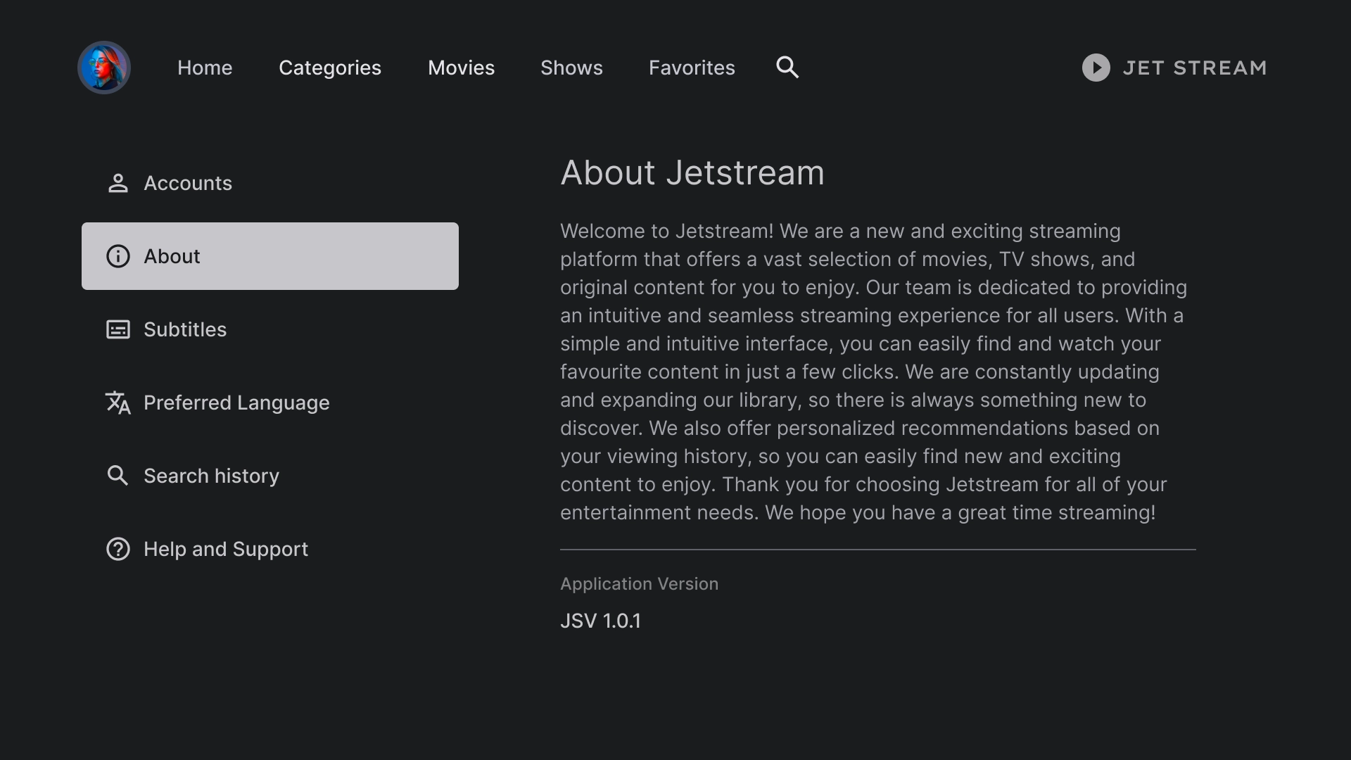
简介
“简介”部分有一个右侧面板,其中包含一个可滚动的文本视图。
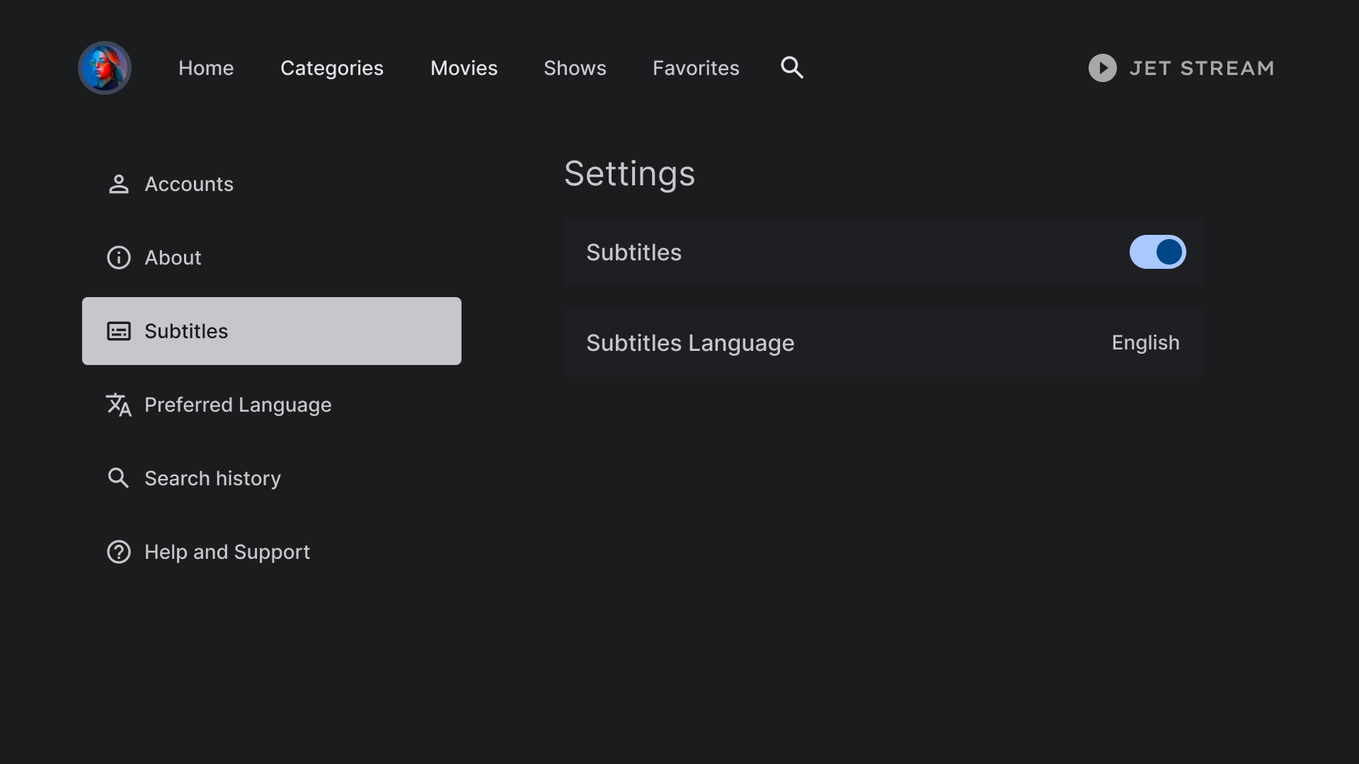
字幕设置
列表组件用于在副标题下显示各种设置,并使用开关或标签等操作。
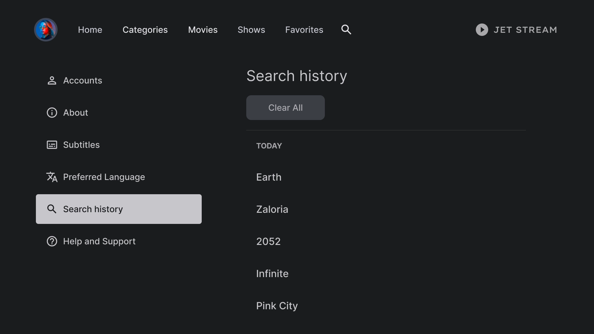
历史记录
搜索记录使用的布局会显示之前搜索过的查询,并提供清除所有搜索记录的选项。
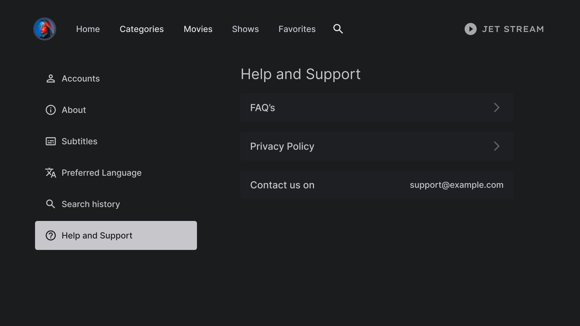
帮助
“帮助和支持”部分使用自定义列表组件显示各种选项,包括联系信息和常见问题解答。