
يتيح المكوّن Switch للمستخدمين التبديل بين حالتين: تم وضع علامة
في المربّع أو لم يتم وضع علامة فيه. استخدِم مفتاح تبديل للسماح للمستخدم بتنفيذ أحد الإجراءات التالية:
- فعِّل أحد الإعدادات أو أوقِفه.
- تفعيل ميزة أو إيقافها
- حدِّد خيارًا.
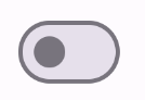
يتكوّن المكوّن من جزأين: الإبهام والمسار. المقبض هو الجزء القابل للسحب في زر التبديل، والمسار هو الخلفية. يمكن للمستخدم سحب الإبهام إلى اليسار أو اليمين لتغيير حالة مفتاح التبديل. يمكنهم أيضًا النقر على زر التبديل للتحقّق من إيقافها أو تفعيلها.
التوافق مع الإصدارات
يتطلّب هذا التنفيذ ضبط minSDK في مشروعك على المستوى 21 من واجهة برمجة التطبيقات أو مستوى أعلى.
التبعيات
تنفيذ مفتاح تبديل
المثال التالي هو عملية تنفيذ بسيطة للدالة البرمجية القابلة للإنشاء Switch:
النتائج

إنشاء صورة مصغّرة مخصّصة
يمكنك تمرير أي عنصر قابل للإنشاء إلى المَعلمة thumbContent لإنشاء صورة مصغّرة مخصّصة. في ما يلي مثال على مفتاح تبديل يستخدم رمزًا مخصّصًا لزر التبديل:
النتائج
يظهر المربّع بدون علامة اختيار كما في المثال الوارد في القسم السابق. ومع ذلك، عند تحديد هذا الخيار، يظهر التنفيذ على النحو التالي:
استخدام ألوان مخصّصة
استخدِم المَعلمة colors لتغيير لون زر التبديل ومساره، مع مراعاة ما إذا كان زر التبديل محدّدًا.
النتائج

النقاط الرئيسية
المَعلمات الأساسية:
checked: تمثّل هذه السمة الحالة الأولية للمفتاح.-
onCheckedChange: دالة ردّ يتم استدعاؤها عند تغيُّر حالة زر التبديل. enabled: ما إذا كان مفتاح التبديل مفعَّلاً أو غير مفعَّل.colors: الألوان المستخدَمة للمفتاح
المَعلمات المتقدّمة
thumbContent: استخدِم هذه السمة لتخصيص مظهر زر التحكّم عندما يكون محدّدًا.colors: استخدِم هذه السمة لتخصيص لون المسار وزر التحكّم.
المجموعات التي تتضمّن هذا الدليل
يشكّل هذا الدليل جزءًا من مجموعات "الدليل السريع" المنسّقة التي تغطي أهدافًا أوسع لتطوير تطبيقات Android:

عرض المكوّنات التفاعلية