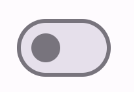
[null,null,["最后更新时间 (UTC):2025-05-08。"],[],[],null,["# Add a switch that users can toggle\n\n\u003cbr /\u003e\n\nThe [`Switch`](/reference/kotlin/androidx/compose/material3/package-summary#Switch(kotlin.Boolean,kotlin.Function1,androidx.compose.ui.Modifier,kotlin.Function0,kotlin.Boolean,androidx.compose.material3.SwitchColors,androidx.compose.foundation.interaction.MutableInteractionSource)) component lets users toggle between two states: checked\nand unchecked. Use a switch to let the user to do one of the\nfollowing:\n\n- Toggle a setting on or off.\n- Enable or disable a feature.\n- Select an option.\n\nThe component has two parts: the thumb and the track. The thumb is the draggable\npart of the switch, and the track is the background. The user can drag the thumb\nto the left or right to change the state of the switch. They can also tap the\nswitch to check and clear it.\n\nVersion compatibility\n---------------------\n\nThis implementation requires that your project minSDK be set to API level 21 or\nhigher.\n\n### Dependencies\n\n### Kotlin\n\n\u003cbr /\u003e\n\n```kotlin\n implementation(platform(\"androidx.compose:compose-bom:2025.08.00\"))\n \n```\n\n\u003cbr /\u003e\n\n### Groovy\n\n\u003cbr /\u003e\n\n```groovy\n implementation platform('androidx.compose:compose-bom:2025.08.00')\n \n```\n\n\u003cbr /\u003e\n\nImplement a switch\n------------------\n\nThe following example is a minimal implementation of the `Switch` composable:\n\n\u003cbr /\u003e\n\n```kotlin\n@Composable\nfun SwitchMinimalExample() {\n var checked by remember { mutableStateOf(true) }\n\n Switch(\n checked = checked,\n onCheckedChange = {\n checked = it\n }\n )\n}\n \n https://github.com/android/snippets/blob/dd30aee903e8c247786c064faab1a9ca8d10b46e/compose/snippets/src/main/java/com/example/compose/snippets/components/Switch.kt#L65-L75\n \n```\n\n\u003cbr /\u003e\n\n### Results\n\n**Figure 1.** An unchecked switch. **Figure 2.** A checked switch.\n\nCreate a custom thumb\n---------------------\n\nYou can pass any composable for the `thumbContent` parameter to create a custom\nthumb. The following is an example of a switch that uses a custom icon for its\nthumb:\n\n\u003cbr /\u003e\n\n```kotlin\n@Composable\nfun SwitchWithIconExample() {\n var checked by remember { mutableStateOf(true) }\n\n Switch(\n checked = checked,\n onCheckedChange = {\n checked = it\n },\n thumbContent = if (checked) {\n {\n Icon(\n imageVector = Icons.Filled.Check,\n contentDescription = null,\n modifier = Modifier.size(SwitchDefaults.IconSize),\n )\n }\n } else {\n null\n }\n )\n}\n \n https://github.com/android/snippets/blob/dd30aee903e8c247786c064faab1a9ca8d10b46e/compose/snippets/src/main/java/com/example/compose/snippets/components/Switch.kt#L80-L101\n \n```\n\n\u003cbr /\u003e\n\n### Results\n\nThe unchecked appearance is the same as the example in\nthe preceding section. However, when checked, this implementation appears as\nfollows:\n**Figure 3.** A switch with a custom checked icon.\n\nUse custom colors\n-----------------\n\nUse the `colors` parameter to\nchange the color of a switch's thumb and track, taking into account whether the\nswitch is checked.\n\n\u003cbr /\u003e\n\n```kotlin\n@Composable\nfun SwitchWithCustomColors() {\n var checked by remember { mutableStateOf(true) }\n\n Switch(\n checked = checked,\n onCheckedChange = {\n checked = it\n },\n colors = SwitchDefaults.colors(\n checkedThumbColor = MaterialTheme.colorScheme.primary,\n checkedTrackColor = MaterialTheme.colorScheme.primaryContainer,\n uncheckedThumbColor = MaterialTheme.colorScheme.secondary,\n uncheckedTrackColor = MaterialTheme.colorScheme.secondaryContainer,\n )\n )\n}\n \n https://github.com/android/snippets/blob/dd30aee903e8c247786c064faab1a9ca8d10b46e/compose/snippets/src/main/java/com/example/compose/snippets/components/Switch.kt#L129-L145\n \n```\n\n\u003cbr /\u003e\n\n### Results\n\n**Figure 4.** A switch with custom colors.\n\nKey points\n----------\n\n- Basic parameters:\n\n - **`checked`**: The initial state of the switch.\n - **`onCheckedChange`**: A callback that is called when the state of the switch changes.\n - **`enabled`**: Whether the switch is enabled or disabled.\n - **`colors`**: The colors used for the switch.\n- Advanced parameters\n\n - **`thumbContent`**: Use this to customize the appearance of the thumb when it is checked.\n - **`colors`**: Use this to customize the color of the track and thumb.\n\nCollections that contain this guide\n-----------------------------------\n\nThis guide is part of these curated Quick Guide collections that cover\nbroader Android development goals: \n\n### Display interactive components\n\nLearn how composable functions can enable you to easily create beautiful UI components based on the Material Design design system. \n[Quick guide collection](/develop/ui/compose/quick-guides/collections/display-interactive-components) \n\nHave questions or feedback\n--------------------------\n\nGo to our frequently asked questions page and learn about quick guides or reach out and let us know your thoughts. \n[Go to FAQ](/quick-guides/faq) [Leave feedback](https://issuetracker.google.com/issues/new?component=1573691&template=1993320)"]]