Sử dụng bộ sưu tập để sắp xếp ngăn nắp các trang
Lưu và phân loại nội dung dựa trên lựa chọn ưu tiên của bạn.
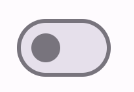
Thành phần Switch cho phép người dùng chuyển đổi giữa hai trạng thái: đã đánh dấu và chưa đánh dấu. Sử dụng nút chuyển để cho phép người dùng thực hiện một trong những thao tác sau:
Bật hoặc tắt một chế độ cài đặt.
Bật hoặc tắt một tính năng.
Chọn một lựa chọn.
Thành phần này có hai phần: con trỏ và dải âm thanh. Thumb là phần có thể kéo của nút chuyển và track là nền. Người dùng có thể kéo nút gạt sang trái hoặc phải để thay đổi trạng thái của nút chuyển. Người dùng cũng có thể nhấn vào nút chuyển để kiểm tra và xoá.
Khả năng tương thích của phiên bản
Phương thức triển khai này yêu cầu bạn phải đặt minSDK của dự án thành API cấp 21 trở lên.
Phần phụ thuộc
Triển khai nút chuyển
Ví dụ sau đây là cách triển khai tối thiểu thành phần kết hợp Switch:
Kết quả
Hình 1. Nút chuyển chưa được chọn.Hình 2. Một nút chuyển đã được đánh dấu.
Tạo hình thu nhỏ tuỳ chỉnh
Bạn có thể truyền bất kỳ thành phần kết hợp nào cho tham số thumbContent để tạo một hình thu nhỏ tuỳ chỉnh. Sau đây là ví dụ về một nút chuyển sử dụng biểu tượng tuỳ chỉnh cho nút nhấn:
Kết quả
Giao diện chưa đánh dấu giống như ví dụ trong phần trước. Tuy nhiên, khi được đánh dấu, cách triển khai này sẽ xuất hiện như sau:
Hình 3. Một nút chuyển có biểu tượng đánh dấu tuỳ chỉnh.
Sử dụng màu tuỳ chỉnh
Sử dụng tham số colors để thay đổi màu của nút và đường dẫn của nút chuyển, có tính đến việc nút chuyển có được đánh dấu hay không.
Kết quả
Hình 4. Một nút chuyển có màu tuỳ chỉnh.
Điểm chính
Tham số cơ bản:
checked: Trạng thái ban đầu của nút chuyển.
onCheckedChange: Lệnh gọi lại được gọi khi trạng thái của nút chuyển thay đổi.
enabled: Liệu nút chuyển đang bật hay tắt.
colors: Màu sắc dùng cho nút chuyển.
Tham số nâng cao
thumbContent: Sử dụng thuộc tính này để tuỳ chỉnh giao diện của ngón tay cái khi được đánh dấu.
colors: Sử dụng thuộc tính này để tuỳ chỉnh màu của bản nhạc và con trỏ.
Các bộ sưu tập chứa hướng dẫn này
Hướng dẫn này là một phần của các bộ sưu tập Hướng dẫn nhanh được tuyển chọn này, bao gồm các mục tiêu phát triển Android rộng hơn:
Hiển thị các thành phần tương tác
Tìm hiểu cách các hàm có khả năng kết hợp giúp bạn dễ dàng tạo các thành phần giao diện người dùng đẹp mắt dựa trên hệ thống thiết kế Material Design.
Nội dung và mã mẫu trên trang này phải tuân thủ các giấy phép như mô tả trong phần Giấy phép nội dung. Java và OpenJDK là nhãn hiệu hoặc nhãn hiệu đã đăng ký của Oracle và/hoặc đơn vị liên kết của Oracle.
Cập nhật lần gần đây nhất: 2025-05-08 UTC.
[null,null,["Cập nhật lần gần đây nhất: 2025-05-08 UTC."],[],[],null,["# Add a switch that users can toggle\n\n\u003cbr /\u003e\n\nThe [`Switch`](/reference/kotlin/androidx/compose/material3/package-summary#Switch(kotlin.Boolean,kotlin.Function1,androidx.compose.ui.Modifier,kotlin.Function0,kotlin.Boolean,androidx.compose.material3.SwitchColors,androidx.compose.foundation.interaction.MutableInteractionSource)) component lets users toggle between two states: checked\nand unchecked. Use a switch to let the user to do one of the\nfollowing:\n\n- Toggle a setting on or off.\n- Enable or disable a feature.\n- Select an option.\n\nThe component has two parts: the thumb and the track. The thumb is the draggable\npart of the switch, and the track is the background. The user can drag the thumb\nto the left or right to change the state of the switch. They can also tap the\nswitch to check and clear it.\n\nVersion compatibility\n---------------------\n\nThis implementation requires that your project minSDK be set to API level 21 or\nhigher.\n\n### Dependencies\n\n### Kotlin\n\n\u003cbr /\u003e\n\n```kotlin\n implementation(platform(\"androidx.compose:compose-bom:2025.08.00\"))\n \n```\n\n\u003cbr /\u003e\n\n### Groovy\n\n\u003cbr /\u003e\n\n```groovy\n implementation platform('androidx.compose:compose-bom:2025.08.00')\n \n```\n\n\u003cbr /\u003e\n\nImplement a switch\n------------------\n\nThe following example is a minimal implementation of the `Switch` composable:\n\n\u003cbr /\u003e\n\n```kotlin\n@Composable\nfun SwitchMinimalExample() {\n var checked by remember { mutableStateOf(true) }\n\n Switch(\n checked = checked,\n onCheckedChange = {\n checked = it\n }\n )\n}\n \n https://github.com/android/snippets/blob/dd30aee903e8c247786c064faab1a9ca8d10b46e/compose/snippets/src/main/java/com/example/compose/snippets/components/Switch.kt#L65-L75\n \n```\n\n\u003cbr /\u003e\n\n### Results\n\n**Figure 1.** An unchecked switch. **Figure 2.** A checked switch.\n\nCreate a custom thumb\n---------------------\n\nYou can pass any composable for the `thumbContent` parameter to create a custom\nthumb. The following is an example of a switch that uses a custom icon for its\nthumb:\n\n\u003cbr /\u003e\n\n```kotlin\n@Composable\nfun SwitchWithIconExample() {\n var checked by remember { mutableStateOf(true) }\n\n Switch(\n checked = checked,\n onCheckedChange = {\n checked = it\n },\n thumbContent = if (checked) {\n {\n Icon(\n imageVector = Icons.Filled.Check,\n contentDescription = null,\n modifier = Modifier.size(SwitchDefaults.IconSize),\n )\n }\n } else {\n null\n }\n )\n}\n \n https://github.com/android/snippets/blob/dd30aee903e8c247786c064faab1a9ca8d10b46e/compose/snippets/src/main/java/com/example/compose/snippets/components/Switch.kt#L80-L101\n \n```\n\n\u003cbr /\u003e\n\n### Results\n\nThe unchecked appearance is the same as the example in\nthe preceding section. However, when checked, this implementation appears as\nfollows:\n**Figure 3.** A switch with a custom checked icon.\n\nUse custom colors\n-----------------\n\nUse the `colors` parameter to\nchange the color of a switch's thumb and track, taking into account whether the\nswitch is checked.\n\n\u003cbr /\u003e\n\n```kotlin\n@Composable\nfun SwitchWithCustomColors() {\n var checked by remember { mutableStateOf(true) }\n\n Switch(\n checked = checked,\n onCheckedChange = {\n checked = it\n },\n colors = SwitchDefaults.colors(\n checkedThumbColor = MaterialTheme.colorScheme.primary,\n checkedTrackColor = MaterialTheme.colorScheme.primaryContainer,\n uncheckedThumbColor = MaterialTheme.colorScheme.secondary,\n uncheckedTrackColor = MaterialTheme.colorScheme.secondaryContainer,\n )\n )\n}\n \n https://github.com/android/snippets/blob/dd30aee903e8c247786c064faab1a9ca8d10b46e/compose/snippets/src/main/java/com/example/compose/snippets/components/Switch.kt#L129-L145\n \n```\n\n\u003cbr /\u003e\n\n### Results\n\n**Figure 4.** A switch with custom colors.\n\nKey points\n----------\n\n- Basic parameters:\n\n - **`checked`**: The initial state of the switch.\n - **`onCheckedChange`**: A callback that is called when the state of the switch changes.\n - **`enabled`**: Whether the switch is enabled or disabled.\n - **`colors`**: The colors used for the switch.\n- Advanced parameters\n\n - **`thumbContent`**: Use this to customize the appearance of the thumb when it is checked.\n - **`colors`**: Use this to customize the color of the track and thumb.\n\nCollections that contain this guide\n-----------------------------------\n\nThis guide is part of these curated Quick Guide collections that cover\nbroader Android development goals: \n\n### Display interactive components\n\nLearn how composable functions can enable you to easily create beautiful UI components based on the Material Design design system. \n[Quick guide collection](/develop/ui/compose/quick-guides/collections/display-interactive-components) \n\nHave questions or feedback\n--------------------------\n\nGo to our frequently asked questions page and learn about quick guides or reach out and let us know your thoughts. \n[Go to FAQ](/quick-guides/faq) [Leave feedback](https://issuetracker.google.com/issues/new?component=1573691&template=1993320)"]]