Tạo bảng dưới cùng
Sử dụng bộ sưu tập để sắp xếp ngăn nắp các trang
Lưu và phân loại nội dung dựa trên lựa chọn ưu tiên của bạn.
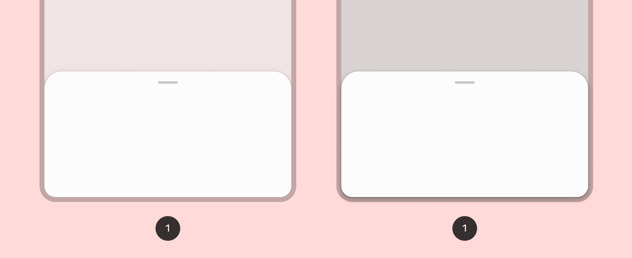
Một trang tính dưới cùng hiển thị nội dung phụ, được neo vào cuối màn hình.
Khả năng tương thích của phiên bản
Phương thức triển khai này yêu cầu bạn phải đặt minSDK của dự án thành API cấp 21 trở lên.
Phần phụ thuộc
Triển khai bảng dưới cùng
Để triển khai bảng dưới cùng, hãy sử dụng thành phần kết hợp ModalBottomSheet
:
Mở rộng và thu gọn trang tính
Để mở rộng và thu gọn bảng, hãy sử dụng SheetState
:
Điểm chính
- Sử dụng khe
content
, trong đó sử dụng ColumnScope
để sắp xếp bố cục các thành phần kết hợp nội dung của bảng trong một cột.
- Sử dụng
rememberSheetState
để tạo một thực thể của SheetState
mà bạn truyền vào ModalBottomSheet
bằng tham số sheetState
.
SheetState
cung cấp quyền truy cập vào các hàm show
và hide
cũng như các thuộc tính liên quan đến trạng thái hiện tại của bảng tính. Các hàm này yêu cầu CoroutineScope
— ví dụ: rememberCoroutineScope
— và có thể được gọi lệnh để phản hồi các sự kiện giao diện người dùng.
Hãy nhớ xoá ModalBottomSheet
khỏi thành phần khi bạn ẩn
trang dưới cùng.
Kết quả
Hình 1. Một bảng dưới cùng tiêu chuẩn (bên trái) và một bảng dưới cùng theo phương thức phương thức (bên phải).
Các bộ sưu tập chứa hướng dẫn này
Hướng dẫn này là một phần của các bộ sưu tập Hướng dẫn nhanh được tuyển chọn này, bao gồm các mục tiêu phát triển Android rộng hơn:
Hiển thị các thành phần tương tác
Tìm hiểu cách các hàm có khả năng kết hợp giúp bạn dễ dàng tạo các thành phần giao diện người dùng đẹp mắt dựa trên hệ thống thiết kế Material Design.
Nội dung và mã mẫu trên trang này phải tuân thủ các giấy phép như mô tả trong phần Giấy phép nội dung. Java và OpenJDK là nhãn hiệu hoặc nhãn hiệu đã đăng ký của Oracle và/hoặc đơn vị liên kết của Oracle.
Cập nhật lần gần đây nhất: 2025-02-06 UTC.
[null,null,["Cập nhật lần gần đây nhất: 2025-02-06 UTC."],[],[],null,["# Create a bottom sheet\n\n\u003cbr /\u003e\n\nA bottom sheet shows secondary content, anchored to the bottom of the screen.\n\nVersion compatibility\n---------------------\n\nThis implementation requires that your project minSDK be set to API level 21 or\nhigher.\n\n### Dependencies\n\n### Kotlin\n\n\u003cbr /\u003e\n\n```kotlin\n implementation(platform(\"androidx.compose:compose-bom:2025.08.00\"))\n \n```\n\n\u003cbr /\u003e\n\n### Groovy\n\n\u003cbr /\u003e\n\n```groovy\n implementation platform('androidx.compose:compose-bom:2025.08.00')\n \n```\n\n\u003cbr /\u003e\n\nImplement a bottom sheet\n------------------------\n\nTo implement a [bottom sheet](https://m3.material.io/components/bottom-sheets/overview), use the [`ModalBottomSheet`](/reference/kotlin/androidx/compose/material3/package-summary#ModalBottomSheet(kotlin.Function0,androidx.compose.ui.Modifier,androidx.compose.material3.SheetState,androidx.compose.ui.unit.Dp,androidx.compose.ui.graphics.Shape,androidx.compose.ui.graphics.Color,androidx.compose.ui.graphics.Color,androidx.compose.ui.unit.Dp,androidx.compose.ui.graphics.Color,kotlin.Function0,kotlin.Function0,androidx.compose.material3.ModalBottomSheetProperties,kotlin.Function1))\ncomposable:\n\n\u003cbr /\u003e\n\n```kotlin\nModalBottomSheet(onDismissRequest = { /* Executed when the sheet is dismissed */ }) {\n // Sheet content\n}\n \n https://github.com/android/snippets/blob/dd30aee903e8c247786c064faab1a9ca8d10b46e/compose/snippets/src/main/java/com/example/compose/snippets/layouts/MaterialLayoutSnippets.kt#L364-L366\n \n```\n\n\u003cbr /\u003e\n\nExpand and collapse the sheet\n-----------------------------\n\nTo expand and collapse the sheet, use [`SheetState`](/reference/kotlin/androidx/compose/material3/SheetState):\n\n\u003cbr /\u003e\n\n```kotlin\nval sheetState = rememberModalBottomSheetState()\nval scope = rememberCoroutineScope()\nvar showBottomSheet by remember { mutableStateOf(false) }\nScaffold(\n floatingActionButton = {\n ExtendedFloatingActionButton(\n text = { Text(\"Show bottom sheet\") },\n icon = { Icon(Icons.Filled.Add, contentDescription = \"\") },\n onClick = {\n showBottomSheet = true\n }\n )\n }\n) { contentPadding -\u003e\n // Screen content\n\n if (showBottomSheet) {\n ModalBottomSheet(\n onDismissRequest = {\n showBottomSheet = false\n },\n sheetState = sheetState\n ) {\n // Sheet content\n Button(onClick = {\n scope.launch { sheetState.hide() }.invokeOnCompletion {\n if (!sheetState.isVisible) {\n showBottomSheet = false\n }\n }\n }) {\n Text(\"Hide bottom sheet\")\n }\n }\n }\n}\n \n https://github.com/android/snippets/blob/dd30aee903e8c247786c064faab1a9ca8d10b46e/compose/snippets/src/main/java/com/example/compose/snippets/layouts/MaterialLayoutSnippets.kt#L370-L408\n \n```\n\n\u003cbr /\u003e\n\n### Key points\n\n- Use the `content` slot, which uses a [`ColumnScope`](/reference/kotlin/androidx/compose/foundation/layout/ColumnScope) to lay out sheet content composables in a column.\n- Use [`rememberSheetState`](/reference/kotlin/androidx/compose/material3/package-summary#rememberSheetState(kotlin.Boolean,kotlin.Function1)) to create an instance of `SheetState` that you pass to `ModalBottomSheet` with the `sheetState` parameter.\n- `SheetState` provides access to the [`show`](/reference/kotlin/androidx/compose/material3/SheetState#show()) and [`hide`](/reference/kotlin/androidx/compose/material3/SheetState#hide()) functions\n and to properties related to the current sheet state. These functions\n require a `CoroutineScope` --- for example, [`rememberCoroutineScope`](/reference/kotlin/androidx/compose/runtime/package-summary#remembercoroutinescope) ---\n and can be called in response to UI events.\n\n- Make sure to remove the `ModalBottomSheet` from composition when you hide\n the bottom sheet.\n\nResults\n-------\n\n\n**Figure 1.** A standard bottom sheet (left) and a modal bottom sheet (right).\n\n\u003cbr /\u003e\n\nCollections that contain this guide\n-----------------------------------\n\nThis guide is part of these curated Quick Guide collections that cover\nbroader Android development goals: \n\n### Display interactive components\n\nLearn how composable functions can enable you to easily create beautiful UI components based on the Material Design design system. \n[Quick guide collection](/develop/ui/compose/quick-guides/collections/display-interactive-components) \n\nHave questions or feedback\n--------------------------\n\nGo to our frequently asked questions page and learn about quick guides or reach out and let us know your thoughts. \n[Go to FAQ](/quick-guides/faq) [Leave feedback](https://issuetracker.google.com/issues/new?component=1573691&template=1993320)"]]