
用户可以通过按钮触发定义的操作。按钮有 5 种类型:
类型 |
外观 |
用途 |
|---|---|---|
| 实心按钮 | 纯色背景与对比鲜明的文字。 |
对于主要操作,例如“提交”和“保存”。阴影效果突出显示了按钮的重要性。 |
| Tonal | 背景颜色会因 Surface 而异。 |
适用于主要或重要的操作。填充的按钮具有视觉重量,适用于“添加到购物车”和“登录”等操作。 |
| 过高 | 阴影让其脱颖而出。 |
适用于主要或重要操作。增加 elevation 以使按钮更醒目。 |
| 加边框的按钮 | 具有边框但没有填充。 |
适用于重要但不是主要的操作。轮廓按钮与其他按钮搭配使用,可指示“取消”或“返回”等备选次要操作。 |
| Text | 没有背景或边框的文本。 |
对于不太重要的操作,例如导航链接,或“了解详情”或“查看详情”等次要操作。 |
版本兼容性
此实现要求将项目 minSDK 设置为 API 级别 21 或更高级别。
依赖项
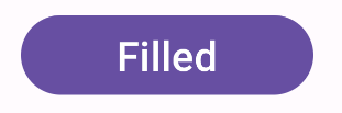
创建填充按钮
填充的按钮组件使用基本 Button 可组合项。默认情况下,此区域会填充纯色。
结果
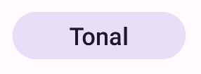
创建填充色调按钮
填充色调按钮组件使用 FilledTonalButton 可组合项。默认情况下,它会填充色调颜色。
结果
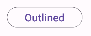
创建轮廓按钮
轮廓按钮组件使用 OutlinedButton 可组合项。默认情况下,它会显示轮廓。
结果
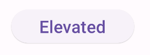
创建一个外露式按钮
外凸按钮组件使用 ElevatedButton 可组合项。默认情况下,它带有阴影,表示高度效果,并显示为带阴影的外轮廓按钮。
结果
创建文本按钮
文本按钮组件使用 TextButton 可组合项。在用户点击之前,它只会显示为文本。默认情况下,它没有实心填充或轮廓。
结果
要点
onClick:用户按下按钮时调用的函数。enabled:如果为 false,此参数会导致按钮显示为不可用和无效。colors:一个ButtonColors实例,用于确定按钮中使用的颜色。contentPadding:按钮内的内边距。
包含本指南的集合
本指南属于以下精选快速入门集合,这些集合涵盖了更广泛的 Android 开发目标:
显示互动组件
了解如何使用可组合函数根据 Material Design 设计系统轻松创建美观的界面组件。
有问题或反馈
请访问我们的常见问题解答页面,了解简短指南,或与我们联系,告诉我们您的想法。