
Nút cho phép người dùng kích hoạt một hành động đã xác định. Có 5 loại nút:
Loại |
Diện mạo |
Mục đích |
|---|---|---|
| Đã điền | Nền đồng nhất với văn bản tương phản. |
Đối với các thao tác chính, chẳng hạn như "Gửi" và "Lưu". Hiệu ứng bóng nhấn mạnh tầm quan trọng của nút. |
| Tonal | Màu nền thay đổi để phù hợp với bề mặt. |
Đối với các hành động chính hoặc quan trọng. Nút có màu sẽ tạo điểm nhấn về mặt hình ảnh và phù hợp với các hành động như "Thêm vào giỏ hàng" và "Đăng nhập". |
| Hơi cao | Bóng giúp nó nổi bật. |
Đối với các hành động chính hoặc quan trọng. Tăng độ cao để nút nổi bật hơn. |
| Đã vẽ đường viền | Có đường viền không có màu nền. |
Đối với các thao tác quan trọng nhưng không phải là thao tác chính. Các nút có đường viền kết hợp tốt với các nút khác để biểu thị các hành động phụ, thay thế như "Huỷ" hoặc "Quay lại". |
| Văn bản | Văn bản không có nền hoặc đường viền. |
Đối với các hành động ít quan trọng hơn như đường liên kết điều hướng hoặc hành động phụ như "Tìm hiểu thêm" hoặc "Xem chi tiết". |
Khả năng tương thích của phiên bản
Phương thức triển khai này yêu cầu bạn phải đặt minSDK của dự án thành API cấp 21 trở lên.
Phần phụ thuộc
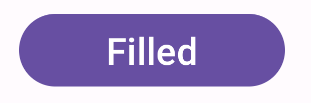
Tạo nút được tô màu nền
Thành phần nút được tô màu sử dụng thành phần kết hợp Button cơ bản. Theo mặc định, hình này được tô bằng một màu đồng nhất.
Kết quả
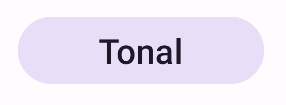
Tạo nút có màu sắc đồng nhất
Thành phần nút tông màu được tô màu sử dụng thành phần kết hợp FilledTonalButton.
Theo mặc định, vùng này được tô bằng màu sắc.
Kết quả
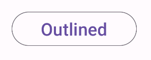
Tạo nút có đường viền
Thành phần nút có đường viền sử dụng thành phần kết hợp OutlinedButton. Theo mặc định, thành phần hiển thị này sẽ có đường viền.
Kết quả
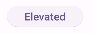
Tạo nút nâng cao
Thành phần nút nâng cao sử dụng thành phần kết hợp ElevatedButton. Theo mặc định, nút này có một bóng đổ thể hiện hiệu ứng nâng và xuất hiện dưới dạng một nút được viền có bóng đổ.
Kết quả
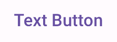
Tạo nút văn bản
Thành phần nút văn bản sử dụng thành phần kết hợp TextButton. Cho đến khi được nhấp vào,
nút này chỉ xuất hiện dưới dạng văn bản. Theo mặc định, hình dạng này không có đường viền hoặc màu nền đồng nhất.
Kết quả
Điểm chính
onClick: Hàm được gọi khi người dùng nhấn vào nút.enabled: Khi có giá trị false, tham số này sẽ khiến nút không xuất hiện và không hoạt động.colors: Một thực thể củaButtonColorsxác định màu sắc được sử dụng trong nút.contentPadding: Khoảng đệm trong nút.
Các bộ sưu tập chứa hướng dẫn này
Hướng dẫn này là một phần của các bộ sưu tập Hướng dẫn nhanh được tuyển chọn này, bao gồm các mục tiêu phát triển Android rộng hơn:

Hiển thị các thành phần tương tác