
يعمل العنصر القابل للتجميع Card كحاوية لتصميم Material لواجهة المستخدم.
تقدّم البطاقات محتوى واحدًا مترابطًا، مثل:
- منتج في تطبيق تسوّق
- مقالة إخبارية في تطبيق أخبار
- رسالة في تطبيق تواصل
يُميّز التركيز على عرض قطعة محتوى واحدة
Card عن الحاويات الأخرى. على سبيل المثال، يقدّم Scaffold بنية عامة
لشاشة كاملة. "البطاقة" هي عنصر أصغر لواجهة المستخدم داخل تخطيط أكبر، في حين أنّ عنصر التخطيط مثل Column أو Row يقدّم واجهة برمجة تطبيقات أبسط
وأكثر عمومية.
يوضّح لك هذا الموضوع كيفية تنفيذ أربعة أنواع من البطاقات:
توافق الإصدار
يتطلّب هذا التنفيذ ضبط الحد الأدنى من إصدار حزمة SDK لمشروعك على المستوى 21 من واجهة برمجة التطبيقات أو إصدار أحدث.
التبعيات
إنشاء بطاقة أساسية
تتصرف Card بشكلٍ مشابه للحاويات الأخرى في ميزة "الإنشاء". يمكنك الإفصاح عن محتوى العنصر من خلال
استدعاء عناصر قابلة للتجميع أخرى فيه. على سبيل المثال، لاحظ كيف يحتوي Card على
طلب Text في المثال البسيط التالي:
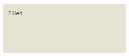
إنشاء بطاقة مملوءة
يكمن المفتاح هنا في استخدام السمة colors لتغيير
اللون المعبّأ:
النتائج
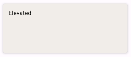
إنشاء بطاقة مميزة
يوضّح المقتطف التالي كيفية تنفيذ بطاقة مرتفعة. استخدِم العنصر القابل للتجميع المخصّص ElevatedCard.
يمكنك استخدام السمة elevation للتحكّم في مظهر الارتفاع
والظل الناتج.
النتائج
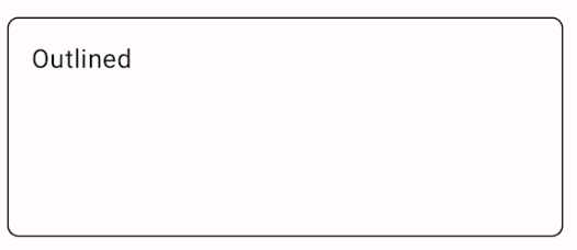
إنشاء بطاقة مخطَّطة
في ما يلي مثال على بطاقة مخطّطة. استخدِم العنصر القابل للتجميع المخصّص
OutlinedCard.
النتائج
النقاط الرئيسية
اطّلِع على المرجع لتعريف Card في واجهة برمجة التطبيقات. ويحدّد العديد من
المَعلمات التي يمكنك استخدامها لتخصيص مظهر المكوّن وسلوكه.
تشمل بعض المَعلمات الرئيسية ما يلي:
-
elevation: تُضيف هذه السمة ظلًا إلى المكوّن يجعله يبدو مرتفعًا فوق الخلفية. -
colors: يستخدم النوعCardColorsلضبط اللون التلقائي لكل من الحاوية وأي عناصر فرعية. enabled: في حال ضبط القيمةfalseلهذه المَعلمة، ستظهر البطاقة على أنّها متوقفة ولن تستجيب لإدخالات المستخدِم.onClick: لا يقبلCardعادةً أحداث النقر. وبناءً على ذلك، إنّ التحميل الزائد الأساسي الذي تريد ملاحظته هو الذي يحدِّد مَعلمةonClick. استخدِم هذه الوظيفة الزائدة عندما تريد أن يستجيب تنفيذك لـCardللنقرات من المستخدم.
لا تتضمّن البطاقات إجراءات التمرير أو الإغلاق، ولكن يمكن دمجها في
عناصر قابلة للتجميع تتيح هذه الميزات. على سبيل المثال، لتنفيذ ميزة التمرير سريعًا لإغلاق
البطاقة، يمكنك دمجها مع العنصر القابل للتجميع SwipeToDismiss. لدمج
مع التمرير، استخدِم عناصر تعديل التمرير مثل verticalScroll. اطّلِع على مستندات Scroll للحصول على مزيد من المعلومات.
المجموعات التي تتضمّن هذا الدليل
هذا الدليل هو جزء من مجموعات الأدلة السريعة المنظَّمة التي تتناول أهداف تطوير Android الأوسع نطاقًا:
عرض المكونات التفاعلية