
Card 可组合项充当界面的 Material Design 容器。卡片用于呈现单个连贯的内容,例如:
- 购物应用中的商品。
- 新闻应用中的新闻报道。
- 通讯应用中的消息。
Card 专注于呈现单一内容,这与其他容器区别开来。例如,Scaffold 为整个屏幕提供一般结构。卡片是较大布局中的较小界面元素,而布局组件(例如 Column 或 Row)则提供更简单、更通用的 API。
本主题介绍了如何实现四种类型的卡片:
版本兼容性
此实现要求将项目 minSDK 设置为 API 级别 21 或更高级别。
依赖项
创建基本卡片
Card 的行为与 Compose 中的其他容器非常相似。您可以通过调用其中的其他可组合项来声明其内容。例如,请考虑以下最小示例中 Card 如何包含对 Text 的调用:
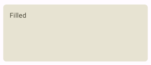
创建已填充的卡片
这里的关键是使用 colors 属性更改填充颜色:
结果
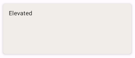
创建外凸卡片
以下代码段演示了如何实现外露卡片。使用专用的 ElevatedCard 可组合项。
您可以使用 elevation 属性来控制高度的显示效果和产生的阴影。
结果
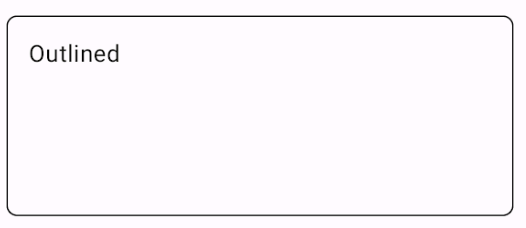
创建带轮廓的卡片
以下是带轮廓的卡片示例。使用专用的 OutlinedCard 可组合项。
结果
要点
如需了解 Card 的 API 定义,请参阅参考文档。它定义了多个参数,可用于自定义组件的外观和行为。
一些关键参数包括:
elevation:向组件添加阴影,使其看起来高于背景。colors:使用CardColors类型设置容器和所有子项的默认颜色。enabled:如果您为此参数传递false,则该卡片会显示为已停用,并且不会响应用户输入。onClick:通常,Card不接受点击事件。因此,您需要注意的主要重载是用于定义onClick参数的重载。如果您希望Card实现响应用户的点击,请使用此重载。
卡片没有固有的滚动或关闭操作,但可以集成到提供这些功能的可组合项中。例如,如需在卡片上实现滑动关闭功能,请将其与 SwipeToDismiss 可组合项集成。如需与滚动功能集成,请使用滚动修饰符,例如 verticalScroll。如需了解详情,请参阅 Scroll 文档。
包含本指南的集合
本指南属于以下精选快速入门集合,这些集合涵盖了更广泛的 Android 开发目标:
显示互动组件
了解如何使用可组合函数根据 Material Design 设计系统轻松创建美观的界面组件。
有问题或反馈
请访问我们的常见问题解答页面,了解简短指南,或与我们联系,告诉我们您的想法。