
Thành phần kết hợp Card đóng vai trò là vùng chứa Material Design cho giao diện người dùng của bạn.
Thẻ trình bày một phần nội dung mạch lạc duy nhất, chẳng hạn như:
- Sản phẩm trong ứng dụng mua sắm.
- Câu chuyện thời sự trong một ứng dụng tin tức.
- Tin nhắn trong ứng dụng liên lạc.
Thẻ tập trung vào việc trình bày một phần nội dung duy nhất giúp phân biệt Card với các vùng chứa khác. Ví dụ: Scaffold cung cấp cấu trúc chung cho toàn bộ màn hình. Thẻ là một thành phần giao diện người dùng nhỏ hơn bên trong bố cục lớn hơn, trong khi thành phần bố cục như Column hoặc Row cung cấp API đơn giản và tổng quát hơn.
Chủ đề này hướng dẫn bạn cách triển khai 4 loại thẻ:
Khả năng tương thích của phiên bản
Phương thức triển khai này yêu cầu bạn phải đặt minSDK của dự án thành API cấp 21 trở lên.
Phần phụ thuộc
Tạo thẻ cơ bản
Card có hành vi giống như các vùng chứa khác trong Compose. Bạn sẽ khai báo nội dung bằng cách gọi các thành phần kết hợp khác trong đó. Ví dụ: hãy xem xét cách Card chứa lệnh gọi tới Text trong ví dụ tối thiểu sau:
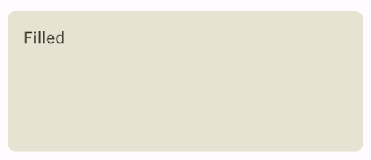
Tạo thẻ đã điền sẵn
Điều quan trọng ở đây là việc sử dụng thuộc tính colors để thay đổi màu nền đã tô:
Kết quả
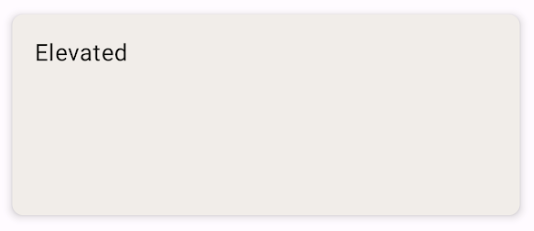
Tạo thẻ nâng cao
Đoạn mã sau đây trình bày cách triển khai thẻ nâng cao. Sử dụng thành phần kết hợp ElevatedCard dành riêng.
Bạn có thể sử dụng thuộc tính elevation để kiểm soát sự xuất hiện của độ cao và bóng tạo ra.
Kết quả
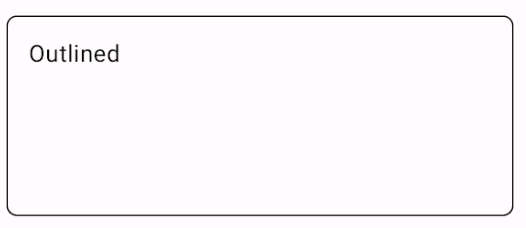
Tạo thẻ có đường viền
Sau đây là ví dụ về một thẻ có đường viền. Sử dụng thành phần kết hợp OutlinedCard dành riêng.
Kết quả
Điểm chính
Xem tài liệu tham khảo để biết định nghĩa API cho Card. Định nghĩa này xác định một số tham số mà bạn có thể sử dụng để tuỳ chỉnh giao diện và hoạt động của thành phần.
Sau đây là một số tham số chính:
elevation: Thêm bóng vào thành phần làm cho thành phần đó trông cao hơn nền.colors: Sử dụng kiểuCardColorsđể thiết lập màu mặc định của cả vùng chứa và mọi phần tử con.enabled: Nếu bạn truyềnfalsecho tham số này, thẻ sẽ xuất hiện dưới dạng bị vô hiệu hoá và không phản hồi với hoạt động đầu vào của người dùng.onClick: Thông thường,Cardkhông chấp nhận các sự kiện nhấp chuột. Do đó, hàm quá tải chính mà bạn cần lưu ý là hàm quá tải xác định tham sốonClick. Sử dụng phương thức nạp chồng này khi bạn muốn phương thức triển khaiCardphản hồi các lượt nhấp của người dùng.
Thẻ không đi kèm với các hành động vốn có như cuộn hoặc đóng, nhưng có thể tích hợp vào các thành phần kết hợp cung cấp các tính năng này. Ví dụ: để triển khai thao tác vuốt để loại bỏ trên thẻ, hãy tích hợp thẻ đó với thành phần kết hợp SwipeToDismiss. Để tích hợp thao tác cuộn, hãy sử dụng đối tượng sửa đổi Cuộn như verticalScroll. Hãy xem tài liệu về Scroll để biết thêm thông tin.
Các bộ sưu tập chứa hướng dẫn này
Hướng dẫn này là một phần của các bộ sưu tập Hướng dẫn nhanh được tuyển chọn này, bao gồm các mục tiêu phát triển Android rộng hơn:
Hiển thị các thành phần tương tác