
Chip 组件是一种紧凑的交互式界面元素。它表示联系人或标签等复杂实体,通常带有图标和标签。它可以是可选中、可关闭或可点击的。
以下是五种条状标签及其可能的使用场景:
- 协助:在用户执行任务期间为其提供指导。通常显示为临时界面元素,以响应用户输入。
- 过滤:让用户从一组选项中优化内容。这些选项可以选择或取消选择,并且在选中时可能包含对勾标记图标。
- 输入:表示用户提供的信息,例如菜单中的选择。它们可以包含图标和文本,并提供用于移除的“X”。
- 建议:根据用户近期的活动或输入内容向用户提供建议。通常显示在输入字段下方,用于提示用户执行操作。
- 凸起:具有凸起的外观,而不是扁平的外观。
版本兼容性
此实现要求将项目 minSDK 设置为 API 级别 21 或更高级别。
依赖项
创建辅助条状标签
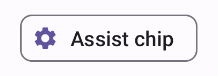
AssistChip 可组合项提供了一种简单的方法来创建辅助条状标签,以引导用户朝着特定方向前进。其一个显著特征是 leadingIcon 参数,可让您在条状标签的左侧显示图标,如图 1 所示。以下示例演示了如何实现它:
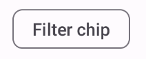
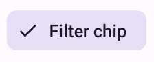
创建过滤条状标签
FilterChip 可组合项要求您跟踪条状标签是否已选中。以下示例演示了如何仅在用户选择了条状标签时显示前置已选中图标:
结果
创建输入条状标签
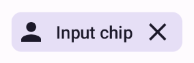
您可以使用 InputChip 可组合项创建由用户互动产生的条状标签。例如,在电子邮件客户端中,当用户撰写电子邮件时,输入条状标签可能代表用户已在“收件人:”字段中输入地址的收件人。
以下实现演示了处于已选状态的输入条状标签。用户按下条状标签时,系统会关闭该条状标签。
结果
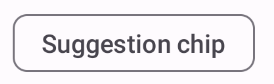
创建建议条状标签
在 API 定义和常见用例方面,SuggestionChip 可组合项是本页面上列出的可组合项中最基本的一种。建议条状标签会显示动态生成的提示。例如,在 AI 聊天应用中,您可以使用建议条状标签来显示对最新消息的可能回复。
请考虑以下 SuggestionChip 实现:
结果
创建外凸条状标签
本文档中的所有示例都使用采用扁平外观的基础可组合项。如果您希望条状标签具有凸起的外观,请使用以下三个可组合项之一:
要点
四个可组合项对应于四种条状标签,并且它们共享以下参数:
label:条状标签上显示的字符串。icon:条状标签开头处显示的图标。某些可组合项具有单独的leadingIcon和trailingIcon参数。onClick:用户点击条状标签时该条状标签调用的 lambda。
包含本指南的集合
本指南属于以下精选快速入门集合,这些集合涵盖了更广泛的 Android 开发目标:

显示互动组件
了解如何使用可组合函数根据 Material Design 设计系统轻松创建美观的界面组件。
有问题或反馈
请访问我们的常见问题解答页面,了解简短指南,或与我们联系,告诉我们您的想法。