
زر الإجراء العائم (FAB) هو زر ذو أهمية عالية يتيح للمستخدم تنفيذ إجراء أساسي في أحد التطبيقات. ويشجّع على اتّخاذ إجراء واحد مركّز يمثّل المسار الأكثر شيوعًا الذي قد يتّخذه المستخدم، وعادةً ما يكون مثبّتًا في أسفل يسار الشاشة.
في ما يلي ثلاث حالات استخدام يمكنك فيها استخدام زر الإجراء العائم:
- إنشاء عنصر جديد: في تطبيق لتدوين الملاحظات، يمكن استخدام زر الإجراء العائم لإنشاء ملاحظة جديدة بسرعة.
- إضافة جهة اتصال جديدة: في تطبيق دردشة، يمكن أن يفتح زر الإجراء العائم واجهة تتيح للمستخدم إضافة شخص إلى محادثة.
- توسيط الموقع الجغرافي: في واجهة الخريطة، يمكن أن يوسّط زر الإجراء العائم الخريطة على الموقع الجغرافي الحالي للمستخدم.
في Material Design، هناك أربعة أنواع من أزرار الإجراء العائم:
- زر الإجراء الرئيسي: هو زر إجراء رئيسي بحجم عادي.
- زر الإجراء العائم الصغير: هو زر إجراء عائم أصغر حجمًا.
- زر الإجراء الرئيسي الكبير: هو زر إجراء رئيسي أكبر حجمًا.
- زر الإجراء الرئيسي الموسّع: هو زر إجراء عائم يتضمّن أكثر من مجرد رمز.
التوافق مع الإصدارات
يتطلّب هذا التنفيذ ضبط minSDK في مشروعك على المستوى 21 من واجهة برمجة التطبيقات أو مستوى أعلى.
التبعيات
Kotlin
implementation(platform("androidx.compose:compose-bom:2025.05.00"))
Groovy
implementation platform('androidx.compose:compose-bom:2025.05.00')
إنشاء زر إجراء عائم أساسي
لإنشاء زر إجراء عائم عام، استخدِم الدالة الأساسية القابلة للإنشاء
FloatingActionButton:
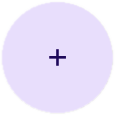
@Composable fun Example(onClick: () -> Unit) { FloatingActionButton( onClick = { onClick() }, ) { Icon(Icons.Filled.Add, "Floating action button.") } }
النتيجة

إنشاء زر إجراء عائم صغير
لإنشاء زر إجراء عائم صغير، استخدِم الدالة البرمجية القابلة للإنشاء
SmallFloatingActionButton. يوضّح المثال التالي كيفية إجراء ذلك، مع إضافة ألوان مخصّصة.
@Composable fun SmallExample(onClick: () -> Unit) { SmallFloatingActionButton( onClick = { onClick() }, containerColor = MaterialTheme.colorScheme.secondaryContainer, contentColor = MaterialTheme.colorScheme.secondary ) { Icon(Icons.Filled.Add, "Small floating action button.") } }
النتيجة

إنشاء زر إجراء رئيسي كبير
لإنشاء زر إجراء عائم كبير، استخدِم الدالة القابلة للإنشاء
LargeFloatingActionButton. لا يختلف هذا العنصر القابل للإنشاء بشكل كبير عن الأمثلة الأخرى باستثناء أنّه يؤدي إلى إنشاء زر أكبر.
في ما يلي عملية تنفيذ بسيطة لزر إجراء عائم كبير.
@Composable fun LargeExample(onClick: () -> Unit) { LargeFloatingActionButton( onClick = { onClick() }, shape = CircleShape, ) { Icon(Icons.Filled.Add, "Large floating action button") } }
النتيجة
إنشاء زر إجراء عائم موسّع
يمكنك إنشاء أزرار إجراء عائم أكثر تعقيدًا باستخدام العنصر القابل للإنشاء ExtendedFloatingActionButton. يتمثّل الاختلاف الرئيسي بين هذا النوع وFloatingActionButton في أنّه يتضمّن مَعلمتَي icon وtext مخصّصتَين. تتيح لك هذه الأزرار إنشاء زر يتضمّن محتوًى أكثر تعقيدًا يمكن تغيير حجمه ليناسب المحتوى بشكل ملائم.
يوضّح المقتطف التالي كيفية تنفيذ
ExtendedFloatingActionButton، مع عرض قيم نموذجية تم تمريرها لكل من icon وtext.
@Composable fun ExtendedExample(onClick: () -> Unit) { ExtendedFloatingActionButton( onClick = { onClick() }, icon = { Icon(Icons.Filled.Edit, "Extended floating action button.") }, text = { Text(text = "Extended FAB") }, ) }
النتيجة

النقاط الرئيسية
على الرغم من توفّر العديد من العناصر القابلة للإنشاء التي يمكنك استخدامها لإنشاء أزرار إجراء عائم متوافقة مع "التصميم المتعدد الأبعاد"، لا تختلف مَعلمات هذه العناصر كثيرًا. في ما يلي بعض المعايير الرئيسية التي يجب مراعاتها:
-
onClick: الدالة التي يتم استدعاؤها عندما يضغط المستخدم على الزر. -
containerColor: لون الزر. -
contentColor: لون الرمز.
z## المجموعات التي تتضمّن هذا الدليل
يشكّل هذا الدليل جزءًا من مجموعات "الدليل السريع" المنسّقة التي تغطي أهدافًا أوسع لتطوير تطبيقات Android:

عرض المكوّنات التفاعلية