إنشاء قائمة انزلاق باستخدام مكوّن "درج التنقّل"
تنظيم صفحاتك في مجموعات
يمكنك حفظ المحتوى وتصنيفه حسب إعداداتك المفضّلة.
عنصر درج التنقل هو قائمة انزلاق تتيح للمستخدمين التنقّل
إلى أقسام مختلفة من تطبيقك. ويمكن للمستخدمين تفعيله من خلال التمرير سريعًا من الجانب
أو النقر على رمز قائمة.
راجِع حالات الاستخدام الثلاث التالية لتنفيذ درج التنقّل:
- تنظيم المحتوى: يمكنك السماح للمستخدمين بالتبديل بين
فئات مختلفة، مثل التطبيقات الإخبارية أو تطبيقات التدوين.
- إدارة الحساب: يجب توفير روابط سريعة إلى إعدادات الحساب وأقسام الملف الشخصي
في التطبيقات التي تتضمّن حسابات مستخدمين.
- اكتشاف الميزات: يمكنك تنظيم الميزات والإعدادات المتعددة في ملف شخصي واحد
للتسهيل اكتشاف المستخدمين للميزات والوصول إليها في التطبيقات المعقدة.
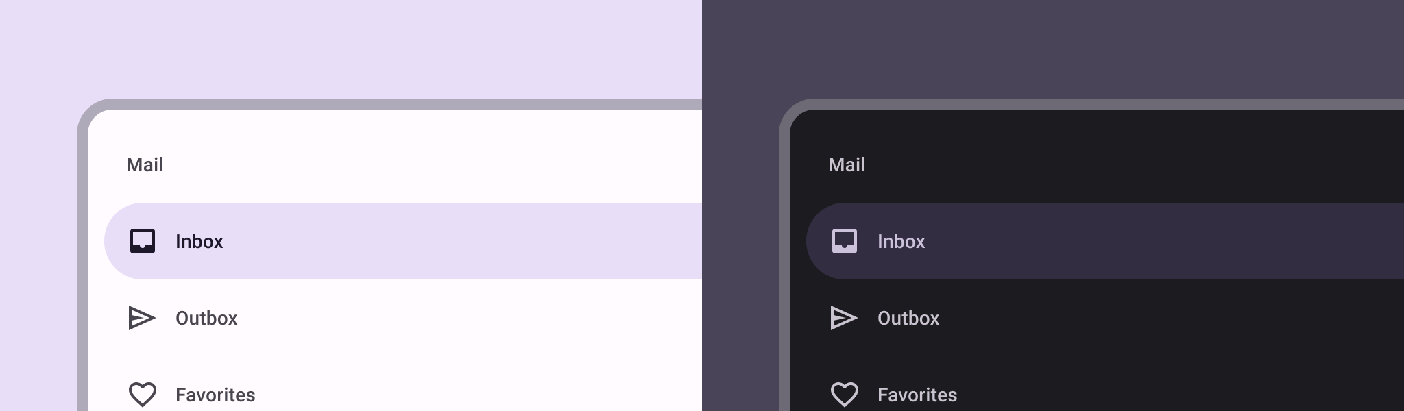
في أسلوب Material Design، هناك نوعان من أدراج التنقّل:
- عادي: مشاركة مساحة داخل الشاشة مع محتوى آخر
- وضع النافذة المنبثقة: يظهر فوق المحتوى الآخر ضمن الشاشة.
توافق الإصدار
يتطلّب هذا التنفيذ ضبط الحد الأدنى من إصدار حزمة تطوير البرامج (SDK) لمشروعك على المستوى 21 من واجهة برمجة التطبيقات أو
مستوى أعلى.
التبعيات
استخدام لائحة تنقّل
يمكنك استخدام العنصر القابل للتجميع ModalNavigationDrawer
لتنفيذ
لائحة تنقّل:
النقاط الرئيسية
استخدِم خانة drawerContent
لتقديم ModalDrawerSheet
و
تقديم محتوى الدرج.
تقبل ModalNavigationDrawer
عددًا من مَعلمات الأدراج الإضافية.
على سبيل المثال، يمكنك تفعيل أو إيقاف استجابة الدرج للسحب باستخدام المَعلمة gesturesEnabled
كما هو موضّح في المثال التالي:
التحكّم في سلوك لائحة التنقّل
للتحكّم في كيفية فتح الدرج وإغلاقه، استخدِم DrawerState
:
النقاط الرئيسية
- نقْل
DrawerState
إلى ModalNavigationDrawer
باستخدام المَعلمة drawerState
.
- يوفر
DrawerState
إمكانية الوصول إلى وظيفتَي open
وclose
،
بالإضافة إلى السمات ذات الصلة بحالة الدرج الحالية. تتطلّب دوال التعليق
هذه CoroutineScope
، ويمكنك إنشاء مثيل لها باستخدام
rememberCoroutineScope
. يمكنك أيضًا استدعاء دوال التعليق في
استجابة لأحداث واجهة المستخدم.
النتائج
الشكل 1. لائحة تنقل عادية (على يمين الشاشة) ولائحة تنقل مشروطة (على يسار الشاشة)
المجموعات التي تتضمّن هذا الدليل
هذا الدليل هو جزء من مجموعات الأدلة السريعة المنظَّمة التي تتناول
أهداف تطوير Android الأوسع نطاقًا:
عرض المكونات التفاعلية
تعرَّف على كيفية استخدام الدوال القابلة للتجميع لإنشاء مكونات جميلة لواجهة المستخدم بسهولة استنادًا إلى نظام التصميم المتعدّد الأبعاد.
يخضع كل من المحتوى وعيّنات التعليمات البرمجية في هذه الصفحة للتراخيص الموضحّة في ترخيص استخدام المحتوى. إنّ Java وOpenJDK هما علامتان تجاريتان مسجَّلتان لشركة Oracle و/أو الشركات التابعة لها.
تاريخ التعديل الأخير: 2025-02-06 (حسب التوقيت العالمي المتفَّق عليه)
[null,null,["تاريخ التعديل الأخير: 2025-02-06 (حسب التوقيت العالمي المتفَّق عليه)"],[],[],null,["# Create a slide-in menu with the navigation drawer component\n\n\u003cbr /\u003e\n\nThe [navigation drawer](https://material.io/components/navigation-drawer) component is a slide-in menu that lets users navigate\nto various sections of your app. Users can activate it by swiping from the side\nor tapping a menu icon.\n\nConsider these three use cases for implementing a navigation drawer:\n\n- **Content organization:** Enable users to switch between different categories, such as in news or blogging apps.\n- **Account management:** Provide quick links to account settings and profile sections in apps with user accounts.\n- **Feature discovery:** Organize multiple features and settings in a single menu to facilitate user discovery and access in complex apps.\n\nIn Material Design, there are two types of navigation drawers:\n\n- **Standard:** Share space within a screen with other content.\n- **Modal:** Appears over the top of other content within a screen.\n\nVersion compatibility\n---------------------\n\nThis implementation requires that your project minSDK be set to API level 21 or\nhigher.\n\n### Dependencies\n\n### Kotlin\n\n\u003cbr /\u003e\n\n```kotlin\n implementation(platform(\"androidx.compose:compose-bom:2025.08.00\"))\n \n```\n\n\u003cbr /\u003e\n\n### Groovy\n\n\u003cbr /\u003e\n\n```groovy\n implementation platform('androidx.compose:compose-bom:2025.08.00')\n \n```\n\n\u003cbr /\u003e\n\nImplement a navigation drawer\n-----------------------------\n\nYou can use the [`ModalNavigationDrawer`](/reference/kotlin/androidx/compose/material3/package-summary#ModalNavigationDrawer(kotlin.Function0,androidx.compose.ui.Modifier,androidx.compose.material3.DrawerState,kotlin.Boolean,androidx.compose.ui.graphics.Color,kotlin.Function0)) composable to implement a\nnavigation drawer:\n\n\u003cbr /\u003e\n\n```kotlin\nModalNavigationDrawer(\n drawerContent = {\n ModalDrawerSheet {\n Text(\"Drawer title\", modifier = Modifier.padding(16.dp))\n HorizontalDivider()\n NavigationDrawerItem(\n label = { Text(text = \"Drawer Item\") },\n selected = false,\n onClick = { /*TODO*/ }\n )\n // ...other drawer items\n }\n }\n) {\n // Screen content\n}\n \n https://github.com/android/snippets/blob/dd30aee903e8c247786c064faab1a9ca8d10b46e/compose/snippets/src/main/java/com/example/compose/snippets/layouts/MaterialLayoutSnippets.kt#L290-L305\n \n```\n\n\u003cbr /\u003e\n\n### Key points\n\n- Use the `drawerContent` slot to provide a [`ModalDrawerSheet`](/reference/kotlin/androidx/compose/material3/package-summary#ModalDrawerSheet(androidx.compose.ui.Modifier,androidx.compose.ui.graphics.Shape,androidx.compose.ui.graphics.Color,androidx.compose.ui.graphics.Color,androidx.compose.ui.unit.Dp,androidx.compose.foundation.layout.WindowInsets,kotlin.Function1)) and\n provide the drawer's contents.\n\n- `ModalNavigationDrawer` accepts a number of additional drawer parameters.\n For example, you can toggle whether or not the drawer responds to drags with\n the `gesturesEnabled` parameter as in the following example:\n\n \u003cbr /\u003e\n\n ```kotlin\n ModalNavigationDrawer(\n drawerContent = {\n ModalDrawerSheet {\n // Drawer contents\n }\n },\n gesturesEnabled = false\n ) {\n // Screen content\n }\n \n https://github.com/android/snippets/blob/dd30aee903e8c247786c064faab1a9ca8d10b46e/compose/snippets/src/main/java/com/example/compose/snippets/layouts/MaterialLayoutSnippets.kt#L312-L321\n \n ```\n\n \u003cbr /\u003e\n\nControl navigation drawer behavior\n----------------------------------\n\nTo control how the drawer opens and closes, use [`DrawerState`](/reference/kotlin/androidx/compose/material3/DrawerState):\n\n\u003cbr /\u003e\n\n```kotlin\nval drawerState = rememberDrawerState(initialValue = DrawerValue.Closed)\nval scope = rememberCoroutineScope()\nModalNavigationDrawer(\n drawerState = drawerState,\n drawerContent = {\n ModalDrawerSheet { /* Drawer content */ }\n },\n) {\n Scaffold(\n floatingActionButton = {\n ExtendedFloatingActionButton(\n text = { Text(\"Show drawer\") },\n icon = { Icon(Icons.Filled.Add, contentDescription = \"\") },\n onClick = {\n scope.launch {\n drawerState.apply {\n if (isClosed) open() else close()\n }\n }\n }\n )\n }\n ) { contentPadding -\u003e\n // Screen content\n }\n}\n \n https://github.com/android/snippets/blob/dd30aee903e8c247786c064faab1a9ca8d10b46e/compose/snippets/src/main/java/com/example/compose/snippets/layouts/MaterialLayoutSnippets.kt#L328-L356\n \n```\n\n\u003cbr /\u003e\n\n### Key points\n\n- Pass a `DrawerState` to `ModalNavigationDrawer` using the `drawerState` parameter.\n- `DrawerState` provides access to the [`open`](/reference/kotlin/androidx/compose/material3/DrawerState#open) and [`close`](/reference/kotlin/androidx/compose/material3/DrawerState#close) functions, as well as properties related to the current drawer state. These suspending functions require a `CoroutineScope`, which you can instantiate using [`rememberCoroutineScope`](/reference/kotlin/androidx/compose/runtime/package-summary#remembercoroutinescope). You can also call the suspending functions in response to UI events.\n\nResults\n-------\n\n\n**Figure 1.** A standard navigation drawer (left) and a modal navigation drawer (right).\n\n\u003cbr /\u003e\n\nCollections that contain this guide\n-----------------------------------\n\nThis guide is part of these curated Quick Guide collections that cover\nbroader Android development goals: \n\n### Display interactive components\n\nLearn how composable functions can enable you to easily create beautiful UI components based on the Material Design design system. \n[Quick guide collection](/develop/ui/compose/quick-guides/collections/display-interactive-components) \n\nHave questions or feedback\n--------------------------\n\nGo to our frequently asked questions page and learn about quick guides or reach out and let us know your thoughts. \n[Go to FAQ](/quick-guides/faq) [Leave feedback](https://issuetracker.google.com/issues/new?component=1573691&template=1993320)"]]