使用抽屉式导航栏组件创建滑入式菜单
使用集合让一切井井有条
根据您的偏好保存内容并对其进行分类。
抽屉式导航栏组件是一种滑入式菜单,可让用户导航到应用的各个部分。用户可以通过从侧边滑动或点按菜单图标来激活它。
请考虑以下三种实现抽屉式导航栏的用例:
- 内容整理:让用户能够在不同类别之间切换,例如在新闻或博客应用中。
- 账号管理:在支持用户账号的应用中提供指向账号设置和个人资料部分的快捷链接。
- 功能发现:在单个菜单中整理多个功能和设置,以便用户在复杂的应用中轻松发现和访问。
在 Material Design 中,抽屉式导航栏有两种类型:
- 标准:与其他内容共享屏幕空间。
- 模态:显示在屏幕内其他内容之上。
版本兼容性
此实现要求将项目 minSDK 设置为 API 级别 21 或更高级别。
依赖项
实现抽屉式导航栏
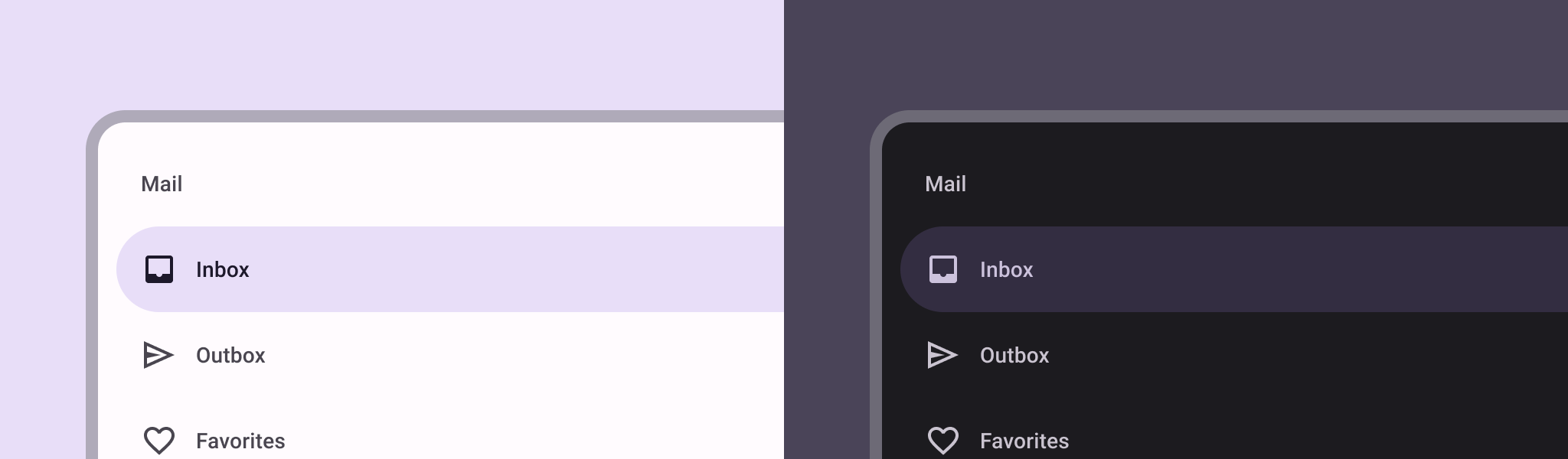
您可以使用 ModalNavigationDrawer
可组合项实现抽屉式导航栏:
要点
控制抽屉式导航栏行为
如需控制抽屉的打开和关闭方式,请使用 DrawerState
:
要点
- 使用
drawerState
参数将 DrawerState
传递给 ModalNavigationDrawer
。
DrawerState
可提供对 open
和 close
函数的访问权限,以及对与当前抽屉式导航栏状态相关的属性的访问权限。这些挂起函数需要 CoroutineScope
,您可以使用 rememberCoroutineScope
实例化 CoroutineScope
。您还可以调用挂起函数来响应界面事件。
结果
图 1. 标准抽屉式导航栏(左)和模态抽屉式导航栏(右)。
包含本指南的集合
本指南属于以下精选快速入门集合,这些集合涵盖了更广泛的 Android 开发目标:
显示互动组件
了解如何使用可组合函数根据 Material Design 设计系统轻松创建美观的界面组件。
本页面上的内容和代码示例受内容许可部分所述许可的限制。Java 和 OpenJDK 是 Oracle 和/或其关联公司的注册商标。
最后更新时间 (UTC):2025-02-06。
[null,null,["最后更新时间 (UTC):2025-02-06。"],[],[],null,["# Create a slide-in menu with the navigation drawer component\n\n\u003cbr /\u003e\n\nThe [navigation drawer](https://material.io/components/navigation-drawer) component is a slide-in menu that lets users navigate\nto various sections of your app. Users can activate it by swiping from the side\nor tapping a menu icon.\n\nConsider these three use cases for implementing a navigation drawer:\n\n- **Content organization:** Enable users to switch between different categories, such as in news or blogging apps.\n- **Account management:** Provide quick links to account settings and profile sections in apps with user accounts.\n- **Feature discovery:** Organize multiple features and settings in a single menu to facilitate user discovery and access in complex apps.\n\nIn Material Design, there are two types of navigation drawers:\n\n- **Standard:** Share space within a screen with other content.\n- **Modal:** Appears over the top of other content within a screen.\n\nVersion compatibility\n---------------------\n\nThis implementation requires that your project minSDK be set to API level 21 or\nhigher.\n\n### Dependencies\n\n### Kotlin\n\n\u003cbr /\u003e\n\n```kotlin\n implementation(platform(\"androidx.compose:compose-bom:2025.08.00\"))\n \n```\n\n\u003cbr /\u003e\n\n### Groovy\n\n\u003cbr /\u003e\n\n```groovy\n implementation platform('androidx.compose:compose-bom:2025.08.00')\n \n```\n\n\u003cbr /\u003e\n\nImplement a navigation drawer\n-----------------------------\n\nYou can use the [`ModalNavigationDrawer`](/reference/kotlin/androidx/compose/material3/package-summary#ModalNavigationDrawer(kotlin.Function0,androidx.compose.ui.Modifier,androidx.compose.material3.DrawerState,kotlin.Boolean,androidx.compose.ui.graphics.Color,kotlin.Function0)) composable to implement a\nnavigation drawer:\n\n\u003cbr /\u003e\n\n```kotlin\nModalNavigationDrawer(\n drawerContent = {\n ModalDrawerSheet {\n Text(\"Drawer title\", modifier = Modifier.padding(16.dp))\n HorizontalDivider()\n NavigationDrawerItem(\n label = { Text(text = \"Drawer Item\") },\n selected = false,\n onClick = { /*TODO*/ }\n )\n // ...other drawer items\n }\n }\n) {\n // Screen content\n}\n \n https://github.com/android/snippets/blob/dd30aee903e8c247786c064faab1a9ca8d10b46e/compose/snippets/src/main/java/com/example/compose/snippets/layouts/MaterialLayoutSnippets.kt#L290-L305\n \n```\n\n\u003cbr /\u003e\n\n### Key points\n\n- Use the `drawerContent` slot to provide a [`ModalDrawerSheet`](/reference/kotlin/androidx/compose/material3/package-summary#ModalDrawerSheet(androidx.compose.ui.Modifier,androidx.compose.ui.graphics.Shape,androidx.compose.ui.graphics.Color,androidx.compose.ui.graphics.Color,androidx.compose.ui.unit.Dp,androidx.compose.foundation.layout.WindowInsets,kotlin.Function1)) and\n provide the drawer's contents.\n\n- `ModalNavigationDrawer` accepts a number of additional drawer parameters.\n For example, you can toggle whether or not the drawer responds to drags with\n the `gesturesEnabled` parameter as in the following example:\n\n \u003cbr /\u003e\n\n ```kotlin\n ModalNavigationDrawer(\n drawerContent = {\n ModalDrawerSheet {\n // Drawer contents\n }\n },\n gesturesEnabled = false\n ) {\n // Screen content\n }\n \n https://github.com/android/snippets/blob/dd30aee903e8c247786c064faab1a9ca8d10b46e/compose/snippets/src/main/java/com/example/compose/snippets/layouts/MaterialLayoutSnippets.kt#L312-L321\n \n ```\n\n \u003cbr /\u003e\n\nControl navigation drawer behavior\n----------------------------------\n\nTo control how the drawer opens and closes, use [`DrawerState`](/reference/kotlin/androidx/compose/material3/DrawerState):\n\n\u003cbr /\u003e\n\n```kotlin\nval drawerState = rememberDrawerState(initialValue = DrawerValue.Closed)\nval scope = rememberCoroutineScope()\nModalNavigationDrawer(\n drawerState = drawerState,\n drawerContent = {\n ModalDrawerSheet { /* Drawer content */ }\n },\n) {\n Scaffold(\n floatingActionButton = {\n ExtendedFloatingActionButton(\n text = { Text(\"Show drawer\") },\n icon = { Icon(Icons.Filled.Add, contentDescription = \"\") },\n onClick = {\n scope.launch {\n drawerState.apply {\n if (isClosed) open() else close()\n }\n }\n }\n )\n }\n ) { contentPadding -\u003e\n // Screen content\n }\n}\n \n https://github.com/android/snippets/blob/dd30aee903e8c247786c064faab1a9ca8d10b46e/compose/snippets/src/main/java/com/example/compose/snippets/layouts/MaterialLayoutSnippets.kt#L328-L356\n \n```\n\n\u003cbr /\u003e\n\n### Key points\n\n- Pass a `DrawerState` to `ModalNavigationDrawer` using the `drawerState` parameter.\n- `DrawerState` provides access to the [`open`](/reference/kotlin/androidx/compose/material3/DrawerState#open) and [`close`](/reference/kotlin/androidx/compose/material3/DrawerState#close) functions, as well as properties related to the current drawer state. These suspending functions require a `CoroutineScope`, which you can instantiate using [`rememberCoroutineScope`](/reference/kotlin/androidx/compose/runtime/package-summary#remembercoroutinescope). You can also call the suspending functions in response to UI events.\n\nResults\n-------\n\n\n**Figure 1.** A standard navigation drawer (left) and a modal navigation drawer (right).\n\n\u003cbr /\u003e\n\nCollections that contain this guide\n-----------------------------------\n\nThis guide is part of these curated Quick Guide collections that cover\nbroader Android development goals: \n\n### Display interactive components\n\nLearn how composable functions can enable you to easily create beautiful UI components based on the Material Design design system. \n[Quick guide collection](/develop/ui/compose/quick-guides/collections/display-interactive-components) \n\nHave questions or feedback\n--------------------------\n\nGo to our frequently asked questions page and learn about quick guides or reach out and let us know your thoughts. \n[Go to FAQ](/quick-guides/faq) [Leave feedback](https://issuetracker.google.com/issues/new?component=1573691&template=1993320)"]]