Tạo trình đơn trượt vào bằng thành phần ngăn điều hướng
Sử dụng bộ sưu tập để sắp xếp ngăn nắp các trang
Lưu và phân loại nội dung dựa trên lựa chọn ưu tiên của bạn.
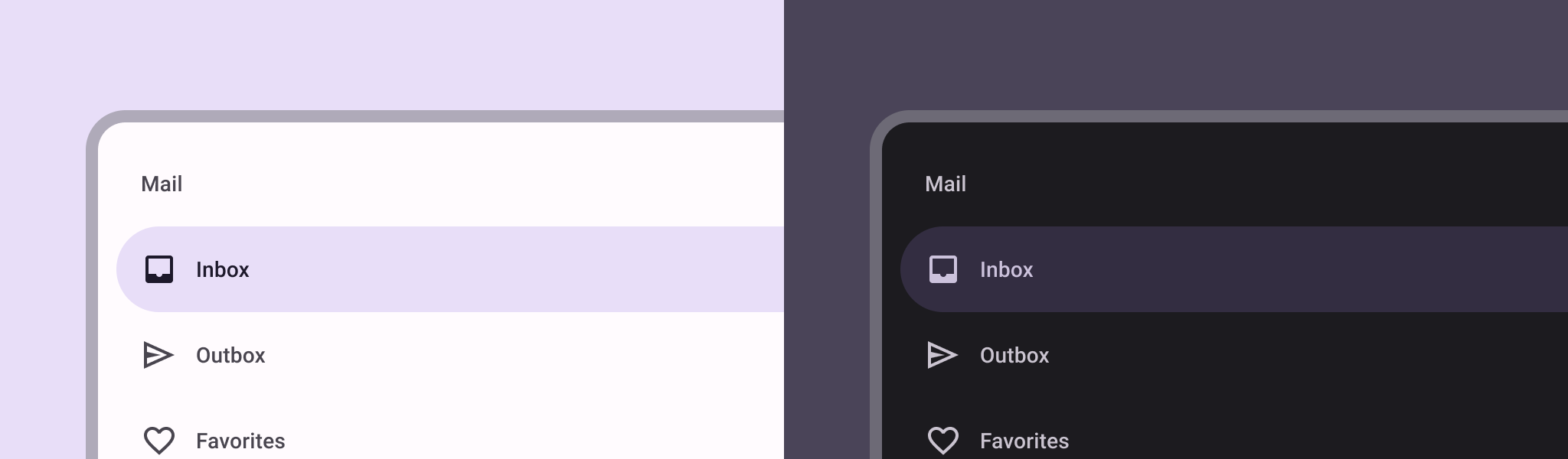
Thành phần ngăn điều hướng là một trình đơn trượt cho phép người dùng di chuyển đến nhiều phần của ứng dụng. Người dùng có thể kích hoạt ngăn này bằng cách vuốt từ bên cạnh hoặc nhấn vào biểu tượng trình đơn.
Hãy xem xét 3 trường hợp sử dụng sau đây để triển khai ngăn điều hướng:
- Sắp xếp nội dung: Cho phép người dùng chuyển đổi giữa các danh mục, chẳng hạn như trong ứng dụng tin tức hoặc ứng dụng viết blog.
- Quản lý tài khoản: Cung cấp đường liên kết nhanh đến phần cài đặt tài khoản và hồ sơ trong các ứng dụng có tài khoản người dùng.
- Khám phá tính năng: Sắp xếp nhiều tính năng và chế độ cài đặt trong một trình đơn để hỗ trợ người dùng khám phá và truy cập trong các ứng dụng phức tạp.
Trong Material Design, có hai loại ngăn điều hướng:
- Chuẩn: Chia sẻ không gian trong màn hình với nội dung khác.
- Cửa sổ bật lên: Xuất hiện ở đầu nội dung khác trong màn hình.
Khả năng tương thích của phiên bản
Phương thức triển khai này yêu cầu bạn phải đặt minSDK của dự án thành API cấp 21 trở lên.
Phần phụ thuộc
Triển khai ngăn điều hướng
Bạn có thể sử dụng thành phần kết hợp ModalNavigationDrawer
để triển khai ngăn điều hướng:
Điểm chính
Sử dụng khe drawerContent
để cung cấp ModalDrawerSheet
và cung cấp nội dung của ngăn.
ModalNavigationDrawer
chấp nhận một số thông số ngăn chứa bổ sung.
Ví dụ: bạn có thể chuyển đổi để xem ngăn chứa có phản hồi với các lệnh kéo bằng thông số gesturesEnabled
hay không như trong ví dụ sau:
Kiểm soát hành vi của ngăn điều hướng
Để kiểm soát cách ngăn mở và đóng, hãy sử dụng DrawerState
:
Điểm chính
- Truyền
DrawerState
đến ModalNavigationDrawer
bằng tham số drawerState
.
DrawerState
cung cấp quyền truy cập vào các hàm open
và close
, cũng như các thuộc tính liên quan đến trạng thái ngăn hiện tại. Các hàm tạm ngưng này yêu cầu CoroutineScope
. Bạn có thể tạo bản sao bằng rememberCoroutineScope
. Bạn cũng có thể gọi các hàm tạm ngưng để phản hồi các sự kiện trên giao diện người dùng.
Kết quả
Hình 1. Ngăn điều hướng tiêu chuẩn (bên trái) và ngăn điều hướng mẫu (bên phải).
Các bộ sưu tập chứa hướng dẫn này
Hướng dẫn này là một phần của các bộ sưu tập Hướng dẫn nhanh được tuyển chọn này, bao gồm các mục tiêu phát triển Android rộng hơn:
Hiển thị các thành phần tương tác
Tìm hiểu cách các hàm có khả năng kết hợp giúp bạn dễ dàng tạo các thành phần giao diện người dùng đẹp mắt dựa trên hệ thống thiết kế Material Design.
Nội dung và mã mẫu trên trang này phải tuân thủ các giấy phép như mô tả trong phần Giấy phép nội dung. Java và OpenJDK là nhãn hiệu hoặc nhãn hiệu đã đăng ký của Oracle và/hoặc đơn vị liên kết của Oracle.
Cập nhật lần gần đây nhất: 2025-02-06 UTC.
[null,null,["Cập nhật lần gần đây nhất: 2025-02-06 UTC."],[],[],null,["# Create a slide-in menu with the navigation drawer component\n\n\u003cbr /\u003e\n\nThe [navigation drawer](https://material.io/components/navigation-drawer) component is a slide-in menu that lets users navigate\nto various sections of your app. Users can activate it by swiping from the side\nor tapping a menu icon.\n\nConsider these three use cases for implementing a navigation drawer:\n\n- **Content organization:** Enable users to switch between different categories, such as in news or blogging apps.\n- **Account management:** Provide quick links to account settings and profile sections in apps with user accounts.\n- **Feature discovery:** Organize multiple features and settings in a single menu to facilitate user discovery and access in complex apps.\n\nIn Material Design, there are two types of navigation drawers:\n\n- **Standard:** Share space within a screen with other content.\n- **Modal:** Appears over the top of other content within a screen.\n\nVersion compatibility\n---------------------\n\nThis implementation requires that your project minSDK be set to API level 21 or\nhigher.\n\n### Dependencies\n\n### Kotlin\n\n\u003cbr /\u003e\n\n```kotlin\n implementation(platform(\"androidx.compose:compose-bom:2025.08.00\"))\n \n```\n\n\u003cbr /\u003e\n\n### Groovy\n\n\u003cbr /\u003e\n\n```groovy\n implementation platform('androidx.compose:compose-bom:2025.08.00')\n \n```\n\n\u003cbr /\u003e\n\nImplement a navigation drawer\n-----------------------------\n\nYou can use the [`ModalNavigationDrawer`](/reference/kotlin/androidx/compose/material3/package-summary#ModalNavigationDrawer(kotlin.Function0,androidx.compose.ui.Modifier,androidx.compose.material3.DrawerState,kotlin.Boolean,androidx.compose.ui.graphics.Color,kotlin.Function0)) composable to implement a\nnavigation drawer:\n\n\u003cbr /\u003e\n\n```kotlin\nModalNavigationDrawer(\n drawerContent = {\n ModalDrawerSheet {\n Text(\"Drawer title\", modifier = Modifier.padding(16.dp))\n HorizontalDivider()\n NavigationDrawerItem(\n label = { Text(text = \"Drawer Item\") },\n selected = false,\n onClick = { /*TODO*/ }\n )\n // ...other drawer items\n }\n }\n) {\n // Screen content\n}\n \n https://github.com/android/snippets/blob/dd30aee903e8c247786c064faab1a9ca8d10b46e/compose/snippets/src/main/java/com/example/compose/snippets/layouts/MaterialLayoutSnippets.kt#L290-L305\n \n```\n\n\u003cbr /\u003e\n\n### Key points\n\n- Use the `drawerContent` slot to provide a [`ModalDrawerSheet`](/reference/kotlin/androidx/compose/material3/package-summary#ModalDrawerSheet(androidx.compose.ui.Modifier,androidx.compose.ui.graphics.Shape,androidx.compose.ui.graphics.Color,androidx.compose.ui.graphics.Color,androidx.compose.ui.unit.Dp,androidx.compose.foundation.layout.WindowInsets,kotlin.Function1)) and\n provide the drawer's contents.\n\n- `ModalNavigationDrawer` accepts a number of additional drawer parameters.\n For example, you can toggle whether or not the drawer responds to drags with\n the `gesturesEnabled` parameter as in the following example:\n\n \u003cbr /\u003e\n\n ```kotlin\n ModalNavigationDrawer(\n drawerContent = {\n ModalDrawerSheet {\n // Drawer contents\n }\n },\n gesturesEnabled = false\n ) {\n // Screen content\n }\n \n https://github.com/android/snippets/blob/dd30aee903e8c247786c064faab1a9ca8d10b46e/compose/snippets/src/main/java/com/example/compose/snippets/layouts/MaterialLayoutSnippets.kt#L312-L321\n \n ```\n\n \u003cbr /\u003e\n\nControl navigation drawer behavior\n----------------------------------\n\nTo control how the drawer opens and closes, use [`DrawerState`](/reference/kotlin/androidx/compose/material3/DrawerState):\n\n\u003cbr /\u003e\n\n```kotlin\nval drawerState = rememberDrawerState(initialValue = DrawerValue.Closed)\nval scope = rememberCoroutineScope()\nModalNavigationDrawer(\n drawerState = drawerState,\n drawerContent = {\n ModalDrawerSheet { /* Drawer content */ }\n },\n) {\n Scaffold(\n floatingActionButton = {\n ExtendedFloatingActionButton(\n text = { Text(\"Show drawer\") },\n icon = { Icon(Icons.Filled.Add, contentDescription = \"\") },\n onClick = {\n scope.launch {\n drawerState.apply {\n if (isClosed) open() else close()\n }\n }\n }\n )\n }\n ) { contentPadding -\u003e\n // Screen content\n }\n}\n \n https://github.com/android/snippets/blob/dd30aee903e8c247786c064faab1a9ca8d10b46e/compose/snippets/src/main/java/com/example/compose/snippets/layouts/MaterialLayoutSnippets.kt#L328-L356\n \n```\n\n\u003cbr /\u003e\n\n### Key points\n\n- Pass a `DrawerState` to `ModalNavigationDrawer` using the `drawerState` parameter.\n- `DrawerState` provides access to the [`open`](/reference/kotlin/androidx/compose/material3/DrawerState#open) and [`close`](/reference/kotlin/androidx/compose/material3/DrawerState#close) functions, as well as properties related to the current drawer state. These suspending functions require a `CoroutineScope`, which you can instantiate using [`rememberCoroutineScope`](/reference/kotlin/androidx/compose/runtime/package-summary#remembercoroutinescope). You can also call the suspending functions in response to UI events.\n\nResults\n-------\n\n\n**Figure 1.** A standard navigation drawer (left) and a modal navigation drawer (right).\n\n\u003cbr /\u003e\n\nCollections that contain this guide\n-----------------------------------\n\nThis guide is part of these curated Quick Guide collections that cover\nbroader Android development goals: \n\n### Display interactive components\n\nLearn how composable functions can enable you to easily create beautiful UI components based on the Material Design design system. \n[Quick guide collection](/develop/ui/compose/quick-guides/collections/display-interactive-components) \n\nHave questions or feedback\n--------------------------\n\nGo to our frequently asked questions page and learn about quick guides or reach out and let us know your thoughts. \n[Go to FAQ](/quick-guides/faq) [Leave feedback](https://issuetracker.google.com/issues/new?component=1573691&template=1993320)"]]