
تتيح العناصر القابلة للتجميع Slider للمستخدمين إجراء اختيارات من مجموعة من
القيم. يمكنك استخدام شريط تمرير للسماح للمستخدم بإجراء ما يلي:
- اضبط الإعدادات التي تستخدم نطاقًا من القيم، مثل مستوى الصوت والسطوع.
- فلترة البيانات في رسم بياني، كما هو الحال عند ضبط نطاق أسعار
- إدخال المستخدم، مثل ضبط تقييم في مراجعة
يحتوي شريط التمرير على مسار ومؤشر وعلامة قيمة وعلامات علامة:
- المسار: المسار هو الشريط الأفقي الذي يمثّل نطاق القيم التي يمكن أن يأخذها شريط التمرير.
- المؤشر: المؤشر هو عنصر تحكّم قابل للسحب على شريط التمرير الذي يسمح للمستخدم باختيار قيمة معيّنة ضمن النطاق الذي يحدّده المخطّط.
- علامات الاختيار: علامات الاختيار هي علامات أو مؤشرات مرئية اختيارية تظهر على طول مسار شريط التمرير.
يعرض هذا الموضوع عمليات تنفيذ شريط التمرير التالية:
توافق الإصدار
يتطلّب هذا التنفيذ ضبط الحد الأدنى من إصدار حزمة تطوير البرامج (SDK) لمشروعك على المستوى 21 من واجهة برمجة التطبيقات أو مستوى أعلى.
التبعيات
إنشاء شريط تمرير أساسي
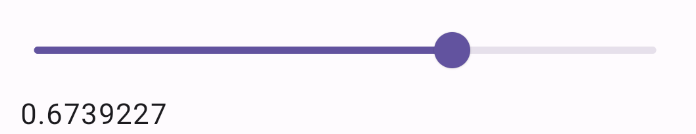
المثال التالي هو شريط تمرير بسيط. يتيح ذلك للمستخدم
اختيار قيمة من 0.0 إلى 1.0. ولأنّه يمكن للمستخدم اختيار أي قيمة في
هذا النطاق، يكون شريط التمرير متواصلًا.
النتائج
إنشاء شريط تمرير متقدّم
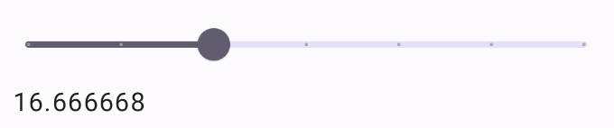
ينفِّذ المقتطف التالي شريط تمرير يتضمّن ثلاث خطوات، مع نطاق
من 0.0 إلى 50.0. وبما أنّ إصبع الإبهام ينقر على كل خطوة، يكون شريط التمرير
منفصلاً.
النتائج
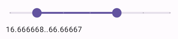
شريط تمرير النطاق
يمكنك أيضًا استخدام العنصر القابل للتجميع المخصّص RangeSlider. يسمح هذا للمستخدم بتحديد
قيمتَين. ويمكن أن يكون ذلك مفيدًا في حالات مثل عندما يريد المستخدم
اختيار حدّ أدنى وأقصى للسعر.
يوضّح المثال التالي مثالاً بسيطًا نسبيًا على شريط التمرير المستمر للنطاق:
النتائج
النقاط الرئيسية
اطّلِع على مرجع Slider للحصول على تعريف كامل لواجهة برمجة التطبيقات. في ما يلي بعض الparameters
الرئيسية للعنصر القابل للتجميع Slider:
-
value: القيمة الحالية لأداة التمرير. onValueChange: دالة lambda التي يتمّ استدعاؤها في كلّ مرّة يتمّ فيها تغيير القيمة.-
enabled: قيمة منطقية تشير إلى ما إذا كان بإمكان المستخدم التفاعل مع شريط التمرير.
عند تنفيذ شريط تمرير أكثر تعقيدًا، يمكنك أيضًا الاستفادة من المَعلمات التالية.
-
colors: مثيلSliderColorsيتيح لك التحكّم في ألوان شريط التمرير. valueRange: نطاق القيم التي يمكن أن يأخذها شريط التمريرsteps: عدد الفتحات في شريط التمرير التي ينطبق عليها الإبهام
يمكنك أيضًا تمرير Slider عنصرَي thumb وtrack قابلَين للتجميع من أجل تخصيص شكل المكوّن بشكلٍ
أكثر دقة.
المجموعات التي تتضمّن هذا الدليل
هذا الدليل هو جزء من مجموعات الأدلة السريعة المنظَّمة التي تتناول أهداف تطوير Android الأوسع نطاقًا:

عرض المكونات التفاعلية