
Slider 可组合项可让用户从一系列值中进行选择。您可以使用滑块让用户执行以下操作:
- 调整使用一系列值的设置,例如音量和亮度。
- 过滤图表中的数据,例如设置价格范围。
- 用户输入,例如在评价中设置评分。
滑块包含滑道、滑块、值标签和刻度标记:
- 滑道:滑道是指表示滑块可取值范围的水平条。
- 滑块标记:滑块标记是滑块上的可拖动控制元素,可让用户在滑道定义的范围内选择特定值。
- 刻度标记:刻度标记是可选的视觉标记或指示器,会显示在滑块的滑道上。
本主题展示了以下滑块实现:
版本兼容性
此实现要求将项目 minSDK 设置为 API 级别 21 或更高级别。
依赖项
创建基本滑块
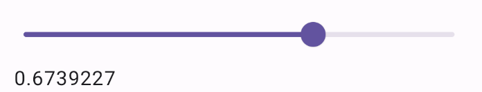
以下示例是一个简单的滑块。这样,用户就可以从 0.0 到 1.0 中选择一个值。由于用户可以选择该范围内的任何值,因此滑块是连续的。
结果
创建高级滑块
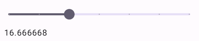
以下代码段实现了一个滑块,其中包含三个步骤,范围为 0.0 到 50.0。由于滑块会跳到每个步骤,因此此滑块是离散的。
结果
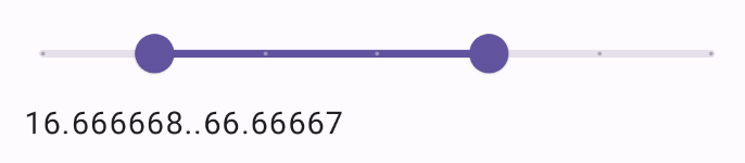
范围滑块
您还可以使用专用的 RangeSlider 可组合项。这样一来,用户就可以选择两个值。在用户希望选择最低价和最高价等情况下,这非常有用。
以下示例是一个相对简单的连续范围滑块示例:
结果
要点
如需了解完整的 API 定义,请参阅 Slider 参考文档。Slider 可组合项的一些关键参数如下:
value:滑块的当前值。onValueChange:每次值发生变化时都会调用的 lambda。enabled:一个布尔值,指示用户能否与滑块互动。
实现更复杂的滑块时,您还可以使用以下参数。
colors:一个SliderColors实例,可让您控制滑块的颜色。valueRange:滑块可取的值范围。steps:滑块上可让滑块卡住的凹槽数。
您还可以向 Slider 传递 thumb 和 track 可组合项,以更彻底地自定义组件的外观。
包含本指南的集合
本指南属于以下精选快速入门集合,这些集合涵盖了更广泛的 Android 开发目标:

显示互动组件
了解如何使用可组合函数根据 Material Design 设计系统轻松创建美观的界面组件。
有问题或反馈
请访问我们的常见问题解答页面,了解简短指南,或与我们联系,告诉我们您的想法。