
Thành phần kết hợp Slider cho phép người dùng lựa chọn trong một phạm vi các giá trị. Bạn có thể sử dụng thanh trượt để cho phép người dùng làm những việc sau:
- Điều chỉnh các chế độ cài đặt sử dụng một phạm vi giá trị, chẳng hạn như âm lượng và độ sáng.
- Lọc dữ liệu trong biểu đồ, chẳng hạn như khi đặt phạm vi giá.
- Thông tin do người dùng nhập, chẳng hạn như đặt điểm xếp hạng trong bài đánh giá.
Thanh trượt chứa một dải, con trỏ, nhãn giá trị và dấu đánh dấu:
- Đường dẫn: Đường dẫn là thanh ngang đại diện cho phạm vi giá trị mà thanh trượt có thể nhận.
- Thumb (Con trỏ): Con trỏ là một thành phần điều khiển có thể kéo trên thanh trượt, cho phép người dùng chọn một giá trị cụ thể trong phạm vi do kênh xác định.
- Dấu đánh dấu: Dấu đánh dấu là các điểm đánh dấu hoặc chỉ báo hình ảnh không bắt buộc xuất hiện dọc theo đường trượt của thanh trượt.
Chủ đề này trình bày các cách triển khai thanh trượt sau:
Khả năng tương thích của phiên bản
Phương thức triển khai này yêu cầu bạn phải đặt minSDK của dự án thành API cấp 21 trở lên.
Phần phụ thuộc
Tạo thanh trượt cơ bản
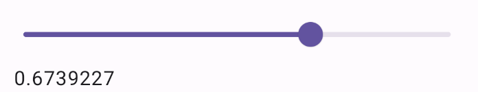
Ví dụ sau đây là một thanh trượt đơn giản. Điều đó cho phép người dùng chọn một giá trị từ 0.0 đến 1.0. Vì người dùng có thể chọn bất kỳ giá trị nào trong phạm vi đó, nên thanh trượt là liên tục.
Kết quả
Tạo thanh trượt nâng cao
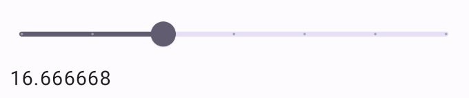
Đoạn mã sau đây triển khai một thanh trượt có ba bước, với phạm vi từ 0.0 đến 50.0. Vì ngón tay cái chụp vào từng bước, nên thanh trượt này là riêng biệt.
Kết quả
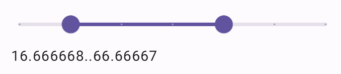
Thanh trượt phạm vi
Bạn cũng có thể sử dụng thành phần kết hợp RangeSlider chuyên dụng. Điều này cho phép người dùng chọn hai giá trị. Điều này có thể hữu ích trong các trường hợp như khi người dùng muốn chọn giá tối thiểu và tối đa.
Ví dụ sau đây là một ví dụ tương đối đơn giản về thanh trượt phạm vi liên tục:
Kết quả
Điểm chính
Hãy xem tài liệu tham khảo Slider để biết định nghĩa đầy đủ về API. Sau đây là một số tham số chính của thành phần kết hợp Slider:
value: Giá trị hiện tại của thanh trượt.onValueChange: Một hàm lambda được gọi mỗi khi giá trị thay đổi.enabled: Giá trị boolean cho biết người dùng có thể tương tác với thanh trượt hay không.
Khi triển khai một thanh trượt phức tạp hơn, bạn cũng có thể sử dụng các tham số sau.
colors: Một thực thể củaSliderColorscho phép bạn kiểm soát màu sắc của thanh trượt.valueRange: Phạm vi giá trị mà thanh trượt có thể nhận.steps: Số lượng rãnh trên thanh trượt mà ngón tay cái sẽ chụp lại.
Bạn cũng có thể truyền Slider một thành phần kết hợp thumb và track để tuỳ chỉnh giao diện của thành phần một cách kỹ lưỡng hơn.
Các bộ sưu tập chứa hướng dẫn này
Hướng dẫn này là một phần của các bộ sưu tập Hướng dẫn nhanh được tuyển chọn này, bao gồm các mục tiêu phát triển Android rộng hơn:

Hiển thị các thành phần tương tác