Scaffold-Komponente erstellen, um die Benutzeroberfläche zusammenzuhalten
Mit Sammlungen den Überblick behalten
Sie können Inhalte basierend auf Ihren Einstellungen speichern und kategorisieren.
In Material Design ist ein Scaffolding eine grundlegende Struktur, die eine standardisierte Plattform für komplexe Benutzeroberflächen bietet. Sie hält verschiedene Teile der Benutzeroberfläche zusammen, z. B. App-Leisten und schwebende Aktionsschaltflächen, und verleiht Apps ein einheitliches Erscheinungsbild.
Versionskompatibilität
Für diese Implementierung muss die minSDK Ihres Projekts auf API-Level 21 oder höher festgelegt sein.
Abhängigkeiten
Scaffolding erstellen
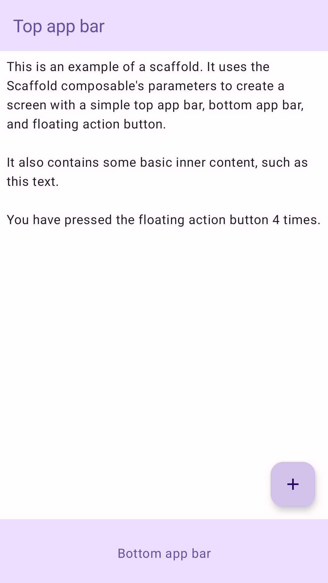
Im folgenden Beispiel wird gezeigt, wie Sie Scaffold implementieren können. Sie enthält eine obere App-Leiste, eine untere App-Leiste und eine schwebende Aktionsschaltfläche, die mit dem internen Status von Scaffold interagiert.
Ergebnisse
Abbildung 1 Eine Implementierung von Scaffold.
Wichtige Fakten
Das Scaffold-Modul bietet eine einfache API, mit der Sie die Struktur Ihrer App schnell gemäß den Material Design-Richtlinien zusammenstellen können.
Scaffold akzeptiert mehrere zusammensetzbare Funktionen als Parameter. Dazu gehören:
topBar: Die App-Leiste oben auf dem Bildschirm.
bottomBar: Die App-Leiste am unteren Bildschirmrand.
floatingActionButton: Eine Schaltfläche, die unten rechts auf dem Bildschirm angezeigt wird und mit der Sie wichtige Aktionen aufrufen können.
Ausführlichere Beispiele zur Implementierung von App-Leisten oben und unten finden Sie auf der Seite zu App-Leisten.
Sie können Scaffold-Inhalte auch wie bei anderen Containern übergeben. Es übergibt einen innerPadding-Wert an das content-Lambda, den Sie dann in untergeordneten Composeables verwenden können.
Sammlungen, die diesen Leitfaden enthalten
Dieser Leitfaden ist Teil der folgenden ausgewählten Sammlungen von Kurzanleitungen, die allgemeinere Ziele der Android-Entwicklung abdecken:
Startbildschirm-Scaffold erstellen
Informationen zum Erstellen komplexer Benutzeroberflächen mit einer standardisierten Plattform Das Scaffolding hält die verschiedenen Teile der Benutzeroberfläche zusammen und verleiht Apps ein einheitliches Erscheinungsbild.
Hier erfahren Sie, wie Sie mit kombinierbaren Funktionen ganz einfach ansprechende UI-Komponenten auf der Grundlage des Material Design-Designsystems erstellen können.
Alle Inhalte und Codebeispiele auf dieser Seite unterliegen den Lizenzen wie im Abschnitt Inhaltslizenz beschrieben. Java und OpenJDK sind Marken oder eingetragene Marken von Oracle und/oder seinen Tochtergesellschaften.
Zuletzt aktualisiert: 2025-02-06 (UTC).
[null,null,["Zuletzt aktualisiert: 2025-02-06 (UTC)."],[],[],null,["# Create a scaffold component to hold the UI together\n\n\u003cbr /\u003e\n\nIn Material Design, a scaffold is a fundamental structure that provides a\nstandardized platform for complex user interfaces. It holds together different\nparts of the UI, such as app bars and floating action buttons, giving apps a\ncoherent look and feel.\n\nVersion compatibility\n---------------------\n\nThis implementation requires that your project minSDK be set to API level 21\nor higher.\n\n### Dependencies\n\n### Kotlin\n\n\u003cbr /\u003e\n\n```kotlin\n implementation(platform(\"androidx.compose:compose-bom:2025.08.00\"))\n \n```\n\n\u003cbr /\u003e\n\n### Groovy\n\n\u003cbr /\u003e\n\n```groovy\n implementation platform('androidx.compose:compose-bom:2025.08.00')\n \n```\n\n\u003cbr /\u003e\n\nCreate a scaffold\n-----------------\n\nThe following example provides a full example of how you might implement\n[`Scaffold`](/reference/kotlin/androidx/compose/material/package-summary#Scaffold(androidx.compose.foundation.layout.WindowInsets,androidx.compose.ui.Modifier,androidx.compose.material.ScaffoldState,kotlin.Function0,kotlin.Function0,kotlin.Function1,kotlin.Function0,androidx.compose.material.FabPosition,kotlin.Boolean,kotlin.Function1,kotlin.Boolean,androidx.compose.ui.graphics.Shape,androidx.compose.ui.unit.Dp,androidx.compose.ui.graphics.Color,androidx.compose.ui.graphics.Color,androidx.compose.ui.graphics.Color,androidx.compose.ui.graphics.Color,androidx.compose.ui.graphics.Color,kotlin.Function1)). It contains a top app bar, bottom app bar, and a floating action\nbutton that interacts with `Scaffold`'s internal state.\n\n\u003cbr /\u003e\n\n```kotlin\n@Composable\nfun ScaffoldExample() {\n var presses by remember { mutableIntStateOf(0) }\n\n Scaffold(\n topBar = {\n TopAppBar(\n colors = topAppBarColors(\n containerColor = MaterialTheme.colorScheme.primaryContainer,\n titleContentColor = MaterialTheme.colorScheme.primary,\n ),\n title = {\n Text(\"Top app bar\")\n }\n )\n },\n bottomBar = {\n BottomAppBar(\n containerColor = MaterialTheme.colorScheme.primaryContainer,\n contentColor = MaterialTheme.colorScheme.primary,\n ) {\n Text(\n modifier = Modifier\n .fillMaxWidth(),\n textAlign = TextAlign.Center,\n text = \"Bottom app bar\",\n )\n }\n },\n floatingActionButton = {\n FloatingActionButton(onClick = { presses++ }) {\n Icon(Icons.Default.Add, contentDescription = \"Add\")\n }\n }\n ) { innerPadding -\u003e\n Column(\n modifier = Modifier\n .padding(innerPadding),\n verticalArrangement = Arrangement.spacedBy(16.dp),\n ) {\n Text(\n modifier = Modifier.padding(8.dp),\n text =\n \"\"\"\n This is an example of a scaffold. It uses the Scaffold composable's parameters to create a screen with a simple top app bar, bottom app bar, and floating action button.\n\n It also contains some basic inner content, such as this text.\n\n You have pressed the floating action button $presses times.\n \"\"\".trimIndent(),\n )\n }\n }\n}\n \n https://github.com/android/snippets/blob/dd30aee903e8c247786c064faab1a9ca8d10b46e/compose/snippets/src/main/java/com/example/compose/snippets/components/Scaffold.kt#L47-L100\n \n```\n\n\u003cbr /\u003e\n\nResults\n-------\n\n**Figure 1.** An implementation of scaffold.\n\nKey points\n----------\n\nThe [`Scaffold`](/reference/kotlin/androidx/compose/material/ScaffoldState) composable provides a straightforward API you can use to\nquickly assemble your app's structure according to Material Design guidelines.\n`Scaffold` accepts several composables as parameters. Among these are the\nfollowing:\n\n- `topBar`: The app bar across the top of the screen.\n- `bottomBar`: The app bar across the bottom of the screen.\n- `floatingActionButton`: A button that hovers over the bottom-right corner of the screen that you can use to expose key actions.\n\nFor more detailed examples on how you can implement both top and bottom\napp bars, see the app bars page.\n\nYou can also pass `Scaffold` content as you would to other containers. It passes\nan `innerPadding` value to the `content` lambda that you can then use in child\ncomposables.\n\nCollections that contain this guide\n-----------------------------------\n\nThis guide is part of these curated Quick Guide collections that cover\nbroader Android development goals: \n\n### Create a home screen scaffold\n\nFind out how to use a standardized platform to build complex user interfaces. The scaffold holds together different parts of the UI, giving apps a coherent look and feel. \n[Quick guide collection](/develop/ui/compose/quick-guides/collections/create-a-home-screen-scaffold) \n\n### Display interactive components\n\nLearn how composable functions can enable you to easily create beautiful UI components based on the Material Design design system. \n[Quick guide collection](/develop/ui/compose/quick-guides/collections/display-interactive-components) \n\nHave questions or feedback\n--------------------------\n\nGo to our frequently asked questions page and learn about quick guides or reach out and let us know your thoughts. \n[Go to FAQ](/quick-guides/faq) [Leave feedback](https://issuetracker.google.com/issues/new?component=1573691&template=1993320)"]]