
在 Material Design 中,框架是一种基本结构,可为复杂的界面提供标准化平台。它将界面的不同部分(例如应用栏和悬浮操作按钮)整合在一起,使应用具有一致的外观和风格。
版本兼容性
此实现要求将项目 minSDK 设置为 API 级别 21 或更高级别。
依赖项
创建框架
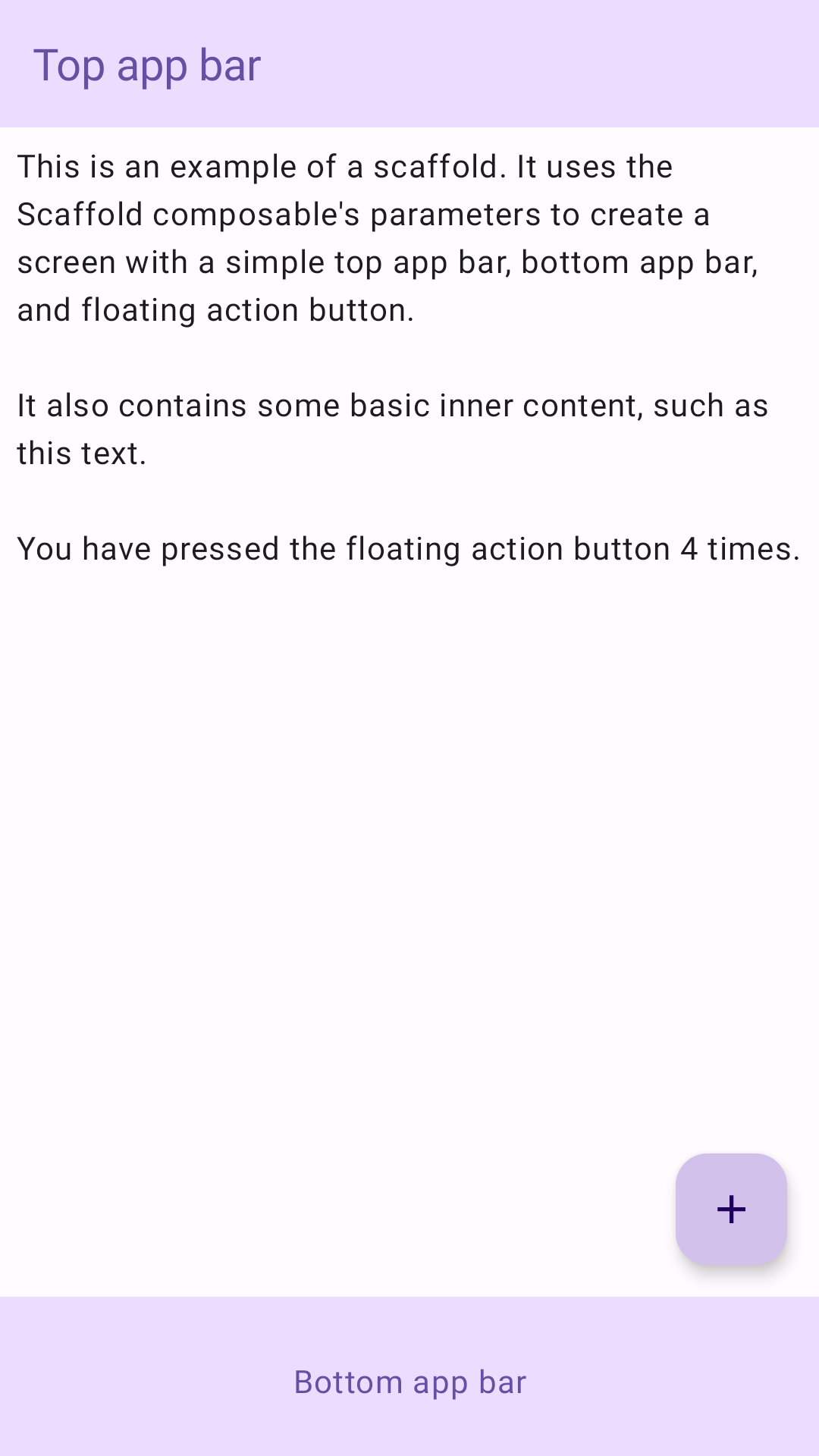
以下示例提供了一个完整示例,展示了如何实现 Scaffold。它包含一个顶部应用栏、一个底部应用栏和一个与 Scaffold 的内部状态互动的悬浮操作按钮。
结果
要点
Scaffold 可组合项提供了一个简单明了的 API,您可以使用该 API 根据 Material Design 准则快速组装应用的结构。Scaffold 接受多个可组合项作为参数。其中包括:
topBar:屏幕顶部的应用栏。bottomBar:屏幕底部的应用栏。floatingActionButton:悬停在屏幕右下角的按钮,可用于显示关键操作。
如需通过更详细的示例了解如何同时实现顶部应用栏和底部应用栏,请参阅“应用栏”页面。
您还可以像传递给其他容器一样传递 Scaffold 内容。它会将 innerPadding 值传递给 content lambda,您随后可以在子可组合项中使用该值。
包含本指南的集合
本指南属于以下精选快速入门集合,这些集合涵盖了更广泛的 Android 开发目标:
创建主屏幕 scaffold
了解如何使用标准化平台构建复杂的界面。框架将界面的不同部分整合在一起,使应用具有一致的外观和风格。
显示互动组件
了解如何使用可组合函数根据 Material Design 设计系统轻松创建美观的界面组件。
有问题或反馈
请访问我们的常见问题解答页面,了解简短指南,或与我们联系,告诉我们您的想法。