Tạo một thành phần giàn giáo để giữ giao diện người dùng lại với nhau
Sử dụng bộ sưu tập để sắp xếp ngăn nắp các trang
Lưu và phân loại nội dung dựa trên lựa chọn ưu tiên của bạn.
Trong Material Design, một giàn giáo là một cấu trúc cơ bản cung cấp một nền tảng chuẩn hoá cho các giao diện người dùng phức tạp. Cấu phần này kết hợp nhiều phần khác nhau của giao diện người dùng, chẳng hạn như thanh ứng dụng và nút hành động nổi, mang đến cho ứng dụng giao diện nhất quán.
Khả năng tương thích của phiên bản
Phương thức triển khai này yêu cầu bạn đặt minSDK của dự án thành API cấp 21 trở lên.
Phần phụ thuộc
Tạo một giàn giáo
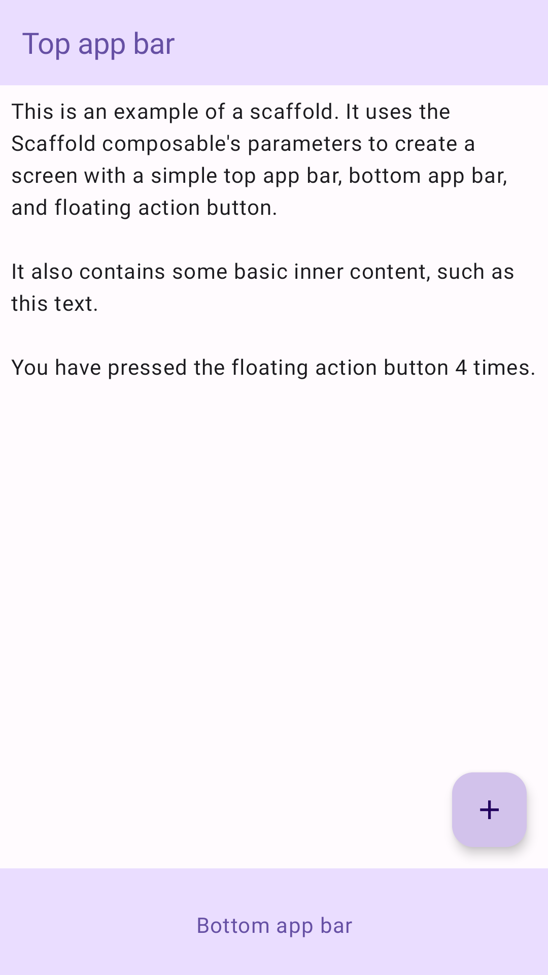
Ví dụ sau đây cung cấp ví dụ đầy đủ về cách bạn có thể triển khai Scaffold. Cấu phần này chứa thanh ứng dụng trên cùng, thanh ứng dụng dưới cùng và nút hành động nổi tương tác với trạng thái nội bộ của Scaffold.
Kết quả
Hình 1. Cách triển khai Scaffold.
Điểm chính
Thành phần kết hợp Scaffold cung cấp một API đơn giản mà bạn có thể sử dụng để nhanh chóng tập hợp cấu trúc của ứng dụng theo nguyên tắc Material Design.
Scaffold chấp nhận một số thành phần kết hợp làm tham số. Trong số đó có:
topBar: Thanh ứng dụng ở đầu màn hình.
bottomBar: Thanh ứng dụng ở cuối màn hình.
floatingActionButton: Một nút di chuột qua góc dưới cùng bên phải của màn hình mà bạn có thể sử dụng để hiển thị các thao tác chính.
Để biết thêm ví dụ chi tiết về cách triển khai cả thanh ứng dụng trên cùng và dưới cùng, hãy xem trang về thanh ứng dụng.
Bạn cũng có thể truyền nội dung Scaffold như cách bạn truyền nội dung đến các vùng chứa khác. Hàm này truyền giá trị innerPadding đến hàm lambda content mà bạn có thể sử dụng trong các thành phần kết hợp con.
Các bộ sưu tập chứa hướng dẫn này
Hướng dẫn này là một phần của các bộ sưu tập Hướng dẫn nhanh được tuyển chọn này, bao gồm các mục tiêu phát triển Android rộng hơn:
Tạo một giàn đỡ màn hình chính
Tìm hiểu cách sử dụng một nền tảng chuẩn hoá để xây dựng giao diện người dùng phức tạp. Khung này kết hợp các phần khác nhau của giao diện người dùng, mang đến cho ứng dụng một giao diện nhất quán.
Nội dung và mã mẫu trên trang này phải tuân thủ các giấy phép như mô tả trong phần Giấy phép nội dung. Java và OpenJDK là nhãn hiệu hoặc nhãn hiệu đã đăng ký của Oracle và/hoặc đơn vị liên kết của Oracle.
Cập nhật lần gần đây nhất: 2025-02-06 UTC.
[null,null,["Cập nhật lần gần đây nhất: 2025-02-06 UTC."],[],[],null,["# Create a scaffold component to hold the UI together\n\n\u003cbr /\u003e\n\nIn Material Design, a scaffold is a fundamental structure that provides a\nstandardized platform for complex user interfaces. It holds together different\nparts of the UI, such as app bars and floating action buttons, giving apps a\ncoherent look and feel.\n\nVersion compatibility\n---------------------\n\nThis implementation requires that your project minSDK be set to API level 21\nor higher.\n\n### Dependencies\n\n### Kotlin\n\n\u003cbr /\u003e\n\n```kotlin\n implementation(platform(\"androidx.compose:compose-bom:2025.08.00\"))\n \n```\n\n\u003cbr /\u003e\n\n### Groovy\n\n\u003cbr /\u003e\n\n```groovy\n implementation platform('androidx.compose:compose-bom:2025.08.00')\n \n```\n\n\u003cbr /\u003e\n\nCreate a scaffold\n-----------------\n\nThe following example provides a full example of how you might implement\n[`Scaffold`](/reference/kotlin/androidx/compose/material/package-summary#Scaffold(androidx.compose.foundation.layout.WindowInsets,androidx.compose.ui.Modifier,androidx.compose.material.ScaffoldState,kotlin.Function0,kotlin.Function0,kotlin.Function1,kotlin.Function0,androidx.compose.material.FabPosition,kotlin.Boolean,kotlin.Function1,kotlin.Boolean,androidx.compose.ui.graphics.Shape,androidx.compose.ui.unit.Dp,androidx.compose.ui.graphics.Color,androidx.compose.ui.graphics.Color,androidx.compose.ui.graphics.Color,androidx.compose.ui.graphics.Color,androidx.compose.ui.graphics.Color,kotlin.Function1)). It contains a top app bar, bottom app bar, and a floating action\nbutton that interacts with `Scaffold`'s internal state.\n\n\u003cbr /\u003e\n\n```kotlin\n@Composable\nfun ScaffoldExample() {\n var presses by remember { mutableIntStateOf(0) }\n\n Scaffold(\n topBar = {\n TopAppBar(\n colors = topAppBarColors(\n containerColor = MaterialTheme.colorScheme.primaryContainer,\n titleContentColor = MaterialTheme.colorScheme.primary,\n ),\n title = {\n Text(\"Top app bar\")\n }\n )\n },\n bottomBar = {\n BottomAppBar(\n containerColor = MaterialTheme.colorScheme.primaryContainer,\n contentColor = MaterialTheme.colorScheme.primary,\n ) {\n Text(\n modifier = Modifier\n .fillMaxWidth(),\n textAlign = TextAlign.Center,\n text = \"Bottom app bar\",\n )\n }\n },\n floatingActionButton = {\n FloatingActionButton(onClick = { presses++ }) {\n Icon(Icons.Default.Add, contentDescription = \"Add\")\n }\n }\n ) { innerPadding -\u003e\n Column(\n modifier = Modifier\n .padding(innerPadding),\n verticalArrangement = Arrangement.spacedBy(16.dp),\n ) {\n Text(\n modifier = Modifier.padding(8.dp),\n text =\n \"\"\"\n This is an example of a scaffold. It uses the Scaffold composable's parameters to create a screen with a simple top app bar, bottom app bar, and floating action button.\n\n It also contains some basic inner content, such as this text.\n\n You have pressed the floating action button $presses times.\n \"\"\".trimIndent(),\n )\n }\n }\n}\n \n https://github.com/android/snippets/blob/dd30aee903e8c247786c064faab1a9ca8d10b46e/compose/snippets/src/main/java/com/example/compose/snippets/components/Scaffold.kt#L47-L100\n \n```\n\n\u003cbr /\u003e\n\nResults\n-------\n\n**Figure 1.** An implementation of scaffold.\n\nKey points\n----------\n\nThe [`Scaffold`](/reference/kotlin/androidx/compose/material/ScaffoldState) composable provides a straightforward API you can use to\nquickly assemble your app's structure according to Material Design guidelines.\n`Scaffold` accepts several composables as parameters. Among these are the\nfollowing:\n\n- `topBar`: The app bar across the top of the screen.\n- `bottomBar`: The app bar across the bottom of the screen.\n- `floatingActionButton`: A button that hovers over the bottom-right corner of the screen that you can use to expose key actions.\n\nFor more detailed examples on how you can implement both top and bottom\napp bars, see the app bars page.\n\nYou can also pass `Scaffold` content as you would to other containers. It passes\nan `innerPadding` value to the `content` lambda that you can then use in child\ncomposables.\n\nCollections that contain this guide\n-----------------------------------\n\nThis guide is part of these curated Quick Guide collections that cover\nbroader Android development goals: \n\n### Create a home screen scaffold\n\nFind out how to use a standardized platform to build complex user interfaces. The scaffold holds together different parts of the UI, giving apps a coherent look and feel. \n[Quick guide collection](/develop/ui/compose/quick-guides/collections/create-a-home-screen-scaffold) \n\n### Display interactive components\n\nLearn how composable functions can enable you to easily create beautiful UI components based on the Material Design design system. \n[Quick guide collection](/develop/ui/compose/quick-guides/collections/display-interactive-components) \n\nHave questions or feedback\n--------------------------\n\nGo to our frequently asked questions page and learn about quick guides or reach out and let us know your thoughts. \n[Go to FAQ](/quick-guides/faq) [Leave feedback](https://issuetracker.google.com/issues/new?component=1573691&template=1993320)"]]