Mit Sammlungen den Überblick behalten
Sie können Inhalte basierend auf Ihren Einstellungen speichern und kategorisieren.
Erstellen Sie eine untere App-Leiste, damit Nutzer sich in Ihrer App leichter zurechtfinden und auf Funktionen zugreifen können. Folgen Sie dieser Anleitung, um Ihrer App mithilfe des BottomAppBar-Composables eine untere App-Leiste hinzuzufügen.
Versionskompatibilität
Für diese Implementierung muss das minSDK Ihres Projekts auf API-Level 21 oder höher festgelegt sein.
Abhängigkeiten
Untere App-Leiste erstellen
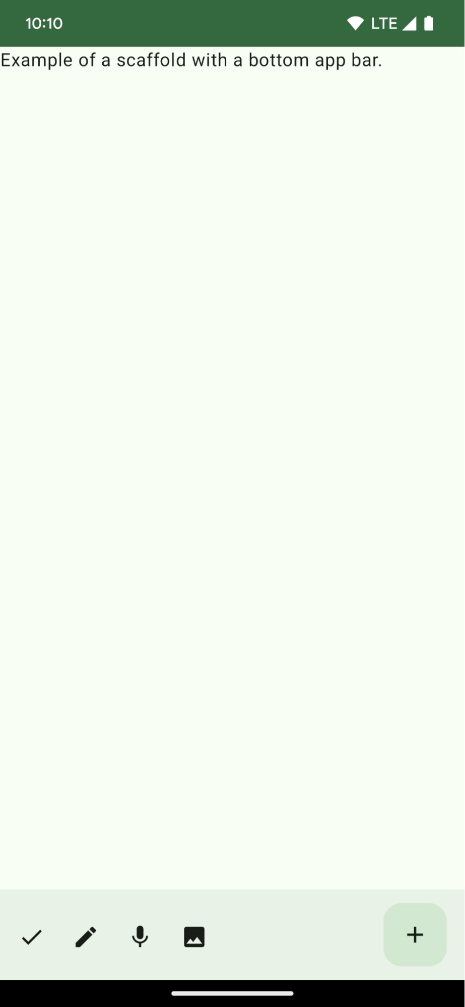
Mit dem folgenden Code erstellen Sie eine untere App-Leiste mit vier Symbolschaltflächen und einer schwebenden Aktionsschaltfläche:
@ComposablefunBottomAppBarExample(){Scaffold(bottomBar={BottomAppBar(actions={IconButton(onClick={/* do something */}){Icon(Icons.Filled.Check,contentDescription="Localized description")}IconButton(onClick={/* do something */}){Icon(Icons.Filled.Edit,contentDescription="Localized description",)}IconButton(onClick={/* do something */}){Icon(Icons.Filled.Mic,contentDescription="Localized description",)}IconButton(onClick={/* do something */}){Icon(Icons.Filled.Image,contentDescription="Localized description",)}},floatingActionButton={FloatingActionButton(onClick={/* do something */},containerColor=BottomAppBarDefaults.bottomAppBarFabColor,elevation=FloatingActionButtonDefaults.bottomAppBarFabElevation()){Icon(Icons.Filled.Add,"Localized description")}})},){innerPadding->
Text(modifier=Modifier.padding(innerPadding),text="Example of a scaffold with a bottom app bar.")}}
Eine äußere Scaffold, für die eine bottomBar festgelegt ist.
Eine bottomBar-Implementierung, die eine Liste von Aktionen enthält.
Aktionen, die Implementierungen von IconButton sind und Icon für Bild- und Inhaltstext enthalten, jeweils mit einem onClick-Lambda, um diese Aktionen auszuführen.
Sie können Composeables für die folgenden wichtigen Parameter übergeben:
actions: Eine Reihe von Symbolen, die links in der Leiste angezeigt werden. Das sind in der Regel entweder wichtige Aktionen für den jeweiligen Bildschirm oder Navigationselemente.
floatingActionButton: Die unverankerte Aktionsschaltfläche, die rechts in der Leiste angezeigt wird.
Ergebnisse
Abbildung 1: Beispiel für eine untere App-Leiste
Sammlungen, die diesen Leitfaden enthalten
Dieser Leitfaden ist Teil der folgenden ausgewählten Sammlungen von Kurzanleitungen, die allgemeinere Ziele der Android-Entwicklung abdecken:
Startbildschirm-Scaffold erstellen
Informationen zum Erstellen komplexer Benutzeroberflächen mit einer standardisierten Plattform Das Scaffolding hält die verschiedenen Teile der Benutzeroberfläche zusammen und verleiht Apps ein einheitliches Erscheinungsbild.
Hier erfahren Sie, wie Sie mit kombinierbaren Funktionen ganz einfach ansprechende UI-Komponenten auf der Grundlage des Material Design-Designsystems erstellen können.
Alle Inhalte und Codebeispiele auf dieser Seite unterliegen den Lizenzen wie im Abschnitt Inhaltslizenz beschrieben. Java und OpenJDK sind Marken oder eingetragene Marken von Oracle und/oder seinen Tochtergesellschaften.
Zuletzt aktualisiert: 2025-06-04 (UTC).
[null,null,["Zuletzt aktualisiert: 2025-06-04 (UTC)."],[],[],null,["# Display a bottom app bar\n\n\u003cbr /\u003e\n\nCreate a bottom app bar to help users navigate and access functions in your app.\nFollow this guidance to add a bottom app bar to your app by using the\n[`BottomAppBar`](/reference/com/google/android/material/bottomappbar/BottomAppBar) composable.\n\nVersion compatibility\n---------------------\n\nThis implementation requires that your project minSDK be set to API level 21 or\nhigher.\n\n### Dependencies\n\n### Kotlin\n\n\u003cbr /\u003e\n\n```kotlin\n implementation(platform(\"androidx.compose:compose-bom:2025.08.00\"))\n implementation (\"androidx.compose.material:material-icons-extended\")\n \n```\n\n\u003cbr /\u003e\n\n### Groovy\n\n\u003cbr /\u003e\n\n```groovy\n implementation platform('androidx.compose:compose-bom:2025.08.00')\n implementation 'androidx.compose.material:material-icons-extended'\n \n```\n\n\u003cbr /\u003e\n\nCreate a bottom app bar\n-----------------------\n\nUse the following code to create a bottom app bar containing four icon buttons,\nand a floating action button:\n\n\n```kotlin\n@Composable\nfun BottomAppBarExample() {\n Scaffold(\n bottomBar = {\n BottomAppBar(\n actions = {\n IconButton(onClick = { /* do something */ }) {\n Icon(Icons.Filled.Check, contentDescription = \"Localized description\")\n }\n IconButton(onClick = { /* do something */ }) {\n Icon(\n Icons.Filled.Edit,\n contentDescription = \"Localized description\",\n )\n }\n IconButton(onClick = { /* do something */ }) {\n Icon(\n Icons.Filled.Mic,\n contentDescription = \"Localized description\",\n )\n }\n IconButton(onClick = { /* do something */ }) {\n Icon(\n Icons.Filled.Image,\n contentDescription = \"Localized description\",\n )\n }\n },\n floatingActionButton = {\n FloatingActionButton(\n onClick = { /* do something */ },\n containerColor = BottomAppBarDefaults.bottomAppBarFabColor,\n elevation = FloatingActionButtonDefaults.bottomAppBarFabElevation()\n ) {\n Icon(Icons.Filled.Add, \"Localized description\")\n }\n }\n )\n },\n ) { innerPadding -\u003e\n Text(\n modifier = Modifier.padding(innerPadding),\n text = \"Example of a scaffold with a bottom app bar.\"\n )\n }\n}https://github.com/android/snippets/blob/dd30aee903e8c247786c064faab1a9ca8d10b46e/compose/snippets/src/main/java/com/example/compose/snippets/components/AppBar.kt#L138-L183\n```\n\n\u003cbr /\u003e\n\n### Key points about the code\n\n- An outer [`Scaffold`](/reference/kotlin/androidx/compose/material/package-summary#Scaffold(androidx.compose.foundation.layout.WindowInsets,androidx.compose.ui.Modifier,androidx.compose.material.ScaffoldState,kotlin.Function0,kotlin.Function0,kotlin.Function1,kotlin.Function0,androidx.compose.material.FabPosition,kotlin.Boolean,kotlin.Function1,kotlin.Boolean,androidx.compose.ui.graphics.Shape,androidx.compose.ui.unit.Dp,androidx.compose.ui.graphics.Color,androidx.compose.ui.graphics.Color,androidx.compose.ui.graphics.Color,androidx.compose.ui.graphics.Color,androidx.compose.ui.graphics.Color,kotlin.Function1)) that has a `bottomBar` set.\n- A `bottomBar` implementation that contains a list of actions.\n- Actions that are implementations of [`IconButton`](/reference/kotlin/androidx/compose/material/package-summary#IconButton(kotlin.Function0,androidx.compose.ui.Modifier,kotlin.Boolean,androidx.compose.foundation.interaction.MutableInteractionSource,kotlin.Function0)) that contain [`Icon`](/reference/kotlin/androidx/compose/material3/package-summary#Icon(androidx.compose.ui.graphics.ImageBitmap,kotlin.String,androidx.compose.ui.Modifier,androidx.compose.ui.graphics.Color)) for image and content description text, each with an `onClick` lambda to perform these actions.\n\nYou can pass composables for the following key parameters:\n\n- `actions`: a series of icons that appear on the left side of the bar. These are commonly either key actions for the given screen, or navigation items.\n- [`floatingActionButton`](/reference/com/google/android/material/floatingactionbutton/FloatingActionButton): the floating action button that appears on the right side of the bar.\n\n| **Note:** After you add the bottom app bar, you can customize it with content as you do with other containers by filling the `BottomAppBar` composable with other content. You can also use `BottomAppBar` without passing a value for `actions` or `floatingActionButton`.\n\nResults\n-------\n\n**Figure 1.** An example of a bottom app bar.\n\nCollections that contain this guide\n-----------------------------------\n\nThis guide is part of these curated Quick Guide collections that cover\nbroader Android development goals: \n\n### Create a home screen scaffold\n\nFind out how to use a standardized platform to build complex user interfaces. The scaffold holds together different parts of the UI, giving apps a coherent look and feel. \n[Quick guide collection](/develop/ui/compose/quick-guides/collections/create-a-home-screen-scaffold) \n\n### Display interactive components\n\nLearn how composable functions can enable you to easily create beautiful UI components based on the Material Design design system. \n[Quick guide collection](/develop/ui/compose/quick-guides/collections/display-interactive-components) \n\nHave questions or feedback\n--------------------------\n\nGo to our frequently asked questions page and learn about quick guides or reach out and let us know your thoughts. \n[Go to FAQ](/quick-guides/faq) [Leave feedback](https://issuetracker.google.com/issues/new?component=1573691&template=1993320)"]]