
ConstraintLayout is a layout that lets you place composables relative to other composables on the screen. It is an alternative to using multiple nested Row , Column , Box , and other custom layout elements .
In the View system, ConstraintLayout was the recommended way to create large and complex layouts, as a flat view hierarchy was better for performance than nested views are. However, this is not a concern in Compose, which is able to efficiently handle deep layout hierarchies, so ConstraintLayout is not as beneficial.
شروع کار با ConstraintLayout
برای استفاده از ConstraintLayout در Compose، باید این وابستگی را در build.gradle خود (علاوه بر تنظیمات Compose ) اضافه کنید:
implementation "androidx.constraintlayout:constraintlayout-compose:$constraintlayout_compose_version"
ConstraintLayout in Compose works in the following way using a DSL :
- با استفاده از
createRefs()یاcreateRefFor()برای هر composable درConstraintLayoutارجاع ایجاد کنید. - محدودیتها با استفاده از اصلاحکننده
constrainAs()ارائه میشوند، که مرجع را به عنوان پارامتر میگیرد و به شما امکان میدهد محدودیتهای آن را در بدنه لامبدا مشخص کنید. - Constraints are specified using
linkTo()or other helpful methods. -
parentis an existing reference that can be used to specify constraints towards theConstraintLayoutcomposable itself.
Here's an example of a composable using a ConstraintLayout :
@Composable fun ConstraintLayoutContent() { ConstraintLayout { // Create references for the composables to constrain val (button, text) = createRefs() Button( onClick = { /* Do something */ }, // Assign reference "button" to the Button composable // and constrain it to the top of the ConstraintLayout modifier = Modifier.constrainAs(button) { top.linkTo(parent.top, margin = 16.dp) } ) { Text("Button") } // Assign reference "text" to the Text composable // and constrain it to the bottom of the Button composable Text( "Text", Modifier.constrainAs(text) { top.linkTo(button.bottom, margin = 16.dp) } ) } }
این کد بالای Button را با حاشیه 16.dp به والد و یک Text با حاشیه 16.dp به پایین Button محدود میکند.
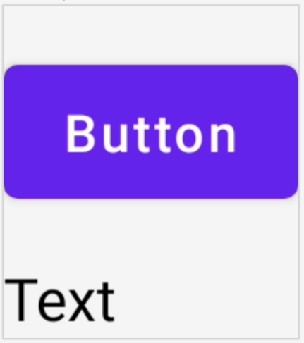
Button and a Text composable constrained to each other in a ConstraintLayout .API جدا شده
In the ConstraintLayout example, constraints are specified inline, with a modifier in the composable they're applied to. However, there are situations when it's preferable to decouple the constraints from the layouts they apply to. For example, you might want to change the constraints based on the screen configuration, or animate between two constraint sets.
برای مواردی از این دست، میتوانید ConstraintLayout به روش دیگری استفاده کنید:
- Pass in a
ConstraintSetas a parameter toConstraintLayout. - ارجاعهای ایجاد شده در
ConstraintSetرا با استفاده از اصلاحکنندهlayoutIdبه composableها اختصاص دهید.
@Composable fun DecoupledConstraintLayout() { BoxWithConstraints { val constraints = if (minWidth < 600.dp) { decoupledConstraints(margin = 16.dp) // Portrait constraints } else { decoupledConstraints(margin = 32.dp) // Landscape constraints } ConstraintLayout(constraints) { Button( onClick = { /* Do something */ }, modifier = Modifier.layoutId("button") ) { Text("Button") } Text("Text", Modifier.layoutId("text")) } } } private fun decoupledConstraints(margin: Dp): ConstraintSet { return ConstraintSet { val button = createRefFor("button") val text = createRefFor("text") constrain(button) { top.linkTo(parent.top, margin = margin) } constrain(text) { top.linkTo(button.bottom, margin) } } }
سپس، وقتی نیاز به تغییر محدودیتها دارید، میتوانید یک ConstraintSet متفاوت ارسال کنید.
مفاهیم ConstraintLayout
ConstraintLayout شامل مفاهیمی مانند خطوط راهنما، موانع و زنجیرها است که میتوانند به موقعیتیابی عناصر درون composable شما کمک کنند.
دستورالعملها
خطوط راهنما، ابزارهای بصری کوچکی هستند که به طراحی طرحبندیها کمک میکنند. Composableها را میتوان به یک خط راهنما محدود کرد. خطوط راهنما برای قرار دادن عناصر در یک dp یا percentage مشخص درون Composable والد مفید هستند.
There are two different kinds of guidelines , vertical and horizontal. The two horizontal ones are top and bottom , and the two vertical are start and end .
ConstraintLayout { // Create guideline from the start of the parent at 10% the width of the Composable val startGuideline = createGuidelineFromStart(0.1f) // Create guideline from the end of the parent at 10% the width of the Composable val endGuideline = createGuidelineFromEnd(0.1f) // Create guideline from 16 dp from the top of the parent val topGuideline = createGuidelineFromTop(16.dp) // Create guideline from 16 dp from the bottom of the parent val bottomGuideline = createGuidelineFromBottom(16.dp) }
برای ایجاد یک خط راهنما، createGuidelineFrom* به همراه نوع خط راهنمای مورد نیاز استفاده کنید. این کار یک مرجع ایجاد میکند که میتواند در بلوک Modifier.constrainAs() استفاده شود.
موانع
موانع به چندین ترکیبپذیر ارجاع میدهند تا یک خط راهنمای مجازی بر اساس افراطیترین ویجت در سمت مشخصشده ایجاد کنند.
برای ایجاد یک مانع، از createTopBarrier() (یا: createBottomBarrier() ، createEndBarrier() ، createStartBarrier() ) استفاده کنید و منابعی را که باید مانع را تشکیل دهند، ارائه دهید.
ConstraintLayout { val constraintSet = ConstraintSet { val button = createRefFor("button") val text = createRefFor("text") val topBarrier = createTopBarrier(button, text) } }
سپس میتوان از این مانع در یک بلوک Modifier.constrainAs() استفاده کرد.
زنجیر
زنجیرهها رفتاری شبیه به گروه را در یک محور واحد (به صورت افقی یا عمودی) ارائه میدهند. محور دیگر را میتوان به طور مستقل محدود کرد.
برای ایجاد یک زنجیره، از createVerticalChain یا createHorizontalChain استفاده کنید:
ConstraintLayout { val constraintSet = ConstraintSet { val button = createRefFor("button") val text = createRefFor("text") val verticalChain = createVerticalChain(button, text, chainStyle = ChainStyle.Spread) val horizontalChain = createHorizontalChain(button, text) } }
The chain can then be used in the Modifier.constrainAs() block.
یک زنجیره را میتوان با ChainStyles مختلف پیکربندی کرد، که نحوه برخورد با فضای اطراف یک composable را تعیین میکنند، مانند:
-
ChainStyle.Spread: فضا به طور مساوی در تمام composableها توزیع میشود، از جمله فضای خالی قبل از اولین composable و بعد از آخرین composable. -
ChainStyle.SpreadInside: فضا به طور مساوی در تمام composableها توزیع میشود، بدون هیچ فضای خالی قبل از اولین composable یا بعد از آخرین composable. -
ChainStyle.Packed: فضا قبل از اولین و بعد از آخرین composable توزیع میشود، composableها بدون فاصله بین یکدیگر، در کنار هم قرار میگیرند.