
نظام التصميم هو مجموعة من قرارات التصميم القابلة لإعادة الاستخدام، والتي يتم التعبير عنها كإرشادات ومكونات وأنماط. يمكن تقسيم النظام إلى أصغر مبادئ تصميم أساسية: أشياء مثل اللون أو النوع أو الشكل التي تبني إلى أجزاء مكونة أكبر معقّدة. على سبيل المثال، يشكل الرمز والتسمية النصية مكونًا من الأزرار، بينما تشكل الأزرار المتعددة والسطح بطاقة. تأتي أنظمة التصميم أيضًا مع مجموعة من الإرشادات تتألف من قرارات التصميم الحالية حول المكونات والأنماط.
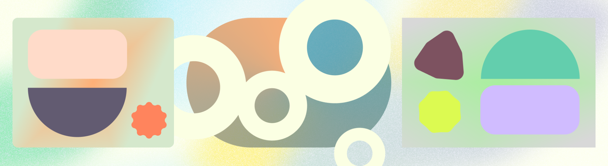
Material Design هو نظام تصميم مفتوح المصدر طوّرته Google لمساعدتك في إنشاء منتجات جميلة تركز على المستخدم. Material 3 هو أحدث تكرار لتصميم Material Design.
مكونات التصميم متعدد الأبعاد
يوفر Material Design مجموعة من المكونات المستندة إلى رمز والتي تمثل وحدات أساسية تفاعلية لإنشاء واجهة مستخدم. يمكن تنظيم هذه المكونات في خمس فئات بناءً على الغرض منها: الإجراء، والاحتواء، والتنقل، والتحديد، وإدخال النص.
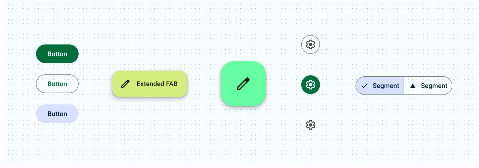
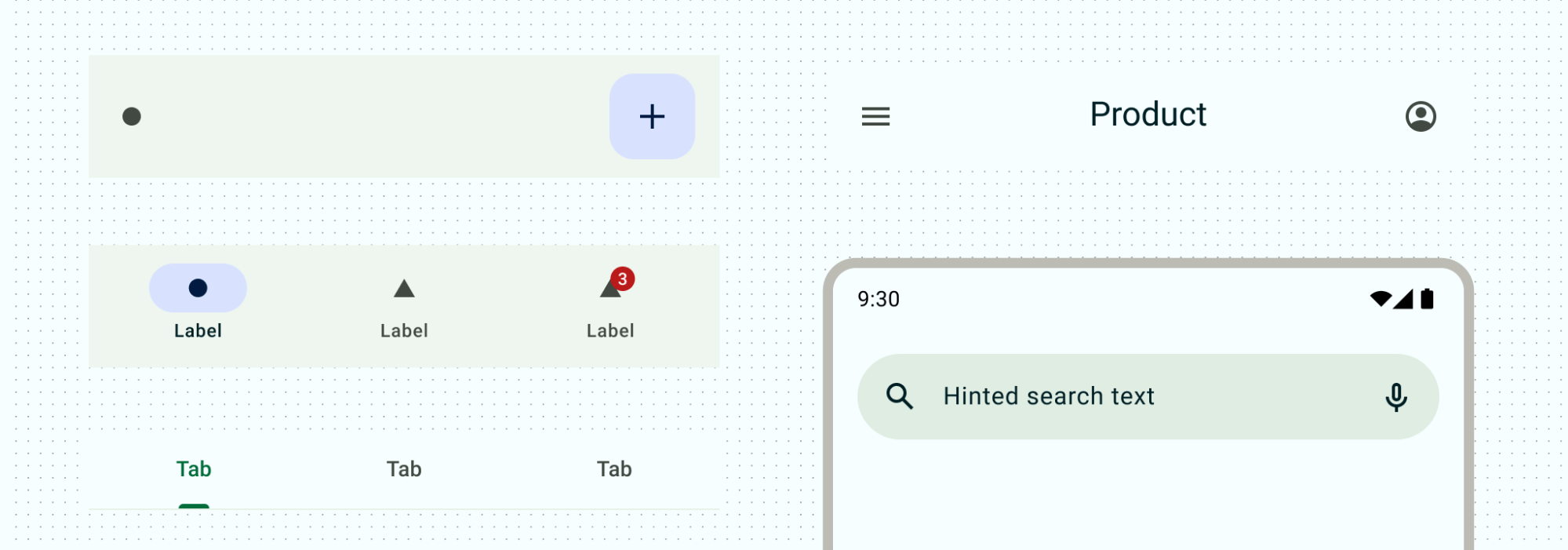
مكونات الإجراء
تساعد مكونات الإجراء الأشخاص في تحقيق هدف ما.
تحتوي Material على أنواع متعددة من الأزرار للمساعدة في تحديد أولوية الإجراءات والتفاعل في سياقات مختلفة. من أزرار الإجراء الرئيسي أو أزرار الإجراء الرئيسي الموسَّع للإجراءات الأساسية إلى إتاحة أزرار الرموز إلى تحديد خيارات باستخدام أزرار مقسّمة
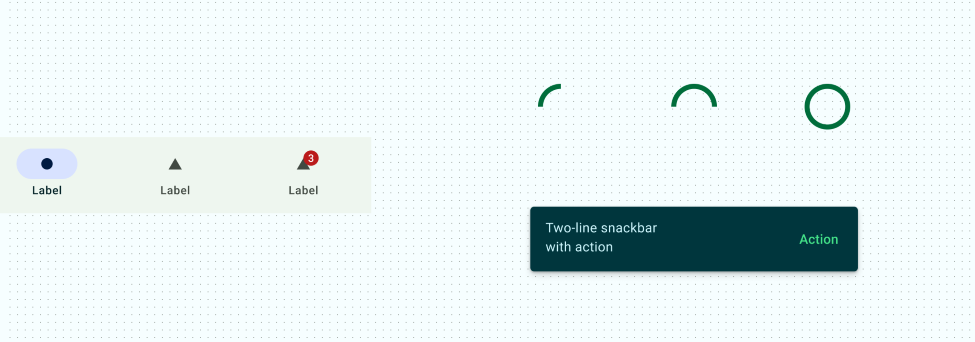
مكونات الاتصال
توفّر عناصر التواصل معلومات مفيدة من خلال تنبيه المستخدمين الذين لديهم الشارات وإعلامهم بالحالة من خلال مؤشرات مستوى التقدّم وتقديم رسائل مختصرة حول العمليات من خلال أشرطة الوجبات الخفيفة.
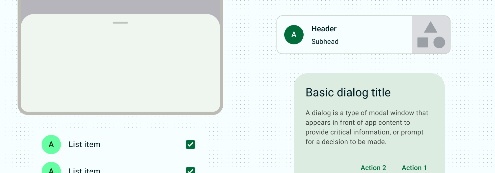
مكوّنات الاحتواء
تحتوي مكونات الاحتواء على معلومات وإجراءات - بما في ذلك المكونات الأخرى مثل الأزرار أو القوائم أو الشرائح. تستخدم معظم مكونات Material المحتوى بشكل صريح، حيث تجمع المحتوى والإجراءات ذات الصلة مع العناصر المرئية: البطاقات ومربعات الحوار والأوراق السفلية والأوراق الجانبية ولوحات العرض الدوّارة والتلميحات. يمكن توفير القوائم باحتواء ضمني أو صريح من خلال عرض فواصل مرئية. توفر هذه المكونات أنماطًا شائعة لعرض مجموعات من المحتوى.
مكوّنات التنقّل
تساعد مكونات التنقل الأشخاص على التنقل عبر واجهة المستخدم. بالنسبة إلى الأجهزة الجوّالة، يحتوي شريط التنقّل أو درج التنقّل على وجهات التنقّل الأساسية. علامات التبويب وشريط التطبيق السفلي وشريط التطبيق العلوي طُرق مختلفة للتنقل بين المعلومات والإجراءات الداعمة. اقرأ المزيد عن كيفية العمل مع التنقل داخل تخطيطاتك.
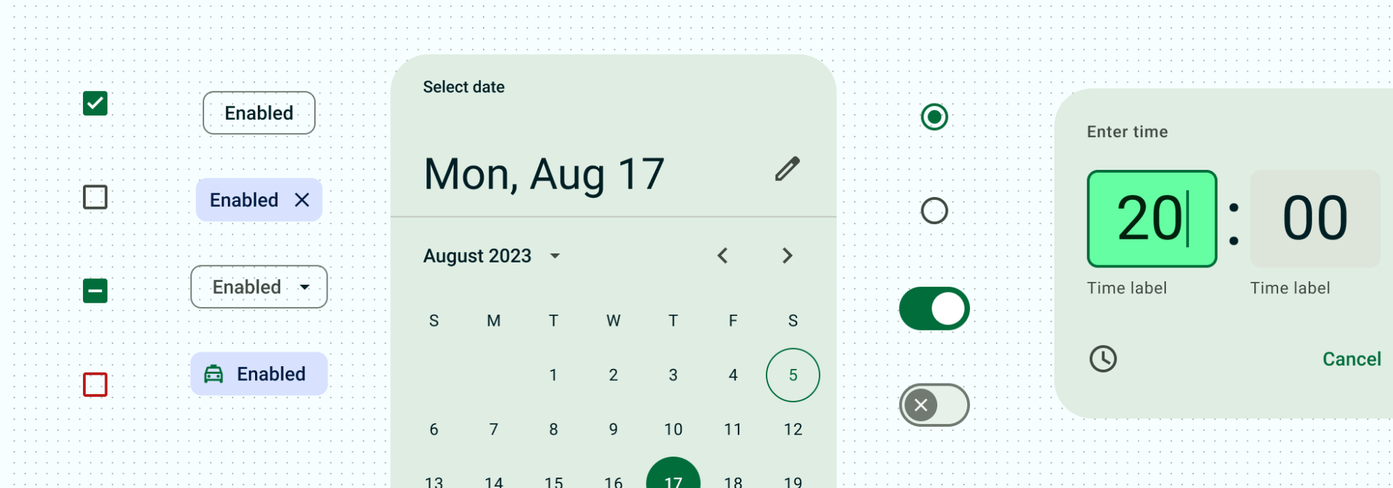
عناصر التحديد
تتيح مكونات التحديد للأشخاص تحديد الخيارات. سواء كنت تنشئ نموذجًا باستخدام مربعات اختيار وأزرار اختيار، أو الفلترة باستخدام الشرائح، أو تبديل الإعدادات باستخدام مفاتيح التبديل وأشرطة التمرير، تسمح عناصر الاختيار للمستخدمين بالتحكّم في قراراتهم وإدخالها.
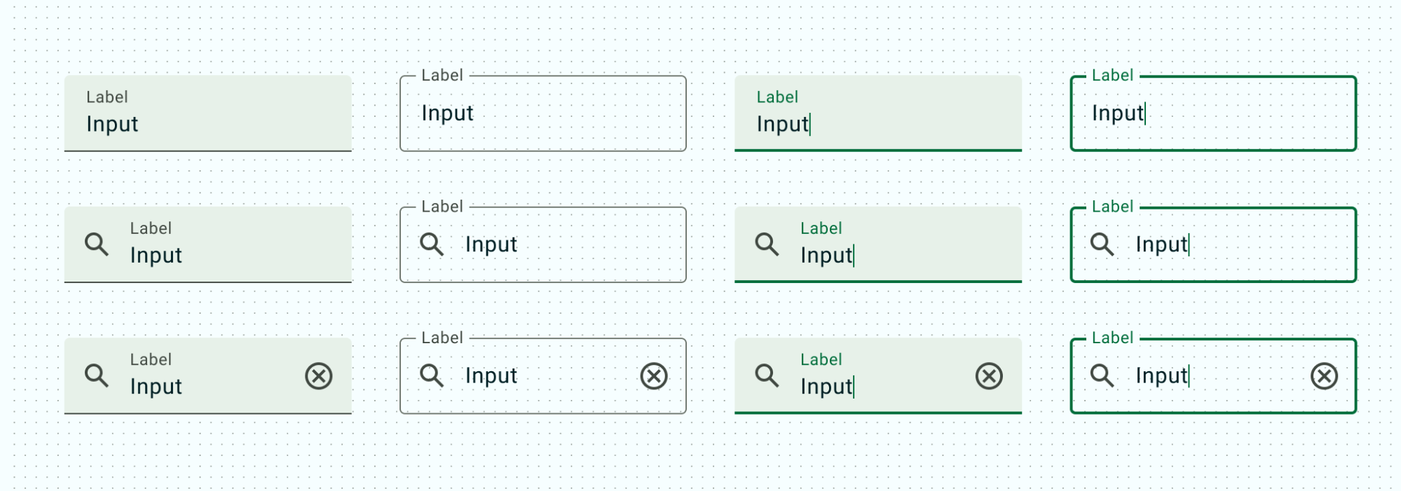
مكونات إدخال النص
تتيح مكونات إدخال النص للمستخدمين إدخال النص وتعديله. تسمح الحقول النصية للمستخدمين بإدخال نص في واجهة المستخدم.
أنظمة التصميم للإنشاء
اقرأ أنظمة التصميم في Compose للحصول على تفاصيل حول كيفية استخدام ميزة Compose لتنفيذ نظام تصميم بسلاسة أكبر ومنح تطبيقك مظهرًا متناسقًا من حيث التصاميم والمكونات والجوانب الأخرى لنظام التصميم.