

配置 widget 以显示应用中的所选内容或数据。
何时使用配置
让用户在选择 widget 期间或通过触摸并按住操作来配置 widget。考虑自定义对 widget 体验的重要性,以决定何时提供自定义功能。
- 如果微件在未选择设置的情况下显示为空,或者自定义是中心化的,请在放置微件期间直接打开配置工作流。
- 如果 widget 具有首选默认设置,或者不需要用户在查看内容之前进行选择,则您的 widget 不需要初始配置界面。在这些情况下,请允许用户在放置后访问配置。
直接用户
我们建议您提供一个配置步骤,以便为具有多个内容类别的应用(例如电子邮件应用)提供可自定义且一目了然的体验。

何时使用配置
允许用户在选择 widget 和 widget 显示在主屏幕之间或通过触控和按住来配置 widget。考虑自定义对 widget 体验的重要性,以决定何时提供自定义功能。
- 如果微件在未选择设置的情况下显示为空,或者自定义是中心化的,请在放置微件期间直接打开配置工作流。
- 如果 widget 具有首选默认设置,或者不需要用户在查看内容之前进行选择,则您的 widget 不需要初始配置界面。在这些情况下,请允许用户在放置后访问配置。
直接用户
引导用户完成配置并提供清晰的反馈。如果您的应用已包含配置流程,您可以镜像应用内配置体验,最好将其精简为 1 到 2 个屏幕。

正确做法
例如,左侧的闹钟配置界面仅允许用户选择闹钟类别,然后添加 widget。点按相应类别会关闭配置步骤并添加 widget。如果配置未完成,请勿取消添加 widget。提供一种状态,以便在 widget 内进行恢复或配置。

错误做法
在此示例中,尽管选择了要显示的内容,但通过 x 图标关闭配置视图是否会添加 widget 并不明确。
如果没有其他预设,则包含空状态。空状态可以显示初始配置或身份验证提醒,以确保引导用户。
自定义微件外观
尽可能提供理想的默认 widget,以便用户无需自定义即可快速开始使用,或帮助用户了解 widget 在主屏幕上的显示方式。
在自定义 widget 外观时显示 widget 预览。

对高级控件使用逐步披露,帮助用户快速完成自定义。

变奏曲
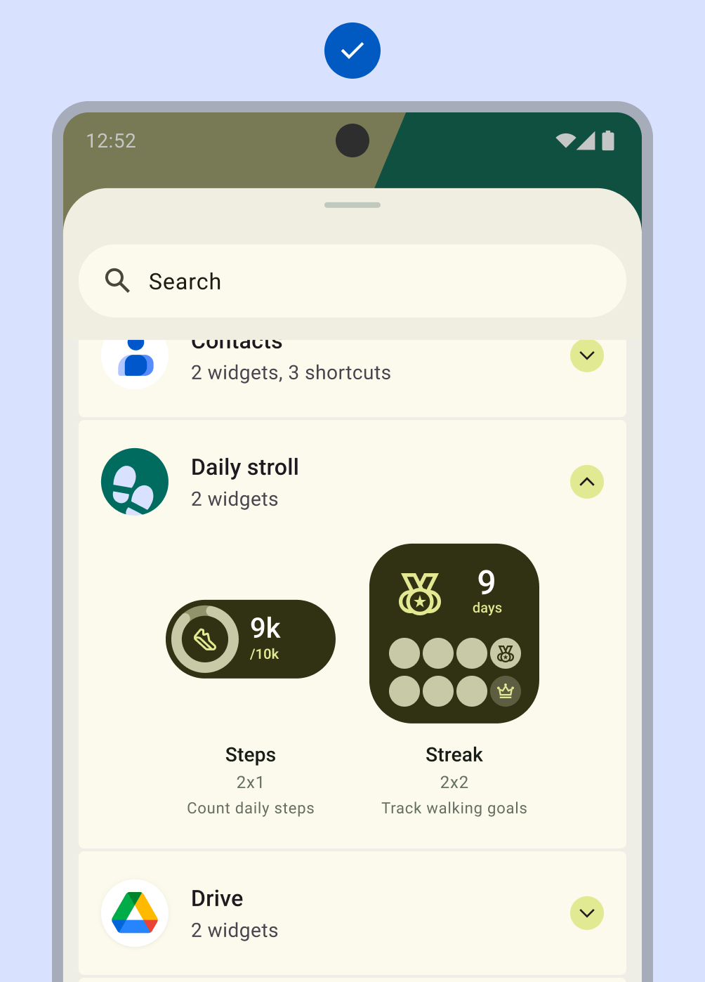
对于自定义程度有限的 widget,直接在 widget 选择器中显示热门或独特的配置。这样就不需要单独的配置界面。
应用可以支持不限数量的 widget。不过,widget 选择器必须侧重于仅展示关键任务和实用变体。将选择器预览限制为 6-8 个变体。通过确认界面允许访问其他变体。
正确做法
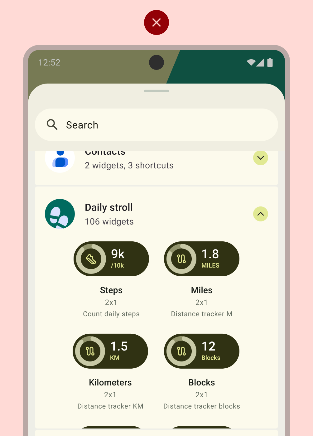
错误做法
布局
在构建配置界面时,请遵循布局基础知识最佳实践,或利用 Material Design 组件,例如包含开关、复选框和切换按钮的列表布局。如需详细了解如何制作高质量的 widget 布局,请参阅 widget 质量。