
세계보건기구(WHO)와 세계은행의 2011년 보고서에 따르면 전 세계 인구의 약 15%(6명 중 1명)는 일생 동안 중대하거나 일시적인 장애를 경험합니다. 따라서 설계에서의 접근성은 포용적이고 유용하며 고품질의 앱을 만들기 위한 기본적인 요소입니다. 접근성은 사용자에게 최상의 결과를 가져다주고 큰 비용이 드는 재작업을 방지할 수 있습니다. Android에는 기본적으로 접근성 옵션을 지원하는 앱을 빌드하는 데 도움이 되는 다양한 기능이 포함되어 있습니다.
눈길을 사로잡는 디자인
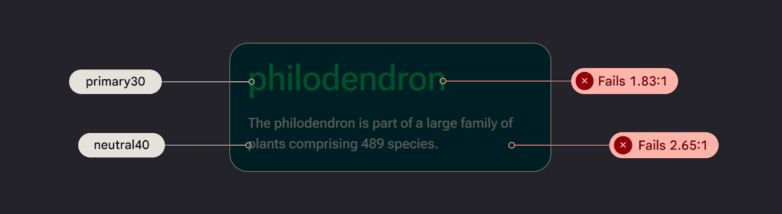
색상 대비와 텍스트 크기를 확인하여 앱 콘텐츠를 가능한 한 쉽게 읽을 수 있도록 하고, 구성요소가 시각적으로 이해하기 쉽고 서로 쉽게 구분할 수 있는지 확인합니다.
다음 가이드라인에 따라 시각 접근성을 고려하여 디자인하세요.
- 사용자가 글꼴 크기를 조정할 수 있도록 하려면 확장 가능한 픽셀(sp)로 글꼴 크기를 지정합니다.
- 본문 크기를 12sp보다 작게 만들지 마세요. 이 가이드라인은 Material 서체 스케일 기본값에 부합합니다.
- 배경과 텍스트의 대비가 4.5:1 이상이어야 합니다. 색상 대비를 확인하는 방법을 알아보세요.
- 노출 영역과 텍스트가 아닌 요소 간에 3:1 비율을 사용합니다. 예를 들어 배경과 아이콘의 비율은 3:1입니다.
- 링크와 같은 작업에는 시각적 어포던스를 2개 이상 사용하세요.
Material의 Accessible 색상 시스템 을 사용합니다. 이 색 시스템은 색조 팔레트를 기반으로 하며 기본적으로 색 구성표에 액세스할 수 있도록 하는 데 중요합니다.
사운드를 위한 디자인
TalkBack은 Android 기기에 포함된 Google 스크린 리더로, 사용자가 눈이 보이지 않게 제어할 수 있도록 합니다. TalkBack으로 앱을 탐색하거나 A11y 스캐너로 앱을 탐색하여 이를 수동으로 테스트할 수 있습니다.
다음 가이드라인에 따라 앱이 스크린 리더를 사용할 수 있도록 준비하세요.
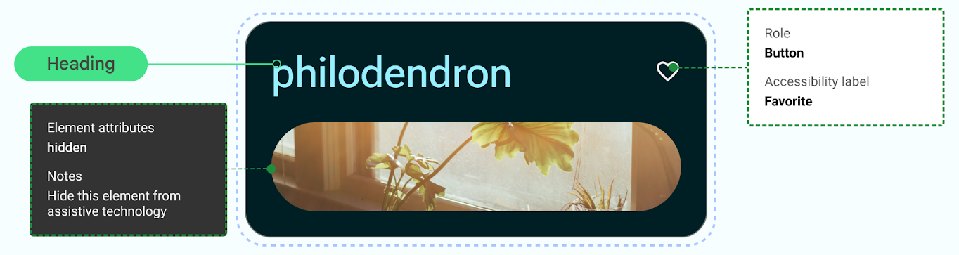
- 코드의 UI 요소를 설명합니다. Compose는 시맨틱 속성을 사용하여 UI 요소에 표시되는 정보를 접근성 서비스에 알립니다.
- Android 프레임워크 요구사항을 충족하려면 아이콘과 이미지의 추가 텍스트 설명을 제공하세요.
- 장식용 항목 설명을 null로 설정합니다.
- 작업 블록과 콘텐츠 블록 간에 건너뛸 수 있게 하려면 UI 세부사항과 그룹화를 고려하세요.
웹 콘텐츠 접근성 가이드라인 (WCAG)을 사용한 접근성 고려사항 및 표기법을 안내하는 Material의 Design to Implementation Walk를 확인하세요.
오디오를 위한 디자인
Android는 사용자가 다양한 음성 명령과 쿼리를 통해 기기와 상호작용할 수 있는 기능을 제공합니다.
Android용 음성 액세스 앱을 사용하면 음성 명령으로 기기를 제어할 수 있습니다. 핸즈프리로 음성으로 앱을 열고 탐색하고 텍스트를 수정할 수 있습니다.
운동 능력을 위한 설계
스위치 제어를 사용하면 사용자가 하나 이상의 기기를 사용하여 Android 기기와 상호작용할 수 있으므로 터치 스크린과 직접 상호작용하는 데 어려움을 겪고 있는 수동기민성 문제가 있는 사용자에게 유용합니다.
스위치 액세스를 탐색하여 수동으로 테스트합니다.
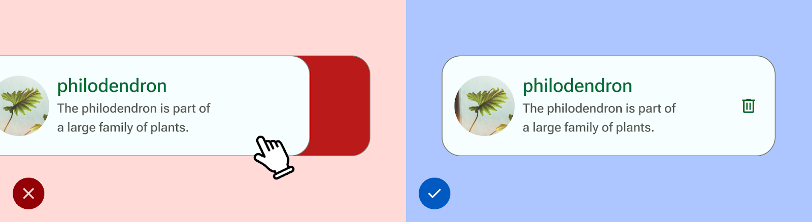
- 모든 작업을 완료하기 위해 동작에 의존하지 마세요. 앱의 모든 사용자 플로우를 지원하도록 접근성 작업을 생성합니다.
- 모든 터치 영역의 크기는 UI 요소의 시각 요소를 넘어서도 최소 48dp여야 합니다.
- 추가 실시간 감각 입력을 제공하는 데 도움이 되는 햅틱 반응을 고려합니다.