

边到边应用会在系统栏下绘制界面,从而充分利用整个屏幕。
要点总结
- 在系统栏下方绘制背景和滚动内容,以实现边到边的体验。
- 避免在系统内嵌下方添加点按手势或拖放目标;这些手势会与边到边导航和手势导航冲突。
在系统栏后面绘制内容
借助边到边功能,您可以在系统栏下绘制界面,从而打造沉浸式体验。
应用可以通过响应内边距来解决内容重叠问题。边衬区用于说明应用内容需要的内边距,以避免与系统栏或物理设备功能(例如显示屏缺口)重叠。了解如何在 Compose 和 View 中支持无边框设计并处理边衬区。
设计边到边用例时,请注意以下类型的内边距:
- 系统栏边衬区适用于可点按且不应被系统栏遮挡的界面。
- 系统手势内边距适用于操作系统使用的手势导航区域,这些区域的优先级高于您的应用。
- 显示屏刘海屏内嵌适用于延伸到显示屏表面的设备区域,例如摄像头刘海屏。
状态栏注意事项
如需了解系统栏的基本设计指南,请参阅 Android 系统栏。以下部分将讨论其他状态栏注意事项。
滚动内容
顶部应用栏应在滚动时收起。了解如何收起 Material 3 TopAppBar。
正确做法
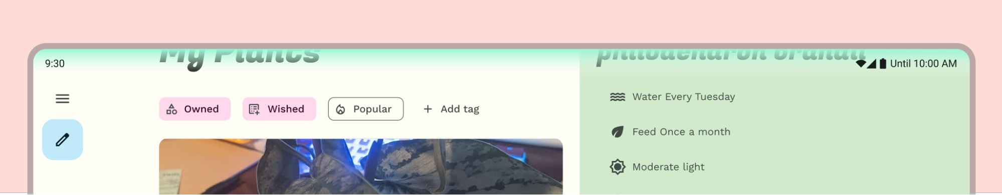
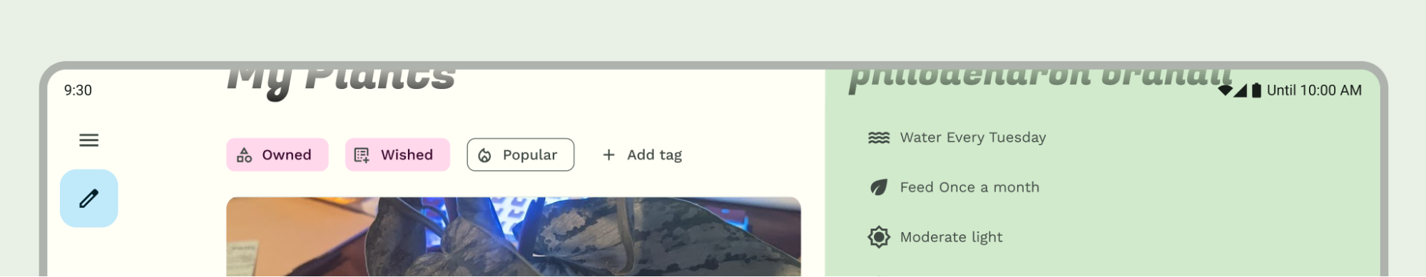
如果应用栏固定,则将顶部应用栏收起到状态栏高度。
正确做法
如果顶部应用栏不是固定的,请添加匹配的背景颜色渐变。
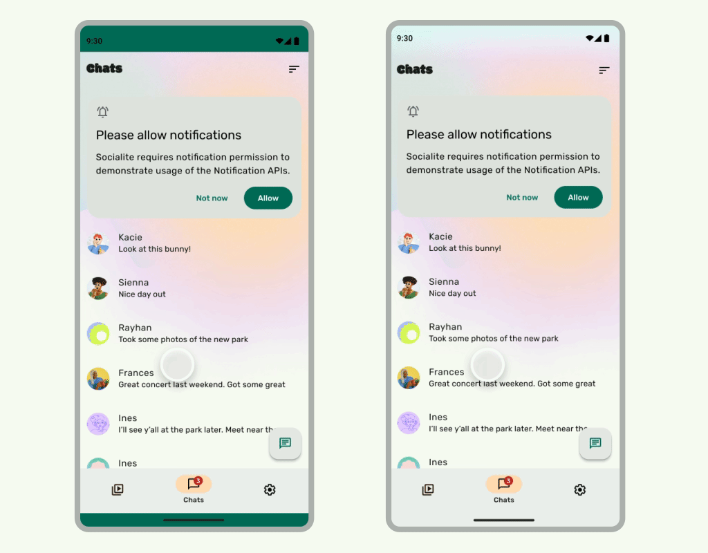
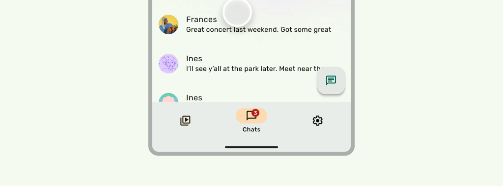
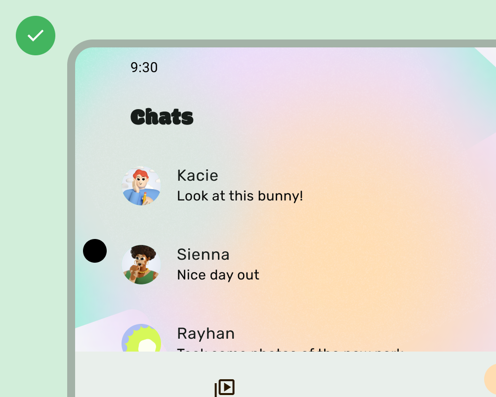
当界面滚动到下方时,状态栏应为半透明状态,以免状态栏图标看起来杂乱无序。为此,请先按照 LazyColumn 或 RecyclerView 文档中的步骤操作,将可滚动界面设置为从边到边。然后,执行以下任一操作,确保系统栏是半透明的:
- 在滚动时依赖 Material 3 TopAppBar 自动保护功能(如果适用)。
- 创建自定义渐变可组合项,或对 View 使用 GradientProtection。如需详细了解如何在 Compose 中执行此操作,请参阅系统栏保护。

对于自适应布局,请确保为具有不同背景颜色的窗格提供单独的保护。
错误做法
渐变保护与每个窗格的背景不匹配
正确做法
具有与每个窗格的背景相匹配的渐变保护。
同样,抽屉式导航栏也应与应用的其余部分分开保护。
请勿堆叠状态栏保护措施,例如同时使用 Material 3 TopAppBar 内置保护措施和自定义保护措施。
导航栏注意事项
如需了解导航栏的基本设计准则,请参阅 Android 系统栏。 以下部分包含其他导航栏注意事项。
滚动内容
底部应用栏应在滚动时收起。
正确做法
在底部应用栏以动画效果消失时,为三按钮导航栏添加系统栏遮罩。
正确做法
保持手势导航的透明度,不要添加额外的遮罩。
刘海屏
显示屏缺口可能会影响界面的外观。应用必须处理显示屏切口内嵌,以免界面的重要部分在显示屏切口下方绘制。
正确做法
使用显示屏刘海内嵌重要界面。
错误做法
将重要的界面放在屏幕边缘。
不过,纯色应用栏背景应绘制到显示屏切口中,如下图所示。
确保横向轮播界面绘制到刘海屏中。
其他指南
一般来说,背景和分隔线也应从边到边绘制,而文本和按钮等内容应内嵌,以免遮挡系统界面和硬件元素。