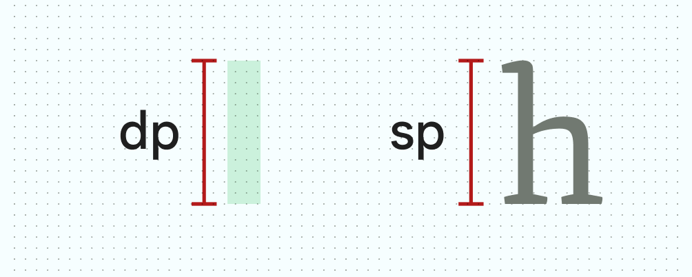
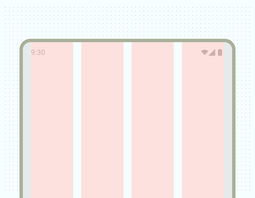
[null,null,["上次更新時間:2025-07-27 (世界標準時間)。"],[],[],null,["# Grids and units\n\nDensity independent pixels (dp) and scalable pixels (sp) are essential for\nbuilding layouts and presenting fonts that respond uniformly to the wide range\nof screen densities, size classes, form factors, and aspect ratios that make up\nAndroid devices.\n\nTakeaways\n---------\n\n- If using a baseline grid, stick to measurements of 4 and 8.\n- Notate specs in dp and sp, instead of pixels.\n- Export bitmap/raster graphics for all buckets.\n- Design with a responsive mindset with different size classes, resolutions, and aspect ratios in mind.\n- **Density-independent pixels (dp)**: density-independent pixels are flexible units that scale to have uniform dimensions on any screen. They are based on the physical density of the screen. These units are relative to a 160 dpi (dots per inch) screen, on which 1 dp is roughly equal to 1 px.\n- **Scalable pixels (sp)**: Scalable pixels serve the same function as dp, but for fonts. The default value of an sp is the same as the default value for a dp. The Android system calculates the actual font size to use based on the device and the user's preference set in the Settings app of their Android device.\n\n| **Important:** Always specify font sizes in sp units or scalable pixels.\n**Figure 1:** Notating dp versus sp\n\nThe primary difference between these units of measurement is that scalable\npixels preserve a user's font settings. Users who have larger text settings for\naccessibility see font sizes match their text size preferences. See how to\n[change font size](/jetpack/compose/text#changing-size) in Compose.\n\nAndroid uses these units to help scale and translate across the range of\ndevices and resolutions.\n\nDensity buckets\n---------------\n\nHigh-density screens have more pixels per inch than low-density ones. As a\nresult, UI elements of the same pixel dimensions appear larger on low-density\nscreens, and smaller on high-density screens. This is why you should not declare\nmeasurements in pixels.\n\nAndroid groups ranges of screen densities into \"buckets\" and uses them to\ndeliver the optimal set of assets to your device. The most commonly used density\nbuckets are `mdpi`, `hdpi`, `xhdpi`, `xxhdpi`, and `xxxhdpi` (`nodpi` and\n`anydpi` refer to a bucket that does not scale per device resolution, typically\nused for vector drawables) each correspond to a resource file of your app.\n**Figure 2:** Party cantaloupe in their respective densities\n\nTo calculate dp:\n\ndp = (width in pixels \\* 160) / screen density\n\nGrids\n-----\n\n### Baseline grid\n\nBuilding with an underlying grid helps create consistent spacing and alignment\nacross your UI. Android UI utilizes an 8 dp grid for layout, components, and\nspacing. \nAlas, your browser doesn't support HTML5 video. That's OK! You can still [download the video](/images/XXXXX) and watch it with a video player. **Video 1:** Showing an 8 dp grid highlighting 8 dp increments\n\nSmaller elements such as icons, type, and some elements within components are\nbest aligned to a 4 dp grid.\n**Figure 3:** 8-dp grids are ideal for most UI elements, while a 4-dp grid is better for smaller elements such as icons\n\n### Column grid\n\nColumns build a grid structure to provide vertical definition to a layout by\ndividing content within the body area. Content is placed in the areas of the\nscreen that contain columns. Align with an underlying grid to align content, but\nshould keep flexible sizing. Learn the basics on how to set up a column grid and\napply content in [Layout basics](/design/ui/mobile/guides/layout-and-content/layout-basics).\n**Figure 4:** Four-column grid\n\nCheck out the Material 3 [Canonical layouts](https://m3.material.io/foundations/layout/canonical-layouts/overview) page for details on\ncreating flexible layouts across form factors.\n\nSize classes\n------------\n\nWindow size classes are a set of opinionated viewport breakpoints that help you\ndesign, develop, and test responsive and adaptive application layouts. Android\nbreaks window size classes into 3: Compact, Medium, and Expanded. Read more on\n[Window size classes](/develop/ui/compose/layouts/adaptive/window-size-classes).\n\n### Aspect ratios\n\nAn aspect ratio is the proportion of an element's width to its height. Aspect\nratios are written as width:height.\n\nTo maintain consistency in your layout, use a consistent aspect ratio on\nelements like images, surfaces, and screen size.\n\nThe following aspect ratios are recommended for use across your UI:\n\n- 16:9\n- 3:2\n- 4:3\n- 1:1\n- 3:4\n- 2:3"]]
