规范 widget 布局
使用集合让一切井井有条
根据您的偏好保存内容并对其进行分类。
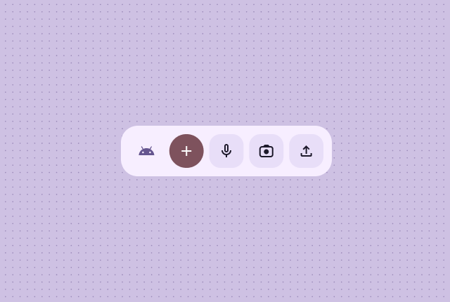
首先确定核心内容,然后再制作有效的微件布局。布局决定了信息和互动元素在微件中的排列方式。Android 为工具栏、文本、列表和网格类型的 widget 提供了多个预构建布局,以简化此流程。
文本
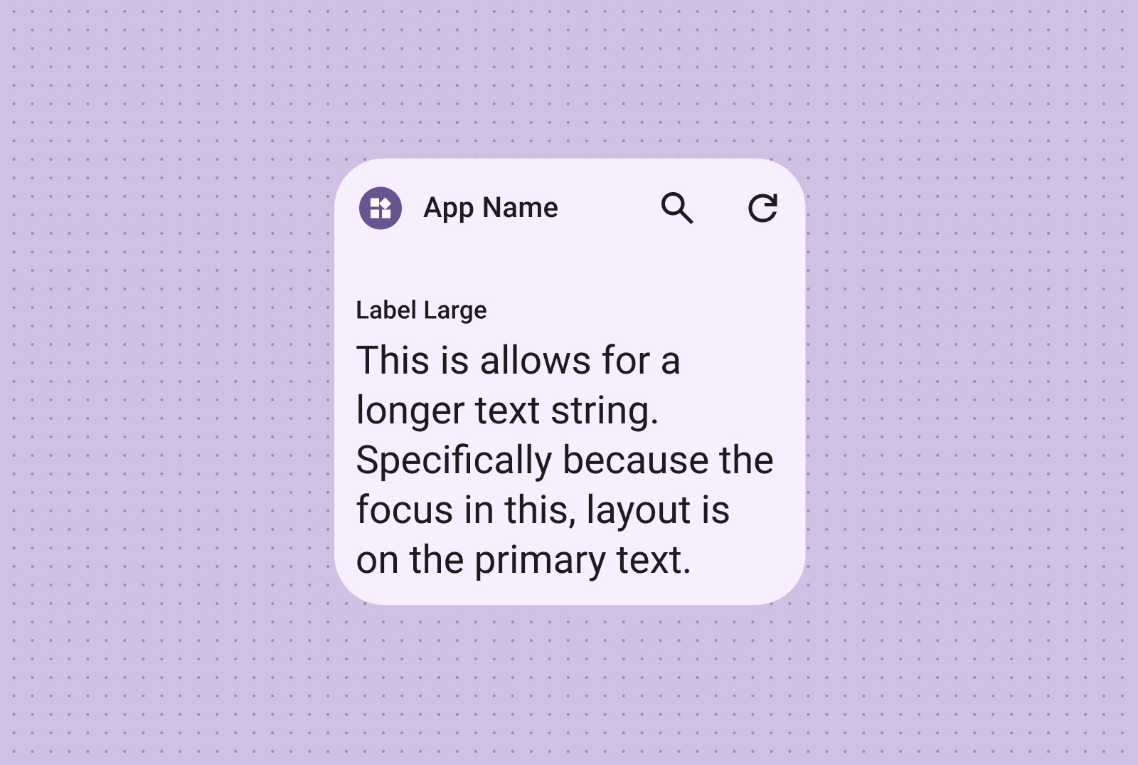
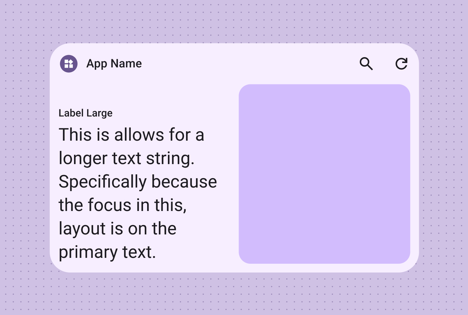
文本布局非常适合显示简洁的信息。您可以选择在文字旁边添加图片,从而提升 widget 的视觉吸引力。
纯文字
非常适合标题、状态更新、简短说明,或任何单行文本即可有效传达信息的场景。如需有关根据微件大小动态缩放文本内容的指导,请参阅规范布局示例。
文字和图片
添加图片以增强视觉效果。如需了解详情,请参阅断点,了解如何针对不同的屏幕尺寸调整此布局。
使用工具栏布局,以灵活的布局(可适应各种 widget 大小)让用户快速访问应用中的常用任务。
搜索工具栏
搜索工具栏布局经过精心设计,可将焦点吸引到工具栏中的搜索作为主要操作。其他实用按钮可让用户快速访问常用功能。
工具栏
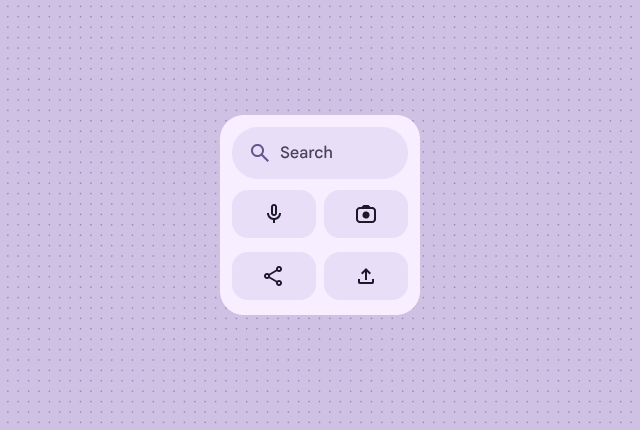
工具栏会显示应用品牌,后跟最常用任务的按钮,非常适合用于切换设置或任务链接。调整大小时,系统可能会隐藏不太常用的选项,以显示更常用的操作。在有空间时,使用断点添加一个至少 48dp 的新可点按按钮。
列表
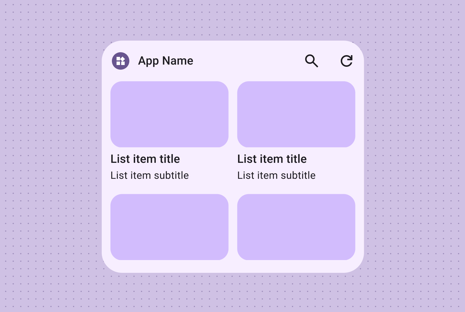
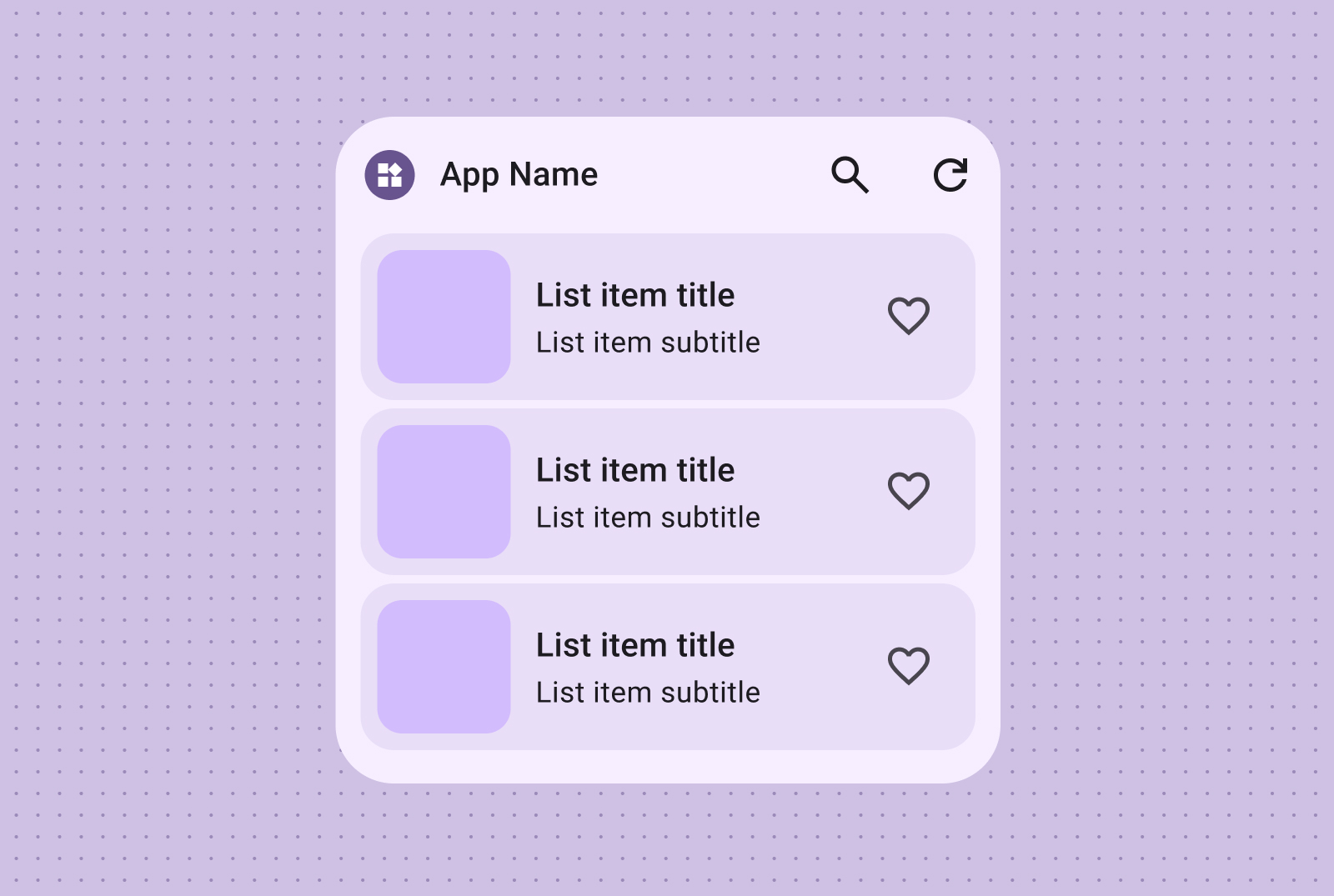
使用列表布局以清晰、易于扫描的格式整理多个项。这非常适合用来显示新闻标题、待办事项或消息。将内容整理成结构清晰、易于浏览的列表。根据您的内容需求,选择容器化或无容器呈现方式。
文字和图片列表
易于浏览的文本和图片列表非常适合展示多种内容类型,例如新闻标题、带有专辑封面的播放列表或消息。
核对清单
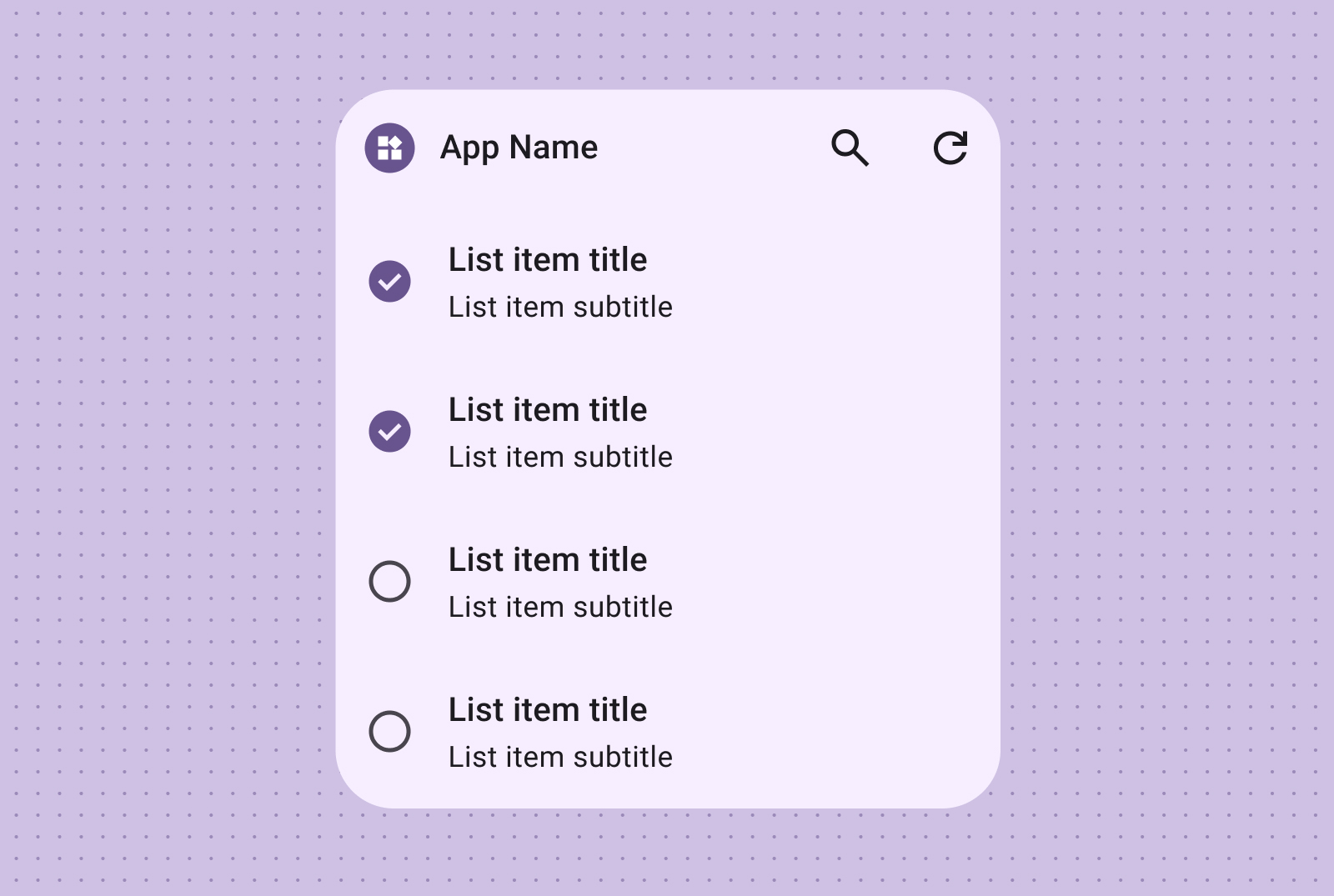
核对清单布局非常适合显示任务,可提供清晰的点按目标,让用户轻松将项标记为已完成。
操作列表
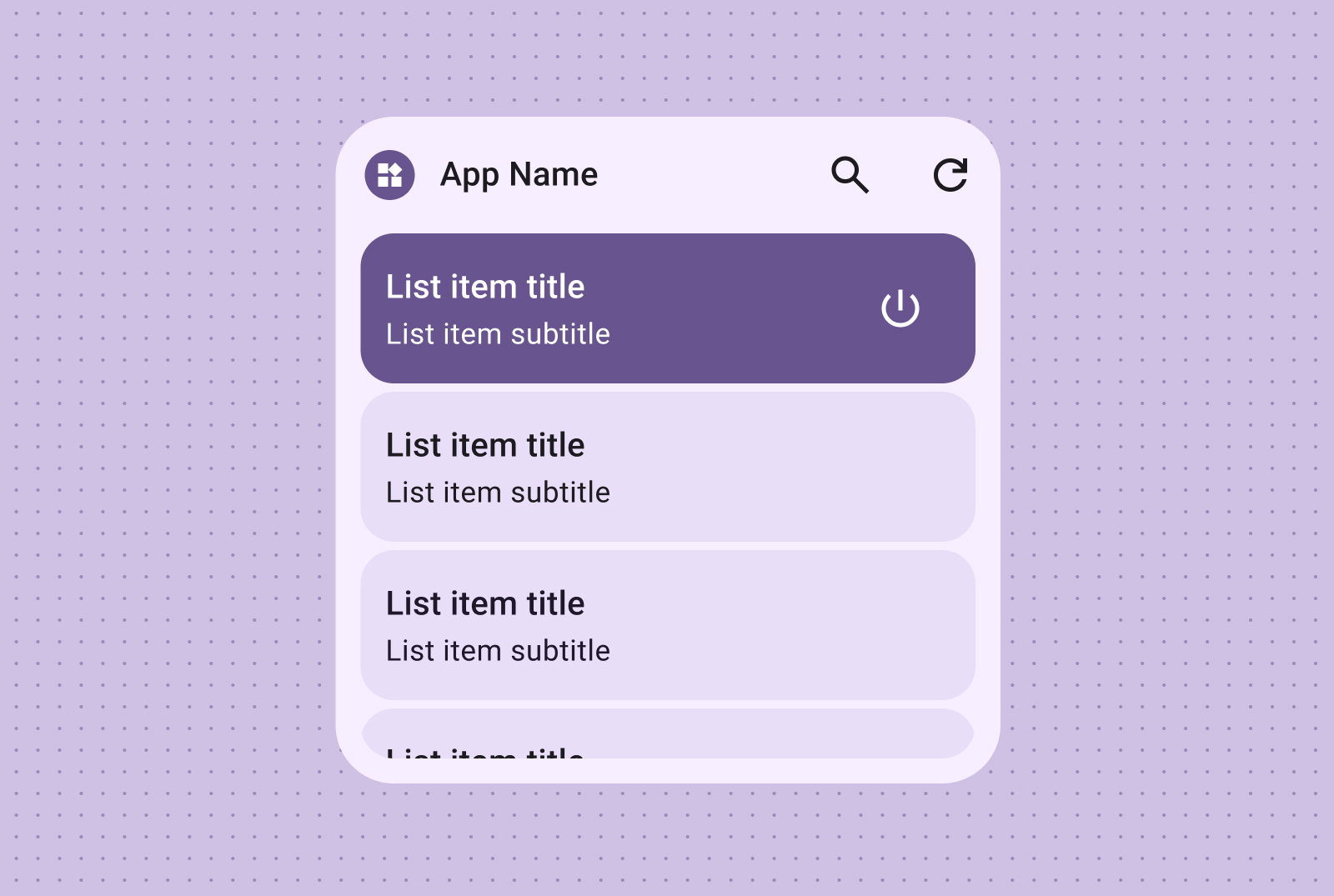
通过操作列表提供直观的控件分组,其中可视的开启/关闭状态可立即提供有关项状态的反馈。
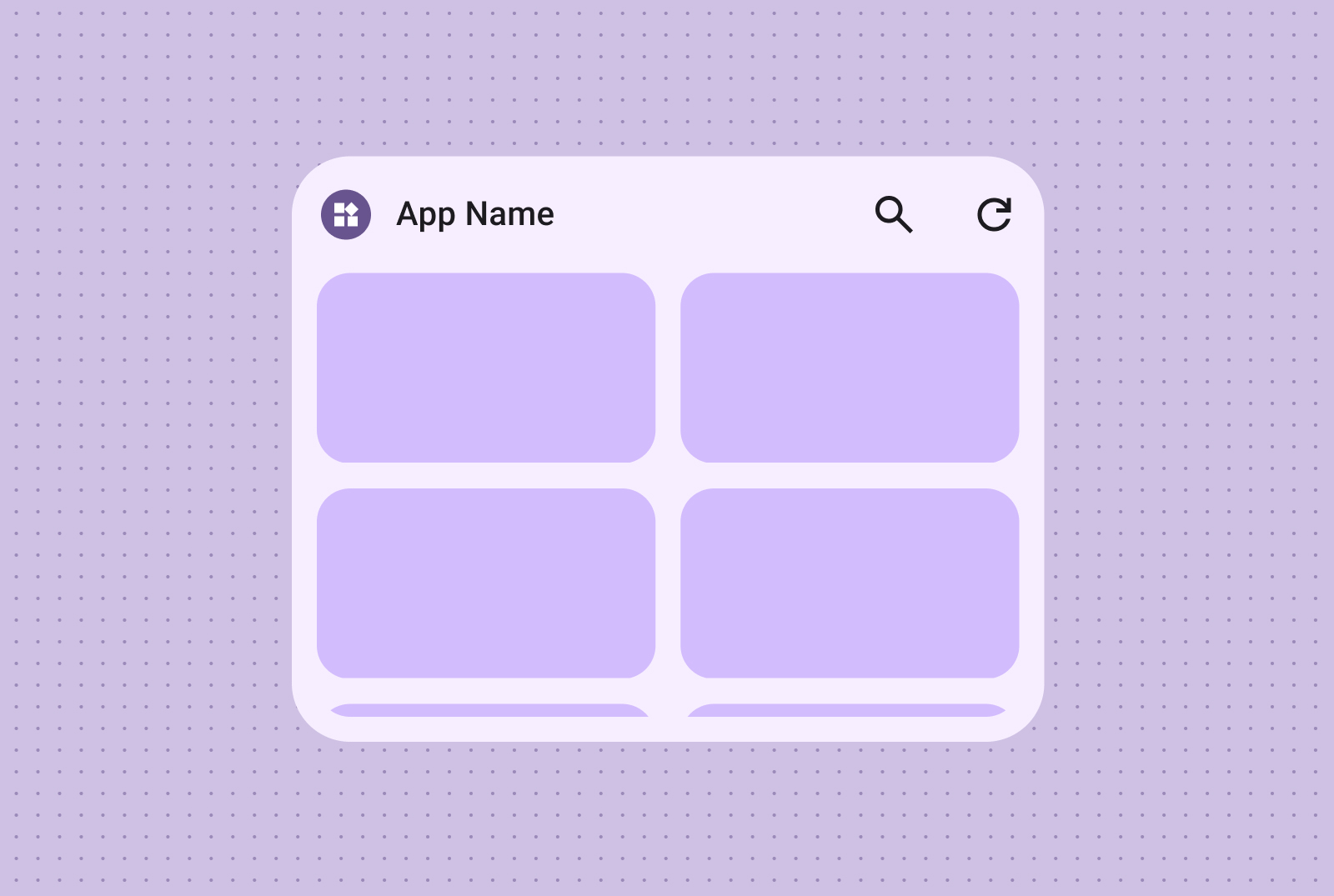
网格
以紧凑、灵活且富有视觉效果的网格形式显示图片,并可添加可选标签。
使用可适应不同屏幕尺寸的列和行。
仅图片
使用仅包含图片的网格创建视觉效果出众的可滚动图片库。行和列会自动适应各种屏幕尺寸,以实现最佳呈现效果。
图片和文字
您还可以添加文字标签和说明,通过其他背景信息和信息丰富图片网格内容。
本页面上的内容和代码示例受内容许可部分所述许可的限制。Java 和 OpenJDK 是 Oracle 和/或其关联公司的注册商标。
最后更新时间 (UTC):2025-07-27。
[null,null,["最后更新时间 (UTC):2025-07-27。"],[],[],null,["# Canonical widget layouts\n\nCraft effective widget layouts by first identifying your core content. Your\nlayout dictates how information and interactive elements are organized within\nyour widget. Android offers several prebuilt layouts for toolbars, text, list\nand grid-type widgets to streamline this process.\n| **Note:** View detailed layout specs in our [Figma Widget Canonical Builder](https://goo.gle/widget-canonical), and find the code samples using Jetpack Glance in the [Android Platform Samples GitHub repository](https://github.com/android/platform-samples/tree/main/samples/user-interface/appwidgets/src/main/java/com/example/platform/ui/appwidgets/glance).\n\nText\n----\n\nText layouts are ideal for displaying concise information. Enhance the visual\nappeal of your widget by optionally including an image alongside the text. \n**Text only**\n\n\nIdeal for titles, status updates, short descriptions, or any scenario\nwhere a single line of text effectively conveys the message. Refer to the\n[Canonical layout sample](https://github.com/android/platform-samples/tree/main/samples/user-interface/appwidgets/src/main/java/com/example/platform/ui/appwidgets/glance)\nfor guidance on dynamically scaling text content based on widget size. \n**Text and image**\n\n\nInclude an image for added visual impact. For more information, see\n[Breakpoints](/design/ui/mobile/guides/widgets/sizing#breakpoints)\nto learn how to adapt this layout for different screen sizes.\n\nToolbars\n--------\n\nUse toolbar layouts to provide users with quick access to frequently used tasks\nin your app, in a flexible layout that adapts across widget sizes. \n**Search Toolbar**\n\n\nA search toolbar layout is intentionally designed to draw focus to search\nas a primary action in the toolbar. Additional handy buttons can provide\nquick access to frequently used functions.\n\n\n**Toolbar**\n\n\nToolbars presents app branding followed by buttons for the most used tasks\nthat are ideal for toggleable settings or task links. When resizing, less\ncommonly used options can be hidden in favor of more common actions. Use\n[Breakpoints](/design/ui/mobile/guides/widgets/sizing#breakpoints)\nto add a new minimum 48dp tappable button when there's room.\n\n\u003cbr /\u003e\n\nLists\n-----\n\nUse list layouts to organize multiple items in a clear, scannable format. This\nis ideal for news headlines, to-do lists or messages. Organize content into a\nstructured, easily scannable list. Choose between containerized or containerless\npresentation based on your content needs. \n**Text and image list**\n\n\nEasily scannable text and image lists are perfect for showcasing multiple\ncontent types, such as news headlines, playlists with album art, or\nmessages. \n**Checklist**\n\n\nThe checklist layout is perfect for displaying tasks, providing clear tap\ntargets for users to easily mark items as done. \n**Action list**\n\n\nProvide intuitive control grouping with action lists, where visual on/off\nstates offer immediate feedback on item statuses.\n\nGrid\n----\n\nPresent images in a compact, flexible, visually rich grid with optional labels.\nUse columns and rows that adapt to different screen sizes. \n**Image only**\n\n\nCreate visually impactful, scrollable image galleries using image-only\ngrids. Rows and columns automatically adapt to various screen sizes for\noptimal presentation. \n**Image and text**\n\n\nYou can also incorporate text labels and descriptions, enriching your\nimage grid content with additional context and information."]]