標準小工具版面配置
透過集合功能整理內容
你可以依據偏好儲存及分類內容。
首先找出核心內容,再設計有效的小工具版面配置。版面配置會決定資訊和互動元素在小工具中如何排列。Android 提供多種預先建構的版面配置,可用於工具列、文字、清單和格狀小工具,以簡化這項程序。
文字
文字版面配置最適合用來顯示簡潔的資訊。您可以選擇在文字旁邊加入圖片,提升小工具的視覺吸引力。
只有文字
非常適合用於標題、狀態更新、簡短說明,或任何只需一行文字就能有效傳達訊息的情況。如要瞭解如何根據小工具大小動態調整文字內容,請參閱 標準版版面配置範例。
文字和圖片
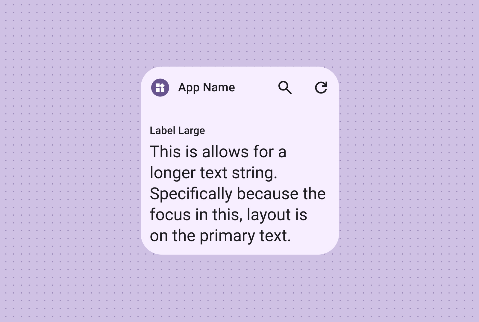
加入圖片可增強視覺效果。如需更多資訊,請參閱「中斷點」,瞭解如何根據不同的螢幕大小調整此版面配置。
使用工具列版面配置,讓使用者能快速存取應用程式中常用的任務,並採用可在各種小工具大小下調整的彈性版面配置。
搜尋工具列
搜尋工具列的版面配置是刻意設計成將焦點放在搜尋功能,以便在工具列中執行主要動作。其他方便的按鈕可讓您快速存取常用的功能。
工具列
工具列會顯示應用程式品牌,接著是用於最常用工作項的按鈕,非常適合用於可切換設定或工作項連結。調整大小時,可以隱藏較少使用到的選項,以便執行較常見的動作。在有空間的情況下,使用中斷點新增最小 48dp 的觸控按鈕。
清單
使用清單版面配置,以清晰可掃描的格式整理多個項目。這類字體非常適合用於新聞標題、待辦事項清單或訊息。將內容整理成結構化且易於瀏覽的清單。請根據內容需求選擇容器化或無容器呈現方式。
文字和圖片清單
輕鬆掃描的文字和圖片清單非常適合用來展示多種內容類型,例如新聞標題、含有專輯封面的播放清單或訊息。
檢查清單
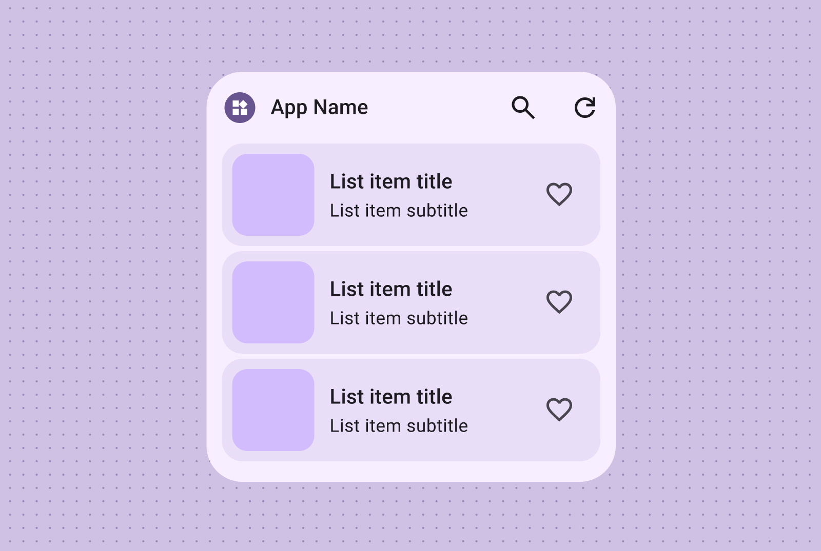
檢查清單版面配置非常適合用於顯示工作,可提供明確的輕觸目標,讓使用者輕鬆將項目標示為已完成。
動作清單
透過動作清單提供直覺的控制項分組,其中視覺開啟/關閉狀態可立即提供項目狀態的即時意見回饋。
格線
以精簡、彈性、視覺效果豐富的格狀版面呈現圖片,並可選擇加上標籤。使用可配合不同螢幕尺寸調整的欄和列。
只有圖片
使用僅含圖片的格線,建立視覺效果強烈的可捲動圖庫。列和欄會自動調整為各種螢幕大小,以便呈現最佳效果。
圖像和文字
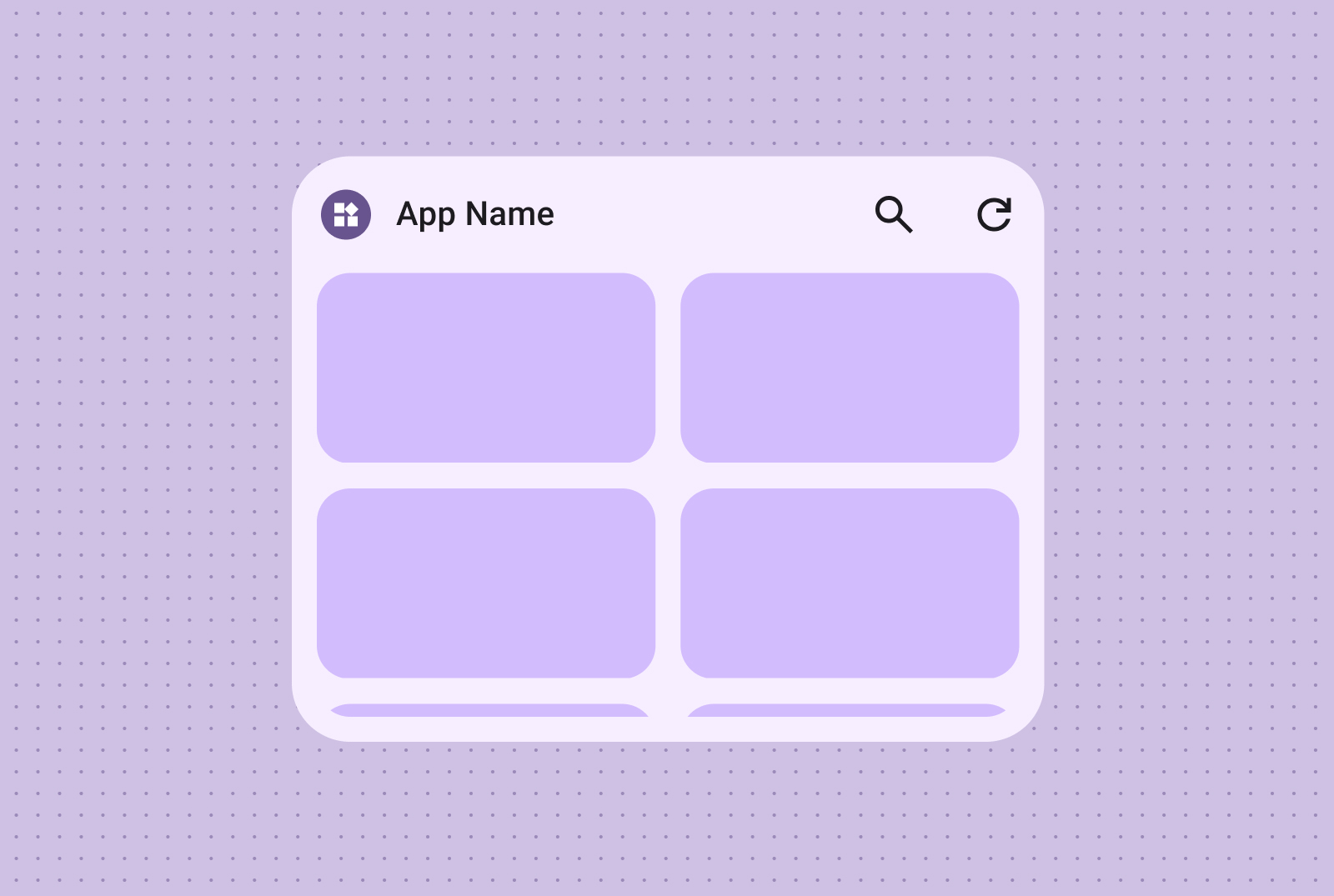
您也可以加入文字標籤和說明,透過額外的上下文和資訊豐富圖片格狀內容。
這個頁面中的內容和程式碼範例均受《內容授權》中的授權所規範。Java 與 OpenJDK 是 Oracle 和/或其關係企業的商標或註冊商標。
上次更新時間:2025-07-27 (世界標準時間)。
[null,null,["上次更新時間:2025-07-27 (世界標準時間)。"],[],[],null,["# Canonical widget layouts\n\nCraft effective widget layouts by first identifying your core content. Your\nlayout dictates how information and interactive elements are organized within\nyour widget. Android offers several prebuilt layouts for toolbars, text, list\nand grid-type widgets to streamline this process.\n| **Note:** View detailed layout specs in our [Figma Widget Canonical Builder](https://goo.gle/widget-canonical), and find the code samples using Jetpack Glance in the [Android Platform Samples GitHub repository](https://github.com/android/platform-samples/tree/main/samples/user-interface/appwidgets/src/main/java/com/example/platform/ui/appwidgets/glance).\n\nText\n----\n\nText layouts are ideal for displaying concise information. Enhance the visual\nappeal of your widget by optionally including an image alongside the text. \n**Text only**\n\n\nIdeal for titles, status updates, short descriptions, or any scenario\nwhere a single line of text effectively conveys the message. Refer to the\n[Canonical layout sample](https://github.com/android/platform-samples/tree/main/samples/user-interface/appwidgets/src/main/java/com/example/platform/ui/appwidgets/glance)\nfor guidance on dynamically scaling text content based on widget size. \n**Text and image**\n\n\nInclude an image for added visual impact. For more information, see\n[Breakpoints](/design/ui/mobile/guides/widgets/sizing#breakpoints)\nto learn how to adapt this layout for different screen sizes.\n\nToolbars\n--------\n\nUse toolbar layouts to provide users with quick access to frequently used tasks\nin your app, in a flexible layout that adapts across widget sizes. \n**Search Toolbar**\n\n\nA search toolbar layout is intentionally designed to draw focus to search\nas a primary action in the toolbar. Additional handy buttons can provide\nquick access to frequently used functions.\n\n\n**Toolbar**\n\n\nToolbars presents app branding followed by buttons for the most used tasks\nthat are ideal for toggleable settings or task links. When resizing, less\ncommonly used options can be hidden in favor of more common actions. Use\n[Breakpoints](/design/ui/mobile/guides/widgets/sizing#breakpoints)\nto add a new minimum 48dp tappable button when there's room.\n\n\u003cbr /\u003e\n\nLists\n-----\n\nUse list layouts to organize multiple items in a clear, scannable format. This\nis ideal for news headlines, to-do lists or messages. Organize content into a\nstructured, easily scannable list. Choose between containerized or containerless\npresentation based on your content needs. \n**Text and image list**\n\n\nEasily scannable text and image lists are perfect for showcasing multiple\ncontent types, such as news headlines, playlists with album art, or\nmessages. \n**Checklist**\n\n\nThe checklist layout is perfect for displaying tasks, providing clear tap\ntargets for users to easily mark items as done. \n**Action list**\n\n\nProvide intuitive control grouping with action lists, where visual on/off\nstates offer immediate feedback on item statuses.\n\nGrid\n----\n\nPresent images in a compact, flexible, visually rich grid with optional labels.\nUse columns and rows that adapt to different screen sizes. \n**Image only**\n\n\nCreate visually impactful, scrollable image galleries using image-only\ngrids. Rows and columns automatically adapt to various screen sizes for\noptimal presentation. \n**Image and text**\n\n\nYou can also incorporate text labels and descriptions, enriching your\nimage grid content with additional context and information."]]