
Canonical layouts are proven, versatile layouts that provide an optimal user experience on a variety of form factors.
The canonical layouts support small screen phones as well as tablets, foldables, and ChromeOS devices. Derived from Material Design guidance, the layouts are aesthetic as well as functional.
The Android framework includes specialized components that make implementation of the layouts straightforward and reliable.
The canonical layouts create engaging, productivity‑enhancing UIs that form the foundation of great apps.
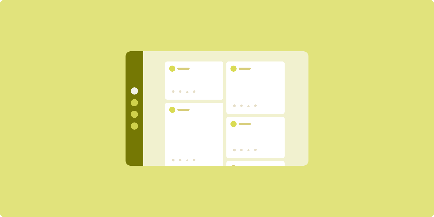
List-detail

The list-detail layout enables users to explore lists of items that have descriptive, explanatory, or other supplementary information—the item detail.
The layout divides the app window into two side-by-side panes: one for the list, one for the detail. Users select items from the list to display the item detail. Deep links in the detail reveal additional content in the detail pane.
Expanded-width displays (see Use window size classes) accommodate both the list and detail at the same time. Selection of a list item updates the detail pane to show the related content for the selected item.
Medium- and compact-width displays show either the list or the detail, depending on user interaction with the app. When just the list is visible, selection of a list item displays the detail in place of the list. When just the detail is visible, pressing the back button redisplays the list.
Configuration changes such as device orientation changes or app window size changes can change the display's window size class. A list‑detail layout responds accordingly, preserving app state:
- If an expanded-width display showing both the list and detail panes narrows to medium or compact, the detail pane remains visible and the list pane is hidden
- If a medium- or compact-width display has just the detail pane visible and the window size class widens to expanded, the list and detail are shown together, and the list indicates that the item corresponding to the content in the detail pane is selected
- If a medium- or compact-width display has just the list pane visible and widens to expanded, the list and a placeholder detail pane are shown together
List-detail is ideal for messaging apps, contact managers, interactive media browsers or any app where the content can be organized as a list of items that reveal additional information.
Implementation
กระบวนทัศน์เชิงประกาศของ Compose รองรับตรรกะคลาสขนาดหน้าต่างที่กำหนดว่าจะแสดงบานหน้าต่างรายการและรายละเอียดพร้อมกันหรือไม่ (เมื่อคลาสขนาดหน้าต่างความกว้างขยาย) หรือแสดงเฉพาะบานหน้าต่างรายการหรือรายละเอียด (เมื่อคลาสขนาดหน้าต่างความกว้างเป็นขนาดกลางหรือกะทัดรัด)
หากต้องการให้โฟลว์ข้อมูลเป็นแบบทางเดียว ให้ยกสถานะทั้งหมด รวมถึงคลาสขนาดหน้าต่างปัจจุบันและรายละเอียดของรายการที่เลือก (หากมี) เพื่อให้ Composable ทั้งหมดเข้าถึงข้อมูลและแสดงผลได้อย่างถูกต้อง
เมื่อแสดงเฉพาะแผงรายละเอียดในขนาดหน้าต่างเล็ก ให้เพิ่ม BackHandler
เพื่อนำแผงรายละเอียดออกและแสดงเฉพาะแผงรายการ BackHandler ไม่ได้เป็นส่วนหนึ่งของการนำทางโดยรวมของแอป เนื่องจากตัวแฮนเดิลขึ้นอยู่กับคลาสขนาดหน้าต่างและสถานะรายละเอียดที่เลือก
ListDetailPaneScaffold เป็นคอมโพสเซเบิลระดับสูงที่ช่วยลดความซับซ้อนในการติดตั้งใช้งานเลย์เอาต์แบบรายละเอียดรายการ โดยจะจัดการตรรกะของบานหน้าต่างโดยอัตโนมัติตามคลาสขนาดหน้าต่าง และรองรับการไปยังมาระหว่างบานหน้าต่าง
ตัวอย่างการใช้งานขั้นต่ำโดยใช้ ListDetailPaneScaffold มีดังนี้
@OptIn(ExperimentalMaterial3AdaptiveApi::class) @Composable fun MyListDetailPaneScaffold() { val navigator = rememberListDetailPaneScaffoldNavigator() ListDetailPaneScaffold( directive = navigator.scaffoldDirective, value = navigator.scaffoldValue, listPane = { // Listing Pane }, detailPane = { // Details Pane } ) }
องค์ประกอบหลักในตัวอย่างนี้มีดังนี้
rememberListDetailPaneScaffoldNavigator: สร้าง Navigator เพื่อ จัดการการนำทางระหว่างแผงรายการและแผงรายละเอียดlistPane: แสดงรายการสินค้าdetailPane: แสดงเนื้อหาของรายการที่เลือก
ดูตัวอย่างการติดตั้งใช้งานโดยละเอียดได้ที่
- คู่มือนักพัฒนาแอปสร้างเลย์เอาต์รายละเอียดรายการ
- ตัวอย่าง รายละเอียดรายการ
Feed
A feed layout arranges equivalent content elements in a configurable grid for quick, convenient viewing of a large amount of content.
Size and position establish relationships among the content elements.
Content groups are created by making elements the same size and positioning them together. Attention is drawn to elements by making them larger than nearby elements.
Cards and lists are common components of feed layouts.
A feed layout supports displays of almost any size because the grid can adapt from a single, scrolling column to a multi‑column scrolling feed of content.
Feeds are especially well suited for news and social media apps.
Implementation
A feed consists of a large number of content elements in a vertical scrolling container laid out in a grid. Lazy lists efficiently render a large number of items in columns or rows. Lazy grids render items in grids, supporting configuration of the item sizes and spans.
Configure the columns of the grid layout based on the available display area to set the minimum allowable width for grid items. When defining grid items, adjust column spans to emphasize some items over others.
For section headers, dividers, or other items designed to occupy the full width
of the feed, use maxLineSpan to take up the full width of the layout.
On compact-width displays that don't have enough space to show more than one
column, LazyVerticalGrid behaves just like a LazyColumn.
Here is a minimal implementation using LazyVerticalGrid:
@Composable fun MyFeed(names: List<String>) { LazyVerticalGrid( // GridCells.Adaptive automatically adapts column count based on available width columns = GridCells.Adaptive(minSize = 180.dp), ) { items(names) { name -> Text(name) } } }
The key to an adaptive feed is the columns configuration.
GridCells.Adaptive(minSize = 180.dp) creates a grid where each column is at
least 180.dp wide. The grid then displays as many columns as can fit in the
available space.
For an example implementation, see the Feed with Compose sample.
Supporting pane

Supporting pane layout organizes app content into primary and secondary display areas.
The primary display area occupies the majority of the app window (typically about two thirds) and contains the main content. The secondary display area is a pane that takes up the remainder of the app window and presents content that supports the main content.
Supporting pane layouts work well on expanded-width displays (see Use window size classes) in landscape orientation. Medium- or compact‑width displays support showing both the primary and secondary display areas if the content is adaptable to narrower display spaces, or if the additional content can be initially hidden in a bottom or side sheet accessible by means of a control such as a menu or button.
A supporting pane layout differs from a list‑detail layout in the relationship of the primary and secondary content. Secondary pane content is meaningful only in relation to the primary content; for example, a supporting pane tool window is irrelevant by itself. The supplementary content in the detail pane of a list‑detail layout, however, is meaningful even without the primary content, for example, the description of a product from a product listing.
Use cases for supporting pane include:
- Productivity apps: A document or spreadsheet accompanied by reviewer comments in a supporting pane
- Media apps: A streaming video and a list of related videos in a supporting pane, or the depiction of an album of music supplemented with a playlist
- Tools and settings: A media editing tool with palettes, effects, and other settings in a support pane
Implementation
Compose 支持窗口大小类别逻辑,可用于确定是同时显示主要内容和辅助内容,还是将辅助内容放置在其他位置。
提升所有状态,包括当前窗口大小类别以及与主要内容和辅助内容中的数据相关的信息。
对于较小宽度的显示屏,可将辅助内容放置在主要内容下方或底部动作条中。对于中等宽度和较大宽度的显示屏,可将辅助内容放置在主要内容旁边,并根据内容和可用空间适当调整辅助内容的大小。对于中等宽度的显示屏,可在主要内容和辅助内容之间平均分配显示空间。对于展开宽度,可为主要内容分配 70% 的空间,并为辅助内容分配 30% 的空间。
SupportingPaneScaffold 是一种高级可组合项,可简化对辅助窗格布局的实现。该可组合函数会根据窗口大小类别自动处理窗格逻辑,在大屏幕上并排显示窗格,或在小屏幕上隐藏辅助窗格。SupportingPaneScaffold 还支持窗格之间的导航。
以下是最低限度的实现:
@OptIn(ExperimentalMaterial3AdaptiveApi::class) @Composable fun MySupportingPaneScaffold() { // Creates and remembers a navigator to control pane visibility and navigation val navigator = rememberSupportingPaneScaffoldNavigator() SupportingPaneScaffold( // Directive and value help control pane visibility based on screen size and state directive = navigator.scaffoldDirective, value = navigator.scaffoldValue, mainPane = { // Main Pane for the primary content }, supportingPane = { //Supporting Pane for supplementary content } ) }
rememberSupportingPaneScaffoldNavigator:用于创建导航器以管理窗格可见性(例如,在紧凑型屏幕上隐藏或显示支持窗格)的可组合函数mainPane:用于显示主要内容的可组合项supportingPane:用于显示补充内容的可组合项
如需查看详细的实现示例,请参阅:
- 构建辅助窗格布局 开发者指南
- supporting-pane-compose 示例
Additional resources
- Material Design — Canonical layouts