
A ToggleChip
is a specialized chip that allows users to select various options.
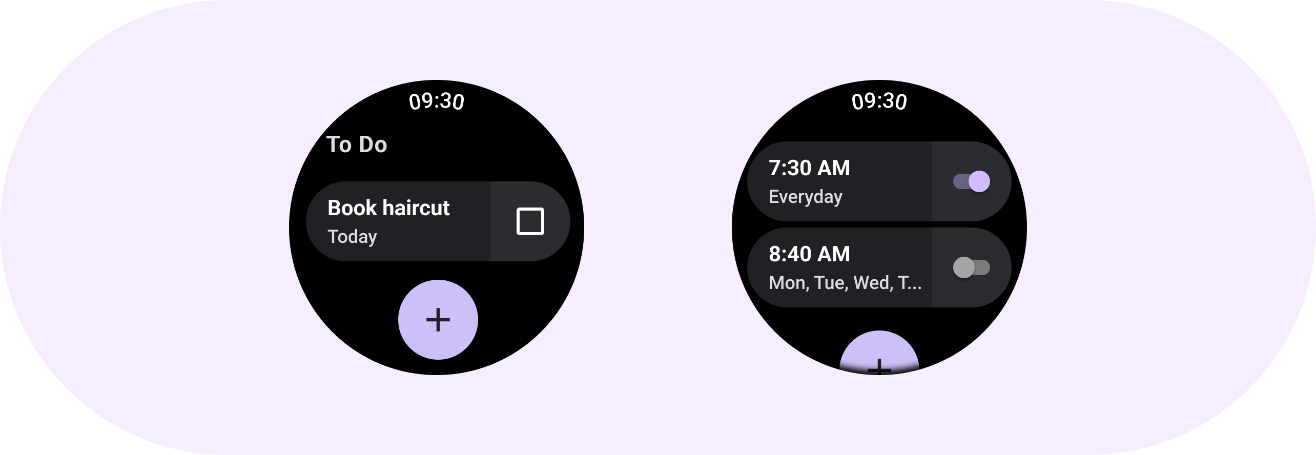

Toggle chips include a bi-state toggle control. Some examples of a bi-state toggle control include a switch, radio button, or checkbox. Use toggle chips for situations in which many options may need to be quickly and easily set, such as in Settings.
Anatomy

A. Label
B. Secondary label
C. Icon
D. Selection control
E. Container
Selection controls

Use a switch to turn a selection on or off.
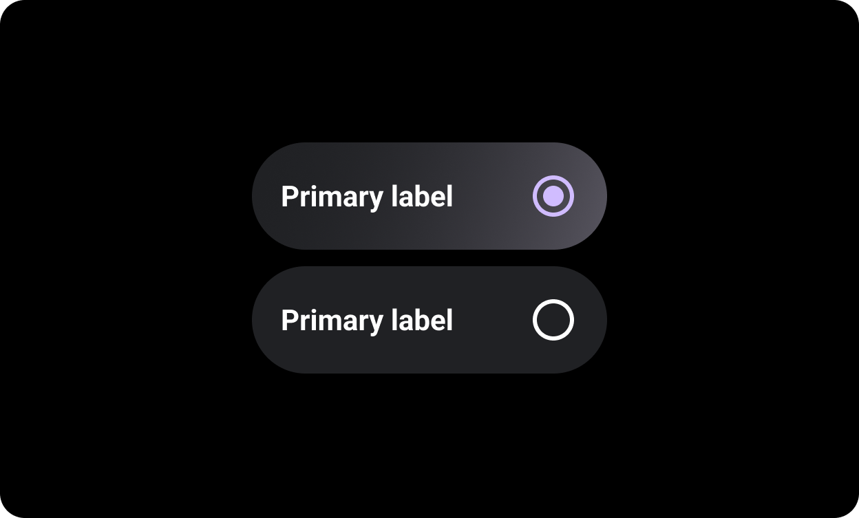
Use radio buttons in lists where the user can select only one option.
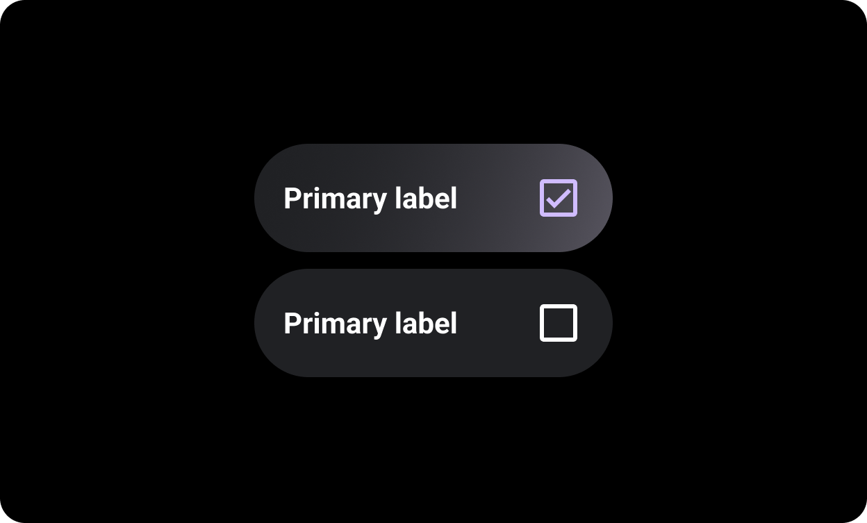
Use checkboxes in lists where the user can select multiple options.
Related Components

The
SplitToggleChip differs from the ToggleChip by having
two tappable areas, one clickable text area and one with a toggle.
On split toggle chips, differentiate between the tappable background area and the toggle control by making each section a different color.
Usage
Use toggle chips as shown in the following examples.
