
Flame Chart 标签页提供一个倒置的调用图表,用来汇总完全相同的调用堆栈。也就是说,将具有相同调用方顺序的完全相同的方法或函数收集起来,并在火焰图中将它们表示为一个较长的横条(而不是将它们显示为多个较短的横条,如调用图表中所示)。这样更方便您查看哪些方法或函数消耗的时间最多。不过,这也意味着,横轴不代表时间轴,而是表示执行每个方法或函数所需的相对时间。
为帮助说明此概念,不妨考虑图 1 中的调用图表。请注意,方法 D 多次调用 B(B1、B2 和 B3),其中一些对 B 的调用也调用了 C(C1 和 C3)。
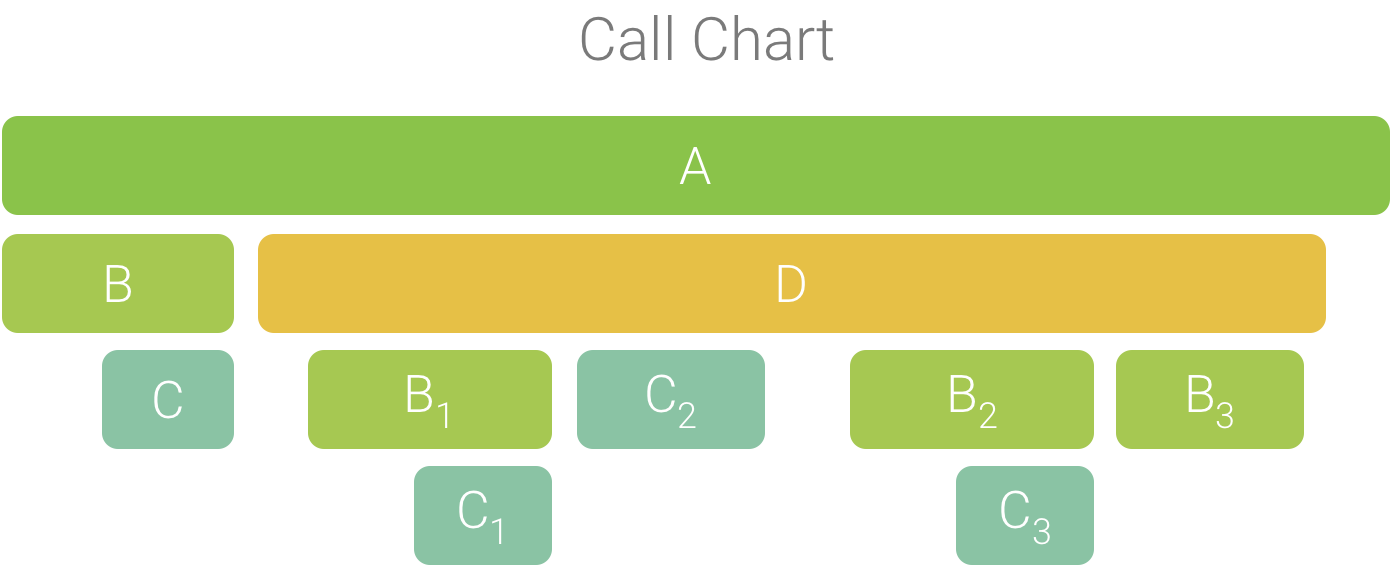
图 1. 一个调用图表,其中的多个方法调用具有相同的调用方顺序。
由于 B1、B2 和 B3 具有相同的调用方顺序 (A → D → B),因此系统将它们汇总在一起,如图 2 所示。同样,C1 和 C3 也汇总在一起,因为它们也具有相同的调用方顺序 (A → D → B → C)。请注意,C2 不包括在内,因为它具有不同的调用方顺序 (A → D → C)。
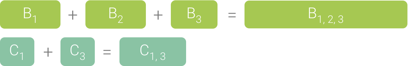
图 2. 汇总具有相同调用堆栈的相同方法。
汇总的调用用于创建火焰图,如图 3 所示。 请注意,对于火焰图中的任何给定调用,占用最多 CPU 时间的被调用方会最先显示。
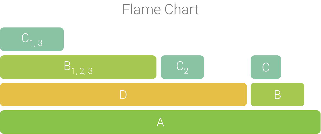
图 3. 图 5 中所示调用图表的火焰图表示形式。